But even when dealing with complexity, wizards are not the slam-dunk answer for creating an optimal user-interface design solution. Breaking up a task into smaller steps does not always provide a better user experience. Any of us who has suffered through using an automated IVR (Interactive Voice Response) system—Press 1 if you need help with hardware, press 2 if you need password reset and so on—that goes several tiers deep knows the frustration of plodding through layers of micro-logic machinations just to ask one basic question. In some cases, having users choose various forms from a simple menu or drop-down list might provide a better solution—from both a coding and a UX perspective.
This column examines the relative advantages of wizards and forms and examines various dimensions we should consider when making a decision about which is better for a given circumstance.
Advantages of Wizards and Forms
Wizards and forms each bring their own respective set of advantages to the table. Wizards are good in the following scenarios:
- presenting a fixed workflow in a prescribed sequence—This can be particularly beneficial if you need to verify or validate prerequisite conditions before asking a user to commit to a lot of data input.
- breaking up a long or complex workflow into manageable tasks—
Wizards are effective in reducing the seeming complexity of a task or providing a sense of progress—for example, when filling in a tax form or performing a large number of setups during an initial system configuration. - where later information is contingent upon what data a user has already provided—Wizards can keep user interfaces from sounding like the logic portion of an SAT test. If you answered Yes to question 7, provide your OS version here; otherwise skip to question 9.
Forms are good in the following scenarios:
- presenting a comprehensive list of what information a user must provide—Forms are effective in communicating to users what questions you’re going to ask, letting users gather whatever information they lack before starting a task. A wizard that asks for information on the very last screen that sends a user off on a scavenger hunt can be an awkward and frustrating user experience. It can also add to code complexity by requiring the system to track incomplete states.
- making it easy to navigate among data-entry fields by pressing Tab—
Power users can provide information efficiently and navigate to fields of interest without removing their fingers from the home position on their keyboard. This can be a significant consideration if users fill in a given form many times during the day. - reducing the number of hits on a server—that is, serving up an entire form after only one call—Performance is often a challenge for Web-based applications. Users can quickly lose patience when there are performance lags while a wizard makes background trips to the application server or database.
A workable—but by no means absolute—guideline is that novices and infrequent users like wizards, but frequent and power users prefer forms. However, as is often the case in UX design, the landscape is often more complicated than that. Let’s examine a simple, illustrative task model and consider how a user could accomplish the task using either a wizard or multiple forms. In that context, we can look at some of the aspects we should consider to choose an optimal approach.
An Illustrative Model
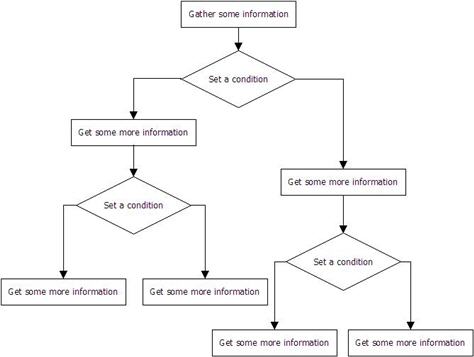
Let’s look at a general model for a task flow that a user interface could handle through either a wizard or multiple forms, shown in Figure 1. Essentially, the user interface needs to present users with and gather some initial information, then ask a question that sets a conditional state. At that point, the task must branch based on the user’s answer. For example, a user might be setting up a report for distribution, so the first step would be to ask for basic information about the report, such as its name. Next, the user would need to select a form of output such as PDF or HTML. Based on the type of output the user selected, the user interface could branch, asking a different set of questions for each branch. Our model has two such conditional branches.
One solution would be to provide a three-page wizard. Figure 2 shows a rough wireframe for the first page of a wizard. This user interface gathers initial information, then, when the user clicks Next, branches to a second page whose content is appropriate to the condition set on Page 1. In our model, Page 2 would gather more information and make another contextual branch to Page 3.
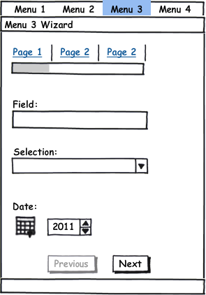
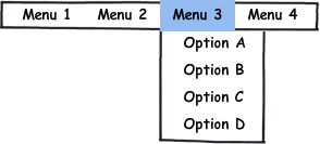
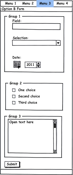
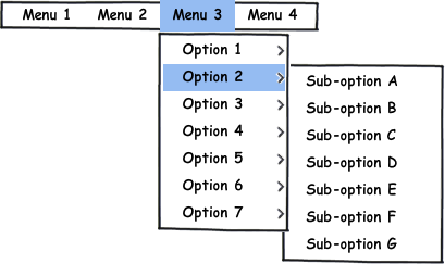
Figure 3 shows an alternative solution that would use four separate forms, each corresponding to one of the conditional paths shown in Figure 1. In this case, a user selects the appropriate form from Menu 3, and the user interface presents the form shown in Figure 4. The user can provide all of the necessary information using just one form.
