Top

Updating Our Understanding of Perception and Cognition: Part II

August 9, 2010

This is the second of my two articles for UXmatters, summarizing some of what researchers have discovered about human perception and cognition over the past thirty years. These articles are not meant to be comprehensive; they are just an overview of what I learned while preparing to write my new book: Designing with the Mind in Mind. The first article in this series focused on visual perception, while this article focuses on cognition and cognitive / perceptual speed.

Champion Advertisement
Continue Reading…

Reading Is Not Natural and Is Easily Disrupted by Poor Design

The odds are that you are a fairly good reader. You learned to read as a child, you’ve read a great deal over your lifetime, and reading is a big part of your life. For you, reading feels automatic and natural. But reading text is no more natural to human beings than playing the violin, riding a bicycle, playing chess, or memorizing and reciting the lines of a play. Like those activities, reading is a skill—a cognitive one—that you must be taught and practice.

Learning to read differs from learning to speak and understand a first language. For young children, learning a first language is natural. They are wired to do it. Over hundreds of thousands—perhaps millions—of years, the human brain evolved the neural structures necessary to support spoken language. Certain areas of the young human brain are dedicated to learning language. As a result, normal humans are born with an innate ability to learn whatever language they are exposed to, without systematic training (Sousa, 2005).

In contrast, writing and reading did not exist until several thousand years ago and did not become common until four or five centuries ago—long after the human brain had evolved to its current state. The brains of young children show no special ability for learning to read. Like juggling or reading music, reading is an artificial skill we learn through systematic instruction and practice.

Because people are not innately wired to learn to read, children whose parents don’t read to them or who receive inadequate reading instruction in school may never learn to read well—if at all. As a result, there are many illiterate and quasiliterate people, especially in the developing world. In comparison, very few people never learn to speak a language.

Learning to read involves training our brain—including our visual system—to recognize patterns. Lines, contours, and shapes are basic visual features our brain recognizes innately. We don’t have to learn to recognize them. But we do have to learn to combine these basic visual features to perceive characters, letters, digits; morphemes, or units of meaning; words, phrases, and sentences.

To get a sense of what text looks like to someone who cannot read, look at a paragraph of text in a language and script you do not know—like that shown Figure 1, an Amharic script, which is used in Ethiopia.

Figure 1—Amharic script
Amharic script

Poor handwriting or presentation of printed text can reduce skilled readers’ reading speed and comprehension to levels similar to those of poor readers. For unskilled readers, poor text presentation can thwart their ability to read altogether. Design factors that can harm users’ ability to read text in a user interface include the following:

  • uncommon or unfamiliar vocabulary—Words that are likely to present difficulties include rarely used words like bailiwick and penultimate, as well as computer-geek terms like authenticate and defragment.
  • difficult scripts and typefaces—Elaborate typefaces are more difficult to read. For example, TEXT IN ALL CAPS is hard to read, especially when it’s also in a fancy font.
  • tiny fonts—If text is too small for a user’s visual system to easily and accurately perceive its visual features, it will be hard to read, as this tiny text shows: Text in a tiny font.
  • centered text—Centered text disrupts the systematic eye movements our eyes become trained to make when we learn to read, because it requires our eyes to constantly readjust their position, as you’ll experience when you try to read this centered text:

    Centered text disrupts the systematic eye movements

    our eyes become trained to make

    when we learn to read,

    because it requires our eyes

    to constantly readjust their position.

  • backgrounds with inadequate contrast—Text on a background with inadequate value contrast is sometimes impossible to read.
  • text on patterned backgrounds—Patterned backgrounds disrupt the recognition of visual features and patterns that is the essential skill for reading, as demonstrated by Figure 2.
Figure 2—Hard-to-read text on a patterned background
Hard-to-read text on a patterned background

Short-Term and Long-Term Memory Aren’t Separate Stores

Historically, cognitive psychologists have distinguished short-term memory from long-term memory. Short-term memory covers situations in which people retain information for very short intervals, typically ranging from a fraction of a second to several seconds, but perhaps as long as a minute. Long-term memory covers situations in which people retain information over longer periods such as hours, days, years, or even lifetimes.

In the 1970s, when I was in graduate school, psychologists were divided about whether short-term and long-term memory are separate functions that are mediated by different areas of the brain. Some claimed they are separate, pointing to the fact that damage to certain areas of the brain causes short-term memory deficits, but not long-term memory loss, and vice versa. Other psychologists claimed the brain has only one seat of memory that has different behavioral characteristics at different time scales. Today, we know that the latter theory is closer to being correct (Jonides et al., 2008).

An analogy may help here. We can think of long-term memory as a huge warehouse with items piled up—some recently arrived; others old and covered with dust. New items arrive through several doors—these correspond to our perceptual senses—and are temporarily illuminated by the light of the open doors, but quickly get pushed into the dark warehouse. On the ceiling are four spotlights, which move around the warehouse, lighting up certain items. Items are illuminated when they enter the warehouse or are hit by a spotlight, then glow for a short time thereafter. When one item glows, other items near it also glow briefly. Glowing items might attract a spotlight.

Short-term memory is what is in the spotlights. The items in it are the focus of our attention. It is not a place where memories and perceptions go for our brain to work on them.
The Magical Number Seven, Plus or Minus Two, Is Really Four, Plus or Minus One

The capacity of short-term memory is extremely limited and volatile. Remember the spotlight analogy: if something makes a spotlight move elsewhere, whatever it was illuminating is no longer the focus of attention.

Why only four spotlights? Many college-educated people have read about “the magical number seven, plus or minus two,” psychologist George Miller proposed as the number of items humans can retain in their short-term memory (Miller, 1956). Later research has found that, in the experiments Miller reviewed, some items that were presented for people to remember could be chunked—that is, considered related—making it appear that people’s short-term memory held more items than it actually did. When the experiments were revised to disallow chunking, they showed that the capacity of short-term memory is more like four, plus or minus one—that is, short-term memory can hold only three to five items (Broadbent, 1975).

Even more recent experiments have suggested that we should measure the capacity of short-term memory in terms of object features rather than objects. For example, noticing many details of a face uses up more of your short-term memory than noticing only a few details does (Cowan, Chen, & Rouder, 2004). Therefore, people typically retain only the features that are relevant to their current task. Experiments have demonstrated that people are often effectively blind to changes in their environment that are unimportant to them—given their current goals (Angier, 2008; Johnson, 2010). One particularly striking study of change blindness showed that about 50 percent of people who give directions to strangers on the street don’t notice if the stranger gets swapped with a different person in the middle of the exchange (Simons and Levin, 1999). For examples of change blindness, check out these videos of Daniel Simons and Daniel Levin’s door study, shown in Figure 3, and Darren Brown’s person-swap study.

Figure 3Daniel Simons and Daniel Levin’s door study

Recognition Does Not Require Search: The Brain is Content Addressable

When you see something you’ve seen before, you usually recognize it immediately. Until recently, our speed of recognition was a mystery to us. Researchers thought recognition required searching long-term memory for matches to objects we perceive. Because recognition is so fast, they assumed the brain must search many parts of long-term memory simultaneously, via parallel processing. However, even a massively parallel search could not explain our speed of recognition or the fact that people can tell almost instantaneously that they have not seen something before.

Now we know that recognition does not require search. Our perceptions stimulate patterns of neural activity throughout the brain. These patterns depend on the features of the perception. Perceiving the same thing later reactivates the same pattern, only more easily than before. That is the recognition. There is no search.

The nature of recognition also explains why, when we are presented with an object we have not seen before and asked whether it is familiar, we don’t search for a memory of the object. Instead, somehow our brains can tell that a new object stimulates a pattern of neural activity that has not been activated before, so we perceive the object as unrecognized.

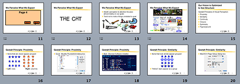
Software designers can exploit the fact that the human brain is wired for recognition by showing users the available options, which lets them recognize options rather than forcing them to recall options. Additionally, recognition is fairly insensitive to scale, so designers can use thumbnail images to depict full-sized images compactly, which PowerPoint does in providing an overview of a full set of presentation slides, as shown in Figure 4.

Figure 4—Thumbnails of slides in PowerPoint
Thumbnails of slides in PowerPoint

We Have Three Brains, Which Work at Different Rates

We think of ourselves as having one brain, but we really have three—or if you prefer, a brain with three main parts. All three parts of our brain perceive the world, but they perceive it in different ways and affect different aspects of our behavior (Weinschenk, 2009), as follows:

  • the old brain—This part of the brain mainly comprises the brain stem, where the spinal cord enters the skull. It has been around since the first fish. It classifies everything into three categories: edible, dangerous, or sexy. It also regulates the body’s autonomic functions such as digestion, breathing, and reflexive movement. Reptiles, amphibians, and most fish have only the old brain.
  • the midbrain—This part of the brain is at the middle both physically, because it is located above the old brain and beneath the cortex, and evolutionarily, because it evolved after the old brain and before the new brain. The midbrain controls our emotions, reacting to things with emotions like joy, sadness, apprehensiveness, fear, aggressiveness, or anger. Birds and lower mammals have both the old brain and the midbrain.
  • the new brain—This part of the brain consists mainly of the cerebral cortex. It controls intentional, purposeful, conscious activity, including planning. Most mammals have a cortex in addition to the old brain and midbrain, but only humans and a few other highly evolved mammals such as elephants, porpoises, dolphins, whales, monkeys, and apes have a sizable cortex.

    The midbrain and old brain affect our thoughts and behavior at least as much as the new brain does. When we perceive something—an object or an event—all three of these brains react and contribute to our thoughts and behavior.

In addition to differing in what they do, the three brains differ in how fast they do it. The old brain operates faster than the midbrain, which in turn, operates faster than the new brain. As a result, we sometimes react according to the response of the old brain and midbrain before our cortex even knows a response is necessary (Stafford and Webb, 2005).

A specific example of these reaction times is the difference between the speeds of the startle / flinch reflex and visual-motor reactions. The startle / flinch reflex is an automatic movement in response to something suddenly moving toward our face or unexpectedly bumping us or making a sudden loud noise near us. It is a self-protective reflex, programmed into our old brain, and it takes only about 0.08 second.

Visual-motor reaction time is a conscious, learned reaction to a perceived event such as clicking a button that appears on our computer screen. It is mediated by the new brain and takes about 0.7 second—that is, about ten times longer than the startle / flinch reflex.

Another way of comparing the startle / flinch reflex to the visual-motor response is to think of driving a car. If another car suddenly appears in front of yours and a collision seems imminent, you can get your hands up in front of your face—your startle / flinch reflex—about ten times faster than you can stomp on the brake pedal—your visual-motor response. Therefore, some martial-arts instructors try to teach students to use their flinch reflex rather than a visual-motor response to block attacks, as this video of the Spear System demonstrates.

The old brain and midbrain often influence our behavior in ways that are contrary to what our rational mind—which our cortex mediates—tells us to do. Therefore, some UX design experts advocate our acknowledging this reality and designing to appeal as least as much to the old brain and midbrain as to the new brain—just as advertisers do (Weinschenk, 2009).

Conclusion

In the last thirty years, we have greatly expanded our understanding of how both human cognition and visual perception work. When preparing to write Designing with the Mind in Mind, I updated my own knowledge of human cognition and vision considerably. In this and my previous article, I have sought to provide a brief overview of some recent discoveries about cognition and visual perception. You can use this knowledge to inform and improve your user interface designs. I encourage you to consider the possibilities this knowledge presents. 

Read More

Updating Our Understanding of Perception and Cognition: Part I

References

Angier, Natalie. “Blind to Change, Even as It Stares Us in the Face.” New York Times, April 1, 2008. Retrieved July 2, 2010.

Broadbent, Donald E. “The Magical Number Seven After Fifteen Years.” In Alan Kennedy and Alan Wilkes, eds. Studies in Long-Term Memory. London: Wiley, 2008.

Cowan, Nelson, Zhijian Chen, and Jeffrey Rouder. “Constant Capacity in an Immediate Serial-Recall Task: A Logical Sequel to Miller.” Psychological Science, 15 (9), 2004.

Johnson, Jeff. “See the Change. Or Not. Inside MK, June 2010. Retrieved July 2, 2010.

Jonides, John, Richard L. Lewis, Derek E. Nee, Cindy A. Lustig, Marc G. Berman, and Katherine S. Moore. “The Mind and Brain of Short-Term Memory. Annual Review of Psychology, 59, 2008.

Miller, George A. “The Magical Number Seven, Plus or Minus Two: Some Limits on Our Capacity for Processing Information. Psychological Review, 63, 1956.

Simons, Daniel J., and Daniel T. Levin. “Failure to Detect Changes in People During a Real-World Interaction.” Psychonomic Bulletin and Review, 5, 1998.

Sousa, David A. How the Brain Learns to Read. Thousand Oaks, CA: Corwin Press, 2005.

Stafford, Tom, and Matt Webb. Mind Hacks: Tips and Tools for Using Your Brain. Sebastapol, CA: O’Reilly, 2005.

Weinschenk, Susan M. Neuro Web Design: What Makes Them Click? Berkeley, CA: New Riders, 2009.

Principal Consultant at Wiser Usability, Inc.

Assistant Professor, Computer Science Department, at University of San Francisco

San Francisco, California, USA

Jeff JohnsonAt Wiser Usability, Jeff focuses on usability for older users. He has previously worked as a user-interface designer, implementer, manager, usability tester, and researcher at Cromemco, Xerox, US West, Hewlett-Packard, and Sun Microsystems. In addition to Jeff’s current position as Assistant Professor of Computer Science at the University of San Francisco, he has also taught in the Computer Science Departments at Stanford University, Mills College, and the University of Canterbury, in Christchurch, New Zealand. After graduating from Yale University with a BA in Experimental Psychology, Jeff earned his PhD in Developmental and Experimental Psychology at Stanford University. He is a member of the ACM SIGCHI Academy and a recipient of SIGCHI’s Lifetime Achievement in Practice Award. Jeff has authored numerous articles on a variety of human-computer interaction topics, as well as the books Designing User Interfaces for an Aging Population, with Kate Finn (2017); Designing with the Mind in Mind: Simple Guide to Understanding User Interface Design Rules (1st edition, 2010; 2nd edition, 2014); Conceptual Models: Core to Good Design, with Austin Henderson (2011); GUI Bloopers 2.0: Common User Interface Design Don’ts and Dos (2007), Web Bloopers: 60 Common Design Mistakes and How to Avoid Them (2003), and GUI Bloopers: Don’ts and Dos for Software Developers and Web Designers (2000).  Read More

Other Articles on Human Factors Research

New on UXmatters