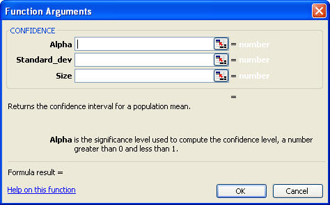
Well, when I tested the online Help in the usability lab, I learned the following:
- The label Busy Callback Time was self-explanatory—really, everybody got it right away.
- No one wanted to set the value to less than zero.
- No one tried to set a value that was even close to going over the allowed maximum—and if someone had, the system would not have accepted the value.
- Everyone figured out that whole up arrow and down arrow thing without my help.
- They figured out Save on their own, too.
Still, users went to Help with one simple question: “What’s a good number of minutes to delay before calling back?” It seems that was the only thing I had not documented.
I understood then that Help should provide domain expertise, not just tell users how to manipulate user interface elements.
Who Are We Helping To Do What?
The term user assistance implies that a user has a goal he or she wants to accomplish by using an application or other tool and may require assistance in doing so. Thus, we can divide user assistance into two main types of information:
- how to use a tool
- how to use a tool to accomplish a specific task or goal
The first type of Help is very tool-centric and focuses on the constraints and manipulations of the user interface itself. Good user experience design minimizes the extent to which this kind of user assistance is necessary by making such interactions self-evident. However, most applications require this type of assistance to some degree. Help that explains how to enter a summation formula in Excel provides an example of tool-centric user assistance.
The second type of user assistance is more user-centric and focuses on goals and problems that exist within a user’s context. Showing someone how to use Excel to do a budget is an example of goal-oriented user assistance.
Unfortunately, many technical communicators continue to emphasize tool-centric user assistance to the same degree that was necessary when we were documenting command line syntaxes for mainframe word processors. User interfaces have moved on; so should technical communications professionals. To earn our place in the world of user experience, technical communicators need to get better at writing goal-oriented user assistance.
Busy Callback Time Redux
So, what did I do after that usability test showed my Help was anything but helpful? I asked one of our customer consultants—the folks who went on site and helped customers tune their systems—what a good value was for Busy Callback Time.
“Ten minutes,” he said. “You know there’s a warm body there, and you don’t want to let that person slip away.”
I followed up, “Why would you make it higher or lower?” After all, there had to be a reason for the spinners that let system administrators change the setting.
“Oh, I check the daily reports,” he said. “If the line-utilization rates are low, I change the busy callback time to make it higher, because I’m wasting an outbound line if I’m calling the same busy number too many times. If the hit rate starts going lower, I decrease the busy callback time, because I’m letting the live bodies get away by not calling back soon enough.”
Okay, there’s a lot of fuzziness here—no hard and fast algorithm, but some really meaningful heuristics. That’s what users were looking for: guidance that has its basis in expertise about managing a call center, not numbered steps that tell users how to enter data into a standard dialog box.
Two psychologists have provided interesting insights into this problem from their different perspectives. Piaget has given us the concept of schemata—models that help us interpret the world. As we take in data, we look for a schema that lets us make sense of it. Once we find a useful schema, we assimilate the data into that schema. However, if our library of schemata does not adequately explain new data, we must accommodate it by changing our schemata or create a new schema if an experience is unique. According to Piaget, this is how we learn.
The concept of schemata also guides how we design user interfaces. How did you know to click a labeled button when you first encountered one? Did you go to the Help file? Probably not. It looked like a real button, and you already had a schema that said buttons are things you press. Your mouse pointer turned into an arrow when it was over the button, so you clicked it. It worked, and you assimilated digital renderings of buttons into your button schema. You also extended your button schema to accommodate the behavior of clicking with a mouse rather than pressing with a finger. User interface designers find metaphors so useful because they tap into people’s existing schemata.
Vygotsky offers a different perspective on learning—one that emphasizes its social aspects. A concept of particular interest to instructional designers and writers of user assistance is his Zone of Proximal Development (ZPD). Vygotsky defines ZPD as “the distance between the actual developmental level, as determined by independent problem solving, and the level of potential development, as determined through problem solving under adult guidance or in collaboration with more capable peers.”
Vygotky’s ideas apply more broadly than just to learning in children. In his definition, think of “developmental level” as meaning “understanding of a product’s application to a user’s context” and replace “adult” with “expert,” and you have an exciting model for user assistance.

