High Context and Low Context
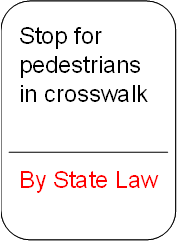
Jean-Luc points out—nonjudgmentally—that the American culture is a low-context culture. Figure 1 shows one of Jean-Luc’s examples that makes his point most vividly. I see this kind of sign several times a week in my own neighborhood.

This is a typically American-style road sign, because in low-context cultures, the assumption is that people know only what you have explicitly told them, and anything that is not expressly prohibited is allowed. On the other hand, people in high-context cultures do not need to be told not to hit pedestrians, because not hurting people is part of the cultural value system, and the assumption is that this guideline applies to traffic scenarios as well. In a low-context culture, it is apparently not only necessary to state this rule, it needs the further status of being law—versus a general guideline for drivers to follow or ignore at their discretion.
The Culture of Technical Writing
What we consider to be good technical writing often reflects an American cultural perspective. One facet of this cultural orientation is that technical writing tends to use a low-context style. Most notably, we tend to write user assistance as if users have never seen the user interface we are explaining. Secondly, we tend to write user assistance as if users have never even used software before. But users rarely go to Help before they have tried to accomplish a task on their own first, and most users today have extensive experience using software and are familiar with the standard ways of interacting with user interfaces. So a user interface is a high-context artifact—one a user has already seen before reading our documentation and that uses rules and conventions the user already knows.
Discussion of a previous column I wrote for UXmatters called “Procedures: The Sacred Cow Blocking the Road” illuminates the contrast between low-context and high-context perspectives. In that column, I gave an example of a two-column choice table that describes the purpose of each option in a user interface. The name of a user interface element is in the first column, and a description of its function is in the second. One reader, TC Makinen, made the following comment:
“Although I like the choice table as a way of simplifying the presentation of procedures, the descriptions in your example aren’t clear. For example, for the Comment option, the description reads ‘Provides a description of the policy,’ which sounds to me as though the description is generated by the software instead of by the user.”
