Top

Straight Talk: Surviving Tough Times as a User Assistance Writer

User Assistance

Putting Help in context

A column by Mike Hughes
January 22, 2009

One theme looms as a result of the global economic meltdown of 2008: The world will never be the same. We find ourselves living in a brave, new—and uncertain—world. Business models must meet higher standards of viability and sustainability, and the services we bundle in those models must add value more directly than ever before. The economic survival of everyone who develops user assistance is clearly on the line. Quite frankly, some of us are going to make it and some of us aren’t.

Early in my technical communication management career—more than twenty years ago—I made this observation: “I can produce a manual that users won’t read for $50,000, or I can produce a manual that users won’t read for $5,000.” My point was that, until we started writing manuals users actually read, the $5,000 option was the better business strategy. But now, to heck with producing manuals users won’t read, Tony Self of HyperWrite has recently thrown down the gauntlet more forcefully with his article “What if readers can’t read?

Champion Advertisement
Continue Reading…

This new world of post-2008 meltdown has changed the game. We must now write manuals users will read, and we must write them for $5,000. If not, we will go out of business. I know that $5,000 figure is probably out of date—as is the concept of a manual—but my point is that, if user assistance is going to survive as a profession, it has to get cheaper and get better at the same time.

Our past mistake was that we took our eyes off the ball and chased technology solutions—as if the problem were the delivery of Help or the authoring tools with which we wrote it. From that perspective, I could restate the observation I made two decades ago: “I can write Help that users won’t read using WinHelp.exe or DITA.” Also, in many cases, our companies made poor product decisions, throwing documentation at bad user interface designs rather than fixing the bad designs, resulting in a content glut. So, user assistance got more expensive without getting any better in the eyes of users.

What, then, is the solution? Simple. My mantra for 2009 is this: It’s the content, stupid! In brief, we need to write less, and we need to write about better stuff.

Successful User Assistance Traits for the New Economy

User assistance departments that will survive and prosper in the next decade must employ three distinct strategies:

  • reduce documentation costs
  • improve the relevance of content
  • integrate documentation more closely with product user interfaces

Contextual Knowledge

The strategic goals of reducing documentation costs and improving the relevance of content are closely related. We cannot afford to write about everything; therefore, we need to focus on writing only about the things that are most relevant to solving user problems. User assistance can make its content more relevant by focusing on contextual knowledge. Contextual knowledge relates to what I have sometimes called expert guidance—see my column “User Assistance in the Role of Domain Expert”—or decision support. It is not about the product. It is about using the product to solve user problems—the problems that users bought a product in hopes of solving. Contextual knowledge transfers advanced domain knowledge to users—who have neither the time nor the motivation to acquire that knowledge on their own.

Discovering and documenting contextual knowledge requires a recommitment to the principles of user-centered design (UCD)—but this time, with our focus squarely on user assistance. Some might say this is nothing new. True, but how many of us have really practiced it? Although we know users refer to documentation in short, sporadic bursts, we persist in designing large, literary documentation structures—often starting with a table of contents that outlines our documentation’s comprehensive scope, then decomposing the content into topics. And this, of course, leads to an information strategy of saying everything that we can possibly say. Or we systematically go through a user interface, documenting every user interaction—often providing instructions that are completely devoid of any context about why a user might interact in one way versus another.

We often start in pursuit of user goals, but end up documenting products in less than optimal ways, probably because of our lack of application knowledge coupled with the inevitability of deadlines. The landscape of the old economy is strewn with PDF manuals comprising hundreds of pages and Help files with thousands of topics that are nested in endless numbers of folders. It’s not just that this is a bad approach—as users have demonstrated by refusing to use the documentation we’ve designed. In the new economy, we simply will not be able to afford such waste. We need to rethink our user assistance deliverables by rethinking our processes.

The user assistance survivors of the new economy need to implement many of the following UCD practices:

  • starting research by talking to the product manager, not the developers—The question of the new economy is not How does the product work?, but What do users hope to accomplish with this product, and how does that support our business model? Other useful questions are How do users measure their own success? and How will users evaluate us?
  • building use cases that focus more on when and why users interact with a product—and less on how. The emphasis needs to be on context. Why or when would users go here, what are they trying to achieve, and how will they know if they achieve it? For more on this topic, see my column “Use Cases for User Assistance Writers.”
  • writing documentation primarily for users who are in the middle of a task—Users go to the documentation when they get stuck performing their own tasks and get out of the documentation as soon as they feel unstuck. We must analyze user tasks for their information requirements and decision points that might stop a user’s task flow. In the new economy, we must design minimalist solutions that get users going again as quickly as possible. Writers who succeed in the new economy will be those who know that ultimately the user’s solution is in the user interface, not in the Help.
  • integrating user assistance into the user interface—Because the solutions to users’ problems are in the user interface, that’s where the user assistance belongs. User assistance won’t be apparent to users in many cases. It will be just another aspect of the user interface.
  • basing information design decisions on real user data from usability testing and contextual inquiries—We have ignored the data in front of us for two decades—users don’t read our documentation—but this new economy has rung the bell, and we must now pay better attention to what we’ve known for many years.
Useful User Assistance

I have been involved in usability testing for two decades, and the feedback I get from technical communicators has been consistent: “We don’t get useful data from the tests, because the users never use the Help unless we force them to.” That is the data, but we have been ignoring it!

For user assistance to be useful, it must meet just two criteria:

  • It must address an authentic need for critical information. What piece of the puzzle are users not getting? We need to realize that there are few novice computer users anymore. Almost everyone knows how to operate user interface elements—that’s not what’s stopping them.
  • It must be easy for users to view the information. The more removed it is spatially—for example, requiring users to click a Help link on a menu bar outside their field of focus—the less likely it is users will view it. User assistance must be easy to get to. If getting to the answer requires significant navigation, users will not go there.

This does not take a lot of technology. Let me relate a story from one of my early experiences with usability testing to demonstrate this. The project involved a product that let call center managers write agent scripts. These scripts displayed customer data on a telemarketing or collection agent’s workstation, suggested questions the agent should ask, led the agent through a sales or collections call, pulling data from databases, and let the agent update that data with information she collected during the call. The application was basically a screen builder in which the call center manager dragged user interface elements such as radio buttons, text panels, graphic panes, navigation buttons, and form elements onto a desktop, then edited those elements by assigning them values or designating their data sources and data destinations.

The problem was that call center managers had never worked with an application in which they started with an empty desktop, then dragged user interface elements and controls onto the desktop. They had worked with word processors and wanted to start typing words directly into the workspace—after all, the things they were building were called scripts. The director of the usability lab we were using noted that it was ironic that I, the documentation manager, was the one who was sponsoring the test, yet I didn’t get any useful data, because the users never opened the manual. But that was it! That was the data!

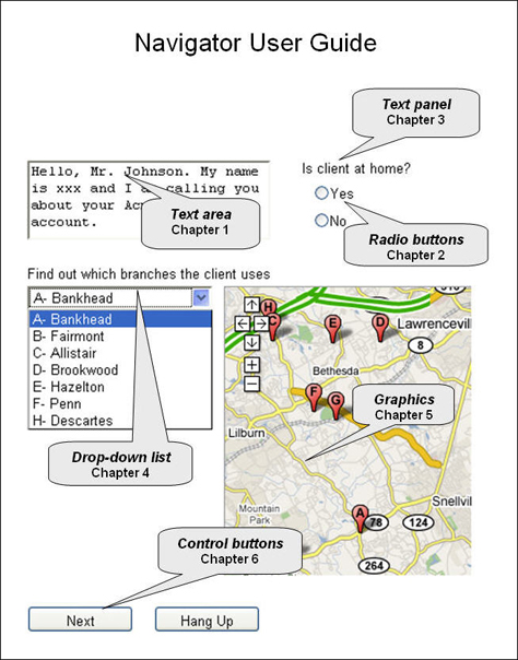
The user assistance had to be useful even if a user never opened the manual. Based on that revelation, we designed a cover that showed a screen capture of a sample application with examples of the various widgets. We then added callouts such as Radio buttons—Chapter 2, Text area—Chapter 1, and Drop-down lists—Chapter 4. The cover offered users a new mental model by showing them what they were trying to build—the software equivalent of the picture of the assembled barbeque grill on the box—and pointed them to where they could get additional information. Figure 1 provides a rough illustration of our design concept.

Figure 1—Our cover concept established the right mental model and pointed users to more detailed information
Cover concept

Unfortunately, this story does not have a happy ending. Marketing said no to the design, because they wanted the cover of the manual to have the same graphic treatment the box had. They had already commissioned a nifty picture of a compass, because the product name had a navigation theme. Soon after that incident, I decided that, if users were not going to open a manual, I could at least reduce its cost to one tenth by not spending a lot of time writing it.

But that kind of solution is not going to work in the new economy. If a manual does not add value, the new economy will eliminate the user manual altogether and save its total cost. And as a consequence, some organizations will eliminate their total documentation cost by eliminating their user assistance writers

Getting Useful Data

You don’t need to spend a lot of money on labs and such to get useful user data. All you need are the following elements:

  • a list of scenarios—authentic tasks for users to perform
  • some facsimile of a product’s user interface—the more realistic the better, but paper prototypes work fine
  • a facilitator—someone to guide and interview the user
  • users—okay, that’s the tough one, but they are out there, or at least you might find people very much like them

If you have fancy recording equipment or software, great! If not, use a word processor to keep a running log of what each user says and does. Here are some tips on how to log:

  • Type fast! Don’t edit in the moment. You can go back and edit after each session.
  • Note major navigation through an application or site—for example, “User goes to Agent view and right-clicks….” This helps put a user’s comments in context within the task.
  • If a facilitator has to intervene, note the intervention and what information the facilitator provides. In such tests, the facilitator is the surrogate for user assistance.
  • Note anything users say that indicates how they expect the system to perform—for example, “I thought hitting Enter would refresh the data.”
  • Note any surprises users identify—such as, “I didn’t expect the screen to go away.”
  • Note all user mistakes.
  • Note users’ attempts to explain their mental models—for example, “Oh, this works like…” or their assumptions about how the system is operating in the background—for example, “It seems like these values are being ANDed.”
  • Note any criteria or rationale users describe as they make selections in the user interface—such as clicking one option versus another.

Interpreting the Logs

As information developers, we must look at the logs to understand what information gaps make it hard for users to complete their tasks. Look for the following kinds of things:

  • facilitator interventions—What information did users need to proceed again on their own?
  • user questions—What information did users actively seek? Looking at how users phrase their questions can provide good clues about how to word Help links.
  • mental models—Understanding how users express their mental models of the system often lets the Help capitalize on those models. However, sometimes the Help must reset your users’ mental model to a more useful one—as I tried to do with the cover of the scripting application’s manual.
  • key conceptual gaps—What essential information are users missing—for example, “If the user knew just this one thing, he could get through his task.”
  • user mistakes—Understand the root causes of users’ mistakes. Look for ways the right information at the right time could prevent mistakes or facilitate recovery from them.

In short, you are looking for moments of opportunity and points of pain that can trigger useful user assistance—what we used to call MOOPOPs when I administered the User Experience Research and Design Center at CheckFree Corporation, as Figure 2 shows.

Figure 2—MOOPOPs, moments of opportunity and points of pain
MOOPOP

Points of pain occur when there are any information or knowledge gaps that cause users to make mistakes or feel anxiety. Moments of opportunity are places in a task flow where you can insert information into the user experience—preferably in the user interface. Opportunities include putting instructional text on the screen, embedding examples in or next to text boxes, and relabeling buttons and other controls to make them more self-explanatory.

For richer contextual information, consider putting a FAQ link where the point of pain occurred. For example, I was working on a banking application in which the Overnight radio button for speed of transfer appeared dimmed if a user had not yet qualified for overnight transfers. We wanted users to know overnight transfers were available and to tell them how to qualify for it. So, we put a link next to the unavailable radio button that read Why can’t I transfer funds overnight? I have found that links phrased as questions whose wording mirrors users’ points of pain are much more effective than question mark icons or expecting users to click Help.

Another example of a moment of opportunity is an empty results set for a search or filter operation. There is a lot of empty screen space you can use to give formatting tips and identify allowable wildcard characters and operators. Similarly, most error messages are moments of opportunity for the points of pain that created the errors.

Conclusion

Hard times are coming for user assistance writers, and our world will never be the same. But the challenging new economy will bring great opportunities for us to quit doing what we already know doesn’t work and focus more on writing user assistance that is useful and easy to get. Be an advocate for reducing the cost of documentation, and remember that writing less is the most effective way of reducing costs at all levels: authoring, editing, translation, production, and file maintenance. In fact, writing less user assistance can give you the opportunity to write better content that adds greater value. 

UX Designer at TSYS

Atlanta, Georgia, USA

Mike HughesIn his role as User Experience Architect for IBM Security, Mike’s professional focus is on designing usable user interfaces that accommodate the user as learner. Previously, as User Assistance Architect at IBM, Mike identified tools, methods, and standards for integrating the content and delivery of user assistance, including documentation, Help, elearning, and training. He was formerly Lead UX Designer for CheckFree Corporation, where he instituted their User Experience Research and Design Center. Mike has a PhD in Instructional Technology from the University of Georgia and a Masters in Technical and Professional Communication from Southern Polytechnic State University. He is a Fellow with the Society for Technical Communication and a Certified Performance Technologist through the International Society for Performance Improvement.  Read More

Other Columns by Mike Hughes

Other Articles on User Assistance Design

New on UXmatters