Top

The Lean Agency

October 21, 2013

Recently, in managing a small user experience and design agency, I’ve discovered that there are some common misconceptions about Lean UX. Many companies have told me that they think being lean just means spending less money. Agencies cost money, so these companies think that keeping UX work in house is lean. Some of our clients have asked us to skip research, avoid creating deliverables, and complete our work based only on assumptions. They’ve asked us to participate in daily meetings, with the goal of working more collaboratively, but often this just slows us down.

Champion Advertisement
Continue Reading…
  • Picture this: You run a UX agency and have been talking to a client about creating a mobile application that would improve communication between the company’s management team and employees.
  • Some background: Management has received complaints that employees haven’t memorized all of the necessary processes and procedures. Employees need to know the answers to specific questions about company policies to successfully complete their tasks—such as making a sale or delivering a product off the truck. Since employees are mostly in the field, they rarely have access to a computer to look up or verify company procedures and policies.
  • Our goal: To discover what information employees need from their corporate office—and why—when they’re out in the field.
  • Our recommendation: To conduct a quick round of ethnography-like research—shadowing people as they go about their day to see what they want and need—before moving on to designing a solution.
  • The client’s response: Their management team is focusing on Lean UX. Spending money for an outside UX firm to conduct an ethnography study and provide a deliverable describing what the employees need doesn’t seem lean to them. They would rather start designing now, then do some quick usability testing to make sure their design works.

A Super-Truncated History of Lean UX

Look, at my agency, we are huge fans of being Lean. Many great ideas and smarter processes have come from our thinking about Lean UX—from replacing the traditional waterfall model of product development with Lean and agile models [1]; to creating a single product team that encompasses design, management, and development [2]; to meeting customer demands by building new businesses and products more quickly and effectively [3]; as well as the Pain-Driven Design (PDD) methodology that Laura Klein introduced in UX for Lean Startups. [4]

Product teams can implement solutions faster—by adhering to short, iterative, low-fidelity development cycles; seek feedback early and often—which anyone who has been in the field of user experience for more than a year knows is the best way to go; and fully integrate UX professionals—so rather than fighting with product and development people, we’re collaborating with them.

However, two years ago, Jeff Gothelf surmised that being Lean would be difficult for a UX agency:

“For internal software/design organizations, the transition to Lean UX is well within reach. You are in the problem-solving business, and you don’t solve problems with design documentation. You solve them with elegant, efficient, and sophisticated software. … Interactive agencies have it a bit tougher because they are in the deliverables business. They get paid for their documentation and spend a lot of time creating it. A specialist creates each document, and they charge for that time. Reducing those efforts means reducing revenue.” [5]

As I thought two years ago and still think today, Jeff seems to believe that agencies are inherently averse to Lean and prone to focusing on extraneous, costly details. In his recent book, Lean UX: Applying Lean Principles to Improve User Experience, Jeff states:

“To make Lean UX work in an agency, everyone involved in an engagement must focus on maximizing two factors: increasing collaboration between client and agency, and working to change the focus from outputs to outcomes.

“Some agencies attempt to focus on outcomes by experimenting with a move away from fixed-scope and deliverable-based contracts. Instead, their engagements are based on simple time-and-materials agreements, or more radically, on outcome-based contracts. In either case, the team is freed to spend their time iterating toward a specific goal, not just a deliverable.”

As an agency, we completely agree with the philosophy of breaking down walls and working with clients, not for them. Involving clients early and often promises the same sorts of benefits as involving users early and often—it makes us smarter and faster. Collaborating with clients helps us move from being outsiders to being insiders and provides us a better understanding of the business need and the problem they’re asking us to address.

We also agree that, in many cases, you can just start by designing. Sometimes, no research is necessary. We’ve done many kickoff meetings where sketches were our deliverables—simply because we hit on an appropriate strategy for navigation or interaction right away. I’ve never wasted time doing user research just for the sake of doing it. My goal in doing research has always been to get clients answers for their burning questions—and ultimately, to solve their problems.

But, what we do isn’t just about solving challenging problems. It’s about creating new, more meaningful experiences—and that may come with a new set of challenges. Companies often bring in agencies to come up with better ideas. I’m not saying that’s right or that all agencies can do this, but there’s a reason why agencies exist and have been experiencing growth over the past few years.

While being Lean is awesome, being innovative means that spending time and money on smart research and devoting ample time to thinking through the problem space can sometimes mean the difference between a good design and a great design. Our focus is not just on making something usable, but on creating value for a business and really impacting people’s lives.

Deliverables Are Not the Ogre in This Tale About Agencies

Yes, agencies typically end engagements with deliverables. But, we don't charge our clients just for the deliverables. We charge them for the value that we provide and the objective insights, fresh perspectives, and innovative solutions that we offer. We provide an innovative vision for an exceptional user experience in the form of an artifact, or deliverable. The presentation of our insights and recommendations in a solid deliverable can often be the tipping point for organizations seeking to change their product or experience for the better.

Sometimes, we create deliverables that comprise only a few slides—which actually takes longer to produce than a 50-slide presentation that offers data, but not insights. Creating these shorter, more impactful deliverables is time intensive, but also worthwhile. We’ve often seen our clients embed them into their own presentations to help the larger organization understand and socialize our research findings and design solutions.

We don’t create deliverables just to show that we’ve thought about a problem in great detail. Obviously, we do think about design problems a lot, but we don’t need to prove this through deliverables. Rather, we need to prove this by producing a beautiful, elegant, fully thought–out design solution. (It’s not about output, it’s about outcomes, as Gothelf notes.) [5]

In the case I described earlier, we knew that doing a legitimate round of research—not just GOOBing it—would help inform our design strategy with actual data from users on what they needed. We were able to convince the client to follow our recommendations, and our ethnographic study revealed a solution that was completely different from what the team had originally conceived. Prior to our conducting this research, the internal design team had been thinking about a mobile-friendly intranet from which field workers could access information. However, our study exposed an opportunity to redefine the intranet as a texting solution that would allow field employees to quickly and easily ask questions about benefits, processes, and tools, using their phones.

Other ideas that our research inspired include FAQs that people could access on wearable, smart devices and embedding smarter technology in the products themselves, so there would be less burden on the field team. We subsequently did concept testing and usability testing to validate that our design solution solved the client’s process problems.

When using our design solution, the field team had fewer unanswered questions and were quickly able to get answers to the questions that they did have. Our design solution also fulfilled the softer goal of making the field team feel more integrated into the company’s culture and persuading them that the corporation really cared about taking care of them. In 15 years as a consultant, I haven’t seen any intranet excite employees as much as this solution did.

Sure, doing the research cost the company money, but that money was well spent. If we had not conducted the research, they would have gone down a totally different and erroneous path. The deliverables from each phase of our research were also valuable, in that they helped the larger team understand why we were investing in this audience and to get on board with our solution. The criteria for being Lean are to get to the best answer in a way that’s faster and smarter. In this case, without a serious dive into the needs of these users through research, reaching the design solution would have been faster, but not smarter or better.

Now, here’s the fun part of this whole scenario: Altogether, the design solution and three rounds of the research took only four and a half weeks—deliverables included.

Some of you might think that we would charge less for this project since we completed it in just four weeks rather than 12 to 15 weeks. Those of you who do think that would be, in my 3-year-old’s words, “silly willies.”

If we can think faster, solve problems faster, and measure and validate faster, in more realistic ways, why would we take a financial hit and charge less? In this case, the ethnography took only two days because the real user needs immediately hit us, so we didn’t need to keep going just to hear the same things over and over again. We canceled the third day of interviews that we’d scheduled, came up with the concept, and used the remaining research sessions to validate our design direction. Further exploration of our ideas led to a storyboard, which we used during a day of concept testing. Then, based on our concept, we created an interactive prototype to use for usability testing.

We had meetings with the client every other day and documented the whole solution, including the rationale for our design decisions and supporting quotes and video to show where the design ideas had originated. So, we were able to co-present to the larger client team with the person who was our point of contact at the client company.

To me, that’s being a Lean agency. UX agencies can make more money by being Lean because the client pays for the value they get, not the time the agency spends on the project or the deliverables that they produce. A quick, great solution is worth more than a slow, inferior one.
Conducting a Design Workshop: A Lean Case Study

A year ago, a financial institution came to us with a great new concept. While the idea was a little hard to grasp at first, once consumers got it, this concept would change the way they think about how they manage their money. The company explained to us that they had done extensive research, including several focus-group sessions—even though their first research phase had given them enough insights into how great the idea actually was and identified points where they could move forward with concept designs—as is a common occurrence. Yet, one round of research was not enough to make them feel comfortable with moving forward. After some additional rounds of research, they were finally ready and asked their internal team to start designing.

This company felt that the team was being Lean because they kept the project in house and came up with just one solution quickly. The internal team had created a fully functional, high-fidelity prototype, with real data pulls. However, to keep the project cost effective, the internal team had created only one design concept, relying on just two designers, with no time for preliminary ideation, brainstorming, or collaborative work sessions. The end result was a functional, but disappointing and boring user interface—think lackluster hmms instead of delighted ahs.

Now, they found themselves spending more money undoing and redoing their in-house work, without their being able to deliver a final product that was worthy of the initial, innovative concept. Once we had listened to their needs and frustrations, we came up with the quickest, most comprehensive, and most creativity-inspiring way of realizing this idea in an intuitive design. Understandably, they wanted assurances that our Lean approach would lead them in the right direction—not into a perpetual cycle of development. We didn’t want to redo any research—they had already spent too much time and money on it. We didn’t want to redo the design—some of the decisions were smart and just needed some massaging.

So, we proposed holding a design workshop with their designers and our designers. Their designers provided history and context; our designers offered fresh perspectives. At the end of the workshop, they would have a great design and be able to move forward. The workshop sessions took place over a two-day period. The cost was about the same as that of another round of research, but in just two days, they had the design answers that they needed to move forward.

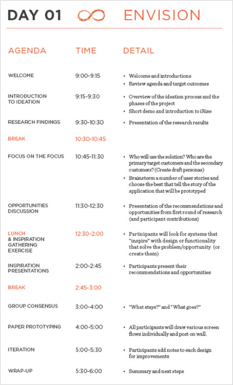
The first day consisted of a series of collaborative design exercises, as Figure 1 shows. During each exercise, the facilitator posed a question or set a task for participants—based on the existing ethnographic research data—then participants worked on their responses individually. The facilitator brought the group together, and all participants shared their views, ideas, and concepts. During the resulting discussion, the facilitator helped the group converge on ten design choices. This model allowed everyone to express their opinions and ideas, without letting any of the stronger personalities in the room dominate.

Figure 1—Day 01 ENVISION
Day 01 ENVISION

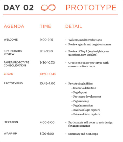
On the second day, as outlined in Figure 2, we brought together all of the design concepts that people had proposed the previous day into an actual design. Similar to a JAD (Joint Application Development) session, our goal was to end the day with a prototype that satisfied the entire group. The detailed design discussions uncovered several larger, strategic issues that we either documented for further discussion later on or simply solved—because of the desire to complete a design by the end of the session. The deliverables from this session helped illustrate the design that the team had envisioned and removed any ambiguity about what we should or should not include in the final design. The client was able to use this design in conducting further research that validated our design direction and in agreeing on the feature set with their developer.

Figure 2—Day 02 PROTOTYPE
Day 02 PROTOTYPE

For this client, the Design Ideation Workshop let us segment the project into steps, enabling us to rethink and regroup before moving into any kind of validation research. The workshop context allowed us to thoroughly vet our design concepts early, preventing our investing too much time and effort in creating inadequate design solutions. We were able to define the scope and goals of the project properly and make adjustments as changes required.

Lean or Cheap: What’s the Difference?

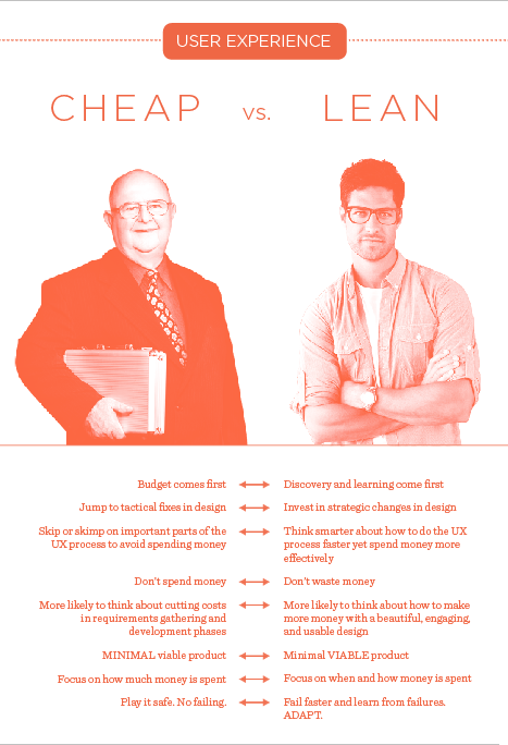
Although agencies can be Lean, that doesn’t mean they charge less. There’s a difference between being cheap and being Lean, as Figure 3 shows.

  • Cheap is about playing it safe, keeping a singular focus, remaining unresponsive to signifiers of change, and spending as little as possible to bring in money quickly.
  • Lean is about spending money to reach some fun, ambitious goals; and utilizing smarter processes to find the most effective and efficient way to reach those goals, while maintaining the ability to adapt and react to changes in the marketplace.
Figure 3—Cheap UX versus Lean UX
Cheap UX versus Lean UX

On the project for the financial institution that I’ve just described, we didn’t focus on creating fancy deliverables. Instead, we focused on building a shared understanding of where the design was working and where it needed to change to deliver both visual and interaction design with the Wow factor that the idea deserved. We worked closely with the product team—not in isolation as an agency or UX team.

Allocating Resources Wisely: A Lean Case Study

A global provider of information for highly trained professionals came to us with a proposal request, outlining a usability study that would take place in two major cities, with 30 participants. They wanted to compare their current search design to that of their biggest competitor, focusing on how they could better help their users to find the “make or break” information that they needed to be successful in their high-stakes jobs.

First, we will never be BFFs (Best Friends Forever) with RFPs (Requests for Proposals). We almost never bid on them, but in this case, we already had a long-standing relationship with the client. The request would give us an opportunity to work with another group in the company—the innovation team—and we really wanted to work with them.

So, we submitted the proposal to satisfy their RFP, but also asked for an initial call. We started that call by saying, “You’re wasting money with this research-heavy approach.” We rescoped the research to just one city, with 30 participants, and outlined three phases of iterative design sessions that would occur both concurrently with research and after each subsequent user-feedback phase.

By the end of Phase 1, they knew their solution was better than their competitor’s, and they also knew what users wanted them to work on. The initial research enabled them to collect user testimonials and procure more investment in design and technology to deliver the innovation that users really wanted during Phases 2 and 3.

Instead of spending one large sum on research, our client ended up spending less on research and more on design and innovation strategy sessions. Plus, we reviewed existing data to learn what was working and consider what needed to change—measuring and adjusting along the way. In the end, the total cost was about the same as what their original, research-heavy RFP would have cost. However, by rescoping and redistributing costs, we were able to give them a more effective way of spending their money to quickly discover what their users really wanted, then focus directly on design and functionality innovations to meet users’ needs, testing and realigning their efforts during each successive phase.

Why is this Lean? We didn’t do less work. In fact, it would have been easier—and our agency would have made more money—if we had just done more research sessions and written up a fancy report. But, we didn’t do that because that’s not what would have led to a better user experience. By reallocating money to different tools in our UX toolkit—from research to design—we left the client in a better place.

Lean UX and the Rock-Star Mentality

Lean or not, success in user-centered design is relatively simple: If you make good decisions more often than you make bad ones, you’ll end up with a great design. While the decisions are sometimes risky, it’s often the case that the more risk you take, the more likely you are to succeed. I don’t mean just making snap decisions and hurtling on. Being Lean—and practicing Lean UX—is about factoring smart risk-taking into your design and innovation process; gleaning quality research findings during discovery, without introducing delay; and making swift course changes that are guided by testing.

In many cases, we’re hard-wired—or hard-pressed—to follow the traditional, user-centered design (UCD) process to a T. But just as Jeff Gothelf reminds us in Lean UX, we need to think about what is valuable and what is waste. We’ve always seen user-centered design as a flexible framework that allows us to create a methodological solution that is right for a project’s needs. Right depends on the context of the problem space, the client culture, the team’s capabilities, and the project’s ultimate goal.

An interview exercise that I often ask job candidates to do is to walk me through the UCD process that they would complete on a startup idea of their own. What would they do? What would they skip? What would they need to create to impress the venture capitalists? In short, what do they value? A more recent trend that we’ve seen at UX Hires is that, when employees are let go during layoffs, they feel that they could have better presented their value if they had created more deliverables and had more concrete artifacts that demonstrated their contribution.

If you were the CEO of a company that needed to make some spending cuts to weather a downturn—as many did during 2008 and 2009 [7]—who would be indispensable and who be expendable? The information architect who created wireframes that you understand or the Director of User Experience who can talk the talk, but doesn’t have much to show for it?

As an agency, we don’t think like in-house, full-time staff members. It feels like we constantly need to demonstrate the value of our contributions and deliver outcomes that matter. In many ways, we've been forced to think smarter and faster to come up with better ideas. Otherwise, we might not get hired again. Although I’ll admit that many UX-agency folks have a bit of a rock-star mentality and aren’t shy of the spotlight—you need a healthy amount of confidence and know-how to survive—we are committed to creating team cohesion in partnership with our clients. And actually, creating that cohesion and getting credit for changing a company's culture and making it more customer centric is what makes us feel like rock stars in the first place. In fact, maybe agencies always have been Lean—even before Lean UX was a thing. 

References

[1] McCahill, Laurence. “10 Things I’ve Learnt About Lean Startup.” WeLoveLean, May 1, 2013. Retrieved September 24, 2013.

[2] Luxr. “The 10 Principles of Successful Lean Product Teams.” Luxr. Retrieved September 24, 2013.

[3] Ries, Eric. The Lean Startup: How Today’s Entrepreneurs Use Continuous Innovation to Create Radically Successful Businesses. New York: Crown Business, 2011.

[4] Klein, Laura. UX for Lean Startups: Faster, Smarter User Experience Research and Design. Sebastopol, CA: O’Reilly Media, 2013.

[5] Gothelf, Jeff. “Lean UX: Getting Out of the Business of Deliverables.” Smashing Magazine, March 7, 2011. Retrieved September 22, 2013.

[6] —— Lean UX: Applying Lean Principles to Improve User Experience. Sebastopol, CA: O’Reilly Media, 2013.

[7] The National Bureau of Economic Research. “US Business Cycle Expansions and Contractions.” The National Bureau of Economic Research, September 20, 2010. Retrieved September 30, 2013.

CEO at Motivate Design

New York, New York, USA

Mona PatelFor over 15 years, Mona Patel’s ability to strategize quickly and customize solutions has set her apart in the industry. In 2009, she started Motivate Design, then two years later, UX Hires, to create a place where clients could get what they need rather than what an agency needs to sell. In short, she was disrupting before it was cool. She has delivered UX strategies and in-house usability programs to hundreds of clients through consulting and training. Before starting Motivate Design, Mona had been a Vice President at Human Factors International (HFI) and a Research Scientist at American Institutes for Research. She is a skilled practitioner of usability testing, expert review, and interaction design for Web sites, Web applications, intranets, and consumer products. Mona currently teaches at Parsons, The New School for Design, where she focuses on showing students the value of good design research. Mona holds an M.S. in Marketing Communications from Boston University and a B.S. in Engineering Psychology from Tufts University.  Read More

Other Articles on Business of UX

New on UXmatters