However, the common thread through all of these projects was that they hired us, as a UX agency, to do the work, while they oversaw the projects. They approved the screener and script, attended the research sessions, and commented on the reports and the resulting insights. While they were happy with the work, I wasn’t.
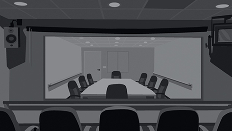
I started realizing that I had internalized more of their customers’ issues because I was sitting with them on the other side of the two-way mirror—looking into their eyes and hearing their voices tremble as they talked about the state of their finances—rather than sitting with the client looking through the mirror, as shown in Figure 1.
While we were hearing roughly the same themes across these research projects, these themes weren’t yet being addressed in the user experience. For example, people are overwhelmed when it comes to managing their money. Thus, a strategy that nearly every financial institution is tackling is how to simplify managing finances while still giving people a feeling of being in control.

What If There Were No Two-way Mirrors?
So we altered our approach, working with the client to craft an Insights Event. Insights because we aren’t really doing research, we’re digging for ideas and inspiration. Event because this isn’t your typical project. It’s really an event—complete with an official invitation and RSVP, orientation meetings, the nearly perfect execution of a full experience whose goal is to provide a good user experience—and let’s not forget the goody / snack bags.
We started the week with friendship group innovation sessions. We invited people who we think of as thought leaders to the sessions and asked them to bring other thought leaders along. These people operate on another level, and I’ve never taken notes so fast in my life. The Motivate Design team served as the event and table moderators, and members of the client team paired with the thought leaders to complete the design-thinking activities together. We did a few rounds of these activities with debriefs in between. The following are descriptions a few of the activities that are part of a friendship group innovation session:
- Act It Out—Be the design. Feel the design. Think the design. We encourage each participant to become the design, acting out what they would expect the design to do. This activity uncovers insights into participants’ emotions regarding the way the design would intersect with people’s lives and allows researchers to cross-check how the design flows, behaves, and handles each participant’s context.
- Deconstruct / Reconstruct—We use this activity to capture participants’ initial, honest reactions to commonplace, overused, and sometimes meaningless words in user interfaces. We prepare for this activity by putting each problematic word that we’ve identified during an earlier design review on a cue card. Then we pair up participants and ask them to take turns placing a card over their forehead and asking their partner to give them clues to help them guess the word on the card. This activity identifies over-used words that have lost their wow-factor, as well as contextual discrepancies between form, function, and overall meaning.
- Dot to Dot—Using a brand as a metaphor—for example, What if a grocery store was like Uber?—we encourage participants to attribute its brand characteristics and promises to another experience. Participants sketch their brand experience and a new experience, making connections at each touchpoint and identifying important brand and experience elements. This gives participants the ability to see traditional experiences from fresh, new perspectives.
We started the next day by conducting a class on today’s social trends, then sent the client associates out on field trips, giving them the opportunity to experience these trends firsthand. For example, one of the trends that we identified was Back to Basics, people wanting to create, make, and explore with their hands. We sent pairs of participants to locations in Boston where they could see this trend in action, including the Makerbot store.
It was rewarding to hear the feedback that the planning around who went to what store mattered. During the experience debriefs, we were able to point out parallels to what our client’s customers experience with their brand. For example, the people on the client team felt that they were in the “outer circle” at Makerbot because they didn’t quite understand what their target market is or exactly what they sold. Think of financial institutions: Do you understand how your bank works? What it sells? How they make money off you?
