During my career, I have designed diverse search user interfaces—for loan matching, large ecommerce, and social networking sites. With the goal of discovering innovative search strategies, I have led participatory design sessions for search user interfaces involving the home page, gallery pages, catalogs, and many others. Most importantly, I have watched over 100 people use various search interfaces as part of my field and lab studies. My design work in the search domain has led me to become intimately familiar with winning strategies for search user interfaces that involve diverse inventories and complex products. As you can see, the topic of search UI design has been the focus of much of my work. Based on this work, I have previously published two articles on search UI design and search caching strategies in the magazine JavaWorld.
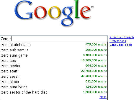
Since this is the first installment of my column, it makes sense to begin from zero, with the no search results page. “Starting from zero, got nothing to lose,” as the Tracy Chapman song goes—so we can hardly do worse.
Starting from Zero
The typical product team has no coherent strategy for cases when there are no search results. Most teams spend the bulk of their design phase working on the search results pages for a successful search. Then, at the last minute, the engineers hurriedly slap something together for the no search results page and launch. Such an approach is detrimental to the success of a search experience. Search, more than any other activity on your Web site, is a living, evolving process of discovery, a conversation between a customer and your system. Unfortunately, misunderstandings in this conversation are all too common, and the effectiveness of the page that appears when there are no search results is critical to keeping the customer engaged.
In my experience, the effort and ingenuity a team invests in the no search results page is indicative of its overall dedication to customer success. Ignoring such a search results page virtually guarantees failure and obscurity. On the other hand, focusing on the needs of the customer, who holds the wallet, and thinking creatively about the case when there are no search results can turn a temporary snag in communication into an opportunity for deeper connection and a source of tremendous competitive advantage.
No Search Results Page: Your Key to Competitive Search Advantage
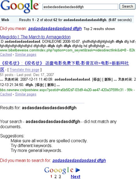
To see how original thinking about the no search results page can revolutionize an entire industry, consider the history of Google. A relative latecomer to an already saturated search market, in which it no longer seemed possible to invent anything new, Google blew away all competition through their unapologetic dedication to customer success. One critical innovation was the Google Did you mean… feature, which gave the process of discovery a safety net and made exploration more fun. This feature was the deliberate result of original thinking about how to help correct the misspellings that were a common cause for the appearance of the no search results page. Controlled vocabulary substitution redefined the way Google does search, and today, the Did you mean… feature shown in Figure 1 is considered a virtual necessity for a successful search implementation.
If you want to create a killer search app, I recommend you begin with the no search results page. Starting from zero forces your team to address the most difficult design questions up front and honestly assess your engineering budget and capabilities. More importantly, your team can define the entire search UI design problem more precisely—in a compelling and possibly even original way.
No Search Results Strategy: Not a Zero-Sum Game
There is no set of rules that guarantees a successful no search results implementation. However, by studying various search UI implementations, I’ve come up with three useful design directions:
- Don’t be afraid to say I did not understand. Clearly indicate there are no search results, so the customer can recover.
- Focus on providing a way out. Make sure every control on the page does something productive to help resolve the no search results condition.
- Focus on the customer’s goal. Provide the most relevant recovery content first, while staying as close as possible to the customer’s original intent.
Let’s look at some examples of how we can combine these design directions creatively to develop compelling experiences and business opportunities.
Don’t Be Afraid to Say I Did Not Understand
Clear communication of system state forms the foundation of all human-computer interaction. In his “Ten Usability Heuristics,” Jacob Nielsen put “Visibility of system status” at #1. If customers can’t understand that the system did not find what they asked for, they can’t take the appropriate corrective action. Yet many search applications do not display the no search results condition clearly and accurately. Figure 2 shows an example of a search results page from a leading financial information site, Morningstar.com. Can you tell whether the system found what the customer searched for?
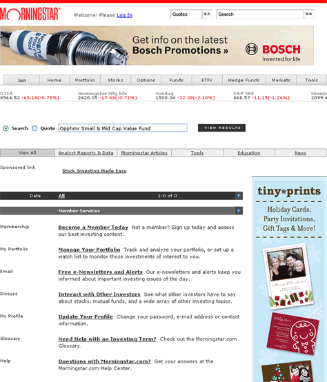
On the Morningstar search results page, there is no explicit message that states No results found. The only zero on the page appears in the black bar in the form of 1-0 of 0, which does not make much sense.
Compare the Morningstar page with the Google page shown in Figure 1, which indicates Your search for asdasdasdasdasdasddfgh did not match any documents. The status message on the Google search results page is clear and straightforward, making it obvious that the problem occurred and providing ways to correct it.
Note that, while Google clearly indicates the no search results condition, this status message appears after the recommendation the Did you mean… feature provides. This demonstrates another key principle: The best design for your application is the one that works with your business model and your particular audience. There are no hard and fast rules for implementing any of the strategies for handling the case when there are no search results.
To be successful, your team must conduct frequent quantitative A/B testing of multiple search results page variants to ensure the pages you’ve designed meet business and customer goals. Qualitative lab and field testing is also highly recommended to help you make sense of your A/B testing results and provide ideas for future improvements.
Focus on Providing a Way Out
On the Morningstar page in Figure 2, the most prominent controls on the page are the links on the gray bar, including Analyst Reports & Data, Morningstar Articles, and Tools. At first glance, these links seem a fine choice for customers to click to browse relevant content. Unfortunately, the links are actually filtering controls that serve only to further constrain the search that already has no results. Instead of providing a way out, filter links on a no search results page suck the customer deeper into the quagmire of no search results, now requiring multiple clicks of the Back button to get back to some useful content.
Morningstar is not the only site guilty of providing unproductive and confusing links that do not give customers a way out. Can you spot some useless filtering controls on the Endless.com no search results page shown in Figure 3?
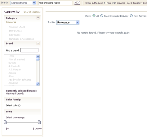
If you answered The entire page except the search box, you are correct. Further constraining already nonexistent search results to those with Free Overnight Delivery, changing the sort order, narrowing by category, or using a fancy price slider would all yield an endless stream of no results. Such system behavior is very confusing to customers who are already frustrated by getting no search results.
Instead of providing controls to further constrain a customer’s query on your no search results page, make sure every control gives the customer a productive way out. Compare these endless nonproductive results to the page in Figure 4, which shows the result of the same query on Amazon.com.
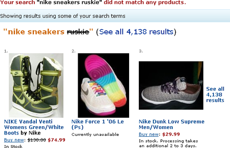
Amazon’s no search results page succeeds in a big way, because of its very prominent and useful links and content that helps customers find their way to Nike sneakers and get away from the no search results page.
