Show Me More
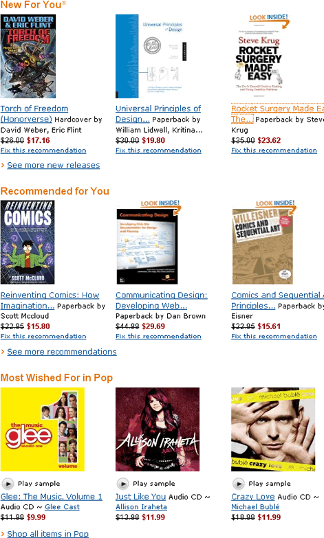
The idea behind the More Like This pattern is very simple: within each group of items representing a particular category from a catalog or accompanying each item in search results, provide a prominent link or button with a label that is some variation of More Like This . Of course, the devil, as they say, is in the details. Figure 1 shows one of the more successful implementations of this pattern, the Amazon.com home page.
On close examination, this design yields a few important lessons:
- Make group organization simple and obvious. Each group title should be prominent and simple, not inviting deep thought or much examination. The words and the color treatment of group titles should flow in a way that lets customers easily skim groups. Their titles exist to clearly separate various groups and direct the eye to the items they contain.
- Focus on helping customers make decisions. Although the items in each group are themselves fairly relevant, the subtle focus of the whole page is not on finding exactly the right item on the current page, but instead on displaying some relevant entry points to an unfathomable cornucopia of relevant choices on Amazon.com that each group exemplifies.
- Format groups differently from search results. The items in each group have a horizontal layout, in a gallery format, so it’s easy to differentiate them from the search results, which typically appear in a vertical list.
The most important thing to keep in mind is that all of these design features support a single key goal: to help customers find what they want by providing the information scent and motivation that makes their navigational decisions easy and intuitive. Let’s examine what happens when sites ignore these lessons by looking at some other implementations of the More Like This design pattern.
Make Group Organization Simple and Obvious
Any cognitive friction around the organization and format of different groups makes navigational decisions more difficult. Instead of making decisions primarily on the basis of the information scent embedded in each group’s content, customers must try to understand why certain groups have a different format—a confusing and usually futile endeavor. Figure 2 shows one example of such an over-designed More Like This page, displaying search results for the query Thai Restaurant San Francisco on Yelp.com.
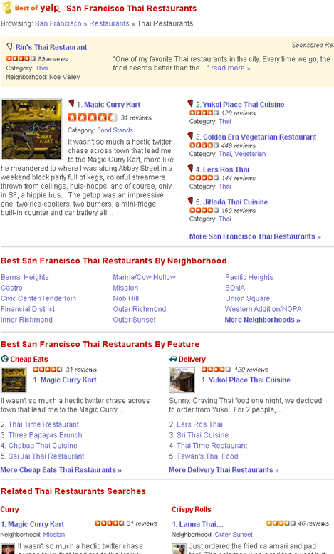
The aim of this page is not to present all possible choices, but to help customers make a quick choice of the method that would best let them explore a bevy of Thai-food restaurant recommendations. Unfortunately, the purpose of the page is far from obvious. Observe that the page has no fewer than seven different groups, each with its own branding and formatting, in an overly complex, nonstandard layout. Together, all of these differences create a cacophony of results, making it very hard to compare the different groups without studying them in detail. Too much fancy formatting and too varied a layout hinders customers’ ability to make navigational decisions quickly, which should be the page’s primary aim.
Contrast this page with the Amazon home page in Figure 1, in which each group has the same simple format, drawing the eye to the content. On Amazon, with the aim of making customers’ navigational decisions quick and easy, groups’ simple, intuitive organization lets customers easily scan them and decide whether to explore a particular group further.
Last, but not least, the first section, Best of Yelp, does not even look like the other groups. It is the only one that contains breadcrumbs. As a rule of thumb, on More Like This pages, breadcrumbs should appear above all of the More Like This groups, not within any of them.
Focus on Helping Customers Make Decisions
To help customers make navigational decisions within More Like This groups, is more content better? The answer is: it depends. Amazon’s More Like This pattern includes one subtle, but very powerful feature: if a customer increases the page width, the number of items in each horizontal group in this liquid layout increases, so higher resolution screens and wider windows show more items in each group. I’ve already discussed the benefits of liquid screen layouts in my column “Choosing the Right Search Results Page Layout: Make the Most of Your Width,” so I will not cover that topic in detail here. Be aware that this kind of horizontal expansion is no simple trick, so don’t expect it to work out of the box, as it were. Though, if you can afford the labor that developing the right CSS stylesheet involves, this is one feature well worth implementing.
On Amazon, more content is better. Partly, this is because every additional item a wider screen shows might be the one that catches the interest of a prospective buyer. But most important, showing a greater number of items presumably creates better information scent for each group, helping to motivate customers to explore a group in more detail.
What if there were a way to show even more content in each horizontal group on a page? One way to do that would be with a carousel widget that scrolls from side to side like that shown in Figure 3, on a category page on Netflix.com.
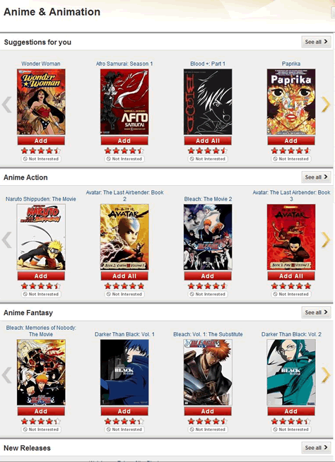
In many ways, the Netflix implementation of a More Like This carousel is very similar to the Amazon implementation of More Like This. The page organization is simple and obvious, and the groups look different from the search results. There is, however, one important difference: clicking an arrow at either side of each group scrolls the contents of the group to the right or left, displaying an additional four items. Does the addition of this carousel widget help or hinder the primary goal of the page?
Well, the jury is still out on that. However, I can tell you that the carousel takes a customer’s focus away from making a decision about which group to explore and instead invites the customer to linger on the page a bit longer, while exploring each of the groups. This is not necessarily a bad thing. But keep in mind that, even though a carousel can show customers twice as many items in a group, it still shows them only 8 to 10 items in total. This is in contrast to the hundreds, if not thousands of items a customer could see in a complete list of search results by clicking the See all > link for a group. Providing larger secondary targets—the left- and right-pointing arrows—also makes people think they should click them. If customers do click the arrows, there is a pretty good chance they might become mesmerized by the fancy scrolling interaction and miss the fact that this page is supposed to help them choose a subcategory to explore. A customer might look at the eight items the widget presents, find none of them relevant, and leave the site, thinking those eight items are all there were to see in a particular subcategory.
A carousel might seem like a fun, beneficial feature, but remember that the main purpose of the More Like This design pattern is to direct customers to explore the entire cornucopia of items under each category—that is, to select a category to explore—not to find exactly the item they want among the 8 to 10 items each carousel displays. To drive people to explore, the overall design of each group must be fairly Spartan, so customers can make their decisions quickly and move on to exploring the main body of the search results. If fancy group formatting or Ajax carousels make customers disregard the more important More Like This buttons, such a page fails to meet its primary objective.
If you are still thinking about using carousels for your More Like This groups, consider that Netflix has one of the best recommendation engines in the world and can usually select very relevant items to include among the 8 to 10 options their carousels display. Amazon, which also has an exceptional recommendation engine, tried incorporating carousels for all of their groups, but now uses the carousel feature more sparingly, presumably because the results underperformed the Spartan group design, which is optimized for quick scanning.
Although a typical More Like This page does not warrant the use of carousels, in some circumstances they can be appropriate. One place where a carousel widget might come in handy is in the Two-Dimensional More Like This design pattern I’ll discuss later. But first, let’s take a quick look at what happens when groups look just like the actual search results.
