Top

Maximizing Value Through Usability Inspections

November 18, 2019

Creating a seamless user experience is something that all UX professionals strive for. No matter what an individual team member’s contribution toward that goal—whether as a UX researcher, UX designer, strategist, product manager, software engineer, or doer of all works—the collective goal of any great product team is to make the user experience a good one.

As UX professionals, the task of balancing time, money, and resources to reduce UX debt and maximize value to the user is our constant challenge. The purpose of employing usability-inspection methods is to identify significant usability issues quickly and inexpensively—in a way that is much more efficient than usability testing.

In deciding which of the family of usability-inspection methods would be best for auditing your software’s usability, this question often arises: What is the most efficient method of auditing or inspecting the usability of software? Should we do a cognitive walkthrough or a heuristic evaluation? Employ a combination of the two methods? Or choose a different method altogether? Working through your options to determine the best method of evaluating your software—and, thus, maximizing value to both users and the business—is a challenge that we all share.

Champion Advertisement
Continue Reading…

Determining the Best Method to Use

I work for MSTS, a global fintech company that develops B2B (Business-to-Business) digital-payment solutions. Through user research, we learned that one of our main personas, the accounts-payable person, spends little time on our portal, moving on and off the portal quickly. The accounts-payable job to be done is primarily the payment of invoices, as well as creating reports. They also use other vendor’s portals to pay invoices or conduct similar tasks. What this tells us is that the learnability of the software must be high and the user interface must be consistent with those of other payment portals, so when users sign in once a month, their user experience can be seamless—pay the invoice, create a report, and move on.

We originally designed a cognitive-walkthrough exercise to understand the system’s learnability for new or infrequent users—such as those using an ATM machine—because this inspection, or audit, method requires no participants. Recruiting and scheduling participants for a standard usability test can be time consuming and costly; as can conducting test sessions and doing analysis for each participant. So, instead, our internal usability and product teams created scenarios, then followed the steps of a cognitive walkthrough, moving through the user experience in the role of the persona.

While a cognitive walkthrough—or any other usability-inspection technique—is not a replacement for usability testing, using such techniques provides a useful, cheap way of getting feedback on a design quickly and efficiently. Our goal was to use this cognitive-walkthrough method to solve the most severe usability issues that would impact the overall user experience.

With a multitude of cognitive-walkthrough models from which to choose, we selected the streamlined cognitive walkthrough that Rick Spencer developed at Microsoft. [1] We found this simplified version of a cognitive walkthrough easy to conduct. Spencer’s model pushed inquiry into just two questions, instead of the four questions that were characteristic of the original cognitive-walkthrough model that was developed at the Institute of Cognitive Science (ICS) at University of Colorado, Boulder. [2]

The ICS cognitive-walkthrough model helps a team focus on a product’s learnability and usability by asking the following four questions:

  1. “Will the user try to achieve the right effect?”
  2. “Will the user notice that the correct action is available?”
  3. “Will the user associate the correct action with the effect that user is trying to achieve?”
  4. “If the correct action is performed, will the user see that progress is being made toward the solution of the task?”
Although this set of four questions enables an inspection team to identify potential learnability and usability issues effectively, progressing through all four questions can be a bit time consuming. In contrast, even though Spencer’s streamlined version of a cognitive walkthrough reduces the number of questions the team must focus on, the method still captures an understanding of the software’s learnability effectively by asking:

  1. “Will the user know what to do at this step?”
  2. “If the user does the right thing, will they know that they did the right thing, and are making progress towards [sic] their goal?”

We supplemented Spencer’s streamlined cognitive-walkthrough method with the heuristic-evaluation framework’s severity-rating system, which rates the severity of an issue. Although the idea of combining these two popular usability-inspection methods is not new, we decided to incorporate this part of the heuristic-evaluation method to prioritize UX debt. This let us easily turn an issue into a user story for the Development team.

Creating a Framework

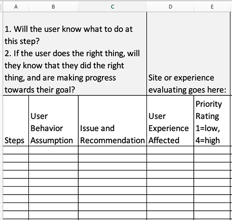
Once we had decided to use Spencer’s version of the cognitive walkthrough and the priority system, we set up the framework shown in Figure 1.

Figure 1—Cognitive-walkthrough framework
Cognitive-walkthrough framework

To create such a framework for your product team, do the following:

  1. Have the entire inspection team write out the steps of a job to be done that would let a persona complete a task.
  2. To mitigate groupthink, ask individual product-team members to enter data into the remaining fields for each step, as follows:
    1. Document your assumptions about the user’s behavior. What did you think the user would do to complete the step?
    2. Capture the usability issues and your team’s recommendations for enhancing the user experience. What is the solution for each issue?
    3. Indicate what part of the user experience each issue affected.
    4. Assign a priority rating for each issue—on 1–4 scale, in which a 1 indicates low priority; a 4, high priority.

This framework enables product owners, UX designers, and UX researchers to execute efficiently.

Executing a Cognitive Walkthrough

When auditing each part of the software user experience, we followed these steps:

  1. Work with the product owner to determine the steps of the task, or job to be done, that we were inspecting—for example, onboarding a customer.
  2. Create a framework for the product team to use, as I described earlier.
  3. Give the product team a week to inspect the steps and complete the framework.
  4. Assign priority ratings to help you decide what issues are the most important to correct.
  5. Have the product owner turn the issues in the Issue and Recommendation column into user stories.
  6. Regroup to discuss your results. Compare your notes and prioritize issues by deciding what issues represent the highest UX debt that you can turn into high-priority user stories.

Conclusion

The cognitive-walkthrough framework that we created was very useful for auditing a product’s usability and learnability. By using the streamlined cognitive-walkthrough method in combination with the severity rating of a heuristic evaluation, we were able to identify and prioritize the resolution of a variety of usability issues. Moreover, prioritizing issues helped us identify user needs and easily translate the issues into user stories.

Of course, a cognitive walkthrough is not only method you could use to learn about a product’s usability issues. After doing a cognitive walkthrough, you could conduct a usability study, testing a product with users or potential users of the product for further learnings. 

Endnotes

[1] Spencer, Rick. “The Streamlined Cognitive Walkthrough Method: Working Around Social Constraints Encountered in a Software Development Company.” (PDF) CHI 2000, April 1–6, 2000. Retrieved November 9, 2019.

[2] Polson, Peter G., Clayton Lewis, John Rieman, and Cathleen Wharton. “Cognitive Walkthroughs: A Method for Theory-based Evaluation of User Interfaces.” (PDF) International Journal of Man–Machine Studies, 1992. Retrieved November 9, 2019.

Head of UX Research at TreviPay

Kansas City, Missouri, USA

John KilleAt TreviPay, a global fintech (Financial Technology) company that serves customers in a variety of domains, including transportation, manufacturing, retail, and ecommerce, John creates digital-payment solutions that make B2B (Business-to-Business) payments easier, faster, and smarter. Over the past decade, John has led extensive user-centered design and customer-research projects in the lab, online, and in the field, across the US and in other countries such as India, Germany, and the Netherlands. He earned his PhD in American Studies from Saint Louis University.  Read More

Other Articles on Expert Reviews

New on UXmatters