So let’s put some novel form-design approaches under the microscope and see how they fare. In this article, I’m going to examine the following Web form fashions:
- unconventional label placement
- creative required-field indicators
- sliders
- hidden contextual Help
Unconventional Label Placement
A field label tells people what sort of information needs to go into a text box or other form widget. This means they need to read the label before they get to the field.
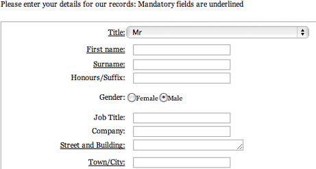
For Web forms in languages that are read from top to bottom and left to right, designers usually place field labels above or to the immediate left of fields, leveraging this principle of reading order. However, I have seen a couple of Web forms that had the labels below their fields, as shown in Figure 1.

Assuming a form is in a language that people read from the top of a page down, positioning a label beneath a text box results in people’s receiving form elements in the reverse order from what they need—that is, text box, then label rather than label, then text box. Because users first see a field, then must look underneath it for its label, then look back up to fill out the field, their experience of filling out the form would be to take two steps forward, then one step backward; jump forward three steps to the next label, take one step backward; jump down to the next label, and so on.
This continuous forward and backward movement is likely to get very tiresome, very quickly. Obviously, it is much more work for users than if labels were always above or to the left of text boxes.
Another modification of the traditional placement of labels that is starting to garner interest around the Web is inserting them inside the text boxes, as shown in Figure 2.
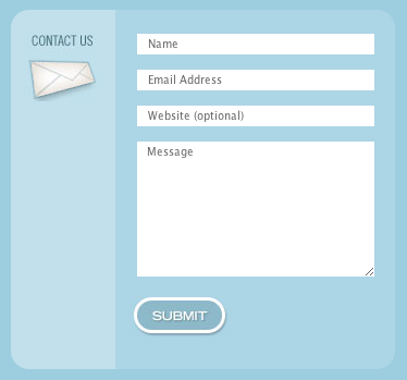
There are many reasons why this is a bad idea:
- Once a user starts typing in a field, its label disappears. So the only way users can check what they are supposed to be doing—if they are interrupted, for instance—is to remove their answers and hope the labels reappear.
- If a label doesn’t disappear as soon as a user selects an insertion point in a field, either the label accidentally gets submitted along with the intended text or the user must delete the label manually.
- Fields with text in them appear to be complete, so you’re likely to end up with much higher error rates.
- Once a form is complete, there is no way for users to review what they’ve typed and confirm that they’ve provided the right information.
- There is no way to keep a usable visual record of the information a user has typed, because a printed or saved form a user has filled out has no labels.
- This approach is feasible only if a field label is very short. So once you get beyond a really simple sign-up form or the like, it means inconsistent formatting between questions on your form.
- This technique relies on JavaScript and is hard to implement accessibly.
I could go on, but Caroline Jarrett has already written on this topic in depth in her UXmatters column “Don’t Put Hints Inside Text Boxes in Web Forms.” I strongly suggest your reading that piece for some great background and empirical evidence that putting labels inside fields is really not a good idea.
So why do it? Some people argue that it makes the form neater. I think this subjective claim is debatable. It’s also a bit like getting rid of the food in your fridge so it’s cleaner. While the slightly obsessive neat-freak in me appreciates this desire, we need to resist such impulses if we’re going to create good user experiences.
Another argument for putting labels inside fields is that doing this saves space. This is certainly true, but there are only a very few instances where space is at such a premium that there is no room for labels outside text boxes—for example, if you’re squeezing a couple of sign-in fields into a small site header. But you need to be very careful with the implementation of this approach—so labels disappear on a user’s selecting an insertion point in a text box, for instance—to maintain usability.
Last, but not least, the most unconventional label placement I’ve seen uses animation. A label is initially inside a field, then, as a user starts typing data, slides out to the left of the field, as in the CSSKarma sliding form labels demo. While this approach is certainly novel, I can’t see any benefit to it. It doesn’t save space, because you need to reserve space for the labels once they slide out of the text boxes. The animation is distracting, and you are still left with many of the problems I mentioned earlier, like users mistakenly thinking they’ve already filled the fields out.
Creative Required-Field Indicators
If you ’re going to use some sort of indicator on your form to point out which questions users must answer, why not stick with the de facto standard—a red asterisk (*)? This may not be the best indicator we could ever have designed, but through its use across a large number of Web sites, it has become a well-known convention. And as Luke Wroblewski says, the red asterisk works well because it has “double visual emphasis.” Both the color and the shape are visual cues, so this indicator is accessible to people with color-deficient vision.
While there are still some people who don’t yet know what this indicator means, there are definitely more people who don’t understand what a red bullet (Figure 3) or a yellow bar (Figure 4) means.
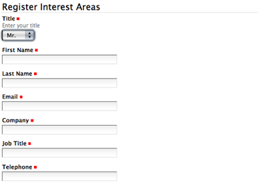
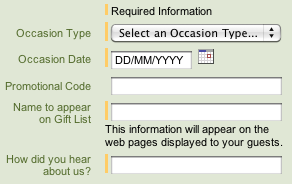
While there is an explanation of what a yellow bar means at the top of the form shown in Figure 4, experience and research show that most users don’t read instructions. Thus, there is a good chance they’ll miss this explanation. Better to just use the convention and know that most users will have no trouble understanding it.
What’s the most troublesome alternative required-field indicator I’ve encountered? Figure 5 shows an example in which the labels of required fields are underlined. Not only is this an unfamiliar approach, we all know underlined text has another well-established meaning on the Web: indicating a hyperlink. This is definitely not a good choice for indicating required fields.
