Content & Presenters: Highlights of Days 2 and 3 of the Main Conference
Here are my reviews of some of the sessions that I attended on Days 2 and 3 of the conference.
More Session Highlights from Day 2
On Day 2—Saturday, April 2nd—I enjoyed the following conference sessions:
- Discussing Design: The Art of Critique—Adam Connor and Aaron Irizarry
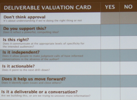
- Lean IA: Getting Out of the Deliverables Business—Jeff Gothelf—See Part I of my IA Summit review for an in-depth review of this excellent session.
- The User Experience Brief: What, Why, and How—John Yesko
- Beyond Digital: What IAs Need to Know About Service Design—Jess McMullin, Samantha Starmer, Andrea Resmini, and Priyanka Kakar
- DIY Mobile Usability Testing—Belén Barros Pena and Bernard Tyers
Discussing Design: The Art of Critique
Presenters: Adam Connor and Aaron Irizarry
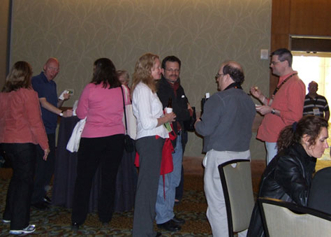
Aaron Irizarry—UX designer at IGN Entertainment—and Adam Connor—Senior Experience Designer at Mad*Pow and a colleague of our UXmatters columnist Michael Hawley—who are both shown in Figure 1, spoke about the value of design critiques and how best to approach them. I gleaned this important point from the summary of their talk in the program: An effective design critique requires understanding why a designer has chosen a particular design solution, then examining whether it meets or fails to meet its defined goals through a dialogue that ultimately helps the designer to assess what work remains to achieve those goals.

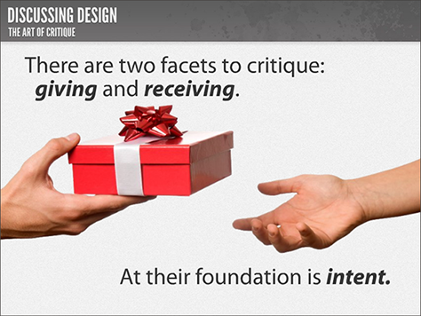
During their excellent presentation, Aaron and Adam provided many best practices for both giving and receiving a design critique—Figure 2 shows an introductory slide—and described the challenges people commonly encounter in delivering critique and how to overcome them.
Aaron and Adam offered the following advice:
- “There are two facets to critique: giving and receiving.”
- “Giving critique with the right intent is selfless.”
- “Gather initial thoughts and reactions, then revisit them in the right context.”
- “Find out the reason behind their thinking.”
- “Lead with questions. The best critique is always a dialogue.”
- “Receiving critique with the right intent takes humility.”
- “Remember the purpose: improvement, not judgment.”
- “Make sure the person you’re giving feedback to wants to hear it.”
- “Don’t take critiques personally.”
- “Listening is critical.”
- “Refer feedback to goals.”
- “Being able to critique is a core skill of a designer.”
- “Why is formal critique valuable? It helps us to get with a mindset of improvement.”
- “Think before you speak. Formulate a response. If your response doesn’t have the intent of improving the product, don’t say it.”
- “Send your design out ahead of time. Set up the design goals at the beginning. Present the goals quickly, then walk through the design. Don’t talk about constraints.”
- “You don’t have to explain every decision you made. Let those things come out during the process.“
- “One of the greatest things about formal critique is that you can put some structure around it.”
- “Try not to use moderators. Work into facilitating things on your own.”
- “Ask ‘How does that benefit our persona?’”
- “Don’t be afraid to call a timeout and take a person out into the hall and ask, ‘What’s up?’”
- “Always communicate next steps.‘ In the next meeting, we’re going to be talking about….’”
- “You’re doing this in the context of getting help. Thank people.”
- “In respect to review, the expectation is that I’ll tell you what’s wrong, and you’ll go fix it.”
- “A lot of times, people are intimidated by the process and come out with guns blazing. They want to establish dominance.”
- “If people are giving opinions, not improving the product, involve them more in the design process.”
- “Let them know you’re taking feedback, and it’s up to you to decide.”
Figure 3 shows Adam Connor and Aaron Irizarry’s full presentation, “Discussing Design: The Art of Critique,” on SlideShare. This well-crafted presentation uses a nice blend of humorous photos and succinct text to make its points.
 on SlideShare
The User Experience Brief: The What and Why Before the How
Presenter: John Yesko
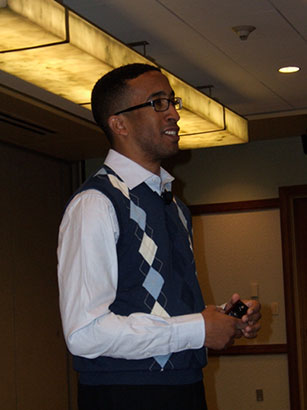
John Yesko, Director of User Experience at Walgreen’s, shown in Figure 4, believes in “working faster and less formally, but we often jump into very tactical, design-oriented deliverables too hastily. The user experience brief is an early-stage, strategic document that establishes what we know from our discovery process and how we intend to attack a project. It’s for stakeholders and the ‘downstream’ team. It’s important to start building consensus early.”
John on creating user experience briefs: “There’s no one right way to do this. It has to be tailored to the project. It varies in length depending on needs—and the attention span of the audience. A design brief is composed of insights from lots of different areas, including stakeholder insights—the opinions of the people signing our checks and letting us have our jobs.”
“Composition of the User Experience Brief:
- Project overview
- User experience inputs—We leverage many inputs, including insights from analytics, user research, things we’ve observed, personas and scenarios, competitive analysis, stakeholders, and UX heuristics. There are a lot of influencers, but our team are the decision makers. We care about what customers think.
- Organizing principles—We interpret these extremely loosely—fundamentals and strategies we’ll observe while designing, major areas of UX focus, all of the things we think are important to discuss, our high-level design approach, our design philosophy. These principles range from the very general—UX guidelines—to the very specific—project-specific design ideas.
- Deliverables—We may include concept maps, user flows, high-level wireframes, suggestions of look and feel.
- Issues and risks—We try to avoid surprises. Considerations include the risks and limitations for this type of deliverable.
- The design direction can become out of date very quickly as details are fleshed out.
- It can create a perception of added time that could be spent designing, but it actually saves time in the long run.
- Stakeholders may not understand what they’re agreeing to.”
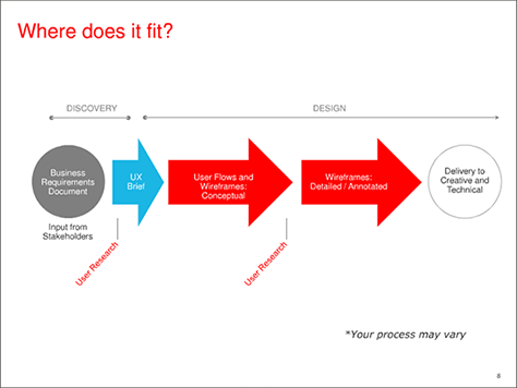
Figure 5 shows here the user experience brief fits in the overall UX process. “The user experience brief is a presentation, not a document,” said John. “The key people are in the room, so they know what they’re going to get. Scoping of requirements gets done before creating the user experience brief, which acts as a clarification of scope. The user experience brief previews the functionality for developers. We’ve defined our own UX process, which allows four to six weeks for creating the user experience brief. Its length depends on the nature of the work, but could be 100 pages. We don’t put anything in there that will put us into a corner. We don’t start design without having the proper information.”
In summary, John said, “The user experience brief helps us survey the situation, encourages collaboration early—so we can save time we’d spending defending our decisions later—and builds credibility for user experience. It demonstrates that a lot goes into the design process. It positions us as strategic thinkers and experience planners, not order-takers.”
John gave a great talk on an important topic that deserves more attention. Figure 6 shows John Yesko’s entire presentation, “The User Experience Brief,” on SlideShare.
 on SlideShare
Beyond Digital: What IAs Need to Know About Service Design
Panelists: Jess McMullin, Samantha Starmer, Andrea Resmini, and Priyanka Kakar
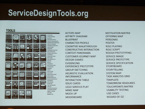
This lively panel, shown in Figure 7, on the hot topic of service design was one of only two panels that I caught during the Summit.

Here are a few highlights from their presentations and discussion.
Jess McMullin
Jess works as a freelance user experience consultant and recently launched the Centre for Citizen Experience to promote design innovation in the public sector.
- “User experience is digital product design.”
- “Customer experience is used more in the US and Canada than service design.”
- “Service design focuses on services rather than users or customers, so is more business oriented.”
- “In customer experience, channels and customers are the touchpoints. Interactions occur at the touchpoints.”
- “Defining moments are how human memories are created—the highs and lows of experiences live long term in memory.”
- “Challenges of Service Design:
- “Actors in a service experience are frontstage and backstage.
- “Support functions are things that never come into contact with customers, but make a service possible.
- “Services are intangibles
- “The evidence of services are cues and affordances.”
- “What stakeholders care about is just as important as users.”
- “Can one person do it all? No.”
Priyanka Kakar
As a Client Experience Design Manager at Vanguard, Priyanka leads multi-channel service design for their high-net-worth clients.
- “We design for humans, building connections across multiple channels.”
- “Experience maps capture interactions across customer channels.”
- “The time elapsed between touchpoints is the holistic experience.”
- “We build channel connections that are channel agnostic.”
- “It’s best when customers are using multiple channels simultaneously.”
- “To customers, interactions are part of an ongoing conversation.”
- “Build relationships, not processes.”
- “Create a culture of learning from storytelling.”
- “Those services that meet latent needs are most important.”
- “Deliverables have to fit the situation.”
Samantha Starmer
Samantha described service design at REI, where she leads the experience, design and information architecture teams.
- “Semantics have become really important, so I don’t use the term service design anymore. People understand customer experience and cross-channel experience better. Terminology matters. We had to start sharing each other’s terminology.”
- “Information is the foundation for providing good services. Information has to be shared across channels.”
- “Cross-team pollination is key.”
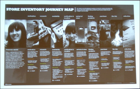
- “Create deliverables that fit the situation—like journey maps. Working toward the deliverable is the key piece, not the output.”
- “People sat in a room together whiteboarding. Then we created wireframes—just enough documentation, process, and deliverables to get us on the same page. We started a new agile cycle every three weeks.”
- “Making incremental improvements is key.”
- “Listen to the language your own company uses, and use the language they’re already using.”
Andrea Resmini
An information architect at FatDUX, Andrea is coauthor of Pervasive Information Architecture: Designing Cross-Channel User Experiences.
- “Users and Context—These are not just different user types who have a range of well-defined needs. These are user types whose needs change through time and are shaped in accordance with the place they currently are.”
- “Designing Pervasive UX—We are moving from the design of products to the design of experiences.”
- “Touchpoints need not be barriers.”
- “Service designers think they’re overlapping with interaction designers.”
DIY Mobile Usability Testing
Presenters: Belén Barros Pena and Bernard Tyers
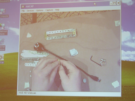
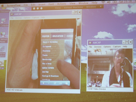
This was one of the most enjoyable, fast-paced, jam-packed, and practical presentations that I attended during the IA Summit. Making very effective use of humor, Belén Barros Pena, shown in Figure 10, and Bernard Tyers engaged attendees in a crash course on mobile usability testing. Bernard demonstrated the construction of a mobile testing setup, as shown in Figure 11. They even conducted a mobile usability test during the session, demonstrating their hardware setup and offering many useful tips, as shown in Figure 12. For the demo usability test session, they asked a volunteer to visit the Web site for the Denver Zoo and find out what bus number to take to get to the zoo.

Here are some highlights from their presentation:
- “When you videotape a test, a participant becomes a person.”
- “Handset usability affects test results, so test with participants’ own phones. Users have probably found workarounds for the own phone’s problems. If that’s not possible, include training and warm-up tasks.”
- “Field vs. Lab—We’ve found the same number of usability issues in the lab as in the field. Testing in the field is more complex, time consuming, and expensive, and it’s a hassle. For most, it’s a luxury they can’t afford. Testing in the lab is better than no testing. For most software, lab testing is fine.”
- “If you must do field testing, do testing late, so you only have to do it once. Do more than one pilot test.”
- “Don’t test over Wi-Fi. It’s not realistic. Mobile networks are slow.”
- “Cover participants’ data costs.”
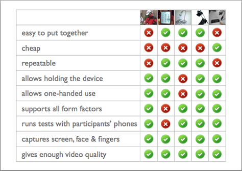
- “Recordings are memory aids and powerful communication tools. There are four ways to record a test:
- using wearable equipment—This allows you to test in the field, but the equipment is difficult and time-consuming to set up and is intrusive, uncomfortable, and heavy.
- using screen-capture applications—These provide high-quality screen recordings. But no single application supports all platforms, and the applications are not cheap. And participants won’t appreciate your installing stuff on their phone.
- using a document camera—This is a popular, well-documented approach, but it’s not cheap. Participants must keep within camera range, and the phone must lie on a desk or be held flat.
- using ready-made or DIY mounted devices—This requires you to attach a rig to a participant’s phone—using either ready made or Do-It-Yourself (DIY) mounted devices. This approach provides natural interaction with the phone, but isn’t cheap. Such devices aren’t easy to build and can be bulky—preventing single-handed use of a phone—or heavy—so holding them can become tiring during long test sessions.”
- “The third and fourth methods are expensive, but the best,” as shown in Figure 13.
- “CamStudio is an open-source, free screen recorder for mobile.”
- “AMCap lets you run more than one instance at a time.”
- “Use Blu-Tack reusable adhesive, a putty-like substance, to cushion and protect the phone.”
- “For testing, the most awkward form factors on the market are those with slide-out keyboards.”
- “The gray backgrounds behind pop-up overlays on Web sites are confusing on mobile phones.”
- “You should develop mobile applications.”
- “We know very little about the mobile context of use. The only way of creating useful, usable, enjoyable software is through user research.”
If Jared Spool hadn’t presented at this IA Summit, this session would have won the prize for most entertaining. But Jared always seems to win that honor.
Note—On SlideShare, you can download a PDF of Belén Barros Pena and Bernard Tyers’s presentation: “DIY Mobile Usability Testing.”![]()
Closing: Beyond User Research: Building and Organizational Brain
Presenter: Lou Rosenfeld
Lou Rosenfeld, shown in Figure 14, is an information architecture consultant, well-known author, cofounder of the Information Architecture Institute, and founder and publisher of Rosenfeld Media. In this interesting and edifying talk, Lou presented some insights from his newest book, Search Analytics for Your Site: Conversations with Your Customers. I’ve since read this excellent book. Once again, Lou has written the first and definitive work on an important topic. I highly recommend that you read it. Lou is a deep thinker and an effective presenter.

Here’s some of what Lou had to say:
- “This is not about building bridges, but burning down silos.”
- “Enterprise information architecture is moving away from silos.”
- “As a consultant, when I go into an organization, I want to learn what they know. Where do the insights live? In silos: reports from the user research group, query data gleaned from the site search team—what people are searching for—logs from the call center, reports from analytics applications, insights from Voice of the Customer research—about user behavior and needs—reports from CRM applications, insights from the research center. There are huge walls between these silos and the people making design decisions.”
- “Organizations are dramatically overpaying for research, duplicating effort, and missing out on the combinatorial effect of putting ideas together, because insights and content live in silos. The sum won’t be greater than the parts.”
- “A nasty three-headed challenge:
- fragmentation—Where is an organization’s research?
- differentiation—What kind of research is there?
- synthesis—How might we combine it effectively?”
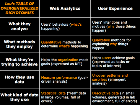
- “A lot of people are good at figuring out what’s going on—people focusing on Web analytics. A lot of other people are good at figuring out why it’s going on—people focusing on user research. These are not necessarily the same people. Not many people are comfortable with both quantitative and qualitative data. There is a combinatorial effect when you combine these two types of insights. We can learn quite a bit from each other’s data. We can improve each other’s design tools. We can help tell each other’s stories. We can help solve each other’s design problems. We can test each other’s hypotheses.” Figure 15 shows some dichotomies between Web analytics and user experience.
- “The organization’s challenge: thinking with a whole brain.”
- “How might practitioners build a whole brain? Surf those silos. Talk to other people. Establish what’s common. The hard part is synthesis.”
- “How might decision makers decide with a whole brain? Blue sky it. If you were going to build your organization’s brain—its decision making apparatus—from scratch, what would it look like?”
- “What we have now is organic and siloed. We talk about the methods rather than the insights they provide. The really interesting thing is to draw the connections between them. Something is wrong, and nobody seems to be thinking about it. If you want to fix it, plug that gap.”
- “Executives love dashboards, but they’re a pain to design when all of the data isn’t quantitative.”
- “It takes detective work to get all of the information out of the silos. Knowledge management is more about capturing information than using it. Useful insights emerge from a morass of more and more stuff. You need an ongoing effort to understand the insights. You’re not going to do it all at once.”
- “Companies that integrate their silos of insights will outpace their competitors.”
