Top

Conference Review: IA Summit 2011: Part II

May 23, 2011

This part of my IA Summit 2011 conference review continues my coverage of the content of the main conference. In Part I of my review, I wrote about a pre-conference workshop and two excellent conference sessions on agile UX.

Champion Advertisement
Continue Reading…

Content & Presenters: The Main Conference

The three days of the main conference were packed with great content. Most hours, it was hard to decide which of several interesting sessions to attend, and there were very few hours when none of the sessions were of interest to me.

The quality of the speakers and presentations were almost universally excellent. The main conference and plenary addresses featured presentations by many prominent UX professionals and authors.

Keynote: Data: [Potential and Pitfalls]

Presenter: Nate Silver

The conference proper started on Friday, April 1st, with Nate Silver’s keynote address about deriving insights from the analysis of statistical data. Silver, shown in Figure 1, writes a political blog for The New York Times titled FiveThirtyEight. I found his keynote a bit disappointing. Although his talk offered some edifying insights, his delivery wasn’t as polished as one might usually expect from a keynote speaker at the IA Summit.
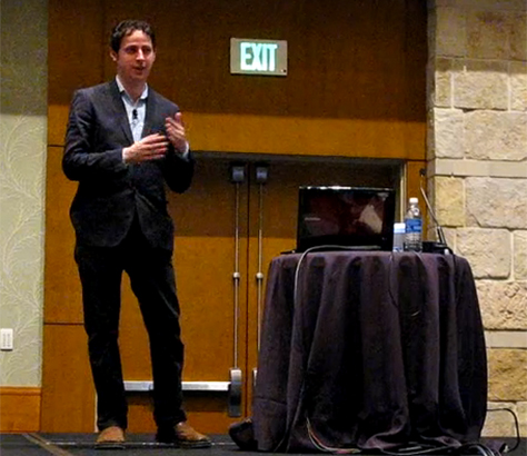
Figure 1—Nate Silver delivering the keynote address
Nate Silver delivering the keynote address

Here are a few points from Silver’s talk:

  • The First 80%: Data 101—The 80/20 rule.” However, in some contexts, only 20% of the data is important.
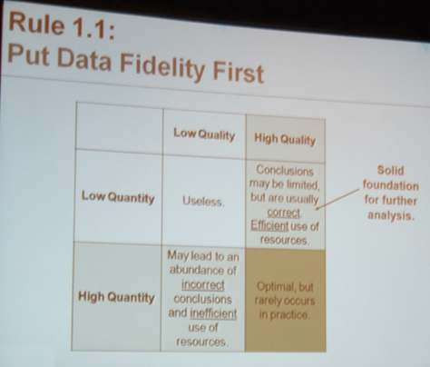
    • Rule 1.1: Put data fidelity first—Data is subject to chaos theory.” See Figure 2.
    • Rule 1.2: Make sure you can handle the truth—Maybe you’re a consultant and want to please your client. Maybe there are economic incentives.”
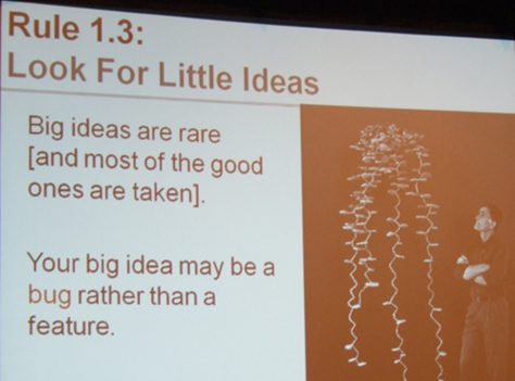
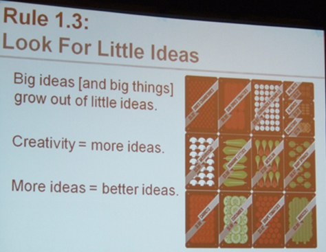
    • Rule 1.3: Look for little ideas—Big ideas tend to be built up from smaller ideas.” This is so true! See Figures 3 and 4.
    • Rule 1.4: Don’t trust the machines
Figure 2—Rule 1.1: Put data fidelity first
Rule 1.1: Put data fidelity first
Figure 3—Rule 1.3: Look for little ideas
Rule 1.3: Look for little ideas
Figure 4—More on looking for little ideas
More on looking for little ideas
  • “The Differentiating 20%: Data 201”—That’s the source of profit and competitive advantage. See Figure 5.
    • Rule 2.1: Embrace the uncertainty—More confident forecasts are not always more accurate. (Often the opposite is true.) Error is predictable, so predict the error.
    • Rule 2.2: Fit the signal, not the noise—Sometimes, instead of finding real meaning behind data, we instead fit the noise.” The more data you obtain, the “more complex your model can be.
      • “Beware of overly specific solutions to general problems.
      • “There’s a place for complexity, but it’s contingent on having a high quantity of data.
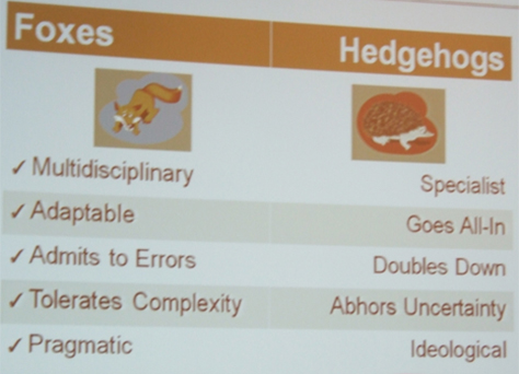
    • Rule 2.3: Be foxy—The fox knows many little things, but the hedgehog knows one big thing.” See Figure 6. “Foxes are better at making predictions. They still make some mistakes, but they’re quite a bit better. Foxes are practitioners. Hedgehogs might be better as business leaders.”
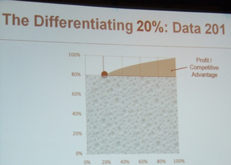
Figure 5—The differentiating 20%
The differentiating 20%
Figure 6—Rule 2.3: Be foxy
Rule 2.3: Be foxy
  • “Take qualitative data and turn it into something quantitative. If you have enough data, turn it into objective data—a model.
  • “People are still afraid of looking at data sometimes. Agree ahead of time how you’re going to look at data. Look at data objectively.
  • “You need to have a sense of what’s important and pertinent to a problem and filter the rest out.
  • “Develop a fluency for working with data.”

The Main Conference: More Session Highlights from Day 1

On Day 1, I attended the following conference sessions:

  • More Than a Metaphor: Making Places with Information—Andrea Resmini, Jorge Arango, and Andrew Hinton
  • Letting Go of Perfection: Developing an IA Agility—Chris Farnum, Joanna Markel, and Serena Rosenhan
  • Rethinking User Research for the Social Web—Dana Chisnell
  • Posting Our Hearts Out: Understanding Online Self-Disclosure for Better Designs—Javier Velasco-Martin

More Than a Metaphor: Making Places with Information

Presenters: Andrea Resmini, Jorge Arango, and Andrew Hinton

In their three brief presentations, Andrea, Jorge, and Andrew drew some parallels between the architecture of buildings and information architecture, whose purpose is “the design of information spaces, in which people meet, transact, communicate, and learn.” Andrea Resmini introduced their topic with these thoughts:

  • “The ideas of space and embodiment shape the way we perceive reality.
  • “This idea of space has nothing to do with geometry.
  • “Space is an anthropological thing.
  • “Space is neither physical nor mathematical and has man at its center.
  • “Space is heterogeneous.
  • “Space is not homogeneous—all references happen within a subjective system.
  • “Space is hodological. A space of paths and experience … corresponds to what we perceive.
  • “Space has evolved through time.
  • “Space is existential. The space of relationships is both egocentric and made up of stabler archetypes.
  • “Place is what we are taking to cyberspace.
  • “The map is the territory. We’re always going for the path of least effort, given their attractive and repulsive valences.” See Figure 7.
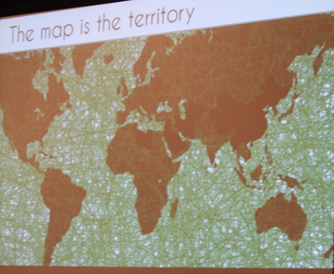
Figure 7—The map is the territory
The map is the territory

Figure 8 shows Andrea’s entire presentation, “More Than a Metaphor,” which is available on SlideShare.

Figure 8More Than a Metaphor on SlideShare

Architecture As a Model

Next, Jorge Arango delivered his presentation “Architecture As a Model,” speaking about his experiences as a UX professional in a developing world context where the terms user experience and information architecture are not well known. Here is some of what he told us:

  • “A challenge I've faced at the beginning of projects is stakeholders who come with expectations. Some think of me as a Web developer; others as a marketer or visual designer.
  • “I want them to see me as a person who brings things into balance—the various forces that pull a project in different directions such as user needs and business needs. I’m there to find the ideal balance that is unique to their project—the design vision.
  • “Then I become the defender of the vision. Vision must be put into form. That’s where design deliverables come in.”
  • Architecture can serve as a metaphor to help stakeholders understand our role.
  • “Architects have developed tools, methodologies, and business practices to arrive at a design vision. People understand what architects do. Architects are not builders. Architects are not marketers.
  • “I’ve started introducing myself to stakeholders as a digital placemaker. I’m there to do for their digital properties what architects do for their physical properties.
  • “Architecture is a very effective way of framing our contributions to projects.
  • “The Myth of the Lone Genius—When many of us think of architects, we think of Frank Lloyd Wright, Le Corbusier, or Mies Van der Rohe, but they were outliers. They usually had very strong agendas for design that were separate from user needs.
  • “Ego-driven design has gained currency. This is very different from how most architects work. Behind each of the forces is a group of people who have their own agendas and valuable things to contribute to a project. People with huge egos don’t get much traction working in environments like these.” See Figure 9.
  • “More than those in other design professions, architects need great leadership skills. Someone has to be at the center of all the activity.”
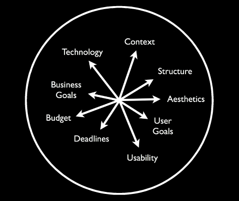
Figure 9—The forces that pull a project in different directions
The forces that pull a project in different directions

Jorge cited Curtis Fentress—architect of the Denver International Airport, whose work we all saw when arriving in Denver for the Summit—as a proponent of ego-free design.

In Figure 10, you can see Jorge’s entire presentation, “Architecture As a Model,” which is available on SlideShare.

Figure 10—Jorge’s presentation on SlideShare

A Few Thoughts About Architecture and IA Practice

Finally, Andrew Hinton shared “A Few Thoughts About Architecture and IA Practice.” He described the work of architect Julia Morgan, who designed the Asilomar Conference Center, birthplace of the Asilomar Institute for Information Architecture (AIfIA), which became the Information Architecture Institute. “Julia Morgan didn’t really have an ideology. She just wanted to do good work for her clients. She didn’t really have a style that she adhered to. She employed whatever styles were appropriate for her clients and the needs of a job. She said, ‘I want my buildings to speak for themselves.’ The world Morgan was working in was dominated by ego-driven architecture.

“Lone genius architects established architecture as a force in our culture. The design of the Asilomar Conference Center doesn’t engineer the behavior of its inhabitants. It encourages and accommodates their behavior. Morgan didn’t design the experience; she designed the conditions within which people can have experiences and make their own meaning. Morgan was a pioneer in

  • behavior—designing for natural patterns of human behavior
  • context—understanding the context in which work is done
  • inhabitance—raising the importance of remembering that people have to live with and within a design

“All too often, practitioners of IA go straight from a requirements document to wireframes or sitemaps, without considering the organic, behavioral context of the people who will have to live in the thing being made. I can’t imagine just going straight to wireframes. We must do the beginning work. The semantic structures we create are just as powerful; just as architectural as anything Morgan made. These semantic structures are dwellings—places where people live, talk, learn, fall in love, and do their work.

“We need to build up a body of knowledge and case studies. Pay attention when things go wrong. Do analysis. Figure out what went wrong. We need to structure things better.”

Figure 11 shows Andrew’s presentation, “A Few Thoughts About Architecture and IA Practice,” which is available on SlideShare.

Figure 11—Andrew’s presentation on SlideShare

Rethinking User Research for the Social Web

Presenter: Dana Chisnell

The premise of Dana’s talk: “The state of the art is a generation old. It’s time for a new generation of user research methods. Usability and user research aren’t telling us what we need to know for social experience design (SxD). We don’t know what we don’t know.

“People don’t live in the world doing one task with one device out of context. When I say social, I mean anything one human does that changes the behavior of another human.

“Designing for social magnifies the flaws in our current research methods. There are five factors we should have been looking at all along that we now really need to pay attention to:

  1. The nature of being online is social.
  2. Scale is a game changer—Caution: large sample sizes. How do you design and test for a massive user-generated information architecture? Quora presents a wicked design problem.
  3. Tasks aren’t what you think—Activities are goals that emerge and change. Tasks aren’t what we should be paying attention to. Twitter. Where’s the task there? People engage in activities rather than discrete stories.
  4. Satisfaction is correlated with task completion—Instead: control, engagement.
  5. Users continuously design your UI in real time—Workarounds are hacks. Maybe we should be thinking about ways to support user design. Etiquette and norms.”

“Social is about context and relationships.”

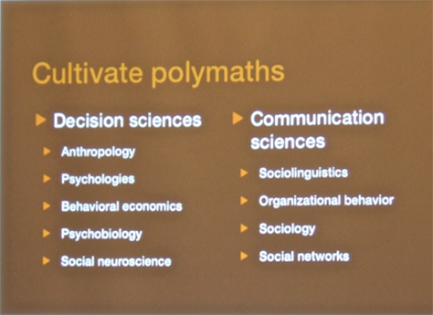
Speaking about cultivating polymaths, as outlined in Figure 12, Dana said, “Behavioral economics is going to be huge.”

Figure 12—Cultivating polymaths
Cultivating polymaths

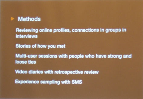
“The most successful user research methods for SxD combine field and testing techniques,” as shown in Figure 13.“ Interview a lot of smart people about what does and doesn’t work. Ask: Why do you use this thing? How do you use it? You can do this remotely.”

Figure 13—User research methods for SxD
User research methods for SxD

“Study of cohesiveness, collaboration, connections, networks, and relationships would have told us

  • who is part of planning and deciding
  • who is trusted
  • why these people are important
  • why they are trusted
  • how planning happens

“All these methods take a lot more time and effort to put together. This takes deep thinking.

“Rethinking user research—We’re not getting the answers we need. Experimenting is limited because we’re pressured to go to market. We’re missing things we don’t know about.”

Posting Our Hearts Out: Understanding Online Self-Disclosure for Better Designs

Presenter: Javier Velasco-Martin

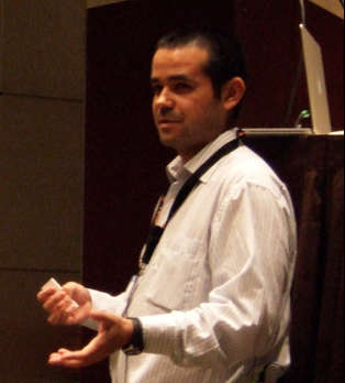
Javier’s presentation provided an overview of the problem he’s defined for his doctoral dissertation on how norms for the intimacy of information people are sharing online are changing—“what is private and what is public?” Javier, shown in Figure 14, presented this list of questions for which he is seeking answers:

  • “Are there differences in intimacy for different computer-mediated communication tools?
  • “Does this reflect on our communication behavior?
  • “What drives people’s online self-disclosure?
  • “Does design have a role is this?
  • “Can we influence this behavior with our designs?”
Figure 14—Javier Velasco-Martin
Javier Velasco-Martin

The Problem

Stephanone and Jang and Rosenfeld and Kendrick have defined the problem Javier’s research is addressing, as follows: “Experienced adults—including early adopters of social media—publishing intimate information in public spaces. Non-directed self-disclosure.”

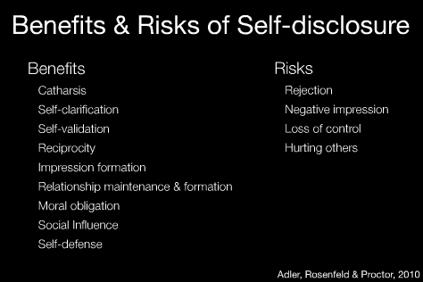
Figure 15 shows the benefits and risks of self-disclosure. “What is our motivation for tweeting? Catharsis is one of the main drivers. Just getting stuff off our chest. Self-disclosure is central to interpersonal relationships. Self-disclosure is reciprocal. If I share something personal, you’ll feel compelled to share, too. Computer interfaces yield more self-disclosure than paper surveys or face-to-face conversations do. People are more frank and open on the computer than on paper.” For intimate topics, self-disclosure depends on the privacy of the computer-mediated communication tool.

Figure 15—Benefits and risks of self-disclosure
Benefits and risks of self-disclosure

The Survey Study

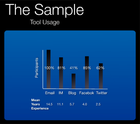
Javier recently conducted “a large-scale, international survey that compares self-disclosure across different computer-mediated communication tools for different communication scenarios.” Many in the UX community, including myself, participated in this online survey, which asked about participants’ usage of the following tools during the last month: email, instant messaging, blogs, Facebook, and Twitter. Questions covered participants’ experience with these tools, their expertise, their frequency of use, the number of people with whom they had communicated, their perception of tool intimacy, and their likelihood of sharing information about their mood, family, politics, or health. Over 1200 people participated in this survey.

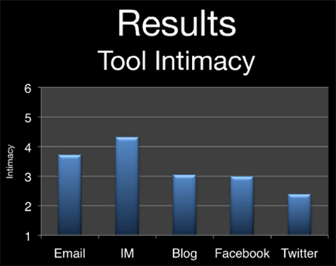
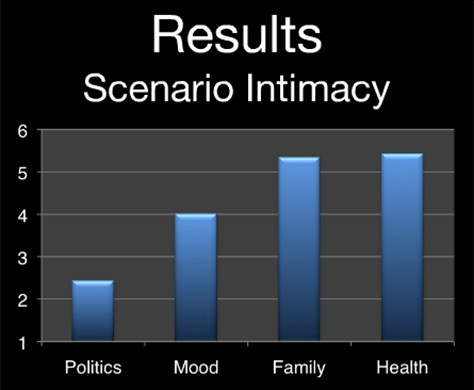
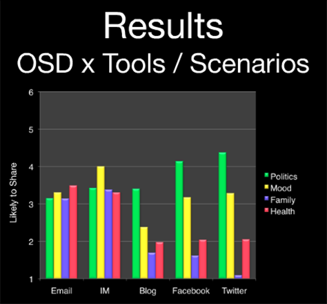
Javier shared some results from this first study. In Figure 16, you can see participants’ usage of these computer-mediated communication tools; in Figure 17, participants’ perception of tool intimacy, about which Javier said, “It’s interesting that blogs and Facebook are about the same.” Figure 18 shows scenario intimacy; Figure 19, levels of online self-disclosure (OSD) by scenario for each tool.

Figure 16—Tool usage
Tool usage
Figure 17—Tool intimacy
Tool intimacy
Figure 18—Scenario intimacy
Scenario intimacy
Figure 19—Levels of online self-disclosure by scenario for each tool
Levels of online self-disclosure by scenario for each tool

The Model

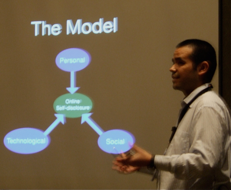
Javier concluded his fascinating talk by presenting his model for online self-disclosure, shown in Figure 20.

Figure 20—Online self-disclosure model
Online self-disclosure model

His online self-disclosure model comprises the following:

  • “The Personal
    • catharsis
    • loneliness
    • self-esteem
    • impression management
    • physical context
    • gender
    • work experience
  • The Social
    • reciprocity
    • intended audience
    • relationship maintenance
    • environment norms
    • cultural norms
  • The Technological
    • relative anonymity
    • social response
    • frequency of use
    • tool privacy
    • interface design”

“Technology is playing a role in how people disclose. They have a sense of anonymity when they’re using their computer.”

“We’re learning about user behavior. People toy with these tools for some time, then find a place for them in their tool palette.”

In Figure 21, you can see a version of the presentation Javier presented at the IA Summit, “Posting Our Hearts Out: Understanding Online Self-Disclosure for Better Designs,” which is available on SlideShare.

Figure 21—Javier’s presentation on SlideShare

Closing: The Most Valuable UX Person in the World

Presenter: Jared Spool

Jared Spool, one of the most effective and entertaining speakers in the UX community, closed Day 1 of the conference with a talk about measuring the value that a UX professional delivers, as shown in Figure 22. As usual, he raised some controversial issues.

Figure 22—Jared Spool
Jared Spool

“The market for UX: Market has to do with the idea of value. The most valuable UX person in the world—who is that person? I’m not the only one who wants to meet this person. This person is highly sought after. There are many companies that would want to hire this person. We have the ability to separate good from bad. How do we separate great from good? How do we separate the best from the rest?”

Our concern with “identifying the best UX person is a reflection of the maturity of the profession. We could choose among ourselves who the best people are—if we knew how to identify them.

“What are the qualities that define the best UX person? (How would you give advice to a manager who needed to hire the best UX person?)

  • good articulation and clarity of thought—I don’t know what that means.
  • self-abnegation and appeal to a higher authority—I don’t know what that means either.
  • empathy and accommodation—You shouldn’t be designing for yourself.”

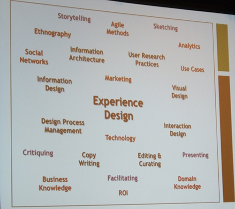
Experience design encompasses the many skills shown in Figure 23.

Figure 23—Experience design
Experience design

The best UX person should have

  • talent—something we’re born with
  • skills—acquired and practiced
  • knowledge—learned intrinsically or extrinsically
  • experience—gained over time”

Experience design skills include “liquid skills—the ability to communicate design in compelling terms—storytelling, critique, sketching. Soft skills define what we do. You must have all of the skills on a team, but team sizes are actually getting smaller.

“Did they build anything useful? A lot of young designers have knowledge, skills, and talent, but lack experience. Experience is really important. Good judgment comes from experience—and experience comes from bad judgment.

“This idea of value—what makes one of us more valuable than another? Interaction designers are better understood by the people who hire them than information architects.” Judging by job requirements in ads, “the Holy Grail is the UX designer who can code. Our skills currently align to the roles we’ve adopted, but jobs are no longer asking for these roles.

“Discrete disciplines are disappearing. Hiring managers don’t want to hire six people to do the job. The market isn’t that interested in having these discrete roles anymore.

“What’s service design? UX when you have a business that’s a service. Enter the specialty collections: mobile design, service design, content strategy. These collections of skills, knowledge, and experience are now specialties. There’s a ton of cross-channel stuff. We take these disparate disciplines and combine them. It’s part of the maturation process.

“Organizational skill-distribution strategies: how do we distribute skills across teams better?

  • assessment and within-team mentorship—When interaction design work comes in, you don’t assign your best interaction designer to it. You assign someone who’s got a lower-level of skills, and they get mentored.
  • cross-team skill pollination—foreign exchange programs—People with completely different skills work on a project for the full duration and get mentored. Then, send them back to their original jobs to mentor others in their role. This publishes relationships throughout an organization. It publishes skills.

“There is a difference between engineering and craft. There is style and craft to everything you do, but that’s not what makes you valuable. The craft element is another element of maturity. What is that baseline knowledge we could build a curriculum on?

“How does the hiring manager separate out the best from the rest? How can we help the hiring manager to hire the right person for the job?

  • certification—There are challenges that come out of this: Certification is inevitable in our field. It’s not necessarily a bad thing.
  • looking to specialists or generalists, while avoiding the compartmentalists—Even if we want to work in content strategy, we still have to keep up our other skills. Create an organization chart for the people working on a project. Talking to that org chart is key.
  • the UX portfolio

“What’s the role of associations in helping hiring managers? What are we doing for hiring managers?

“How do we grow our own value and become the most valuable UX person?

  • practice and critique—According to Malcolm Gladwell, “You need 10,000 hours to achieve expertise. Where are you going to get that? Practice. Critique—talking about the good and the bad. Great teams have dedicated practice and critique elements.
  • new mentor-and-apprentice models—Mentorship is actually looking over their work on a regular basis and telling them: You still suck.
  • growing our design vocabulary—Establish design principles for specific projects—for example, discoverability versus completeness.
  • build up the curriculum—Avoid the body of knowledge trap.

“Find out who is doing great work and idolize and emulate those people. Dissect what they do to deserve that idolatry.”

In the next installment of my IA Summit 2011 review, I’ll continue my coverage of the conference sessions. 

Read more:

Principal Consultant at Strategic UX

Founder, Publisher, and Editor in Chief of UXmatters

Silicon Valley, California, USA

Pabini Gabriel-PetitWith more than 20 years working in User Experience at companies such as Google, Cisco, WebEx, Apple, and many startups, Pabini now provides UX strategy and design consulting services through her Silicon Valley company, Strategic UX. Her past UX leadership roles include Head of UX for Sales & Marketing IT at Intel, Senior Director of UX and Design at Apttus, Principal UX Architect at BMC Software, VP of User Experience at scanR, and Manager of User Experience at WebEx. Pabini has led UX strategy, design, and user research for Web, mobile, and desktop applications for consumers, small businesses, and enterprises, in diverse product domains. Working collaboratively with business executives, multidisciplinary product teams, and UX teams, she has envisioned and realized holistic UX design solutions for innovative, award-winning products that delighted users, achieved success in the marketplace, and delivered business value. As a UX leader, she has facilitated conceptual modeling and ideation sessions; written user stories; prioritized product and usability requirements; established corporate design frameworks, standards, and guidelines; and integrated lean UX activities into agile development processes. Pabini is a strategic thinker, and the diversity of her experience enables her to synthesize innovative solutions for challenging strategy and design problems. She is passionate about creating great user experiences that meet users’ needs and get business results. A thought leader in the UX community, Pabini was a Founding Director of the Interaction Design Association (IxDA).  Read More

Other Columns by Pabini Gabriel-Petit

Other Articles on Conference Reviews

New on UXmatters