The word intuitive has lost its meaning. What people mean when they say intuitive is not usually obvious. So, in this article, I’ll examine the anatomy of intuition. But, as tradition dictates, before we begin the dissection, I’ll kill the patient. I propose to do away with the use of the term intuitive in our UX design vocabulary and replace it with availability.
a·vail (v.)
- To use or take advantage of an opportunity or available resource. For example, “She did not avail herself of my advice.”
- To help or benefit. For example, “No amount of struggle availed Charles.”
Synonyms: help, serve, profit
a·vail·a·bil·it·y (n.)
Handiness, or the quality of being at hand when needed. The ease with which a thought comes to mind.
Availability is a word packed with well-defined meaning for science and philosophy—and can give designers practical guidance toward designing products that need no more explaining than sex.
Intuitive asks for a magic wand; availability gives us handles and levers.
For this analysis of intuition, I’ll use the framework from Jesse James Garrett’s diagram “Elements of User Experience,”![]() shown in Figure 2. The framework comprises surface, skeleton, structure, scope, and strategy. For each of these “planes of User Experience,” availability makes it easier to understand what works and provides a bridge to relevant research in other fields.
shown in Figure 2. The framework comprises surface, skeleton, structure, scope, and strategy. For each of these “planes of User Experience,” availability makes it easier to understand what works and provides a bridge to relevant research in other fields.
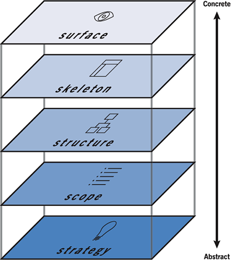
From The Elements of User Experience: User-Centered Design for the Web, by Jesse James Garrett
Surface
The surface level of an experience includes the smallest components of a design that make sense in themselves—for example, images, copy, colors, typography, and widgets. Availability at this level refers to how readily the intended meaning comes to mind. Do people understand the label? Do they recognize the icon? Is the font readable? The ease with which different understandings come to mind is a result of the
- way our brains work
- properties of a thing—a stimulus
- skills and experience of the perceiving individual
The Way Our Brains Work
User interface designers frequently rely on findings from the early human-performance tradition of cognitive science, which focused on empirical analyses of perception, attention, memory, response selection, and motor control—most notably, Fitts’s Law, Hick’s Law, and Miller’s “Magical Number Seven, Plus or Minus Two.”
Fitts’s Law![]() describes the time it takes to move the mouse pointer to a target area as a function of distance to the target. So, if you place targets closer or make them bigger, they’ll be easier to click. In other words, when targets are closer or bigger they are more spatially available.
describes the time it takes to move the mouse pointer to a target area as a function of distance to the target. So, if you place targets closer or make them bigger, they’ll be easier to click. In other words, when targets are closer or bigger they are more spatially available.
Hick’s Law![]() describes a person’s reaction time as a function of possible choices. The time it takes to make a choice increases logarithmically with the number of options from which one must choose. For example, the choice between chocolate and vanilla is quick and almost automatic, but picking a flavor becomes progressively more difficult and takes longer with each additional flavor on a menu. Your final choice becomes less cognitively available as the number of options increases.
describes a person’s reaction time as a function of possible choices. The time it takes to make a choice increases logarithmically with the number of options from which one must choose. For example, the choice between chocolate and vanilla is quick and almost automatic, but picking a flavor becomes progressively more difficult and takes longer with each additional flavor on a menu. Your final choice becomes less cognitively available as the number of options increases.
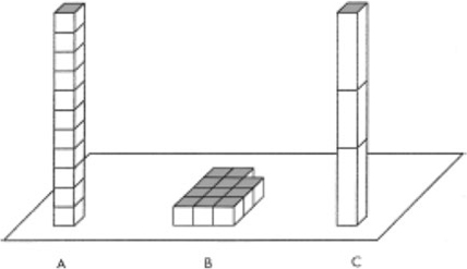
Miller’s “Magical Number”![]() describes the limits of human short-term memory capacity. We can keep between three and five things in mind—that is, in working memory—at a time. (Miller put the magical number at seven, but further research has determined that the magical number is Four, Plus or Minus One. See Jeff Johnson’s article “Updating Our Understanding of Perception and Cognition: Part II” for more on this.) For example, you can easily remember a shopping list of four items, but should enter longer shopping lists into your smartphone. Otherwise, you’re likely to find yourself in the middle of the baking goods aisle, struggling to remember what you’ve forgotten. Miller’s Magical Number is also about cognitive availability.
describes the limits of human short-term memory capacity. We can keep between three and five things in mind—that is, in working memory—at a time. (Miller put the magical number at seven, but further research has determined that the magical number is Four, Plus or Minus One. See Jeff Johnson’s article “Updating Our Understanding of Perception and Cognition: Part II” for more on this.) For example, you can easily remember a shopping list of four items, but should enter longer shopping lists into your smartphone. Otherwise, you’re likely to find yourself in the middle of the baking goods aisle, struggling to remember what you’ve forgotten. Miller’s Magical Number is also about cognitive availability.
These laws come from research whose intent was to increase human performance, but when you apply them to a design, their effect is to make goals and objectives more available, making the user experience less effortful.
The Properties of a Thing
aff·ord·ance
The extent to which an object makes an action available to a person.
Affordance![]() refers to the perceived possibilities for interacting with an object. For example, a text box on a Web page presents the possibility of typing text. These possibilities are available to users. Other possibilities such as changing the background color of a text box are less available. So we can also think about affordance in terms of availability.
refers to the perceived possibilities for interacting with an object. For example, a text box on a Web page presents the possibility of typing text. These possibilities are available to users. Other possibilities such as changing the background color of a text box are less available. So we can also think about affordance in terms of availability.
Skills and Experience
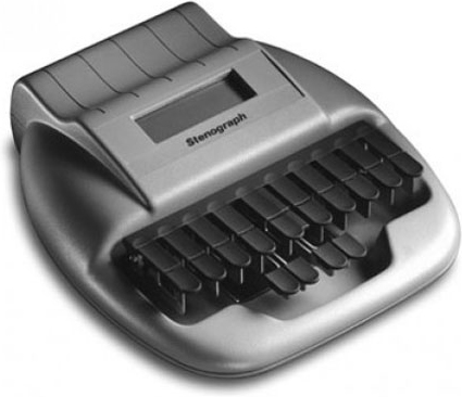
People’s skills and experience shape the possibilities they can realize in an object. Functions that are unavailable to novices may be readily available to experts. For example, while most people cannot perceive how they could record a conversation in real time using the stenographic machine shown in Figure 3, an experienced courtroom stenographer can use a stenographic keyboard as easily as you or I can use a computer keyboard. Similarly, a skilled pianist can use a piano keyboard like that shown in Figure 4 without consciously thinking about the placement of her hands; and many skilled programmers find a computer keyboard and a VI editor, shown in Figure 5, the easiest way to express their creativity. Expertise opens up the potential of tools, making functionality available to the skilled user.


A culture is a set of skills and experience that makes particular meanings of words, symbols, and other tools more or less available. So the purpose of regionalization and localization of user interfaces is to increase the availability of the intended meanings.
Design for accessibility![]() is about making functionality and other benefits of tools available to all people—whatever their hardware, software, language, culture, location, or physical or mental ability.
is about making functionality and other benefits of tools available to all people—whatever their hardware, software, language, culture, location, or physical or mental ability.
