An Agile Problem: Incoherent Design Solutions
In the above-mentioned article, I also explained that a key way in which agile approaches achieve their speed is by breaking down the development process into lots of short, sharp sprints of the same length—typically, just two to six weeks—that have clear goals—for instance, to get a search feature working. Success, in purely agile terms, means a team has met their goals for each sprint. However, a consequence of decomposing development projects into sprints is that successful sprints do not necessarily mean that a software system hangs together in a coherent way. So, even if every sprint is a success, the result is not necessarily success for the development project as a whole!
For example, I recently observed a large-scale software development project on which the UX team supplied the development team with a prototype as the input for each agile sprint, as I’ve just described. However, one of the sprints resulted in a primary navigation design that was incompatible with the design the development team had implemented in a previous sprint. The result: the UX and development teams had to rework the output from both sprints extensively—adding to the project backlog. Of course, this wasted a lot of time—a particularly egregious sin in an agile environment.
Subsequent analysis of this problem revealed the root cause: two different UX designers had led the prototyping work for the two sprints in question, and neither the scrums nor the regular UX team meetings had caught this design communication problem—despite both UX designers’ being reasonably experienced. This analysis also revealed that the system had a number of major inconsistencies in the way the user interface worked and, while these problems weren’t as serious as the primary navigation’s incompatibility problem, resolving these inconsistencies also involved a significant amount of additional rework.
Clearly, the potential for agile development to generate inconsistent or even incompatible sprint outcomes is something that is fundamental to agile methods rather than a problem that is particular to UX design. However, it is clear from this example that problems that originate during UX design can easily trigger such problems during agile development, resulting in the familiar sound of “Why is UXD the blocker in our agile UCD environment?” echoing around the project team!
A UX Solution: Conceptual Prototyping
In the real world of large-scale software development, we can’t reasonably expect that the same UX designer will lead design for all sprints. Similarly, we can’t expect scrums and UX meetings to catch all problems with inconsistencies in designs—even though some of them might be substantial. However, intelligent UX strategies can address this problem.
My first suggestion is that you produce a big-picture, or conceptual, prototype as your first major UX design artifact on a project.
Conceptual Prototypes
In a UX context, conceptual prototypes define a conceptual model of a software system from a user’s perspective, including things like the following:
- the scope of the tasks that the system will perform—For example, for a document database, some of these tasks might be searching, browsing, setting up alerts, and managing favorites.
- the macro, or high-level, information architecture—For example, how to classify and organize the key functions and documents.
- a broad template design for key page types—For example, where the primary navigation goes and what the header and footer should contain.
Because of the holistic nature of conceptual prototypes, their use makes it more likely that you can start off a design in a way that promotes its overall coherency—so you can avoid, or at least significantly reduce, the types of inconsistencies and incompatibilities that I described earlier.
Conceptual prototypes are wide rather than deep—that is, they cover all of the key aspects of a software system and avoid getting bogged down in details such as error handling or the aesthetics of visual design. Often, UX professionals see width and depth as antagonistic factors in prototyping, because we must sometimes achieve one at the expense of the other—in terms of the time we can devote to either. However, high width–low depth prototypes can provide an ideal balance. Their low depth means you can iterate these prototypes relatively quickly, while their high width makes sure you keep your focus on the big picture. Conceptual prototypes help you to identify and make key design decisions at an early stage.
Note—Conceptual prototypes are often a factor within the realm of lean UX—another contemporary initiative that aims to improve software development speed. The only difference is that, in a lean UX context, you might produce conceptual prototypes for the purpose of rather than as a result of initial research and ideation.
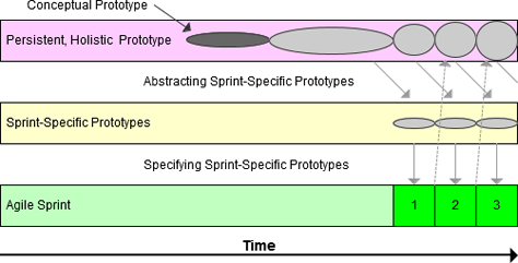
Of course, UX professionals recognize and have widely discussed and evaluated the benefits of working with conceptual prototypes—their use is common practice. However, I want to suggest two relatively novel extensions to their use—within the context of an agile development environment:
- Interactive conceptual prototypes
- Persistent, holistic prototypes

