Top

What Puts the Design in Interaction Design

July 10, 2007

“Most design jargon deals with how to design rather than what to design and why.”—John Arnott

“I prefer design by experts—people who know what they are doing.”—Donald Norman

Interaction design is a blended endeavor of process, methodology, and attitude. Discussions of process and methodology are pervasive in the interaction design milieu and often revolve around a perceived tension between process and methodology and the role of design within this discipline. To be clear, process is the overarching design framework—for example, an iterative, or spiral, process or a sequential, or waterfall, process. Conversely, a methodology is a prescribed design approach such as user-centered design or genius design.

Champion Advertisement
Continue Reading…

Along with all this talk about process and methodology, interaction designers spend much time distinguishing and labeling their various design practices: Is it interface design or information design? This is not surprising, because interaction design lies at the junction of several design disciplines. The resulting crossover between various specialties and issues is often muddled, understandably. There is no doubt that interaction design, as a design discipline, differs from applied human-computer interaction and cognitive psychology. These distinctions are omnipresent in the current literature.

“Interaction design’s strongest ties are to the discipline of design—not to, say human-computer interaction or cognitive psychology, although it does draw heavily on those fields. Interaction designers are designers, for good or ill.”—Dan Saffer

Saffer makes the point that interaction designers are designers not only because of process and methodology, but also because of attitude. Traces of this theme recently appeared in a thread on the IAI mailing list, “Is there a design school culture?” in which the thread instigator contemplated the difference between designers who went to art/design school and those who did not. He eloquently stated that, at times, he feels like a muggle, an outsider, who is not quite immersed in the same culture of design compared to those who had a formal design/art education. Though the author was not specifically talking about interaction design, there is a strong parallel to recent discussions on the IxDA discussion list in the “Old Guard versus New Guard” thread, which also contemplated the issue of formal design training.

At times in my career, I have certainly felt like a muggle, and certain creative types might even have called me a mudblood. But my experience has been more akin to being a squib—born into the world of design, but not quite a designer. Looking back, interaction design was for me a result of a process, not a pursuit of design. I considered interaction design a small piece of the puzzle that I relegated to an artifact, a deliverable—here’s the interaction design. In my mind, design dealt with the pursuit of aesthetics, but I always thought there had to be more. My view and practice of interaction design has certainly matured since then, but this underlying question still remains: What’s the magic and why should I use it? In other words, what puts the design in interaction design?

To answer this question, we need to think about the purpose of design. Design is a loaded term that has a pliable meaning. In a moment of clarity, Christopher Alexander defined the purpose of design: “The ultimate object of design is form.” This definition truly resonates with me, because it equates design with creation—specifically, the creation of something tangible, a form that traditionally takes shape as either a 2-D visual representation or a 3-D physical object or space. Interaction design sits at the convergence of these dimensions, with the addition of time (4-D) and behavior (5-D). The form of interaction design is difficult to define; it is implicit though seemingly intangible—time and behavior do not necessarily have a physical shape. To fully understand the role of design in interaction design, we must first describe its form.

Then, we must identify the need for design. Form does not always result from a new design process. Alexander demonstrates that it can build upon existing patterns that fit within the targeted context. We see this everyday online. The Web is mostly built upon ubiquitous patterns of interaction. However, to address new problems through innovation or the modification of existing patterns, you must design. A pattern is a solution for a particular context. Furthermore, our pursuit through design is to create a good fit between form and context. The variability of context in the digital realm—the playground of interaction design—makes this pursuit more difficult. Again, to fully understand the role of design in interaction design, we must understand why we need to design.

Pondering Form

“Form follows function—that has been misunderstood. Form and function should be one joined in a spiritual union.”—Frank Lloyd Wright

“The gestalt of a digital artifact emerges in the interaction with the user over time.”—Jonas Lowgren and Erik Stolterman

Designed behavior is not invisible. Sometimes it is obfuscated; at other times, it is apparent or even obvious. Most importantly, designed behavior dictates the flow between action and reaction, which is the basis of an interaction. A user takes an action through an affordance, which in turn causes a reaction in the presentation layer. An interaction doesn’t have to be digital. For example, when I listen to a record, I must operate the turntable through the motion of lifting up the tone arm and carefully placing it on the vinyl. As soon as the needle touches the vinyl, I receive feedback in the form of sound—hopefully, it’s not too much of a crunch. Then, once a side of the record had played through, my old turntable would automatically lift the tone arm and shut down. In comparison, my new turntable, which is completely manual, infinitely continues rotating at the end of a side until I return the tone arm to its stand and press the off switch.

A user’s initial action can cause multiple reactions that occur over time. There might be a pause in behavior until a state changes, in the same way that a conversation has pauses. Conversations unfold over time, but are not continuous. A conversation has starting and stopping points. Conversation reflects interaction—the seemingly intangible component of behavior. Conversation enables communication between action and presentation. It is a conduit between action, or operation, and reaction, or presentation. These layers of an interaction converge with the multiple dimensions of an interaction design language. Together they constitute an inseparable union: the form of an interaction. As shown in Figure 1, the five dimensions of an interaction design language converge with operation, conversation, and presentation to create form.

Figure 1—Elements of the form of an interaction

Elements of the form of an  interaction

In the introduction to Designing Interactions, Gillian Crampton Smith suggests that there are four dimensions to an interaction design language. I have added a fifth. The five dimension of the language of interaction design are:

  • 1-D—words—which are interactions
  • 2-D—visual representations—which include typography, diagrams, icons, and other graphics with which users interact
  • 3-D—physical objects or spacewith which or within which users interact
  • 4-D—timewithin which users interact—for example, content that changes over time such as sound, video, or animation
  • 5-D—behavior—including action, or operation, and presentation, or reaction

The first three dimensions enable interaction, whereas time and behavior define interaction. It is important to note that time, as it relates to sound and other media, enables interaction as well. Typically, interactions are tangible acts—for example, pressing or clicking a button or grabbing a handle. It does not matter whether the things that afford action are virtual or physical.

The form of interaction design converges with the physical or virtual world. Most interactions require touch or movement—though voice-driven systems are one exception. A mouse is the best example of this convergence. Designed to solve the problem of interaction with the virtual world, the mouse is one part handle and one part button. It lets users instigate conversations between actions and reactions. Gestural touch is slowly replacing the mouse. Look no further than the touch pad on a laptop, which has multiple modes, depending on how many fingers you have on the pad. Multi-touch screens like that on an iPhone are also offering new ways to interact. You can swipe, press, drag, or pinch the screen to interact. Interestingly, if you rotate an iPhone, the screen automatically changes from a portrait view to a landscape view—so the entire device is itself an affordance.

Presentation is multi-dimensional, though it is mostly visual. It can also take the form of a vibration, a tone, or occur over time like music, video, or animation. Animation is a powerful communication medium. It can give the necessary pause in an interface to create a greater sense of change or affordance. Presentation affords interaction and operability in the virtual world. As a conversation unfolds, presentation might become unnecessary at times, because systems conceal some behavior from users. A ubiquitous example is ordering a book online. When you order a book, the initial reaction you receive from the system is an on-screen confirmation. Later, the e-commerce company ships your book, and the system renews the virtual conversation by sending you a shipping notification. Conversation is not always a two-way street; a third party might also be involved and instigate action or reaction, unbeknownst to the initial instigator.

The qualities of an interaction determine a user’s overall experience of and satisfaction with it. Interaction designers must consider the qualities of the multiple dimensions of interactions. Therefore, they need to have 2-D and 3-D visual and spatial literacy. Though they should ultimately focus on the quality of the conversation that is the root of behavior. Dance has similar qualities to interaction—such as line, position, space, color, tempo, melody, rhythm, and tone. According to David Malouf, you can synthesize these qualities into four base-level qualities of interaction: flow, responsiveness, context, and appropriateness. Coincidentally, the conversational postulates Sternberg described, loosely imply these four qualities:

  • Maxim of Quantity—Make your contribution to a conversation as informative as required, but no more informative than is appropriate. This implies flow.
  • Maxim of Quality—Your contribution to a conversation should be truthful; you are expected to say what you believe to be the case. This implies responsiveness.
  • Maxim of Relation—You should make your conversation relevant to the aims of the conversation. This implies context.

  • Maxim of Manner—You should try to avoid obscure expressions, vague utterances, and purposeful obfuscation of your point. This implies appropriateness.

According to Lowgren and Stolterman, additional qualities of an interaction to consider are ambiguity, surprise, parafunctionality—the means by which digital products condition our behavior—anticipation, playability, seductivity, relevance, usefulness, pliability, fluency, immersion, control/authority, elegance, transparency, efficiency, social action space, social interaction, identity and personal connectedness. You should also consider whether an interaction is dominant, subdominant, or subordinate. Finally, aesthetics and interactivity are equally important. Aesthetics can bolster seductivity and personal connectedness, thereby creating a better and more cohesive experience.
Why Should You Design?

“I’ve been amazed at how often those outside the discipline of design assume that what designers do is decoration. Good design is problem solving.”—Jeffrey Veen

“Though design is by nature imaginative and intuitive, and we could easily trust it if the designer’s intuition is reliable, as it is, it inspires very little confidence.”—Christopher Alexander

As I’ve previously stated, form in interaction design revolves around a conversation. Interaction designers are linguists of behavior, storytellers, and poets who are striving to create a conversation that fits within the context in which it unfolds. The conversation is complex, multi-faceted, and requires design. Design is much more than decoration. Design is thoughtful creation to solve a problem—a design problem that is akin to a puzzle or a question. In most situations, designers must address new problems through innovation or the modification of existing patterns. As Alexander has pointed out, this leads to a self-conscious design culture—a culture in which it is not enough to just copy old patterns. Conversely, in a design culture that is not self-conscious, designers repeat the same forms over and over again, based on familiar patterns. They learn design “informally, though imitation and correction.”

The heart of design is not imitation; it is creation. Design is not something you can just read about and apply. It is not a prescriptive process or methodology. Design is learned through doing. Yet imitation has its place. Standard patterns of behavior provide guidance and inspiration. They are potential solutions that fit within a given context that constrains the form. Context itself is variable, especially in the digital realm. It is always shifting. For example, in a self-conscious design culture, a mobile phone is no longer just a mobile phone. It becomes a media / communications / retrieval / organizational device that plays music and video, enables texting, phone calls, and email, and provides a connection to the Internet. What is the context of use for such a device? Who will use it? Who needs it? Understanding the context of a design problem and creating a solution that fits are two pieces of the same puzzle: design.

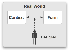
In a design culture that is not self-conscious, design happens as a direct interaction between form and ccontext, according to Alexander. Designers create form directly within a context, as Figure 2 shows.

Figure 2—Interaction of form and context
Interaction of form and context

An example is the traditional building methods of the Dayak people in Borneo. The Dayak’s traditional structure is the long house, whose form not only fits the context of the surrounding environment, but also of the culture. As building methods evolve, design patterns become established, then are imitated and, finally, corrected when misfits occur. Long houses are found along the rivers of Borneo, which flood on occasion. At some point, the Dayak started building their houses on stilts to avoid the rising water and corrected a misfit between form and context. This was a major change to the form that might have required rebuilding the structure—not practical. Most likely, the Dayak started off by putting smaller structures on stilts, then eventually grouped them to form longer, singular structures—creating a traditional design pattern. Either way, the unselfconscious design culture reacts directly to misfits by being adaptable and self-organizing. Interestingly, modern construction techniques have caused a misfit. The Dayak now build some cinder-block houses on the ground, losing an advantage of houses constructed on stilts—air circulation. This is an unfortunate change from tradition that directly compromises comfort.

The Internet is a blend of self-conscious and unselfconscious design culture; a domain of design and craftsmanship. The proliferation of sites on the Web has its roots in imitation and correction, but is sustained by innovation and modification. The range of different types of sites on the Web is immense—from personal Web sites and blogs that use standard patterns and visual templates to highly designed and innovative user experiences for applications. In one sense, context can dictate the need for innovation, but the use of existing patterns to create a Web site without regard to context is commonplace. After launch, the craftsman can easily correct the fit between the Web site and its context through simple manipulation of the code. The craftsmen of the Web are similar to the Dayak builders, in that they can react directly to misfits of form and context; there is no need for formal design.

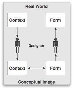
Interaction designers do not always have the luxury of directly creating form within its context. In our self-conscious design culture, we are always trying to define and solve new problems. The problems can be complex and have many variables. Context is equally complex, so designers should formally consider its implications. In most cases, the constraints of producing and distributing digital products have removed designers from context. In such cases, designers can create their own conceptual images of contexts based solely on their intuition. Figure 3 depicts design in a self-conscious design culture, in which designers do not directly manipulate form within context.

Figure 3—Design in a self-conscious design culture
Design in a self-conscious design culture

However, Alexander tells us this is less than ideal, because it can be an unreliable method. As part of the self-conscious design process, the designer needs to create an accurate model of the context that becomes the basis for identifying fit and misfit between form and context.

The identification of a misfit between form and context typically instigates the exploration of a design problem. Traditionally, interaction design concerns fit—creating an interaction based on a user’s mental model. Interaction designers also need to consider misfits. Indi Young’s alignment diagram is the perfect tool for determining misfits between form and context. Designers can translate fits and misfits into requirements—small details that help define form. According to Alexander, a formal design process helps designers to organize these details into a coherent structure.

Bill Buxton suggests that designers also use process to elaborate upon, then reduce the number of design options through exploration and decision-making. Design is an iterative process that is best done using pen and paper—by sketching. Designers can engage in trial-and-error design without the cost and time of a product’s full production. Buxton tells us sketches are disposable, timely, and plentiful, but suggest fitness rather than confirm it.

The best way to gauge the fitness of a particular form is to test it within its context. In an unselfconscious design culture, form is a dynamic prototype, an operative image that is constantly changing and reacting to context. Designers need to create dynamic prototypes, at varying levels of fidelity, to test for fitness. This requires further iterations beyond sketches.

The goal of a self-conscious design culture is not only to solve new problems, but also to mimic the unselfconscious design process. For interaction designers, design should become an adaptable and self-organizing process that reacts easily to misfits in context, without the need to directly manipulate form within its actual context. Their design methods are tools that let them model context, identify fit and misfit, and test dynamic prototypes against the context of a design situation.

Reflections

“Design is everything. Everything!”—Paul Rand

“In the beginner’s mind, there are many possibilities;  in the expert’s mind, there are few.”—Shunryu Suzuki

This article is not meant to be prescriptive, but reflective. Questioning is an integral part of design. It is the essence of the beginner’s mind—an important quality of a designer. Design is all around us. We see it in the products we use, the cars we drive, and the homes we live in. As interaction designers, we can borrow from other disciplines, but we should also be reflective and wander down our own paths.

Interaction designers must develop their own mode of design thinking and establish their place in the design milieu. The common thread that holds the discipline of interaction design together is the desire to create effortless and meaningful interactions between people and their digital products. But we must look beyond the description of patterns and truly define our own design language—a language of behavior. Through exploring the premise of interaction design’s form, we are possibly one step closer to this goal.

Design is crucial to the creation of form. It lets us create new forms that fit within their context of use. Though self-conscious design is not always necessary, it is a path to success in creating form that is complex and multi-layered. Interaction designers need to embrace the magic—by realizing that design is rooted deep beneath the aesthetic surface and provides a process that reacts easily to misfits in context. As Dan Saffer said, “Interaction designers are designers, for good or ill.” 

Bibliography

Alexander, Christopher. Notes on the Synthesis of Form. Cambridge, MA: Harvard University Press, 1964.

Blood Purity (Harry Potter).” Wikipedia. Retrieved July 7, 2007.

Burgos, Nate, ed. Thought Leadership by Design. Nate Burgos, 2007. Available online.

Buxton, Bill. Sketching User Experience. San Francisco: Morgan Kaufmann, 2007.

Hannah, Gail Greet. Elements of Design. New York: Princeton Architectural Press, 2002.

Heller, David. “Aesthetics and Interaction Design: Some Preliminary Thoughts.” Interactions 12:5 (September-October 2005): 48-50.

Lowgren, Jonas, and Erik Stolterman. Thoughtful Interaction Design. Cambridge, MA: The MIT Press, 2004.

Moggridge, Bill. Designing Interactions. Cambridge, MA: The MIT Press, 2007.

Muggle.” Wikipedia. Retrieved July 7, 2007.

Saffer, Dan. Design for Interaction. Berkeley, CA: New Riders, 2007.

Sternberg, Robert J. Cognitive Psychology. Belmont, CA: Thomson Wadsworth, 2006.

Suzuki, Shunryu. Zen Mind, Beginners Mind. New York: Weatherhill, 2000.

Product Manager, IDEXX Neo, at IDEXX

Portland, Maine, USA

Kevin SilverKevin is an empathetic champion of users and a strong proponent of user-centered design. He strives to design digital products that are simple, elegant, and easy to use. Involved in desktop application design and development since 1995, he started tinkering with HTML in the late 90s—just in time for the flurry of growth on the Web before the big .com bust. Kevin has worked on a diverse range of projects, including designing applications for Indian Health Services (a federal agency), Envision Utility Software, University of New Mexico, Anchor Computer, the United States Air Force, and Web sites for Norwegian Cruise Lines, Dr. Martens, Buck Knives, Museum of the African Diaspora, and Adobe, to name a few. One thing Kevin has learned through all of these engagements is that satisfying the needs and goals of users is central to a successful experience. He is a member of IXDA, IAI, and ASIS&T and has presented at the IA Summit.  Read More

Other Articles on Interaction Design

New on UXmatters