This is a sample chapter from the new book There’s Not an App for That: Mobile User Experience Design for Life, by Simon Robinson, Gary Marsden, and Matt Jones. 2015 Morgan Kaufmann.
Chapter 7: Problem 2: From Heads Down to Face On
What’s the Problem?
Most apps today require us to look down at the screen. This can lead to what’s been called a stop-start form of living: we are drawn away from the action around us to complete a task on our phones. Breaking our flow is one thing; perhaps a bigger issue is that we are missing opportunities to use our devices to enhance our experience of the people and places around us.
Champion Advertisement
Continue Reading…
Why Should You Tackle It?
In the next sections we’ll encourage you to think about the benefits of lifting up your users’ eyes to look around them, to confront the world rather than retreat from it. There’s a “utility” and an “innovation” reason to introduce this new thinking:
You can keep your users in the flow of what they are doing if they don’t have to stop or even pause to look down at their device.
By getting your users to see the richness of the physical world around them as a toolkit for their digital interactions—a resource to create and share content as well as control services—you can weave physical and digital interactions together. It’s not about augmenting reality or mixed reality, it’s about making a coherent, immersive, singular reality.
Key Points
Heads down is the default interaction style for mobiles. Users stare down at the screen while prodding and swiping.
We are information omnivores and we are driven to consume and create content. It’s not surprising then that heads-down screen time is popular—the screen offers a rich visual display that can communicate a great deal of content, quickly and pleasingly.
Think instead of what face-on interactions could offer your users. Face on is about giving your users more of a chance to maintain eye contact with the world around them.
Introduction
The time we spend interacting with our mobiles mostly involves heads down, necks bent in dereference, screen enraptured. While many tech researchers have persuasively argued for heads-up alternatives, and lots of prototypes have been created, heads down is still the norm.
For our second design disruption, we will look at how heads-down interactions might be diminishing user experiences, and where not just heads-up, but face-on designs might be better. We will explore why it is difficult to design effective face-on interactions, highlighting a number of prototype attempts. Importantly, though, we’ll see why it is worth the effort, and how such a design standpoint could improve future user experiences.
What Is “Heads Down”?
Think about your usual posture when you are using your mobile phone. What’s your body language like while you interact? Do you feel open and expressive, or are you more likely to be closed and withdrawn, looking down and completely focused on its screen?
Then consider the number of times you turn to your mobile to check email, send a tweet, or read the sports reports. In 2012, Lookout’s Mobile Mindset Study sampled over 2,000 US adults, and found that 60% couldn’t last an hour without checking their phones. Over 30% checked phones during meals with friends, or more dangerous situations, such as while driving.
“Sometimes people signal their departure by putting a phone to their ear, but it often happens in more subtle ways—there may be a glance down at a mobile device during dinner or a meeting”—Sherry Turkle
Decades ago, TV shows and films like Star Trek, James Bond, and Doctor Who imagined a future full of fantastic gadgets—things you pointed with, manipulated, and felt reactions from. Devices that really were magical, despite some unusual uses such as killing Klingons. These devices helped fictional heroes probe, scan, and alter physical environments while tackling head-on the devious aliens and other monsters.
Meanwhile, the mobiles most of us carry tend to teleport us away from things right in front of our faces. Tapping on a map for directions while in the middle of a beautiful park just doesn’t feel quite the same as looking around, asking for directions, or simply following your instincts to see where to go. Looking down at a device to scan restaurant reviews while in a busy tourist spot is so different to physically exploring the possibilities even with all the awkwardness and human interaction this might involve: dodging over-keen waiters luring you in, peering into a busy restaurant to see if there’s a quiet table somewhere inside.
So, “heads down” breaks the link between the user and the people and places physically present. There’s something special about seeing things with your own eyes, and about touching things with your own hands. Consider pioneering explorers—the burning human desire to reach unexplored jungles, the summit of Everest, or the surface of the Moon—in person. Director and deep-sea explorer James Cameron, on his recent journey to the deepest point in the ocean in a submarine packed full of display screens and digital technologies insisted that there was a window to see the view. He puts it bluntly: “There is no way I’m coming down here to the deepest point in the ocean and not seeing it with my own eyes.”
Built for Better?
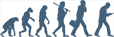
Evolution theory tells us that over many millennia, humankind has emerged from the swamp, our species adapting to ever expand the abilities to perceive and manipulate the environment. From slithering over the ground, we crouched, then stood tall to take the world in. From the postures we developed, to the Y vision cells spread around our retinas to acutely respond to peripheral motion, we are “face on” creatures.
While we are making the case for a return to the physical as a reference point for design, there are many people who disagree. They argue that we are in a transition period between physical groundedness and digital primacy. That is, until now, humans have thrived through physical connectedness; in the future we’ll become more and more digital beings (for the extreme outcome, think The Matrix).
Will humankind evolve further over time to retreat from the physical and embrace the digital? Or, do we designers need to rethink the tools we are developing?
How Did This Happen?
We are voracious consumers of information, constantly craving new content. We are also highly social animals, wanting to know more about each other. The way these reflexes have played out in the digital era of course is a huge collective effort to index, map, and share all our experiences. Over the past two decades we’ve jumped at the chance to be able to absorb so much more of what’s happening around us into our own already busy lives. As Microsoft Research’s Richard Harper explains, in his book Texture, we complain about being busy or overloaded, but we’re constantly looking for more ways to engage and expand our web of connections: “we seem to delight in the experiences that new channels of communication afford.”
The physical world and the people actually around us may be absorbing and fascinating, but there’s a near-unlimited sea of possibilities if we use our mobiles to connect. It’s easy to see, then, how so many of us give in to the temptation to look down eventually, and after that it’s hard to return to the less alluring local surroundings. Somewhat ironically for a device we still call a phone, its most heads-up basic feature—phone calling—is actually dwindling in usage, particularly amongst younger people. Other tasks have taken over, and these require more of our focus.
We look down at a screen because it allows us to absorb large quantities of information. Compared to other modalities such as audio or vibration, visual displays easily win in pure bandwidth (see the Screens are effective box for an example). Then there’s the way a mobile’s home screen can display many app notifications—new messages, status updates, breaking news, weather reports—all as eye-catching teasers. And once you’ve looked, it’s tempting to dive in and drop out. Clearly, there’s also the fact that websites, images, and videos just don’t work well in any other modality. For all these reasons, it is a challenge to encourage designers to think about alternative approaches.
Screens Are Effective
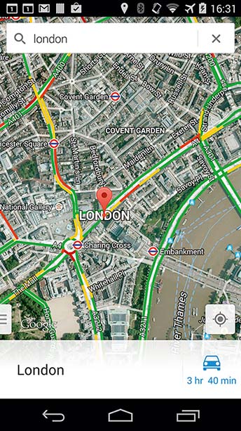
Try this exercise. Look at the mobile map below and summarize it verbally to someone standing next to you. Try to do this within 10 seconds.
Afterwards, show the screen to the person. What strategy did you take in your description? What did you miss? How did the visual display beat the verbal description? How did the verbal description beat the visual? Imagine building an app that verbalizes local descriptions: what would it be like?
For people with impaired vision, screen readers can help provide access. Looking into research that has been carried out to improve these services is an interesting starting point when thinking about how to present the richness of a visual display without a screen.
As an aside, take a look at the top of the display, too. There are five visible notifications (and often more in an overflow panel), each tempting the user to spend longer on the screen, to check calendar notifications, emails, and app updates. Things like these can encourage us to remain in the screen, even if we weren’t planning to originally. A better way might be to only give notifications in this manner for key events, grouping lower-priority emails and updates into a single push when the user has already been using the device for some time.
Face On
The “face on” design principle is about thinking how to create mobile devices, services, and apps that increase the chances people have to take in the people and places around them. A first simple step is to consider alternatives to screen-based interactions, reducing the look-down distractions involved in conventional everyday app use.
We Are Not as Aware as We Think We Are
Christopher Chabris and Daniel Simons devised a simple selective attention test that has since become famous for its straightforward but effective demonstration of attention blindness. If you haven’t seen the video (or, if you have, its sequel) it’s well worth watching it before you read the rest of this box.
The video starts with a group of six basketball players, three wearing white and three wearing black, passing two basketballs between them. At the start of the video the viewer is instructed to count how many passes the players wearing white make to each other. At the end of the video, the answer is revealed.
The task is quite simple, so you probably counted correctly. However, there’s also an unusual event that you probably missed—midway through the play, another person, dressed as a gorilla, wanders across the screen, right through the middle of the players. In tests, around half of the people who watched the video didn’t see the gorilla, despite it wandering in plain sight and even dancing for the camera.
After watching the video, think about the number of times you’ve experienced this sort of situation in the street, or in a restaurant—missing things until they’re strikingly obvious—while focused on your phone.
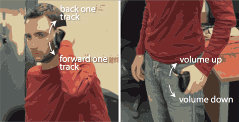
An interesting example of how to replace a visual interface that has multiple layers of on-screen menu frustration has been provided in BodySpace, by Steven Strachan and colleagues, who used sensors in the device to determine the mobile’s position relative to a user’s body. This information was then used to access particular features of the application such as volume control. Further gestures with the device allowed the user to change settings, access content, and so on (see Figure 7.1). For example, a flick of the wrist at waist level increases or decreases volume; next to the ear the same gesture changes tracks.
Figure 7.1— BodySpace aims to reduce on-screen menu frustration by using areas around the body to control the phone’s functions.
Using this method of interaction means that there is no need to look at the screen for quick tasks that a user frequently performs. While perhaps not suitable for long and involved tasks, for short, recurring interactions, this method can be used to lessen the amount of attention that needs to be paid to the device.
Design Challenge
When you read about research prototypes in this book, as well as using them as potential blueprints for your own work, challenge yourself to think of alternative or additional approaches.
So, taking BodySpace, at first glance, while making the point that gestures can be used to navigate menus and content, the approach seems, perhaps, overcomplicated. Today, we have volume rocker switches on the sides of our devices, and headsets with small controllers that can pause, skip, or replay tracks, without the need to take the phone out of our pockets.
But if we take the broader insight of BodySpace—using the user’s body and how they gesture around it as a navigation tool—how could we go beyond these buttons to have a more fluid, simpler, interaction?
Maybe you’ve struggled to hit the right button on your headset wire toggle to take a call while listening to music? What if by simply grasping the toggle and moving upwards towards your ear the call is connected, but if you pull down, towards your pocket, the music keeps playing and the call is rejected? Or, when you do want to do something more complicated, like change a playlist, instead of having to fire up the app, look at the screen, scroll, and select, why not use different locations around your body as ways of jumping straight to the songs you want? Favorites next to your heart, upbeat running music on your thigh…
The BodySpace research prototype was created and evaluated long before accelerometers, magnetometers, and the like became commonplace in everyday mobile devices. Now, though, most smartphones have these and more sensors. Developers have used such features in lots of interesting ways: think of how you can shake your phone to undo a typing error, or how tilting the mobile during a gaming app can control a race car or a ball in a maze. There’s currently little use of the techniques for off-screen interaction, though. One reason for this is that gestures can be difficult to learn, and hard to understand without feedback.
As developers we might be put off from using these more innovative techniques because we are tied into a “keep it simple” or “ease of use” mindset that measures success in the very short term. That is, we worry about interfaces that are not mastered immediately. However, there are many exhilarating, impressive skills that our users develop with longer, fulfilling periods of practice (playing a musical instrument, crafts, reading, or sports to name but a few).
Design Pointer
To help users develop into beyond-the-visual virtuosos, you can introduce a gestural technique when they are looking at the screen, providing visual feedback to help them as they practice it, then allow themselves to wean off the screen as they become masters of the gesture. So, think back to the BodySpace example. As the user takes the device out of their pocket the range of gestures could be displayed on the screen with the one the system thinks the user is performing becoming more visually prominent as the device is moved: move the mobile up towards your heart and the favorites icon might get brighter and bigger, for example.
Helping people remain aware of the world around them is just the first step in achieving “face on” interactions, though. A grander challenge is thinking of ways to weave mobile interaction into physical experiences, enhancing or altering a person’s experience of a place as they engage with it (see the Enlivening interactions box below for an example).
Enlivening Interactions
Zombies, Run! (and its sequels) is a highly popular app that cleverly adds to a runner’s experience. As they jog round their daily routes, listening to their music soundtrack, they are led to imagine themselves as a hero of a post-apocalyptic world, devastated by a zombie attack.
The app adds in radio reports and challenges them to complete missions, with disturbing zombie grunts emerging through the sounds: slow down too much and the zombies catch up, and it is all over for the runner. Look at app store reviews and it is clear that many people have found the approach compelling, changing the way they see physical exercise and the routes they take.
While the runners do play the game by using their movements, there’s room for further integrating the digital and physical interactions. For example, one reviewer noted that when they had to stop at traffic lights at a busy intersection, the zombies caught up and the game was over! Runners’ actions are mapped to a digital world that they have to view on-screen. Making the actual run route the stage for the gameplay would be very challenging, of course, but would dramatically deliver “face on” play.
So What’s to Be Done?
For people without visual impairment, a screen is a compelling canvas for foraging for information; this keeps our users’ heads down. How can we lift up people’s eyes and still provide them with the connectivity and content they crave? Some possibilities are:
Heads-up displays—either visual or conversational speech interfaces.
Displays and devices that you only need to look at briefly or when there’s something important.
Designing for an ecology of devices, encouraging the user not to feel they have to do everything all the time on their mobile.
Seeing the mobile as a pointer or wand to connect to the world around your users.
In the next two chapters we’ll take this range of responses to consider two contrasting Opportunities for design:
In your face technology
In the world approaches
Discount for UXmatters Readers—Buy There’s Not an App for That and other Morgan Kaufmann titles from the Elsevier store online, using the discount code PBTY15, through December 31, 2015, and save 25% off the retail price.
Resources
Lookout’s Mobile Mindset study can be found at [1]. Richard Harper’s book on the future of communications is a compelling discussion on the effect of communications on our lives [2]. For an interesting article about how mobile phones are no longer mainly used for phone calls, see [3]. James Cameron’s comments about the need for windows as well as screens are in an in-depth National Geographic feature article [4].
The BodySpace system illustrated in Figure 7.1 was developed by Steven Strachan and colleagues—the paper describing the approach can be found at [5]. Christopher Chabris and Daniel Simons’ selective attention test was published in [6], and the video used for the experiment can be found at [7]. The game Zombies, Run! can be found at [8].
This article poses many problems and very few solutions. I would almost argue no solutions.
Gestures are an already implemented function fro many apps, but gestural controls do not solve visual communication issues. One could argue that all of the proposed gestural controls in the Body Space example are already accounted for via headset controls, tactile buttons on devices, and gesture controls.
Encouraging designers to find ways for users to use their devices less is not a solution. Driving your car less does not make your car more efficient, and it definitely doesn’t solve any transportation issues.
Head-up displays are a challenge. You are correct. If they weren’t challenging, they would be implemented more. But, so far, our devices are limited by their hardware and physics. I would love to hear more of your thoughts on this.
How does using a phone as a wand or pointer solve the issue of a user receiving information from their device?
None of your solutions solve your proposed problem; they just suggest not using devices, which negates our purpose as UX designers and nullifies our products. Maybe your book goes on to suggest more solutions in depth, but in this article, there has been no confidence instilled in me that I will receive any information of value other than: “If users engage with a device they don’t engage with the world around them.”
Thanks for the comments, Andrew. This chapter is about the problems, not the solutions. For each problem, we then have chapters about the opportunities for doing better now and in the future.
We’re very clear in the book that we want people to use mobiles, wearables, and the like and provide ways to do this that also allow them to engage with the world around them.
Your comments about BodySpace are spot on—we take the same view in the box just below the images in the article.
Former Professor of Computer Science, University of Cape Town
Cape Town, South Africa
Gary was an educator, pioneer, and community builder and a passionate advocate of human-computer interaction (HCI) for development. He is known internationally for his work in mobile interface design and Information and Communications Technologies for Development (ICT4D)—for which he was a recipient of the ACM SIGCHI’s Social Impact Award in 2007. Gary died suddenly of a heart attack on December 27, 2013. He is survived by his wife Gil and his two children, Holly and Jake. Read More
Research Officer at Future Interaction Technology Lab, Swansea University
Swansea, Wales, UK
Simon’s research work for the Future Interaction Technology Lab has so far focused on mobile technologies that allow people to immerse themselves in the places, people, and events around them—rather than focusing just on their mobile devices. Simon is an avid rock climber and loves the fact that climbing doesn’t need a touch screen to make you feel full of life. Read More
Professor and Head of Department, Computer Science, at Swansea University
Swansea, Wales, UK
Matt’s research work focuses on human-centered computing, with a particular emphasis on mobile and ubiquitous computing for resource-constrained communities in regions such as India and South Africa. In his spare time, he tries to live life face on with his energetic family and enjoys nothing more than an exhilarating, early-morning, cycle ride to the glorious beaches of the Gower. Read More
 Most apps today require us to look down at the screen. This can lead to what’s been called a stop-start form of living: we are drawn away from the action around us to complete a task on our phones. Breaking our flow is one thing; perhaps a bigger issue is that we are missing opportunities to use our devices to enhance our experience of the people and places around us.