Top

The Web and Beyond: SIGCHI Conference in Amsterdam

October 23, 2006

The Netherlands’ tenth annual SIGCHI Conference took place on Thursday, June 8th, 2006, in Amsterdam. Titled The Web and Beyond, the conference focused primarily on interaction design for Web 2.0. The conference drew a capacity crowd to the fabulous art deco Theater Tuschinski. There could be no more beautiful venue for a design conference.

Champion Advertisement
Continue Reading…
Figure 1—Theater Tuschinski
Theater Tuschinski

I arrived at the Theater Tuschinski in Amsterdam to find two long queues, each extending down the sidewalk on either side of the entrance. Unfortunately, unbeknownst to many people in line, each queue was for people whose names began with specific letters of the alphabet, so many people found themselves in the wrong queue. The registration desk was also initially understaffed, so we were concerned that we might not get inside the theater before the conference began. However, the organizers recruited more people to staff the registration desk and the queues began moving much more quickly, so we got in on time. Other than this little usability glitch with the queues and a problem with the presentation software during the introduction, the rest of the day went by without a hitch.

The morning comprised two keynote addresses. They were presented in the main theater, shown in Figures 2 and 3, which accommodated the entire crowd. After lunch, the conference broke into three tracks, one in English; the rest in Dutch. At the end of the day, the crowd again gathered in the main theater for the final keynote address and a panel discussion. The keynotes and other presentations in English were all given in the main theater, so that is where I remained for most of the day.

Figure 2—Interior of Theater Tuschinski
Interior of Theater Tuschinski

In Amsterdam, almost everyone speaks English, so everyone in the audience was able to fully appreciate the presentations that people gave in English. Since I don’t speak Dutch, this conference format worked really well for me. It was great to experience the Dutch UX community and, at the same time, enjoy a high-quality conference where there was plenty of good content I could follow. The crowd at this conference had a strong sense of camaraderie and energy that is similar to that of the IA Summit. I highly recommend this conference to anyone whose primary language in English, as well as to those who speak Dutch.

Figure 3—Proscenium arch of Theater Tuschinski
Proscenium arch of Theater Tuschinski

Each attendee received a nice, slim nylon briefcase—branded with the cool The Web and Beyond logo and containing a thick notepad and a list of attendees. The organizers provided refreshments at coffee breaks and served a light lunch. During the breaks, one could check out the posters, visit the exhibitors’ booths, or mingle with the crowd in the lobby, shown in Figure 4.
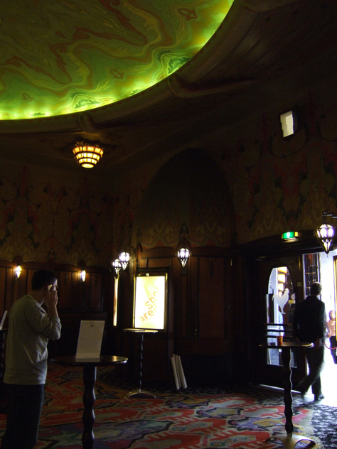
Figure 4—Theater Tuschinski lobby
Theater Tuschinski lobby

The Brave New World: Usability Challenges of Web 2.0

Keynote Speaker: Jared Spool

After breaking the ice with his iPod® versus SanDisk® survey, Jared Spool remarked, “Almost everybody knows someone who owns or owns an iPod. Apple has turned the iPod into a fashion statement.” The iPod is a huge success story, as is Netflix. “Eighty-five percent of new subscribers recommend Netflix to a friend. Ninety-three percent of subscribers evangelize Netflix. They did that by creating an experience,” said Jared. “Experience design is the business we’re in. We’re creating experiences. We’re in the age of experience design. Experience design differentiates iPod/iTunes® and Netflix from competitors. Experience design has become a boardroom conversation, but are we ready for this? Do we know what to do?”

Shown in Figure 5, Jared told us that, in the beginning, “It didn’t matter whether technology was usable. After technology, you start thinking about features. Eventually, you have so many features, it’s impossible to find what you want. When you deliver a good experience, you can pretty much cut out everything else.”
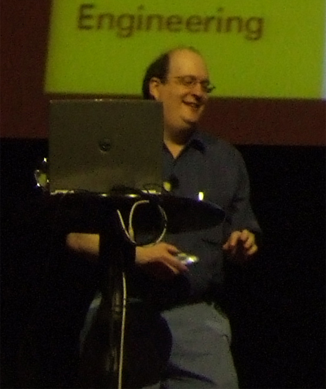
Figure 5—Jared Spool
Jared Spool

“Web 2.0 is the generation of Web sites designed around experiences,” said Jared. “They’re about creating meaningful experiences for users. Small pieces, loosely joined that share common design attributes—APIs (Application Programming Interfaces), mashups, RSS, folksonomies, social networks. These sites have less functionality. Flickr™ has all of the elements we expect to see in a Web 2.0 site. Flickr lets you paste a snippet of code into a site to display a slide show. Tagging is a very important part of Flickr. Tagging allows you to see what other people are saying about things. It’s a social network. You can stalk your friends’ lives.”

Jared listed the following Web 2.0 usability challenges:

  • “APIs make everyone a designer.
  • RSS has no defined experience.
  • Folksonomies are made from chaos.
  • Social networking involves multiple people.
  • The long tail introduces new challenges.
  • Keeping the focus on the experience.”

Jared asked, “Now that we’ve got the boardroom’s attention, do we really know what it takes to create a user experience?”

Distracted by the beauty of the Theater Tuschinski, Jared interrupted his talk to say, “This is the prettiest place I’ve ever given a presentation.”

About tagging, Jared exclaimed, “You have users basically creating the taxonomies for these sites, without any understanding about what it’s supposed to be doing. Are you tagging things for yourself or other people? How do we know when to use folksonomies versus traditional taxonomies? How do we build moderated folksonomies? Netflix Friends™—their social networking capability—is a tremendously popular feature. How do you create evaluation protocols for social networking applications? Do we understand all the dynamics of social interactions? How do we build them to deal with gaming and spam?”

According to Jared, Amazon is about the long tail, as shown in Figure 6. “Fifty-seven percent of their revenues come from books you can’t buy in a bookstore.” On the other hand, “Ninety-eight percent of users view just two percent of the content on Microsoft.com. There is a whole building of people who write the content nobody sees.”
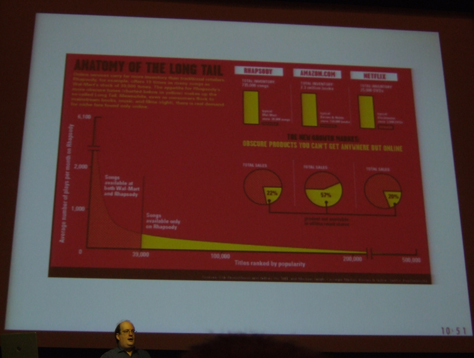
Figure 6—The long tail
The long tail

“When we’re designing for experience, we need to look at all things that affect the experience. Even stuff lawyers write. If we can’t meet those demands, they’ll find people who can,” said Jared. “One of the nice things about this Web 2.0 world we’re living in,” if you design something well, “people will copy it.”

Jared confessed, “I haven’t decided yet whether tags are really valuable, or they’re the chia pets of interface design. I’m wondering whether tagging is basically the same sort of thing, or if it will grow into something useful. It’ll have to have some sort of moderation.”

Jared’s bemused style is engaging, and his talks are always informative.
The Frontiers of User Experience

Keynote Speaker: Jesse James Garrett

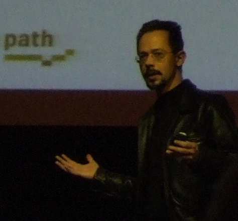
Jesse James Garrett, shown in Figure 7, introduced his topic by saying, “Things weve been doing since the beginning of the Web are starting to appear broken.” He said, “The frontiers of the world of user experience are user research, information architecture, and interaction design.”

Figure 7—Jesse James Garrett
Jesse James Garrett

About user research, Jesse said, “We can’t create effective user experiences for people if we don’t understand who they are. We have to do user research. We had the triumph of usability as a concept, but people are starting to recognize the limitations of usability testing. Regarding “field research—watching people in their own environments, interacting with our products”—Jesse told us, “The context really in large part determines the experience users are going to have. There’s a class of problems that can really be addressed only in field research. Executives can relate to it. There’s something about seeing the real environment. We show the context through highlights videos and photos.”

According to Jesse, information architecture (IA) presents “the challenge of seeing something from someone else’s point of view. The problem with information architecture is that we just don’t know how people talk about things or conceptualize certain things. What tagging represents is an admission of defeat. We’ll outsource the IA to users. Tag clouds have emerged as a popular navigation device. One of the big things that have contributed to the success of tagging is that you don’t have to choose that one perfect place for content. Tagging relies on the good intentions of users of the system.” He described destructive behaviors such as “tagbombing,” in which people deliberately apply tags wrongly.

“Interaction design is finally coming into its own on the Web,” said Jesse, “because we have new approaches on the Web. We’ve historically been limited in the options we have.” The traditional Web “assumes a document retrieval model. This is implicit in the way the Web works. But we can do all kinds of things on the Web.” The waiting inherent in the “request/response model has been a great source of frustration for users.” Ajax offers “dynamic display and interaction” and “allows page elements to be addressed independently. It’s like roller skates for the Web. Even desktop applications have been constrained by standards developed twenty years ago. Why is this the Ajax moment? The end of the browser wars has provided a stable landscape. In the early days of the Web, it was considered a risky choice to use scripting. We create technologies faster than we can understand them—how to use these things most effectively to create user experiences.”

“Google email and maps have opened people’s eyes to what you can do with Web applications. We thought these were problems we’d already solved. There was a lot more room for innovation. After Gmail came out, Yahoo! looked at their vulnerabilities. Google did this with no compromises. To be successful, design and technology have to collaborate more effectively than ever before. Designers have to understand the limitations of technology; developers, the limits of design.”

Jesse aptly described the challenges and opportunities of Web 2.0.

AJAX, RIA, SPI: The Impact of New Technologies on User Experience

Panelists: Yohan Creemers, Onno Bakker, and Joost Willemsen

The theme of the first session of the afternoon in English was “Technology.” Yohan Creemers spoke about the characteristics of RIAs (Rich Internet Applications): interaction, feed forward, and multimedia. He told us, “The challenges aren’t technical, they’re design issues.”

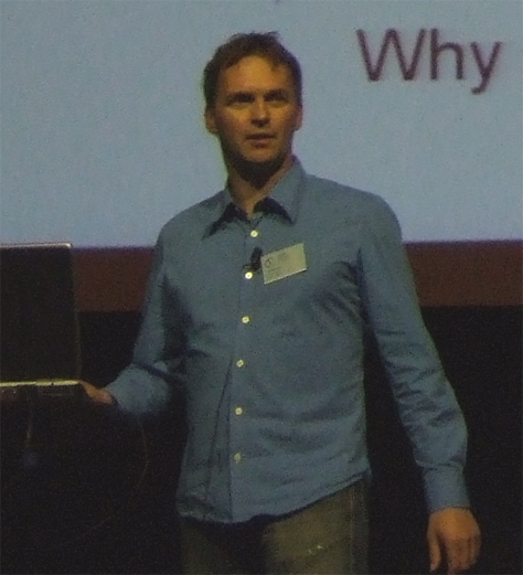
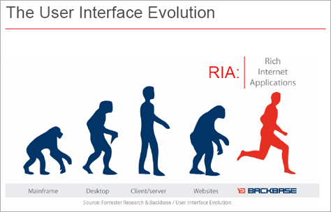
Next Joost Willemsen, shown in Figure 8, discussed “improving user flows with SPIs” (Single-Page Interfaces), which are characteristic of RIAs and are better for complex, non-linear user flows. As shown in Figure 9, RIAs have highly evolved user interfaces. Showing an example of an online travel booking application, Joost demonstrated the differences between multipage user flows and SPIs. Shopping online involves “looking for the best combination of price and expected experience.” Unless customers know exactly what they want, the shopping process is not linear. It involves a lot of clicking back and forth and waiting for pages to load. Customers tend to lose sight of the big picture and have difficulty comparing options. SPIs let users search, modify searches, compare selected search results, try different options, and make purchases. SPIs provide an immersive user experience. Users view only the content they need. There is no penalty for their not knowing what they want.

Figure 8—Joost Willemsen
Joost Willemsen

Joost said, “It isn’t really new. It’s pretty much the desktop application way of interacting. People get accustomed to this way of interacting very soon. We’ve chosen to stay quite close to the Windows® model.”

Figure 9—The evolution of user interfaces
The evolution of user interfaces

Finally, Onno Bakker told us about the evolution of an instant messaging application from a WAP (Wireless Application Protocol) mobile Web application to a conventional Web application to a Web application implemented with some JavaScript to an RIA. The Ajax version of the Web application supports drag and drop and contextual menus.

The Next Generation of User Interface Patterns

Panelists: Martijn van Welie and Bill Scott

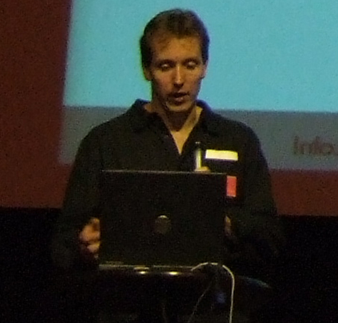
Figure 10 shows Peter Boersma introducing the next afternoon session, a “Design” themed panel on user interface patterns. Peter defined a user interface design pattern as “a general, repeatable solution to a commonly occurring problem.” He said, “A design pattern is not a finished design that can be transformed directly into code; it is a description of how to solve a problem that can be used in many different situations.” Examples of such solutions include login, shopping cart, and paging mechanisms.

Figure 10—Peter Boersma
Peter Boersma

Martijn van Welie, who appears in Figure 11, created www.welie.com as a repository for about 7100 interaction design patterns for Web sites, graphic user interfaces (GUIs), and mobile Web applications. He said, “Web 2.0 is much more dynamic. There are no more tedious page loads. Instead, there are in-page interactions and drag and drop within the browser. There is a tighter integration of data and tasks. Patterns are the hands-on bag of tricks you carry with you as an interaction designer. We’re actually going back to a kind of interaction we already know—drag and drop with animation. We need only interaction design patterns.”

Figure 11—Martijn van Welie
Martijn van Welie

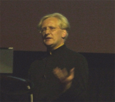
With a background in both technology and design, Bill Scott is Yahoo! Ajax Evangelist and Pattern Curator. Shown in Figure 12, Bill gave a presentation titled “Patterns and Beyond.” He told us, “What patterns are about is surfacing a vocabulary. There are now about 30 patterns in the Yahoo! Design Pattern Library,” which include APIs, code, and accessibility notes.

Figure 12—Bill Scott
Bill Scott

The patterns in the Yahoo! Design Pattern Library illustrate the following principles and themes:

  • immediacy—Live Suggest and Auto Complete
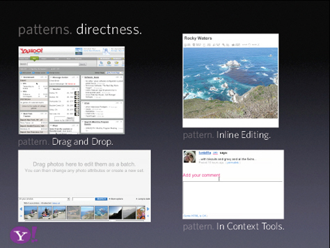
  • directness—Drag and Drop, Inline Editing, and In-Context Tools, as shown in Figure 13
  • invitational—Hover Invitation, Drop Invitation, and ToolTip Invitation + Hover Invitation
  • without boundaries—Endless Scrolling, In-Context Expand, Inline Assistant, Hover Details, and Lightweight Popup + Lightbox
  • light footprint—Remembered Collection, Rating an Object, and In-Page Action
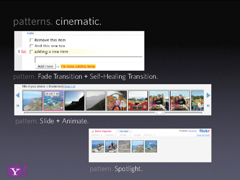
  • cinematic—Fade Transition + Self-Healing Transition, Slide + Animate, and Spotlight, as shown in Figure 14
  • rich content—Shareable Object
Figure 13—Directness
Directness
Figure 14—Cinematic
Cinematic

“A lot of the design community on the Web wasn’t exposed to what [desktop application designers] were. The Web space supported only limited interactions, but now we actually have more power than we had on the desktop. Patterns are great for education. The most important Web 2.0 pattern is inline editing. Auto-completion is very important, too.”

In the future, Bill sees designers creating pattern mashups, based on pattern APIs. Bill gave a compelling presentation of the excellent design work the Yahoo! Design Pattern Library embodies.

During the discussion that followed, Peter Boersma stated, “A design pattern is an attempt to standardize already-accepted best practices. A collection of patterns doesn’t make a pattern language.”

Web 4.0: Now’s the Time to Plan

Keynote Speaker: Steven Pemberton

Steven Pemberton’s presentation looked forward to Web 4.0. Here’s what he hopes the future holds:

  • semantics layered over viewable content
  • Web applications produced using declarative markup

Shown in Figure 15, Pemberton exclaimed, “Today, our computers are tremendously powerful. Why aren’t we using that extra power to make people’s lives easier? The diversity of devices and users is a good argument for accessibility. Google is a blind user, so if you want people to find your pages,” don’t put text in images. “Web 2.0 is built on facilities designed into the Web starting in 1995”—such as blogs, microformats, tags, Ajax, and Web 2.0.”

Figure 15—Steven Pemberton
Steven Pemberton

“When devising future technologies, generalize rather than particularize,” said Pemberton. He enumerated the following advantages of a declarative approach to programming:

  • accessible applications—“Because of the model-view-controller approach, it is just as easy to bind an accessible interface to the data as a purely visual one.”
  • device-independent applications—With “late binding to the data, you can bind device-dependent interfaces.”
  • reuse—Widgets are “available to all applications, and [aren't] hard-wired into an application.”
  • less code—It requires “much less coding, mainly because you don’t have to worry about all the fiddly administration [of] procedural programming.”

“In the long term, the browser will disappear. You’ll just think about the environment itself,” Pemberton predicted.

Panel Discussion: The Web and Beyond

Moderator: Jeroen van Erp

Panelists: Justien Marseille, Steven Pemberton, and Jared Spool

The day concluded with a panel discussion that program chair Jeroen van Erp moderated. Two of the keynote speakers participated in the discussion—Steven Pemberton and Jared Spool—and Justien Marseille took Jesse James Garrett’s place. Here are are a few highlights:

  • Steven Pemberton told us that surveys show users choose a Web site for the following reasons:
    • good content
    • usable user interfaces
    • quick downloads
    • fresh content
  • “Netflix users talk about movies—never the information architecture, social networking, or user interface,” said Jared Spool. “The interface becomes invisible. The interface has to be there, but you won’t notice it unless it breaks.”
  • Jared also said, “The Web is made of people. The wisdom of crowds is all people making things like recommendations and tags.”
  • Jared stated emphatically that “Much effort is wasted on home pages. Content pages are much more important.”
  • According to Jared, “Any test has bias, so you just have to account for it.”
  • “It’s essential that information be machine readable as well as human readable,” said Steven.
  • Jared declared that “Ninety-nine percent of everything is crap, including user comments.”
  • “A lot of Web sites are a real mess right now, if you’re not using one of the standard browsers,” said Steven. 

Photos by Pabini Gabriel-Petit and Theater Tuschinski

Principal Consultant at Strategic UX

Founder, Publisher, and Editor in Chief of UXmatters

Silicon Valley, California, USA

Pabini Gabriel-PetitWith more than 20 years working in User Experience at companies such as Google, Cisco, WebEx, Apple, and many startups, Pabini now provides UX strategy and design consulting services through her Silicon Valley company, Strategic UX. Her past UX leadership roles include Head of UX for Sales & Marketing IT at Intel, Senior Director of UX and Design at Apttus, Principal UX Architect at BMC Software, VP of User Experience at scanR, and Manager of User Experience at WebEx. Pabini has led UX strategy, design, and user research for Web, mobile, and desktop applications for consumers, small businesses, and enterprises, in diverse product domains. Working collaboratively with business executives, multidisciplinary product teams, and UX teams, she has envisioned and realized holistic UX design solutions for innovative, award-winning products that delighted users, achieved success in the marketplace, and delivered business value. As a UX leader, she has facilitated conceptual modeling and ideation sessions; written user stories; prioritized product and usability requirements; established corporate design frameworks, standards, and guidelines; and integrated lean UX activities into agile development processes. Pabini is a strategic thinker, and the diversity of her experience enables her to synthesize innovative solutions for challenging strategy and design problems. She is passionate about creating great user experiences that meet users’ needs and get business results. A thought leader in the UX community, Pabini was a Founding Director of the Interaction Design Association (IxDA).  Read More

Other Columns by Pabini Gabriel-Petit

Other Articles on Conference Reviews

New on UXmatters