Top

The UX Designer’s Place in the Ensemble: Directing the Vision

Dramatic Impact

Theater and the creative process of design

A column by Traci Lepore
December 1, 2008

I’m sitting in a conference room with a coworker and two clients. It’s chaotic, hot, and a challenge just to walk around without tripping on the mess surrounding us. We are in the midst of designing and are buried in paper and sharpies and flipcharts. The walls around us are covered with consolidated data from requirements gathering and flipchart pages we’ve filled with our thought processes. Every few minutes, we need to retape some piece of paper that’s in danger of falling into a crumpled heap on the floor. Then, suddenly, I’m gripped with the feeling of déjà vu. It seems like I’m working on the same design I’ve worked on a thousand times before—and I’m getting bogged down in the details to boot! It’s at once disheartening and terrifying. But I’m the lead on this project, so I need to drive the team forward—which presents a challenge at this particular moment.

In that moment, I realized I had to step back and take a new perspective on both my role and the goal of our design.

Champion Advertisement
Continue Reading…

Inspiration from an Unexpected Source

When I found myself trapped in déjà vu and needing a new perspective, I turned to theory I had learned in a directing class for inspiration—and ironically, direction. I realized I might gain insight on the lead role I was playing if I thought about how my role correlated to that of a theatrical director.

You may ask, What does directing have to do with creating a user interface design? Well, we know a director is responsible for the strategic vision of creative work. That’s a given. But, did you know he is also responsible for ensuring a successful outcome that both meets his vision and is in line with the producer’s desires and budget? To make that happen, a director works with the cast, crew, costume and set designers, and everyone else who contributes to a successful theatrical production to pull together a cohesive product, without losing site of his vision. It’s a complicated job. In this scenario, change director to UX lead, producer to business owner, and the rest to designers, developers, and technical writers. Is this starting to sound familiar? Though I’d found myself feeling lost, fortunately, I did find inspiration in the unlikely source of a directing class.

In my directing class, we had studied five different theorists—all with their own unique perspectives and ideas. While I absorbed all of this information in preparation for my own first directing experience—a scary story in itself, but one for another time—I found myself intrigued by how many of the concepts could translate to any creative process, not just theater.

Peter Brooks’s The Empty Space, in particular, stood out as an approach that could help define direction and purpose when doing any kind of creative work. His groundbreaking book describes the landscape of theater as he saw it in one moment in time. His categorization of the four types of productions he typically encountered—Deadly, Holy, Rough, and Immediate—slightly esoteric though it was—reinforced the need, first and foremost

  • to understand the ultimate aim for the experience or design you are creating
  • to continually go back to that goal if you start feeling like you are getting lost

Brooks also gives us a way to measure the success of our ultimate aim and think about a long-term strategy—if we take these things into consideration from the beginning. For me, these concepts were the lifeline I needed to pull myself out of the weeds and recenter my focus.

Sonia Moore’s book The Stanislavski System discusses what is popularly known as The Method and provides a practical guide to one of the most well-known methods for training actors. Her ideas also gave me practical points of reference for devising and implementing a design process. So, I started thinking about whether combining these two theorist’s ideas could help me formulate a solid approach to understanding how best to undertake a design project and control the direction a design takes as a creative product.

A Glimpse into the Empty Space: Delving into the Deadly

In describing his first category of theatrical production, Brooks talks about Shakespeare as a form of theater that easily lends itself to being what he calls Deadly Theatre, because people’s expectations and assumptions about what Shakespeare is have become rote and bound in tradition. We have certain expectations and preconceived notions of what the Shakespeare experience will be. When a production meets those expectations, it is considered good or perhaps even extremely successful. The problem is: It can also be a complete bore.

Most of us have had the experience of watching some tired production of Hamlet or A Midsummer Night’s Dream, haven’t we? If the director approaches the work without a fresh perspective and asks nothing more of the actors than the same old interpretation, such a production threatens to become a thing without life or energy—thus, it is, in fact, dead. Similarly, if we let our user interface (UI) designs fall into the same old patterns again and again, we do not fulfill one of our most important goals as designers—to create a user experience that is engaging.

Sadly, I think some aspects of UI design—and designers themselves—have fallen into the trap of taking for granted things we do by tradition, or just because it’s the way something is done. I ask you to think of some major, successful corporate or business Web sites. Is there anything that comes to mind about their design and layout that has become too much a matter of common practice—and thus, often thought about very little during the design process? How about the standard header for a Web site or application, with its predictable logo, auxiliary links, simple search, and branding like the headers Figure 1 shows?
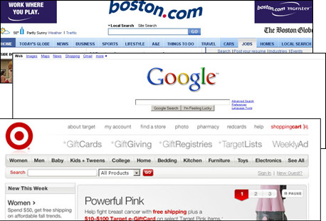
Figure 1—Standard headers threaten to make a design deadly
Standard headers

I worry that we are too tied to the traditional ways of presenting such standard features and, therefore, don’t stop to think whether there is something else we might do. If we are to avoid falling into the trap of creating deadly designs, we must approach every aspect of a design with a fresh eye and never simply accept a common approach as a foregone conclusion, before we’ve even begun to consider the right design for a particular situation. If you find yourself thinking you don’t need to design some part of a user interface, because it is always done a certain way, a red flag should go off in your head. It should tell you to stop and think about why the standard is a standard and whether its intents and purposes truly suit yours in a given instance. It may be that the standard is suitable—in which case, you have no reason to look further—but perhaps it isn’t. By understanding your personal choices rather than simply making the choices of the crowd, you can avoid the pitfalls of deadly design.

Achieving the Holy Grail

Brooks describes the experience of Holy Theatre—a much tougher form of theater to achieve—as one in which people “have seen the face of the invisible through an experience on the stage that transcended their own experiences.” Put simply—the invisible made visible. According to Brooks, Holy Theatre is a celebration of ritual that lets us connect at our own level, in a real way, with the higher aims of life—those higher aims being the invisible. For Brooks, Holy Theatre requires clear, direct two-way communication—between the audience and the actors.

To understand how art of any kind, but theater in particular, can communicate on this level, Brooks and his colleagues grounded their work in the ideas of Antoin Artaud, who touted gesture as a language that transcends verbal communication. They tried to understand the smallest behavior an actor could use to communicate what state he was in. Was it gesture, movement, rhythm, sound? Looking beyond written language gets more to the core of the experience—something UX professionals should care deeply about. What is Holy is clean, clear, and simple and communicates in a direct and engaging manner.

With their breakthrough products like the iPod and iPhone, shown in Figure 2, Apple has succeeded in achieving what many would call Holy Design. Apple is clearly aware of the fundamental requirements of Holy Design—clean, clear, and simple. Apple also understands that, for an experience to be Holy, it must be unique and innovative. Apple reinvents their products’ user experiences—though, like all of us, they use others’ designs as fodder for their design concepts—and drive their success by offering the next revolutionary idea.

Figure 2—Apple’s innovative products attain Holy Design
Apple's innovative products

Setting your aim on Holy Design means making a commitment to think things through anew on a continual basis—a major undertaking that potentially represents a serious organizational change. To successfully achieve Holy Design, not only do you need to focus on one idea at a time, you need to think about the idea from every perspective. Holy Design is an immersive experience, and achieving it requires starting at square one every time and working through the design process from beginning to end. Successful companies like Apple—or even Quark back in the day—know that creating a few exceptional products can make for a very successful business model—if you take the time to develop that Holy user experience again and again.

Rough and Dirty

Another of Brooks's categories of theater, Rough Theatre, is without pretense, down to earth, and gets to the “real actions” in a performance. Rough Theatre is popular theater for the common masses, or anti-theater. It requires no particular dramatic form, beautiful sets, or even an auditorium; it happens in the moment, with whatever is available. Brooks compares Rough Theatre to Surrealism, which he defines as “pure psychic automatism, by which one proposes to express, either verbally, in writing, or by any other manner, the real functioning of thought. Dictation of thought in the absence of all control exercised by reason, outside of all aesthetic and moral preoccupation.” Rough Theatre introduces us to the nitty-gritty realities of life and, by letting us share a common experience, makes us feel connected with our fellows. At the heart and origin of every design, I believe there exists some aspect of roughness and the desire to find the common experience that provides value. However, I caution us all to think of Rough Design as merely that—the scaffolding upon which to build a developed experience.

When I tried to think of an example of Rough UI Design, one Web site immediately popped into my head—Craigslist, shown in Figure 3. With its distinct lack of visual design, its user-based moderation, and free or minimal pricing for posts, Craigslist goes against many of the standard traditions of both design and business. As a place where users can post anything—from items for sale to rants and raves on any topic—Craigslist suits the definition of Surrealism in shocking ways, but its remaining so unrestrained and impulsive for so long is taking its toll. Too overindulgent, the site is quickly becoming a place that requires users to wade through spam and wackos to find anything of real value and relevance. This example begs the question of whether the rough-and-dirty can survive in the long term. Where and when do you draw the line and impose some restraint? While Rough Design is a viable short-term solution, you need to have a longer-term plan in mind.
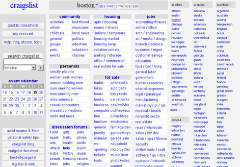
Figure 3—Craigslist epitomizes Rough Design
Craigslist

Satisfying the Immediate

For any advocate of user-centered design, perhaps the easiest of Brooks’s ideas to understand is that of Immediate Theatre, because it is a reflection of life in the here-and-now. Who better to intimately understand the immediate experience than those living it? Product design evolves naturally from what we observe and understand. But don’t take this to mean you should jump to any conclusions or decisions. The immediate refers to what is around us, not the fast-and-furious improvisation that is more suited for Rough Theatre. For example, Brooks talks about the director who typecasts actors during auditions—instead of watching the actors to see what roles might naturally fit them—and sometimes ends up frustrated by bad choices.

Brooks mentions three activities by which you can achieve the Immediate:

  • representation—the instantiation of an idea. For designers, this would be developing concepts and prototypes.
  • repetition—working through concepts multiple times and fine tuning them. Designers write use cases, create storyboards, get feedback, and do iterative design. Repetition also means you shouldn’t stop once you have a product. You need to continually improve the design to meet current needs.
  • assistance—getting help from the knowledgeable people around you to keep you honest. Stakeholders and user research let you achieve this during the design process.

Through representation, repetition, and assistance, we can achieve the Immediate, which is a true reflection of current life. Continual appraisal keeps our work immediate and up to date.

We have only to look at the lessons social networking has taught us to understand this concept in designers’ terms. The current generation, sometimes referred to as the Y generation, is tech savvy and uber-connected. Our community no longer comprises the people in our neighborhood, but the entire world. We are information greedy and more comfortable using technology as the means of communication in social interactions than we are face to face. As a result, social networking sites such as MySpace, Facebook, and LinkedIn have arisen to support the growing demand.

These social networking sites have shown us what competing to remain immediate looks like—as MySpace and Facebook fight it out for the top market position. Facebook seems to understand the need to constantly reassess how closely they are satisfying people’s immediate needs and adjust accordingly. But how long will that remain so?

You may have the hot product of the moment, but there’s always the danger of becoming complacent—and a product’s ultimately becoming obsolete—rather than continuing the work that’s necessary to support people’s immediate and evolving needs. The Razr phone from Motorola, shown in Figure 4, is just one example of how failing to continually reassess how well you are meeting the market’s immediate needs can mean the end of a once in-demand product. Immediacy is a never-ending task. Your job isn’t done once a product is out the door, because the world and its needs are constantly changing.

Figure 4—The Razr failed to meet immediate needs and stay on top
Razr

The Stanislavski Method of Design

In contrast to Brooks’s theoretical ideas, Moore attempts to distill complex theory and methodology into everyday, practical application through her examination of the Stanislavski Method, which is an actor-training method Contantin Stanislavski developed and actors such as Marlon Brando, Marilyn Monroe, Robert DeNiro, and even Johnny Depp have made famous. Its major premise is that truthfully portraying a character requires actors to immerse themselves psychologically and physically in a character’s circumstances—both inside and outside of rehearsal. In essence, the actor must become the character.

After reading Moore’s book, I wondered whether this approach could translate into a practice of Method Design. If we think about designing an entire user experience, this seems like a completely plausible idea. Stanislavski believed the key to performance as a creative outlet is to understand how a human being can control, in performance, the most intangible and uncontrollable aspects of human behavior, such as emotions and artistic inspiration. If your goal is to end up with a truly engaging and user-centric design, why couldn’t that be a key to design as a creative outlet as well?

While some parallels to Method acting already exist in our typical design methodologies, I believe there is some relevance to thinking about how we could explore this concept even further. First, let’s start with the idea of table talk, in which an ensemble of actors spends time together discussing the work and what they understand about it and see happening. The actors also spend time doing research to understand the background, history, and domain of the work. In general, table talk corresponds to what UX designers might call requirements gathering. It brings everyone to a shared understanding that lets them move forward in the creative process with the same assumptions and information.

Part of the homework that goes along with table talk involves finding the actions and the through line in the content. According to the Method, understanding the action, intent, and how they follow through coherently from beginning to end are all important. For UX designers, it is important to understand the same issues in regard to the overall system and work practice for which you are designing. Think about the overall storyline of the system or work practice and how the design can follow it. The big picture is just as important as the scenes along the way.

Two other ideas Moore discusses that seem relevant to any creative process are the tempo, or rhythm, and the adaptations. It may seem strange to ask you to think about the tempo and rhythm of an interaction design, but this can offer a valuable new perspective for thought during design. What is the pace of the work and how do you want to control it? Are your users doing a quick in-and-out kind of task or something that requires them to hang around for awhile? If you are designing a complex interaction that might be implemented in Flash or Ajax, it makes even more sense to take into account the tempo and rhythm you are setting for the interaction and how that might affect the user’s experience.

Adaptations can also help us think about the overall picture if we look at how the main intent and actions take twists and turns and change in the course of a story’s through line. If you’ve ever defined use cases, you know designers are familiar with this concept. But can we take these ideas even further and see how they intertwine and relate, so we can envision the big picture in a way that is more coherent? If we understand all the different adaptations and follow each one throughout the overall story line to its end, we can provide a complete and comprehensive experience.

Putting Theory into Practice

Both theatrical directors and UX designers play challenging and rewarding roles, but being successful in these roles requires more than just being a creative strategist. Whether you follow one well-defined process or take bits and pieces of many different processes to create your own, it is important to have a coherent approach and keep in mind the vision for the product as you take each step along the way to get to the goal. It is essential to define the ultimate vision for the product from the perspective of the audience, the technical needs and constraints, and the production requirements—in other words, to understand how the user, the technical requirements, and the business needs play into the design vision. Sensitivity to that balance and understanding how to achieve it ensure a successful end.

When it comes to deciding on your approach for achieving the product vision, remember what we can learn from Brooks and answer the following questions for yourself and your ensemble, your team, and stakeholders:

  • Are you willing to do and capable of doing the continual assessment work that is required to maintain immediacy? In other words, are you ready to commit to a truly user-centered process that gathers requirements from users, produces concepts based on those requirements, and then validates them with users again before beginning to develop anything?
  • Are you prepared for the commitment attaining a Holy Design requires—taking a whole new perspective as necessary? Do your organizational structure and business model let you focus on just a few products—doing them not just well, but creating great, cutting-edge products?
  • Can you afford to put something rough out there for the time being, with the awareness that, in the long term, doing that won’t let you be successful, so you’ll need to do something better? Do you already have a prioritized roadmap and rollout plan in place that you are working toward?
  • Or will you go with the safe and easy Deadly Design that meets the status quo, because it’s where you can be comfortable and satisfy expectations? What does your market look like and how fast is it moving? Understanding the driving forces around you can tell you how long you can remain comfortable providing the status quo.

Understanding the long-term plan will help you determine the short-term strategy on which you should embark. Any one of these approaches can be valid if you take the time to understand the user, business, and technical needs and take all of them into account as you lay out your plans. Just remember that each one of these choices has implications for how you’ll go about doing the work. If you are clear about the choices you are making at the beginning, you can be successful if you approach the work accordingly.

Once the design process is underway, always keep the big picture in mind—even as you get pushback from various stakeholders. Remembering what Moore teaches about distilling a complex methodology into a coherent practice can keep you from going insane, because you’re drowning in the details. Try some of these methods:

  • Do table talk to get the members of your team on the same page. If you feel you are getting off track along the way, don’t hesitate to do more table talk.
  • Understand and maintain the overall through line for the work and the system—and the actions and intentions for achieving it.
  • Break the work into manageable pieces. Don’t get overwhelmed by trying to tackle the whole thing at once. Just work on one manageable chunk at a time. Then, do a run through in the context of the whole through line once you design each chunk to check it against the big picture.
  • Check in with your audience at reasonable points during the design process to understand the nuances of the experience you’re presenting and the level of user acceptance you’ve achieved. Then, fine tune your design based on user feedback

As for that project I was telling you about and my feelings of déjà vu and boredom—well, they passed. I took a step back and thought about what it was we were trying to achieve and refocused on the goal. Incidentally, we were trying to satisfy the needs of the Immediate, but getting caught up in wanting to address the possibilities of a Holy Design, which, from a business and technical perspective, the organization wasn’t going to be able to achieve. We got ourselves back on track by realizing that, to satisfy the immediate needs, we didn’t have to do a complete overhaul. We delivered a design I feel confident addressed the immediate needs. More importantly for me, I found a new perspective that I can take forward with me and apply to future work. 

References

Artaud, Antoin. The Theatre and Its Double. New York: Grove Press, 1994.

Brooks, Peter. The Empty Space. New York: Touchstone, 1995.

Moore, Sonia. The Stanislavski System. Reprint of 2nd edition. New York: Penguin (Non-Classics), 1984.

Principal User Experience Designer at Oracle

Boston, Massachusetts, USA

Traci LeporeWith over fifteen years of experience as an interaction designer and user researcher, focusing on user-centered design methods, Traci has experienced a broad range of work practices. After ten years of consulting, Traci transitioned to working on staff with product teams at companies such as Avid and Oracle. Through her UXmatters column, Dramatic Impact, Traci shares how she infuses aspects of theatrical theory and practice into her design practice to bring a more empathetic, user-centered focus to her work. Traci holds an M.A. in Theater Education from Emerson and a B.S. in Communications Media from Fitchburg State College. She is a member of the Boston chapters of UXPA and IxDA and has spoken at conferences such as the IA Summit and Big Design. She is also a nominee for the 2016 New Hampshire Theatre Awards in the best supporting actress category.  Read More

Other Columns by Traci Lepore

Other Articles on Design Process

New on UXmatters