Top

The Usability of Legalese

December 23, 2013

People engage with our legal system in the US to achieve some goal—usually one relating to some form of risk mitigation or conflict resolution. Because legal services involve both interactions and goal-directed behavior, one might expect the legal system to have been designed on principles of usability. Instead, the products of the legal system inflict legalese on people. Merriam-Webster.com defines legalese as the “the specialized language of the legal profession.” [1] Whatever the design principles behind this specialized language, they are definitely not principles of usability. Why are so many products of our legal system unusable?

What Is Usability?

Let’s begin this discussion by looking at the ISO 9241 standard, which defines usability as “the extent to which a product can be used by specified users to achieve specified goals with effectiveness, efficiency, and satisfaction, in a specified context of use.” Poor usability in product and system design can lead to litigation. So this discussion focuses on why the legal system has not embraced the tenets of usability in the design of its products.

Champion Advertisement
Continue Reading…

Effectiveness

First, let’s consider the usability attribute effectiveness. Legal products are all too often ineffective. For example, Figure 1 shows a photograph of a warning sign that the California Health and Safety Code legally mandates in public buildings. Recently, I saw this warning sign on an airplane-boarding ramp as I exited my plane. What is its intended use? What goal does this message support?
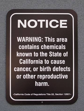
Figure 1—Hazardous materials warning sign in a California airport
Hazardous materials warning sign in a California airport

Even though this warning sign does not indicate a specific response—as the ANSI Z535 standard for safety signs and labels requires—its purpose is presumably to inform people to take action to avoid the hazard of the aforementioned chemicals. [2] However, this avoidance behavior would not be realistic in that particular context. In this case, effectiveness might mean that travelers should not leave their planes. Such a response is not feasible. So how could anyone consider this warning to be usable in terms of its effectiveness when the context negates the implied response behavior?

Efficiency

We can also consider the usability of legal products in terms of their efficiency. The example in Figure 2 shows a legally mandated sign that places serving alcohol in Montana must post. Its goal is to communicate that it is unlawful to serve additional alcohol to people who are already drunk. But how efficiently does this sign communicate that message to either servers or patrons?

Figure 2—Legally mandated sign for Montana restaurants and bars
Legally mandated sign for Montana restaurants and bars

The inefficiency of this legal message comes from the inclusion of multiple criteria that are ambiguous and redundant. What do apparently and obviously mean to an observer? Is there a legal distinction that most observers could make? And since it would be readily apparent that an obviously intoxicated person was also apparently intoxicated, why does this sign include both terms? Apparently intoxicated should be sufficient—and would help prevent debates about semantics between servers and patrons.

And how could a server determine a patron’s actual intoxication without the training or any equipment for collecting and testing breath or blood samples to determine alcohol levels? So, within the context of use, that stipulation is also unachievable.

Satisfaction

Let’s look at the usability of legal products in terms of satisfaction. Here, the focus is on people’s emotional response to products of the legal system—especially emotions in response to situations that require interactions with the legal system.

As an example, consider this clause from a legal document that is necessary for a woman to secure a donor egg in an effort to become pregnant and have a child:

“It is understood by all PARTIES that Ova(um) donation, including genetic material from the Ova(um), and ‘in vitro’ and/or ‘in utero’ fertilization are procedures within a new, unsettled, and uncharted area of the law, and no warranties have been or can be made as to the ultimate result, cost, liability, or obligation of the PARTIES, as a result of the conduct contemplated by this Agreement and/or that may ensue from any judicial, legislative, or administrative process as a result of the conduct contemplated herein or with respect to any arbitration/litigation necessary to establish any right of any of the PARTIES per this Agreement, including parental rights and/or financial obligations regarding any donated Ova(um), embryo, or Child(ren) born as a result of this Agreement.”

First, ignoring for a moment the inefficiency of the statement’s vocabulary and syntax, how does the sentiment of this statement in any way honor or support the positive and optimistic emotions of the person seeking to become a parent? On the contrary, the statement’s sentiment does nothing to increase satisfaction—rather, its explicit tone serves only to increase any doubt or stress in the reader. Clearly, this warning fails to consider the satisfaction of the intended reader—especially in the context of what should be a positive and reaffirming experience.

Why Do Products of the Legal System Fail to Achieve Usability?

So why do these examples of products of the legal system fail to achieve basic usability? The standards by which the legal system judges the quality of its products, or legalese, are orthogonal to the standards by which we define usability. We can understand this disconnect between usability and legalese by referring back to the standard definition of usability that I provided earlier. Specifically, the distinction resides in how we specify users, goals, and contexts of use.

From the legal perspective, the specific users are the operators of the legal system—that is, lawyers, attorneys, and judges. However, from a usability perspective, the specific users are the people expecting service from the legal system. In addition, while we take an inclusive view of users when defining usability, the legal system often designs legalese for extreme outliers. For example, my aspirin bottle contains a paper package of moisture-absorbent beads with the prominent warning label “Do Not Eat.” Is this message intended for all users, because most people would automatically assume the aspirin manufacturer had included a free snack in the bottle? No. The intent of this warning is to prevent an extremely rare case.

Similarly, the legal system directs legalese to the specific goals of the legal system itself rather than to the goals of the people requesting legal services. For example, the hazard warning in Figure 1 does not satisfy any goal for the airplane-boarding ramp’s users. Instead, the act of posting these signs serves only the goal of the building owner who must demonstrate compliance with local health and safety codes. As such, these warnings are almost facetious because they’ve already satisfied their design goal before people even enter the ramp.

Finally, legalese has a narrow expectation of the specific context of use. Its intended context of use is primarily the courtroom—or some other environment that is part of the legal system.  For example, the intent is not for the liability statement shown in Figure 2 to be effective in places serving alcohol. Rather, it would be useful only in a case of public intoxication that was later brought to court.

Conclusion

The fact that many products of the legal system are not usable by consumers of the legal system has important consequences. Legalese imposes unnecessary stress on people who are seeking legal services. Plus, a legal system that was not designed to be usable cannot be effective or efficient in the service that it provides. Indeed, the level of intimidation that unusable legal products inflict on people may actually deter some from seeking legal services. This hampers the delivery of people’s legal rights. Since, in most societies, access to legal representation is a basic human right, this is a moral issue.

So what is the way forward? We need to define a framework that unites legalese with usability. Key to this unification is a change in culture of legal systems, so they focus less on those operating the system and more on those using it. Moreover, legal systems should be more considerate of the emotional context in which people use legal products. We can frame this culture using the concept of hedonomics, whereby legal products would move beyond mere functionality to address the emotions and aspirations of users. [3] This shift in perspective would then naturally invite consideration of traditional usability principles in the design and delivery of legal products. And in the end, a more usable legal system would be a good thing for everyone. 

References

[1] Merriam-Webster. “Legalese.” Merriam-webster.com. Retrieved November 30, 2013.

[2] Stranco, Inc. “Information on ANSI Z535.4-2007.”PDF Strancoinc.com.] Retrieved November 30, 2013.

[3] Hancock, Peter, Aaron Pepe, and Lauren Murphy. “Hedonomics: The Power of Positive and Pleasurable Ergonomics.” Ergonomics in Design, January 2005. Volume 13, Number 1.

Professor at Montana State University

Bozeman, Montana, USA

Nicholas WardNic is a Professor of Mechanical and Industrial Engineering at Montana State, where he teaches undergraduate and graduate courses on work design, interaction design, usability engineering, and human error. For nearly 20 years, he has conducted product design and usability testing of intelligent vehicle systems for car companies. He has a PhD in applied psychology from Queen’s University. Areas of interest to Nic include workload assessment, cultural influences, and risk taking.  Read More

Other Articles on Content Strategy

New on UXmatters