The Form Book: Best Practice in Creating Forms for Printed and Online Use
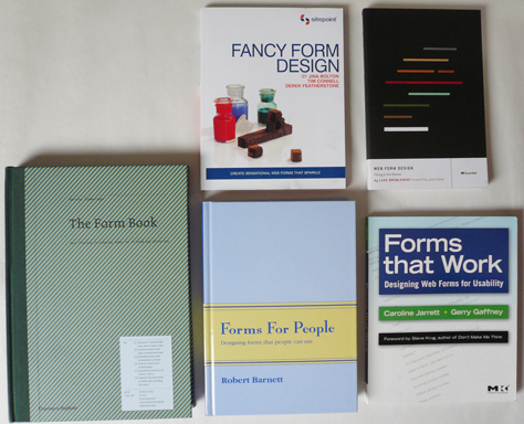
The newest of these five books is Borries Schwesinger’s The Form Book: Best Practice in Creating Forms for Printed and Online Use, published in 2010 by Thames and Hudson.
This is the English edition of his German book Formulare Gestalen, which Verlag Hermann Schmidt Mainz published in 2007. However, it’s not just a translation; nearly all the examples of forms are in English.
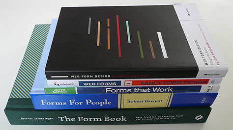
It’s a massive book: 324 pages on heavy paper, A4 sized—a bit taller and narrower than letter-sized. It’s definitely a coffee-table book rather than something you would want to haul along on a commute.
Borries is an information and communication designer, coming from a graphic design tradition. Thus, his book is mainly about what looks good in form design, and it is lovely to look at, with striking use of full-page, full-sized illustrations of many different types of paper forms—and some digital ones.
If you want visual inspiration, particularly for paper forms, then buy this book.
The book includes a short bibliography, but no references.
Forms for People: Designing Forms That People Can Use
The most comprehensive of these five books is Robert Barnett’s Forms for People: Designing Forms That People Can Use. This is the second edition of the book, published in 2005 by his business, Robert Barnett and Associates, of Canberra, Australia.
Robert Barnett was a leading Australian forms designer and educator for over 40 years until his death in 2009. He always championed the importance of “useability,” sticking firmly to the spelling that was preferred in Australia until quite recently.
Robert’s professional work was primarily with government and large corporations in Australia. A typical recent project for him would have been persuading a government client to rethink and redesign a complex, multipage paper form, including making an electronic version.
This hefty book has 494 pages, all tightly packed with information. It’s a brain dump of everything that Robert knew about forms, which was a heck of a lot. A modest man, he quoted lots of references to support his ideas. He was also a dedicated teacher, so the book rattles along, and it is peppered with anecdotes. Here’s one that will resonate with many UX professionals:
“Some years ago we were commissioned by a major public company to conduct useability studies of one of their most commonly used forms. The form had already undergone extensive analysis by a market research company using focus groups, yet we found in our useability testing with many respondents that the market research results were significantly flawed. They had been asking people about preference whereas we were researching actual use by real customers.”—Robert Barnett
If you’re working with paper forms, this is the book to buy. Electronic forms don’t appear until page 396; Web forms barely at all.
Though Amazon indicates this book is out of print, you can get it directly from Robert Barnett and Associates,![]() in Australia. You can also buy it from the Business Forms Management Association,
in Australia. You can also buy it from the Business Forms Management Association,![]() where its price is US $75 for members; US $95 for nonmembers.
where its price is US $75 for members; US $95 for nonmembers.
Web Form Design: Filling in the Blanks
The two previous books were mostly about paper forms. What about books on Web forms?
Well, chances are that you already know about or, possibly, already own, Luke Wroblewski’s best-seller Web Form Design: Filling in the Blanks, which Rosenfeld Media published in 2008.
Luke wrote this book when he was working at Yahoo! It also draws on his experience at eBay. Because it’s about Luke’s practical experiences, it doesn’t have a bibliography or references. The heart of this book is how to improve the design of Web forms, and specifically, the finer details of interactions with Web forms. For example, he has a whole chapter on where to put the buttons, which he calls actions, and another chapter on label placement.
This book comprises a slim 226 pages and is also available in an electronic edition.
If you’re designing forms that are part of a well-designed Web site and a well-understood process—such as account creation, contact us, or ecommerce checkout—this is the book to buy.
Fancy Form Design: Create Sensational Web Forms That Sparkle
The next book on our forms bookshelf also focuses solely on Web forms: Fancy Form Design: Create Sensational Web Forms That Sparkle, by Jina Bolton, Tim Connell, and Derek Featherstone, which SitePoint Pty Ltd. published in 2009.
This is the slimmest of the five books, at 151 pages, and the authors have devoted many of these pages to extensive code examples. The book takes you step-by-step through how to achieve a variety of effects in your Web forms, such as background gradients within the boxes. Unusually, for a coding book—and I suspect because of Derek Featherstone’s influence—there’s advice throughout on coding for accessibility.
As you might expect, this book focuses on the practical, so doesn’t provide a bibliography or references—apart from a few useful links.
If you’ve already decided on your form’s fields and layout and want specific coding advice on how to achieve particular effects in Web forms, buy this book.

