Top

The Power of Faces in User Experience

January 7, 2013

If you were to describe what a face is, what would you say? Would you talk about its features? Or would you talk about its function? We interpret the majority of the things a human face does unconsciously.

Faces Express Who People Are

I’m guessing that you probably said the main role of faces is to let us identify and recognize people, which is true. But faces do much more. People’s faces

  • reveal their identity, age, and gender to others
  • show their genetic inheritance
  • portray a variety of emotions—for example, anger, disgust, happiness
  • identify their ethnicity
  • influence the behavior of others

Champion Advertisement
Continue Reading…

A person’s face subtly reflects the power and complexities of his or her brain. We can infer someone’s mood or emotions and even read thoughts from a face. However, all too often, we ignore or fail to fully understand this reality when designing Web sites. We forget to consider what the human face is capable of doing during design. In many cases, we assume that, when communicating to people online, the written word and an attractive design convey the entire message.

However, like text, images are capable of communicating a message. Using imagery is another form of discourse. Think of a children’s book. It relies very little on the written word because, through the power of images, it can convey messages that are far stronger than those it communicates through its text alone.

Including appropriate pictures lets our readers automatically infer much of our story before reading any text. However, when we randomly add images that don’t communicate a story, they can be jarring and confuse our readers. People can’t help but look at images and infer information from them. Placing an image alongside text is so influential that including a picture of anything next to a statement increases its validity!

When we include an image of a face on a Web page, the impact it has is much greater than the impact of a photo of a landscape, for example. The amount of information we gain from a face is so powerful that we can work out whether it is attractive in less than 13 milliseconds. That is so fast we aren’t even consciously aware that we’ve seen the face! If the information that a face provides is so rich, can you imagine what impact faces must have on your other content?

Faces Instantly Tell Stories

When you include a picture of a face, you are not adding context. You are not just brightening the page. You are sending implicit messages, fundamentally changing a page’s message, and influencing readers. An image of a face can never be an add-on.

Sex Sells, but Do You Want That?

Figure 1 shows a picture of an attractive woman. If you add her picture to your Web site—et voilà—your page will be brighter and more interesting, and so now is this article!

Figure 1—The more of a person’s body you show in a photo, the more it’s about sex
The more of a person’s body you show in a photo, the more it’s about sex

If you were to present the image shown in Figure 1 on a Web page, what would actually happen is aptly called emotional arousal. Yes, your readers would be engaged, but by the image, not your written content. Rather than the thought I want to read this driving their engagement, it would be more an unconscious recognition of the woman’s attractiveness—She’s pretty hot. We all know that sex sells. But if your readers are so distracted by the sexual affect of an image, how do you expect them to take in your content’s actual message—or even pay attention to your content at all?

A simple attempt to brighten the page could ruin your objectives—due to the power of the human face. The more of a person’s body you show in a picture, the more dramatic its influence. Readers think more about the person and his or her attributes. When you display a person’s entire body, the impression readers gain is based more on sexual attraction than personality. Therefore, in such a case, the way you engage your readers may be based more on sexual arousal than intellect.

If you feel this is inappropriate, you can modify a photo to change its influence. For example, if you were to crop the image in Figure 1 to focus on the woman’s face, readers would think more about her personality and her intelligence. The way we depict people can influence readers to interpret our content in a more positive and objective manner.

Cognitive Processing of Faces

The way our brain processes faces is unique. Large parts of our brain are specialized to look for and recognize faces. As a result, our drive to detect faces is so strong that, that we may see them anywhere, as in the example shown in Figure 2.

Figure 2—An abandoned Bristol building appears to have a face
An abandoned Bristol building appears to have a face

Thus, we have an incredible bias toward seeing faces. An image of a face on a Web page doesn’t necessarily have to be about making people feel something or overtly changing their behavior. The power of a face can actually be much more subtle than that.

Our recognition of faces evolved to help us detect unknown threats. Quickly glancing toward a suspicious person could just give you the edge in a life-threatening situation, by letting you spot a potential enemy before they spot you. This could be the difference between life and death.

Eyetracking studies have shown that, when you present a picture of a scene—like that shown in Figure 3—on a Web page, including a person distracts users. People have an innate drive to focus on other human beings, no matter how stunning a scene is. Researchers have found that our ability to control our gaze and avoid looking at a person is really weak.

Figure 3—When looking at a stunning landscape, it’s hard not to be distracted by a person
When looking at a stunning landscape, it’s hard not to be distracted by a person

Even before we start to consider the subtle impacts of faces, you can clearly see that simply including a photo of a person in your content is very distracting. When a person is facing forward or a person’s face is clearly visible, this exacerbates our drive to extract more information about that person from the image—beyond their simply being human.

Affecting Users’ Gaze

Not only are faces great for grabbing people’s attention, they are very useful for directing our attention, too. You can influence the way users interact with a Web page by influencing their gaze. Static pictures of faces are very powerful if they seem to be looking at a specific part of a page.

We have developed this bias for looking in the same direction as others for a number of reasons—one of which also relates to threat detection. Another reason relates to our ability to imagine what another person is thinking or doing, which allows us to better understand another human being’s behavior. Following another person’s gaze—in conjunction with our ability to recognize human emotions—makes it very easy to gain an understanding of someone else’s situation.

Using this approach to directing users’ gaze lets you highlight key information and even encourage users to look at a particular piece of content. Interestingly, using faces or even avatars that move as they gaze rather than a still photo of a face is not as effective in directing a user’s eyes to a particular part of a page. A static picture of a face captures our gaze better than any dynamic scene. The more the focus of an image is on a person’s eyes, the more powerfully it captures our attention.

Staring Eyes—Being Watched Changes Our Behavior

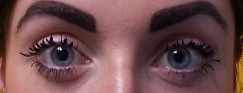
Since including a picture of a face can distract people from a Web page’s content, any that face you include should relate to your content and be in close proximity to the most important information. The amount of influence that a face can have on people is surprising. For example, the feeling that we are being watched by someone is strong enough to change our behavior. So, if you want to make people behave in a more socially acceptable manner, making them feel that they are being watched will encourage them to do so. Including a photo of a person’s staring eyes like that in Figure 4 makes people feel they’re being watched.

Figure 4—Framing the eyes very powerfully holds your gaze
Framing the eyes very powerfully holds your gaze

The eyes in this photo are quite distracting. (Do you keep looking at the photo?) The feeling of being watched is very powerful. This relates, in part, to conformity. We follow social norms so we don’t get thrown out of our group by our peers.

This is one of the reasons that the most powerful charity campaigns include an image of a victim staring into the camera. It raises feelings of responsibility and empathy and makes us feel accountable for the victim. It’s also the reason that one of the most famous National Geographic images creates an emotional attachment between you and its subject.

For the same reason, if you want a picture of a person’s face to actually influence what people do—or to be taken seriously—the person must look real. Including a person’s face on a Web page should always be well thought–out decision. If your Web site uses a lot of stock photography or images that are very generic and unrelated to your site’s content, they don’t communicate that there is a genuine relationship between the person in the image and your company.

However, if you always ensure the genuineness of the people in the images that you include on your Web site, your site will appear more trustworthy and engaging to users. This makes it clear that your organization establishes genuine relationships with people, and they will be more likely to start a new relationship with you! All because of the power of faces.

Emotional Faces Affect People

The emotional component of a face is so strong that it can influence what people think about a Web page. If I were to show you a picture of an angry person, you might not realize it, but your brain would associate that picture with a threat. And when we are threatened, we experience an automatic response—we become agitated! Simply by presenting a face alongside something, we can easily transfer that person’s emotion to it—regardless of whether that is our goal. Though it’s not quite as extreme as Angry face → Cat → Angry at cat.

By presenting an angry face, you activate a negative emotion in users. So, if you were to present users with an online form, for example, immediately after their seeing the angry face, they would associate that negative emotion with the online form, so: Angry face → Standard online form → Angry at form, and the form becomes an even bigger barrier on the Web site.

One situation where a picture of a person can influence people’s behavior is on a charity’s donation pages. One design decision that you must make when creating a donation process is what images to use to encourage visitors to make a donation. Many are fearful of including an image that is too negative or too positive, so instead rely on images that represent the middle ground.

Take a look at Figures 5-7, which show three charity donation pages. What do you instantly notice about them?

Figure 5—Donation page for Oasis
Donation page for Oasis
Figure 6—Donation page for Action for Children
Donation page for Action for Children
Figure 7—Donation page for Oxfam
Donation page for Oxfam

These are all fantastic charities that deserve our time and money. Yet the types of imagery that they use are quite different. Which do you feel would be most likely to encourage a donation?

There is quite a high chance that you answered Oxfam or Action for Children. But do you recognize the reasons why? Unsurprisingly, large amounts of research have been conducted to attempt to answer just this question. To appreciate why certain images work better, you have to appreciate the principles behind donating.

Connecting Emotions to Opening Our Wallet

Making a donation relies strongly on empathy. How much can people relate to an image of a person that they are looking at? However, as you already know, faces are intrinsically rich with information. Images on charity pages should be about encouraging people to give money. They do this by making us feel an emotion, then creating a connection between that emotion and opening our wallet.

Oxfam and Action for Children create strong emotional responses to engage us. However, other charities such as Oasis sometimes play it safe with images that take the middle ground, and their imagery is not emotionally engaging enough to make us donate. As you can see in Figure 5, the pictures on the Oasis site are quite nice and active, but they don’t make you feel anything.

Research has found that, when people are giving their money or their time, there is no perceived difference in the degree to which very negative or very positive pictures affect them. We also know that pictures that take the middle ground—and are a little bit negative or a little bit positive—are about as effective as displaying no image at all.

We can assume that including a photo depicting a very negative emotion on a Web page would make people feel bad. Even though closing their browser might stem this emotion, they might still feel pretty crappy. Charity sites provide a quick solution to give people a happy feeling: donate some money. People get a warm fuzzy feeling, knowing that their money will, for example, help a sick child. I’m not saying that images are the sole motivators to donate, but they do help to decrease a donation page’s bounce rate.

Using a very positive picture is a slightly more subtle tactic. First, it plants an element of doubt in a person’s mind: if I don’t donate, that happy scene may never happen. Second, people likely believe that, by making a donation, they’ll make someone else happy. This feels fantastic! So, you should commit to using either a very positive or a very negative picture to get the desired result.

Faces Are Never Extra Content

All of your design decisions about content, button location, fold awareness, navigation issues, and nearly anything else concerning your effort to provide a great Web site user experience can be significantly undermined if you fail to consider the impact that images of people have on your content.

The reckless addition of images of faces or poorly thought out reasons for including a picture of a person on a Web page can dramatically influence the impact of its content. If an image does not appear to relate directly to your content, your site design looks lazy, incomplete, and inadequately thought through.

Pictures of faces are not just extra content. Faces send implicit messages of their own that can influence how people perceive a Web page! Their influence is so strong that they can make people look in a specific direction, make people unknowingly feel a particular way about a page, and even make people behave in a particular way. So, when adding images of people to your Web site’s content, remember that displaying faces is another form of discourse. Therefore, images should always relate to your content. 

Further Reading

Archer, Dane, Bonita Iritani, Debra D. Kimes, and Michael Barrios. “Five Studies of Sex Differences in Facial Prominence.” Journal of Personality and Social Psychology, 1983. Retrieved January 4, 2013.

Burgin, Victor, ed. “Looking at Photographs.”PDF In Thinking Photography. London: Macmillan, 1990. Retrieved January 4, 2013.

Henderson, J.M. “Human Gaze Control During Real-World Scene Perception.”PDF Trends in Cognitive Sciences, November 2003 .Retrieved January 4, 2013.

McLeod, Saul. “Bruce and Young - Face Perception.” Simply Psychology, 2011. Retrieved January 4, 2013.

UX Consultant at Fjord

London, UK

James CostonJames earned a BSc in Psychology and an MSc in Cognitive Neuropsychology, then started working as a UX professional fresh out of university in Nomensa’s graduate scheme. His knowledge of psychology is the pillar on which he’s based his work as a UX consultant. Applying key principles and using his understanding of cognitive processes and social persuasion helps him to drive toward infallible user experiences. James regularly writes articles that teach readers the value of psychology in user experience. His articles have received praise from Smashing Magazine and other online UX magazines.  Read More

Other Articles on Software User Experiences

New on UXmatters