Top

The Nature of Choice Sets and Their Effect on Decision Making

Decision Architecture

Designing for decision making

A column by Colleen Roller
February 7, 2011

In my last column, “The Power of Comparison: How It Affects Decision Making,” I discussed the concept of relativity and how it relates to decision making. Essentially, the concept of relativity in decision-making says:

  • People assign value to things by comparing one thing to another. People do not possess an innate value meter that determines absolute value.
  • People are constantly comparing and contrasting physical things, people, experiences, and ephemeral things such as emotions, attitudes, and points of view.

In this column, I’ll expand upon the concept of relativity and how the context in which people make decisions significantly influences decision outcomes. Specifically, we’ll look at how the nature of a choice set affects people’s ability to decide.

Champion Advertisement
Continue Reading…

Binary Decisions

The outcomes of binary decisions—in which people decide whether to do something—are often very different from decision outcomes in contexts that involve more than a simple yes or no choice.

As an example, let’s look at a study involving a decision to purchase a CD player. The researchers asked participants in the study to imagine that they were interested in buying a CD player, but had not yet determined which brand or model they wanted. If they passed a store having a one-day sale, where a popular Sony CD player is on sale for $99—a sale price that is well below the player’s list price—would they buy the Sony or wait to do more research? In the study, 66% of the participants responded that they would buy the Sony, while 34% said they would wait.

The researchers then conducted another variation of the study for which the options included the $99 Sony CD player, but also an Aiwa CD player for $169. The prices for both of these players were well below list. In this case, the number of people who would opt to purchase the Sony was significantly less.

  • 27% would buy the Aiwa
  • 27% would buy the Sony
  • 46% would wait

Why does the number of people who would purchase the Sony player shift from 66% in the first example to 27% in the second example? If people felt the Sony was a good deal in the first scenario, why is that deal less attractive in the second scenario? Because the introduction of the Aiwa in the second scenario increases the complexity of the decision. In the second scenario, the decision maker must choose between a cheaper, popular model and a more expensive, more sophisticated model.

Note how the number of people who would delay their decision increases from 34% in the first scenario to 46% in the second scenario. [1] When people don’t know what to decide, they often delay their decision, opting not to decide until they have more information. Simply adding or removing options from a choice set can significantly influence both the complexity of the decision and the decision outcome.

This example also reveals something else about people’s decision preferences: they avoid comparing things that are not easy to compare.

Easy Versus Difficult Comparisons

In general, people like to compare things that are easy to compare. To illustrate, let’s consider a scenario in which a person is purchasing a new home and there are three options to consider: two of the homes are on a lake and the other is in the woods. All of them are about the same price and are equally desirable. The only difference is that one of the homes on the lake has had some flood damage and needs repairs. Which home would you choose?

Unless they had a strong preference for one of the homes, many people would choose the home on the lake without the flood damage. Why? Because it’s difficult to compare living on a lake to living in the woods. There are pros and cons to each. But the two homes on the lake are easily compared, and of those two, the one without the flood damage is clearly better.

This example illustrates how one option can affect the desirability of other options. An inferior option—the home on the lake with flood damage—can actually make another similar option—the home on the lake without flood damage—seem more attractive. This is the power of context in action.

This example also demonstrates how people respond to options that are too different and, thus, not easy to compare, because neither option is clearly preferable to the other. Unless there is a strong preference for a particular home or location, there are difficult tradeoffs to make in deciding whether to live on the lake or in the woods.

When Options Are Too Similar

We’ve seen how people avoid comparing things that are not easy to compare and like to compare things that are easy to compare. But what happens when you present very similar options to people? How do they decide between them?

Let’s look at a research study that examined two different scenarios in which doctors made choices regarding how to handle a particular medical condition. In the first scenario, they could choose either to take the patient directly to surgery or prescribe medication X as a precursor to surgery. Results showed that 72% of the doctors opted to prescribe the medication prior to sending the patient to surgery.

In the second scenario, doctors still had the option to send the patient directly to surgery, but they could also choose between two equally effective medications—X and Y—as a precursor to surgery. What did they do? You might want to brace yourself for the answer. Most of them elected to prescribe neither medication, but instead, to send the patient directly to surgery. [2] In many ways, this behavior seems counterintuitive. After all, if both medications were equally effective, there was no downside to prescribing either one of them.

However, it’s important to understand people’s typical rationale in this type of situation. When people have two options that are equally attractive, they feel conflicted, because there is no compelling reason to choose one option over the other. Choosing between two options that are essentially equal makes it very difficult to justify a decision. Neither option is clearly superior to the other. So given another, more clearly differentiated option, they’ll choose it—just to avoid the conflict inherent in having to choose between two options that are too similar. As you’ve seen in our example, the doctors opted simply to send the patient to surgery.
Implications for Design

So far, I’ve talked about how binary decisions are often the simplest type of decision to make and how the nature of a choice set affects decision making. Specifically, we’ve seen that choice sets offering options that are too different from one another—and, thus, are more difficult to compare—can force decision makers to grapple with complicated tradeoffs, making the decision-making process more complex. Choice sets offering options that are too similar can also cause difficulty, especially when decision makers feel they must justify their decisions and no option is clearly superior to the others.

As you think about how to optimize a design for decision making, it is often useful to take a step back, put yourself in the shoes of users, and think about how they would decide between the options you’re providing, considering the research I’ve described in this column.

  • Would they need to make difficult tradeoffs? If so, how can you help them determine what’s most important to them, so they can feel good about the decisions they make?
  • Are the options too similar? Would people find there is no single option that is clearly superior to the others? If so, think about how you could simplify the choice set by eliminating options that seem too similar in regard to the attributes people care about.

Architecting an optimal decision-making experience can be daunting, especially when you consider the many subtle, yet significant aspects of context that affect decision outcomes. A key thing to keep in mind: the way people compare and contrast items in a choice set often depends on the options you provide—as well as the information you provide about those options.

Every option in a choice set has a large number of attributes. It won’t be possible for you to provide information about every attribute for every option. So, what information should you provide? To what attributes should you draw people’s attention?

Determining what kind of information to provide—and which attributes you should highlight—goes hand in hand with how you expect people to use that information, especially during the process of comparison. Decision Architects understand that choosing what information to provide determines how people compare the items in an option set, and consequently, how they decide.

When determining what information to provide:

  • Ensure that the information enables easy comparisons. People should be able to make apples-to-apples comparisons—without having to translate any information or do their own calculations.
  • Find out what kinds of information people want or expect to see. For example, if you’re selling cameras, there are probably specific kinds of information photographers would use to determine which camera to buy from the available choice set.
  • If people in your organization are subject-matter experts, provide the type of information consumers should use to make the right decision. In addition to providing the right type of information, offer structured guidance if it would make the decision process easier.

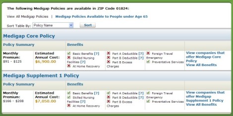
Unless people are experts in a particular domain, they generally make decisions based on the information available to them. In the example shown in Figure 1, which lets people compare health-insurance policies, the attributes of each type of policy appear in an easy-to-compare, tabular layout. Customers would likely make a decision based on the benefits and costs that the table provides, so the designer of the table should be sure to include the policy attributes that would best enable people to make the right decision.

Figure 1—Comparing health-insurance options
Comparing health-insurance options

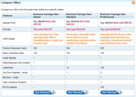
In the example shown in Figure 2, people must compare offers based on what each package contains. This might be fine for people who know exactly what items they need and how many of each item. But for people who don’t know, some guidance would be helpful. For example, the site could ask users a few questions, then propose a package that would match their needs. Or, if there are particular user profiles that characterize the types of individuals or small businesses that typically order one package rather than another, the site could provide that information.

Figure 2—Comparing business packages
Comparing business packages

Another critical design take-away from this column—although it might seem counterintuitive—is that offering someone a binary choice—the choice to do or not to do something—can be a very effective means of reducing decision complexity and helping people feel better about the decisions they make.

Let’s take a look at an example involving Financial Engines, Inc., a provider of advisory services for employer-sponsored retirement plans. Their Online Advisor application helps plan participants make better savings and investment decisions, with the goal of improving their retirement security. When Financial Engines redesigned its Online Advisor in 2002, one aspect of the redesign addressed the presentation of investment choices to plan participants. Prior to the redesign, choice sets gave plan participants five options for each major retirement decision—for example, five potential savings levels.

The redesigned Online Advisor gave participants a single alternative to consider. For example, would participants prefer to stay at their current level of savings or move to the next level, which would entitle them to the company 401(k) match? The new design focused an individual’s attention on a single alternative—that is, a binary choice.

Prior to the redesign, only 40% of participants were saving enough to be eligible for the 401(k) company match. After the redesign, a full 100% elected to receive the company match. [3]

No Neutral Design

Remember, there is no such thing as a neutral design. Every aspect of a design has an effect on people’s ability to make decisions, including the number of options and the kinds of options in a choice set. Every decision occurs against the backdrop of some type of context. And in the design of Web applications, it’s the UX Designer who architects the context in which users make decisions. It’s the architecture of the context that drives decision outcomes. 

Notes

[1] Scott, Jason, and Gregory Stein. “Retirement Security in a DC World: Using Behavioral Finance to Bridge the Expertise Gap.”PDF Pension Research Council Working Paper, 2003. Retrieved January 23, 2011.

[2] Redelmeier, Donald, and Eldar Shafir. “Medical Decision Making in Situations That Offer Multiple Alternatives.”PDF JAMA, Vol. 473, 1995. Retrieved January 26, 2011.

[3] Shafir, Eldar, Itamar Simonson, and Amos Tversky. “Reason-Based Choice.”PDF Cognition, Vol. 49, 1993. Retrieved January 23, 2011.

Independent Consultant

Boston, Massachusetts, USA

Colleen RollerColleen is a skilled writer and an experienced UX researcher who has spent hours watching people use Web sites and other digital tools. She has a deep understanding of what works—and what doesn’t—from a design and content perspective. Whether it’s an online user interface or the written word, she collaborates with her clients and partners to craft solutions that communicate clearly and succinctly. Colleen always welcomes opportunities to use her writing and UX design and research skills.  Read More

Other Columns by Colleen Roller

Other Articles on Decision Architecture

New on UXmatters