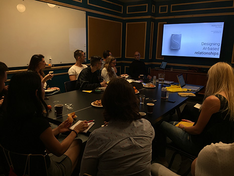
Future London Academy’s UX and Digital Design Week 2017 took place August 14–18, in London. Throughout the week, we visited a variety of design studios and product companies and learned a lot about the way they work, including their projects, products, processes, management, culture, and all the things that shape them. The lineup for the program was great as always, featuring Moving Brands, Microsoft Lift, Territory, Deliveroo, Moo, Made by Many, NomNom, Monese, Analog Folk, Firedrop, and Andrea Picchi.
In this review, I’ll provide an overview of the conference, describing its
organization
venue
hospitality
content
presenters
proceedings
community
Champion Advertisement
Continue Reading…
Organization
Future London Academy (FLA) organizes several week-long programs annually: UX and Digital Design, Design Thinking and Innovation, and Future of Branding. The company also creates tailored learning programs for individual companies and summer courses for students.
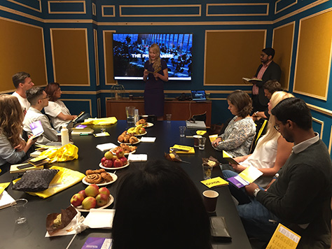
Ekaterina Solomeina, Moe S. Hussain, Callum Lovekin, and I acted as hosts throughout the course of the conference. Figure 1 shows Ekaterina Solomeina and Moe Hussain kicking off the day. Each day, we welcomed attendees and delivered opening remarks; then led attendees to different companies through the beautiful streets of London, introduced the speakers, and guided attendees through the activities of the day. Finally, we offered our closing remarks, encouraging attendees to gather together to chat in the evening, at a lovely, nearby, 400-year-old pub.
Figure 1—Ekaterina Solomeina and Moe Hussain kicking off the day
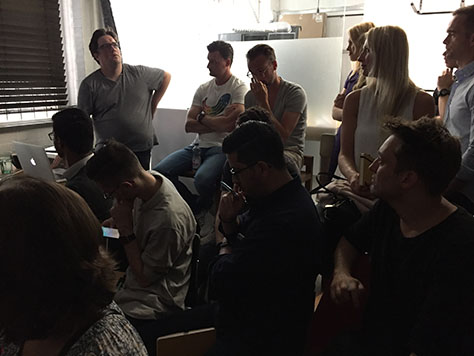
A key feature of the conference was that attendees visited design teams where they work, at their companies’ offices. This provided a great opportunity to see how they work from the inside. Designers presented a lecture or workshop. Then, everyone participated in a free-form chat about their projects, work methods, culture, and many aspects of great design. This format is very different from a typical conference’s presentations, enabling companies to talk more openly and show more of their internal work. Plus, attendees have much more time for asking questions because the speakers are not in a rush to complete their session on time.
Venue
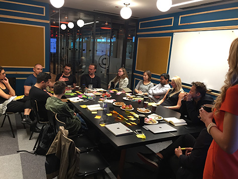
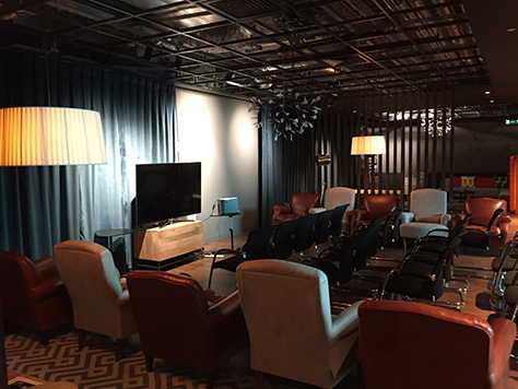
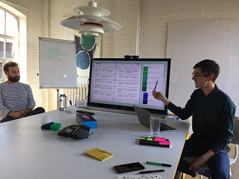
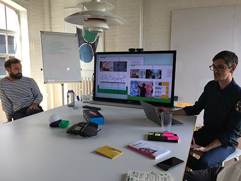
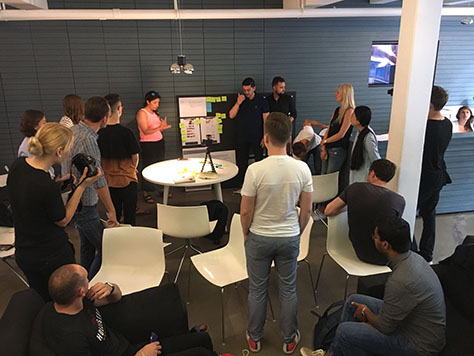
The primary venue comprised the WeWork coworking space and conference room, as Figures 2–4 show. While every morning started with a lecture or debrief, each day featured different venues: the offices of the design teams who were presenting that day. Many of these product companies and design agencies are based in Shoreditch, which is one of the hottest tech areas of London. Since Attendees took up residence in Shoreditch as well, we walked to the host companies some days, as Figure 5 shows. These ambulatory intervals added to the overall experience.
Figure 2—Morning lecture and debrief at WeWork Figure 3—Debrief process at WeWork Figure 4—Attendees gathered outside WeWork with Andrea Picchi Figure 5—Attendees walking to a lecture in London
It was inspiring to see design teams’ creative spaces, which are a contributing factor to their ability to create great products. Figures 6–10 show some of the offices we visited.
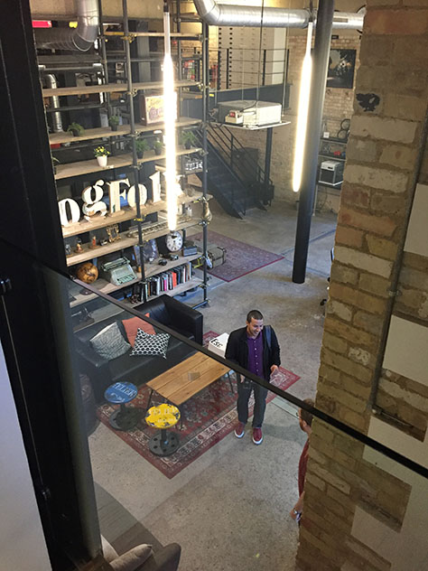
Figure 6—Microsoft Lift office Figure 7—Mixed reality studio at the Microsoft Lift office Figure 8—Made by Many office Figure 9—Moo office Figure 10—Analog Folk office
Content & Presenters
UX and Digital Design Week covered some of the biggest talking points of the past few years: UX strategy, the connection between brand and user interface, algorithm-driven design; FUI, or fantasy user interfaces from sci-fi movies; augmented reality (AR), virtual reality (VR), and mixed reality (MR) experiences; design systems, design management, and building a design culture. We received expert advice relating to a variety of contexts, including cutting-edge product companies, traditional organizations with competent design teams, small design studios, and big service-design agencies. There are so many bright minds and great companies in London! It’s one of the strongest cities in Europe for every aspect of design.
It’s very easy to find yourself in the trap of the local maximum—rarely looking around, finding your current level to be sufficient, and having exhausted your opportunities for development. Just as in every other year after returning from the conference, I’ve collated my notes and gathered my impressions, fostering myriad ideas for the development of my company’s design organization in the process. In this review, I’ll share some of the more alluring insights.
I’ll gather my insights from the conference around some key topics:
Design management
Integrating user interface with brand promise and identity
Product design
Organizing Design Teams and the Process
The first topic that the conference covered in depth was design management.
Territory Studio
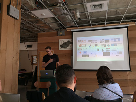
As we learned from Territory Studio, it’s possible to take creativity to the assembly line. Territory Studio has given birth to lots of interesting concepts about the future and with impressive speed—for example, The Avengers took half a day per screen, while Ex Machina took one day. To make this possible, they expend a huge amount of energy developing both the team and the skills of each individual designer, then they try to picture the final result before starting work. This helps them avoid the loss of time from wandering around aimlessly. They find mood boards, sketches, and external opinions helpful. To begin with, they think more about the ideal user journey rather than specific interactions and generally try out many ideas, rooting out the bad ones. Although the opposite sometimes occurs when they use the absurdity of technology to inject a little humor. Take a look at the showreel in Figure 11.
Figure 11—Territory Studio showreel
It helps to think of the user interface (UI) for film as an operating system. Making a UI Kit for films lets Territory see the big picture and reduce the number of diversions. The team works together on creating a concept document. What they end up with is something like a typical process in Google Docs. A prototyper’s toolkit consists of the following: Adobe Illustrator, Photoshop, AfterEffects, and Cinema 4D—or whatever is most convenient at any given moment. They organize hackathons—spending 24 hours communicating with the client, then constructing a prototype and improving on it during subsequent iterations. When making decisions, the director tends to have the final say.
There is a lot of intensity on film projects. But no one wants poor quality, so they devote many sessions to skills training up front, after which ordinary projects feel easy. This is one of the reasons why, at the moment, they want to slow down growth and balance the team’s skillset. Because the studio was founded during the latest recession, they are used to running a tight ship—just as any new studio would.
Typically, a project includes such roles as designer, animator, and technologist. But Territory Studio wants to combine these roles for the same reason that product companies have come up with the concept of product designer. They work with freelancers—and thanks to their exciting projects, it’s easy to find the best. But interacting with freelancers in the midst of such intense work is challenging. From time to time, they move a few of these people into the office because it’s easier just to go to them and tell them what to do in five minutes than to write a long, descriptive email message to a remote worker.
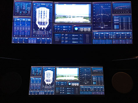
Territory is good at more than just orderly production. Over the last few years, they’ve worked on a huge number of memorable sci-fi films, including The Avengers, Guardians of the Galaxy, Blade Runner 2049, The Martian, Ex Machina, Ghost in the Shell, Jupiter Ascending, Transcendence, Mission: Impossible, and Prometheus. They’re always trying to think about where our civilization is going and, often, these ideas become the basis for user-interface ideas. Mouse devices and keyboards lost their on-screen appeal a long time ago, so they’re always trying to come up with new options. A hot topic these days is agentive UX, which involves exploratory work in the field of artificial intelligence. For superhero films, they study real-life superheroes such as pilots and biologists—basically, those who work with complex technologies. It’s interesting to note that the presentation of professional data is often quite dry—and there’s a lot of it—but an expert is capable is noticing even minor changes in individual parameters.
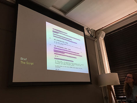
The team gets the script at the start of a project, as the brief in Figure 12 shows. Lots of discussions revolve around what goes on in a scene. They work closely with the camera department and production designer to get a feel for the overall tone of a film. They work with the creative director to make sure everything contributes to the narrative flow, as shown in Figure 13. The fantasy user interface (FUI) can essentially act as a character—complete with its own personality and purpose. There are many professionals in the field whose opinions are worth listening to. The user interface can also have an impact on costume. For example, an icon might appear on the sleeve of a character or an abbreviation could materialize on a gate. The interactions here are pretty tight—everyone uses each other’s mood boards.
Figure 12—Brief for a fantasy user interface (FUI) Figure 13—David-Sheldon Hicks, Creative Director at Territory
Issues come up all the time, but once people accept that’s what happens, they’re good to go. They all realize that, if they hand their work in late or it’s of suboptimal quality, there will simply be no more work. What’s interesting is that Territory are ultimately responsible for their work. There isn’t much real product development, so they can push concepts to their limits. This ownership can really intensify the joy that results from project work. One time, a new designer was working on Guardians of the Galaxy, and they asked him to do a few screens, but didn’t say what film it was. Sometime later, when he was at the cinema, he watched a trailer for the film and recognized his work. He was delighted and began putting even more intensity into his work. Having a chat with the director over the phone or presenting to actors can be hugely motivational. Seeing someone like Christopher Nolan, a guy who is carrying a hundred million–dollar budget, provokes feelings of empathy and inspires people to work harder as a result.
Many film ideas make their way into real-life projects. For example, there is a collaborative Kinect and augmented-reality project with Intel and a space company that extrapolates data from the video stream. Lots of their work relates to games, including Microsoft Hololens, Sony PS VR, and Oculus. Technologies develop so quickly that even movie concepts sometimes don’t come fast enough. Getting to release dates takes a lot of time and preparation and, occasionally, the real world catches up with them.
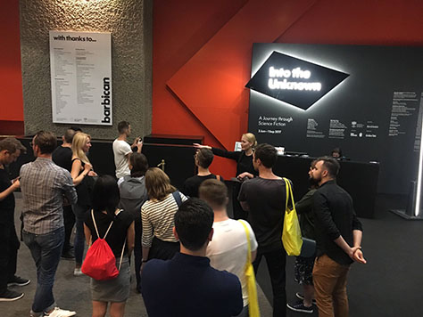
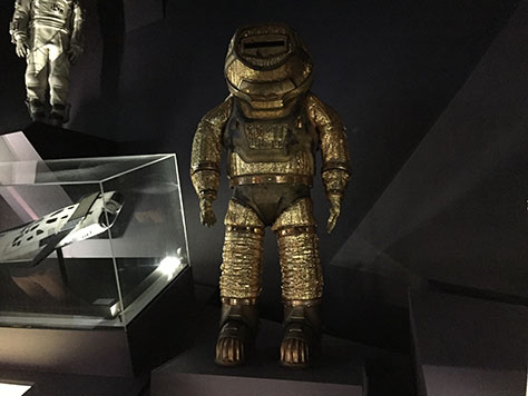
Incidentally, during the conference, there was a sci-fi exhibition going on at the Barbican, and some of the exhibits were of Territory’s design, including those shown in Figures 14–16.
Figure 14—FUI exhibit from The Martian, at the Barbican Figure 15—Into the Unknown exhibition on sci-fi movies Figure 16—Exhibits from Into the Unknown
Moo
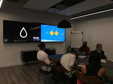
Moo offers printing services for greeting cards, business cards, and other print collateral to companies and individuals. One department is dedicated to online orders, while another focuses on work for artists and illustrators who are creating their own merchandise. It’s interesting to watch how designers from these two departments influence each other. They communicate regularly and work alongside other branches of design, which really helps expand their horizons. The team is structured similarly to that at Spotify. Designers sit in teams—working on their creation process, templates, and so on—and are divided into two clans—creation process and content. Researchers work with multiple teams simultaneously and act as internal consultants. There’s a guild for design systems that has two clients—one from design and another from development. One source of product ideas and insights is the support team, which occasionally conducts workshops. As Figure 17 shows, Moo use a version of the Double Diamond model. Figure 18 shows the photo studio at Moo.
Figure 17—Moo’s version of the Double Diamond model Figure 18—Moo’s photo studio
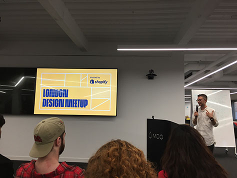
A couple of hours after the lecture, there was a London Design Meetup at the Moo office, as Figures 19 and 20 show. Kevin Clark—a guy from our group and design lead at Shopify—organized the meetup, which was similar to the ones back home in Moscow—pizza, beer, and a few short presentations on UX design.
Figure 19—London Design Meetup hosted by Shopify at Moo Figure 20—Byron Fernandes talks at the London Design Meetup
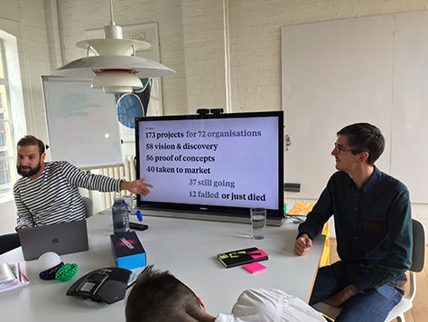
Deliveroo
Jonny Burch, shown in Figure 21, spoke about the Deliveroo design team, which has grown quickly from ten to over a thousand employees in the space of three years. Designers have had to keep up with some serious speed. These days, roughly 30 people are responsible for product design, content strategy, and research. These teams are themselves subdivided into several smaller teams. The consumer core team, for searches and order tracking, consists of four people; consumer experience, six; growth, three; delivery, nine; and restaurants, five. How did this structure come about? As is typical, the design team began as a small team that completely understood the problem space and handled everything on their own, then grew along with the product teams. It’s a lot like the human development cycle: adults and teenagers behave differently. Each niche requires its own specialized approach and experience and has a unique focus. Today’s demands will not be the same as tomorrow’s.
Figure 21—Jonny Burch talks about Deliveroo’s design team
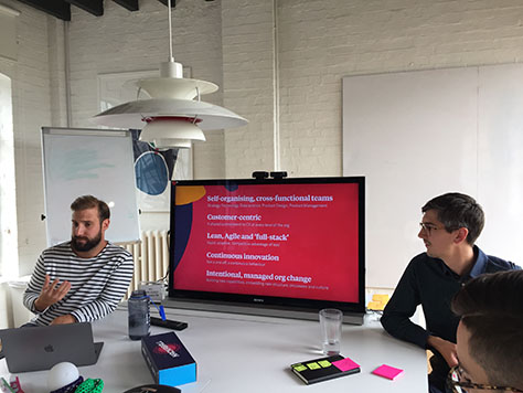
One of the design team’s biggest questions involves figuring out how to scale good work. It’s easy to be a lone designer. You get to call all the shots. But as a company grows, it becomes impossible to micromanage all decisions, so new approaches become necessary. Here are the company’s key issues:
culture—This is a key area of focus for Deliveroo. If a design team has a good culture, you can spread that culture throughout the rest of the company.
rituals—These involve how to get feedback and how to give it. Because the head of design, Simon Rohrbach, knows less about each given context, he needs rituals to stay in the loop.
tools—The team shares a toolkit, working in code and in Sketch.
environment—The studio environment is important to the team’s success.
systems—The team doesn’t want to constantly reinvent the wheel. They want to solve problems, not think about all their different shadings. They’ve implemented a design system in code and Sketch.
Deliveroo has a deep understanding of their user, given that food is an integral part of every human being’s life. This emotional connection strengthens empathy. It’s great that every employee is essentially a client because everyone eats and orders food. For example, every Friday there’s a delivery for everyone in the office. (They brought in some extra food for us, too.) The team describes the subject domain as chaotic, human, and international. What their clients want is to find food as easily as possible and get it delivered as quickly as possible.
The driver experience is a different story altogether. It’s all about making sure the order reaches its destination. Deliveroo describe their task as designing for people all around the world—who have different life experiences, speak different languages, try to earn money; and might be riding bicycles, scooters, or cars—so they might get a flat tire—or might be on foot or in the restaurant. They need to wear gloves and may need to take shelter from pouring rain or snow or sweat in tropical heat, while, at the same time, they must deliver ice cream or pizza, using the app for eight hours straight. Whether clients come back depends heavily on their experience. If their food doesn’t turn up, solutions such as giving them their money back aren’t ideal—they still end up hungry.
A good product always hides great complexity that ensures it works. In this case, designers’ job is to reduce lag time across the board. That’s why good design is not just expressed visually. Although the first version of the product didn’t even work on mobile, much has changed throughout the years. A huge rebranding effort took place last year. The exterior, the products, and other mediums changed in all countries at the same time—seemingly overnight. To begin with, it seemed that there were too many problems to solve, so for the products, they started off by changing just the logo and colors. A new user interface will follow later. If they had tried to tackle that at the beginning, they would have had to support both the old and new versions during the relaunch.
Made by Many
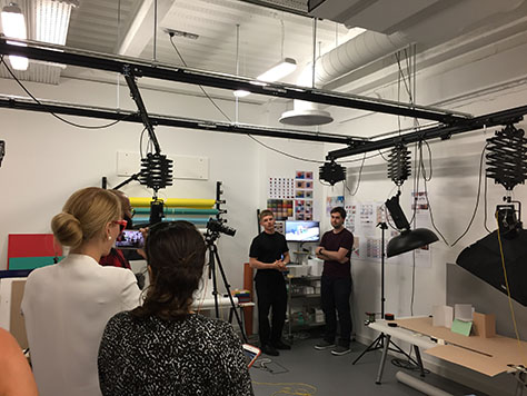
Tom Harding and Adam Morris talked about design at Made by Many, as shown in Figures 22–24. The company aims to aid both colleagues and clients in their development efforts. To this end, they’ve prepared three guidebooks for skills development—relating to design, strategy, and technology—which describe what a good result looks like. They rebuilt the agency to focus on clients’ digital transformations because, to make good products, you must also innovate in your workflow. They’ve changed the structure of the company, making course corrections regularly. This is one of the biggest challenges for modern companies. We’ve solved a similar problem by keeping the team’s development in harmony, so it was interesting to see a studio approach.
Figure 22—Tom Harding and Adam Morris speaking about playbooks Figure 23—Made by Many project statistics Figure 24—Made by Many principles
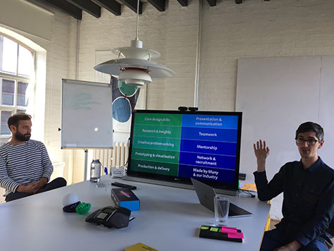
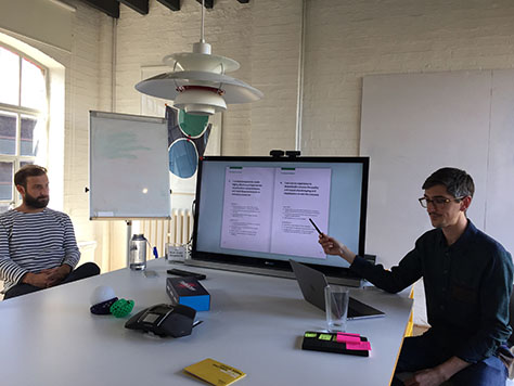
These days, designers at Made to Many call themselves product designers. (Although they’ve noticed that their title may change from project to project.) As a rule, a universal designer works on projects with a strategist, developer, and manager. A few years ago, they codified this position with the help of a mighty skills-knowledge matrix, shown in Figures 25–27, which helps them assess current employees and new candidates. Currently, they rate the mastery of skills on a scale from one to six, but a score of six is impossible to attain.
Figure 25—Overview of skills-knowledge matrix for designers Figure 26—Delving more deeply into the skills-knowledge matrix Figure 27—Made for Many skills-knowledge matrix for designers
Designers must also regularly demonstrate these primary skills:
key design skills—These essential skills cover everything from specific design solutions to process to company culture. The design process guidebook shown in Figure 28 covers skills relating to process.
research and insights—Designers must be able to use different technologies and tools in varied situations.
creative approaches to problem-solving—Designers must know how to get around limitations and dead ends and how to transfer their work experience from one area to another.
prototyping and visualization—Designers must have the ability to translate ideas into deliverables and prototypes that they can test with users. It’s important that they not become overly attached to specific tools or technologies and be able to glean as much knowledge as possible with minimal expense.
production and delivery—Designers must be able to make a design work in practice.
Figure 28—Made by Many design process guidebook
Additional skills include the following:
presentation and communication
teamwork
mentoring
networking and hiring
company and market sector
For employee ratings, they use an application called Coach Amp 360 Reviews. They conduct a series of regular mini-meetings with managers—weekly or every six months for a long review. To test specific skills, they assign designers to projects that require these skills. They study 20 factors that determine whether a project is the right fit for a designer. Does the designer have the necessary experience and creativity. Balance is important. If designers do too many similar projects, they might get bored.
Connecting Brand with Interface
The second topic the conference covered is how to integrate user interface with brand promise and identity.
Analog Folk
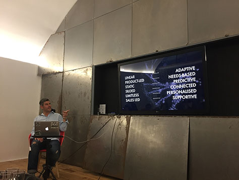
Matt Dyke, shown in Figure 29, spoke about how Analog Folk is trying to escape the confines of the classic branding agency by expanding the concept of brand with the help of algorithms. Their mission is to use digital tools to improve the analog world. In their formula Brand = Promise + Experience, the first part of the equation prevailed for a long time. Only in the last decade have they started paying more attention to the latter part. Modern brands are defined by what they do, not what they talk about. So to have impact, it is important not just to react to existing scenarios, but also to help shape them. Thus, their new model encompasses anticipation, offering support, and expert help.
Figure 29—Matt Dyke shows how client businesses transform
Users have unexpressed ambitions that the brand can help them with, making it even more valuable to them. For example, Nike wants to become stronger. Analog Folk employ a stack of tools to achieve these goals:
human interface
decision logic
artificial intelligence (AI) services
development platforms
data services
Moving Brands
At Moving Brands, Mia Chuang, shown in Figure 30, ran a workshop on how they actively involve their clients in brand work. They organize joint workshops during which they test the connection between the brand and the user interface—how much the main screens and scenarios relate to key principles. What they end up with is a powerful tool for identifying and fixing mismatches. Bringing in the client is really useful when it comes to explaining the logic behind decision-making—not to mention the fact that the client’s presence in the workshop significantly raises the chances of the brand identity’s thriving after delivery. Our group took part in such a workshop, working on an example brand, as shown in Figures 31 and 32.
In their client work, Moving Brands use tact and common sense, giving the user interface some character, but make sure they don’t go overboard. Technical limitations also have an impact. For example, when they worked on the BBC’s iPlayer Kids, shown in Figure 33, development depended partly on utilizing parts of the existing iPlayer, so it was easier to leave them standardized. They also had to make sure interaction scenarios were clear. The goal wasn’t to create a whole new application, but to develop the brand to suit a new audience.
Figure 33—BBC iPlayer Kids case study
One version of the characters was too complex. They seemed more like TV-series characters. At the same time, the company didn’t want to mix their characters with those that were already on TV. If they had used existing characters, children would have had trouble relating to them because they’re already tied to existing ideas. It would be harder to project new ideas onto unique, established characters. New characters, however, don’t suffer from the same issue. Their purpose is to support the narrative, not to take focus.
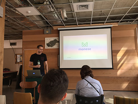
Monese
The mobile bank Monese is a rare example of a product that has been made with great attention to detail—one that exists in real life, not just as a concept on Dribbble. It has a modern visual design, a comprehensively thought through user interface whose focus is simplifying operations, and a strong emotional component. Plus, the brand is tightly interwoven with the user interface, so the digital product and its marketing activities are well integrated. Joe Allison, shown in Figures 34 and 35, spoke about how Monese achieved this result:
brand storyboarding—They defined the steps of interactions with the brand.
brand values—These acted as a filter for testing design solutions. They asked colleagues about three values that the company holds. They did lots of design sprints and created mood boards.
interaction branding—The foundation for the brand consisted of key interactions with the product—payments first and foremost. In the end, the opposite also worked—the branding itself began to define interactions with the product.
brand system—They created a brand system.
Figure 34—Joe Allison of Monese
Users’ key interaction with the product is money transfers, so the team focused on that. The branding itself reflects the simplicity of transferring money—its constant movement. That’s why, when compiling mood boards, they searched for examples of how to express movement with a static image. Moving lines reflect an endless current of payments. The final idea was a static shot of movement. To enhance the sensation of movement, they tried to create all imagery on the card in perspective. In addition, to support the brand, it was important to reflect the softness of lines in the graphics, so it was necessary to pay close attention to detail during development. To make sure that there were no crossovers with competitors, they made a giant artboard containing screenshots of other products. Check out their fantastic rebranding case study.
Figure 35—Joe Allison showing their rebranding process
Business goals for the company generally revolve around user experience—the simplicity and speed of money transfers—because it’s easy to tie to the user interface. They try not to think like a typical bank and seek inspiration from consumer products such as Netflix and Spotify. Alon Uziel, shown in Figure 36, spoke about Monese’s interface design principles, which they’ve cobbled together from best practices rather than tying them to the brand. Each of the following principles has characteristics that lead to concrete results:
They tested their prototypes in their UX labs. The team wasn’t limited by the design of an existing product, so they could fearlessly try different approaches to using interactive gestures. The main criterion was not how quickly the customer could input their user ID and password, but how long it took to verify their personal details.
The internal team did absolutely everything in six months. Even by their own standards, that was a pretty long time. A classic branding company would probably have taken about a month. Ideas come from all team members—from support to security to designers. If the team has to sell something, a shout-out goes to the marketing and growth teams. The whole company is a lean team that does everything together. They’ve tried design sprints a couple of times and would like to do more. On one occasion, they even did it by the book. But, most of the time, the team is in production mode, and there just aren’t enough time and resources. It’s funny that even medium-sized companies find that standard methodologies have no place in their workflow.
Product Design
World-class product-design work was the third realm of insights I gleaned from the conference.
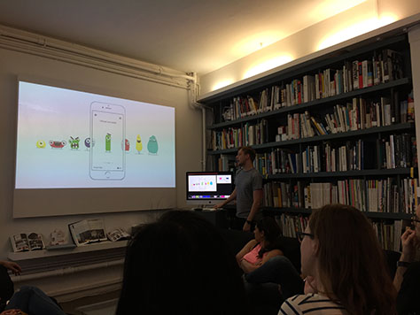
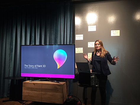
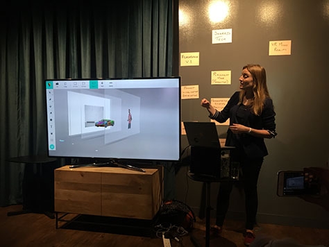
Microsoft Lift Studios
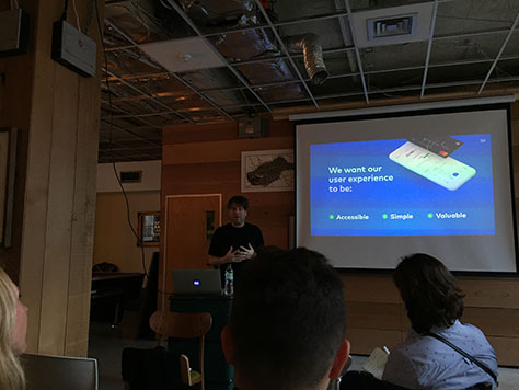
Microsoft wanted to make Windows creative again and one of today’s hot trends is 3D, so they created Paint 3D. Jennifer O’Brien, shown in Figure 37, spoke about how they embraced MS Paint as a suitable foundation for making a complex environment accessible to the typical user—a familiar bunch of people who already use lots of computers. Their design principles were pretty basic: simplicity, speed, and ease of use. A video of the product vision showed where the product might go and really helped sell the idea to managers and users. (Microsoft Lift Labs constantly receives feedback on videos like this one.)
Figure 37—Jennifer O’Brien talking about the Paint 3D design process
The original product had appeared way back in 1985. The design team looked at all five versions on the computers and Windows operating systems of their time, which helped them better understand the product and its ideology. They created the video of the version history shown in Figure 38. They also researched how people launched and quit Paint, as well as how the tool relates to users’ wider context of work. They looked at what actions users carry out in the application to see which contribute to their retention of users and which do not. Then, they found and fixed bugs and lag times. What’s interesting here is that they learned how to do A/B testing on a desktop application. Thanks to telemetry, they can see the clickability of interface elements—for example, where users click the start screen.
Figure 38—Video of Microsoft Paint version history
Jennifer discussed the Paint 3D design process, as shown in Figure 39.They made many interactive prototypes because nobody had ever solved a problem like this before. One of their first questions was whether it was even possible to mix 2D and 3D, so their first step was the simple conversion of two-dimensional images into three-dimensional images. They got a serious wow for this so went further, asking: Can a casual user draw in 3D? They had to greatly simplify the user interface to achieve this. For example, they got rid of the locatable camera because, during testing, nonprofessionals became disoriented and preferred the frontal camera. To develop and improve the user interface, they proposed and prototyped hypotheses. They used PowerPoint and Unity for prototyping—even using them to assemble the first version of Paint 3D because this was the quickest way of doing so. To make such prototypes possible, the designers, engineers, and 3D modelers worked very closely together and conducted usability testing in a centralized, US-based lab.
Figure 39—Microsoft Paint 3D design process
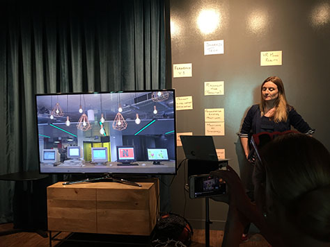
The team carefully studied other 3D tools in search of ways to simplify the application. What’s interesting is that there was one other department that was particularly excited by their ideas and asked for a texturizing feature. The company organizes jams, during which people from different departments and user groups get together and work on solving a common problem. These jams give them the opportunity to test ideas out on a whole bunch of people. They also hold public events—for example, together with BAFTA, children spent a whole day drawing monsters in 3D, then saw them in augmented reality. This was really magical for them.
At the moment, a lot of really exciting projects are happening at Microsoft Lift Studios, including Hololens, Paint 3D, and SwiftKey.
Firedrop
Web-site builder Firedrop uses algorithm-based design to simplify the lives of small business owners. To avoid repeating The Grid’s mistakes—trying to solve an overly universal challenge—they chose a narrower and more grounded problem: eliminating bad designers. Previously, founder Marc Crouch, who is shown in Figure 40, had run his own Web design studio, but many clients had no money for good design and instead turned to services like Fiverrr. These clients became the target audience for Firedrop. The company targeted their tool at generating leads, with the first stage consisting of one-pagers. This helped them understand how Web sites work on the platform and why things might break.
Figure 40—Marc Crouch talking about algorithm-driven design
Firedrop looked at Squarespace, Wix, and other Web-site constructors to study their templates and popularity. They limited functionality to avoid overloading the tool. For example, you can’t upload videos, but you can embed them using YouTube. They optimize for SEO and pure code. They added a bot to make sure they didn’t come across as just an order-fulfilling tool, but rather an experienced and useful consultant. This helped them form trust instead of trying to be trendy. One study arranged a comparison: What type of support do people trust most—human or software? It turned out that people are more likely to open themselves to bots than humans. When it comes to new tools, it’s always best to establish trust first. People must understand that they’ll get a normal Web site out of the process.
How can they automate design? It’s best to start at the end, then make your way to principles from there. Can computers be artists? Picasso famously said that good artists copy and great artists steal. Computers are currently great at imitation, and they can make pretty great generative art. But is that genuine creativity? There is less tolerance to rule breaking in design than there is in art. For algorithm-driven design tools, one of the biggest problems is limiting the scope of generated solutions. Firedrop could spit out millions of combinations, but they’ve narrowed the results down to about 800 variations. At first, they tried to do this manually, but then started applying rules such as symmetry, contrast, range, and rhythm. To check the workability of various design concepts, they change the look of their own Web site every week.
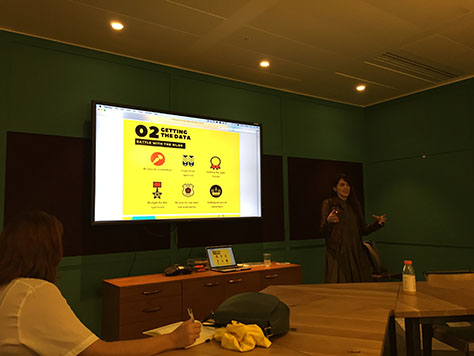
NomNom
NomNom is a tool for the collection and analysis of product insights. It solves a problem that most companies never get around to fixing: combining feedback from many sources such as support tickets, user research, analytics, and comments in app stores. Insights don’t just come rushing in immediately, but as the result of a gradual process of accumulating knowledge about users and products that eventually leads to leaps in understanding. It’s important to assess whether one needs such a tool in the first place. Before a company becomes data driven, it has to travel a long road of culture change. In practice, implementing such technology requires such huge adjustments that everything collapses quickly. We have been moving in this direction for a relatively long time, but too slowly, and there are never-ending problems. Still, there is some sort of positive outcome from this, and it increases every time a problem is solved.
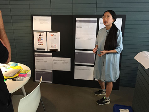
Sofia Quintero, shown in Figure 41, spoke about how NomNom put together a list of implementation problems through their meetings with clients, including the following:
access to data
lawyer agreements
receiving data in the correct format
budget
access to raw data instead of summaries
access to clients
Figure 41—Sofia Quintero speaking about NomNom
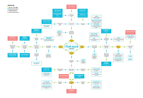
Sofia also mentioned the fantastic Unstuck Map from Nikkel Blaase, shown in Figure 42, which is a diagram detailing various methods for user studies and analytics.
Figure 42—Unstuck Map by Nikkel Blaase
Sony Mobile
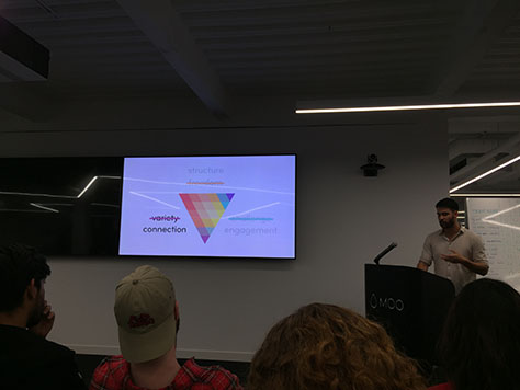
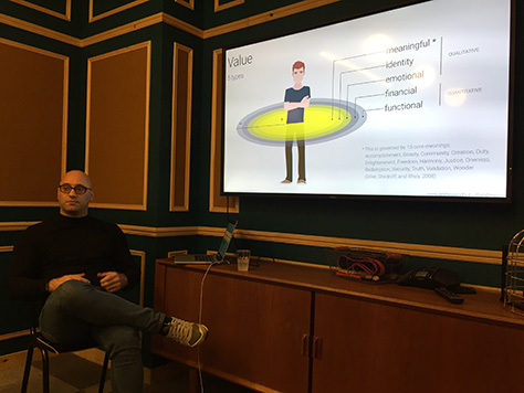
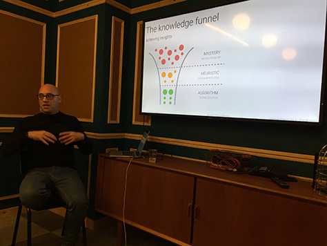
Andrea Picchi of Sony Mobile, shown in Figures 43–45, spoke about the importance of building a relationship between a product and the user—a connection that exists to exchange value. While a competitor might copy features, it’s hard to copy value. Value can be elusive. For example, one of Starbucks’ most important KPIs is the amount of time a client spends in the café, because this is something that helps build relationships. Because designers are unable to have a direct impact on relationships, they have to affect change through triggers. While it takes a maximum of one month to figure out how to use Sketch or Adobe Illustrator, learning to solve problems is much harder. Sony Mobile has a SWAT team of five mighty designers who understand this and spend 20% of their time solving other teams’ problems.
Figure 43—Andrea Picchi’s talk on designing AI-based relationships Figure 44—Types of value Figure 45—The knowledge funnel
General impressions
In summarizing my main impressions from this year’s conference, I would outline them as follows:
Simplifying complexity is a difficult challenge. But if you focus on one understandable segment of users and their main problem, it’s possible to launch a simple version of a product. This is something two companies shared with us: the creators of Microsoft Paint 3D—whose functionality they pared right down, simplifying interaction with the user interface—and Firedrop, which focuses on one-pager, promo sites.
A hybrid designer, who has a number of adjacent skills, is valuable not just in product companies, but also in UX agencies such as Made by Many, less conventional design studios such as Territory Studio, and on experimental product teams such as that at Microsoft.
We saw some interesting offices, including Microsoft Lift Studios, which is a cross between a standard workspace and a loft; Made by Many, whose gorgeous look is the result of an unusual refurbishment of a production space; Analog Folk, which has several interesting floors; and Moo, which managed to revamp a giant hangar.
There are many variations on the theme of design sprints, which don’t necessarily follow a five-day format. This methodology is just a modern design process that has been applied to the development of a digital product and requires no branding.
A successful tie-in of brand and user interface tends to suggest a close design relationship with representatives of the business. This is apparent from Monese’s amazing results, as well as the Moving Brands approach to work sessions.
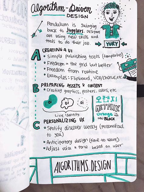
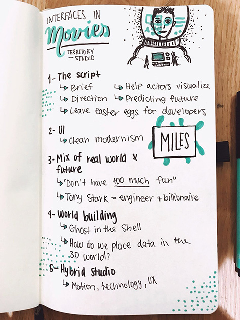
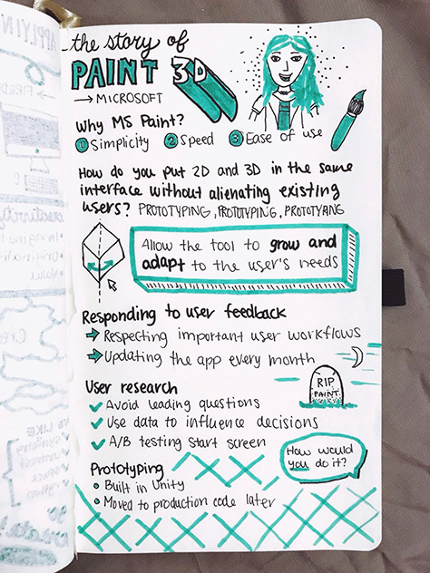
I actually gave a talk, too, subbing for one of the morning speakers by giving my presentation on algorithm-driven design. Kevin Clark created gorgeous sketchnotes for all the talks! You can see the sketchnotes for my presentation in Figure 46, for the Territory Studio talk in Figure 47, and on the story of Paint 3D in Figure 48.
Figure 46—Sketchnotes for my presentation on algorithm-driven design Figure 47—Kevin Clark’s sketchnotes for the Territory Studio talk Figure 48—Kevin Clark’s sketchnotes on the story of Paint 3D
Proceedings
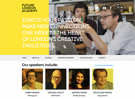
Attendees received a conference program and some useful gifts. However, it was hard to obtain speakers’ presentations because the information they shared with attendees was not yet ready for publication. (Attendees had to sign many NDAs.) However, the opportunity to see everything was well worth it. FLA does not maintain information about their past events on their Web site, which is shown in Figure 49.
Figure 49—Future London Academy Web site
Hospitality
Most conference attendees stayed at a Premier Inn hotel that was just one minute away from the WeWork coworking space. (This accommodation option came with the event ticket.) Morning lectures and a Friday debrief session took place in a WeWork conference room. During previous years’ conferences, attendees resided in several nearby houses, which made the venue feel somewhat like a campus. However, some people preferred having more privacy, so this year, the conference organizers offered a nearby hotel.
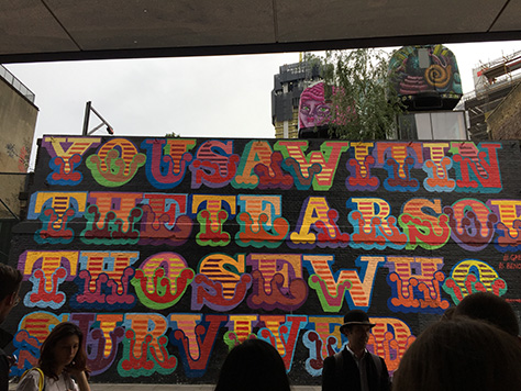
Since many attendees were visiting London for the first time, the organizers allowed plenty of free time for touring the city. I love London! It has a terrific mix of classic and modern culture. There was a graffiti tour on Tuesday, which included many hallmark works, including one from the movie Exit Through the Gift Shop about Banksy, shown in Figure 50.
Figure 50—A stop on the graffiti tour
At the end of the week, on Friday, all attendees gathered for an after party at Analog Folk’s office. It was time to relax. Experiencing a dozen tightly packed lectures in one week was a bit exhausting.
Community
This year, the group was varied as always, including designers from Brazil, Australia, the Netherlands, Belgium, Austria, Germany, Britain, USA, Canada, and Russia. Participants came from such companies as Facebook, Shopify, Yahoo!/Oath, European Centre Bank, ONY, and Sberbank. Figure 51 shows the conference attendees. This diverse community provided rich potential for interesting conversations. In addition to enjoying the main program, everyone found out how product designers work in different countries and various companies. For example, Paul Aultran, of Facebook, used to work at Google and was a design-sprint facilitator; Kevin Clark told us about the Shopify Polaris design system; and Konrad Kaczmarczyk showed us Satchel, his plugin for synchronizing symbols in Sketch.
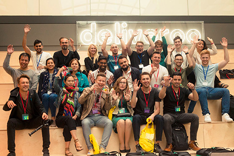
Figure 51—Attendees gathered in the Deliveroo office
Conclusion
Among all of the design events I’ve ever attended, this conference was certainly one of the highlights. The speakers and their studios, the organization of the program, and the diverse attendees provided a lot of inside knowledge and a great experience. London is always interesting because, in this city, all of the different design disciplines are equally well developed, while, as a rule, most countries focus on just one or two. Trips like this act as great reality checks, ensuring a balanced understanding of our discipline.
In 2018, FLA’s UX and Digital Design Week will take place August 13–17. The organizers have already announced the lineup of speakers and studios, which includes Fjord, Stink Studio, Net-A-Porter, Native Design, Modern Human, Samsung, R/GA, Spov, Creative Navy, and Space Ape. I’m looking forward to widening my professional horizons at the fourth iteration of this conference.
Yury leads a team comprising UX and visual designers at one of the largest Russian Internet companies, Mail.Ru, which is part of the Mail.Ru Group. His team works on communications, content-centric, and mobile products, as well as cross-portal user experiences. Both Yury and his team are doing a lot to grow their professional community in Russia. Read More