Top

OZ-IA 2007: Conference Review

November 19, 2007
Organization 2 stars
Content 3 stars
Presenters 4 stars
Proceedings 3 stars
Venue 4 stars
Hospitality 4 stars
Community 4 stars

For any community of practice, especially one that is still growing, it’s crucial to have opportunities to interact and collaborate with our peers and build a vital sense of community. It’s also necessary to set a direction for the profession, find out what our peers are thinking and doing, and recognize and foster talent within the community. And it’s important that all of this occurs—not based on outside influences—but within the local community. This is the situation the information architecture (IA) community currently faces in Australia.

It is for these reasons that the organizers of OZ-IA took the important step of establishing an IA conference in Australia. As IA practitioners, we had previously been forced to travel to the USA or Europe to participate in such events. We needed a local gathering: OZ-IA, now in its second year.

OZ-IA 2007 was held on September 22–23, 2007, in Sydney, Australia. By my estimate, about 100 people attended OZ-IA this year, showing good growth over last year and demonstrating a great deal of support from IA practitioners, other industry groups, and corporate sponsors.

Champion Advertisement
Continue Reading…

As you’d expect, the conference reflected the issues participants face, including what is possibly the biggest issue at the moment: the current shortage of expertise! There just aren’t enough skilled IA practitioners in the Australian market, and each of the organizations taking part in the conference took the opportunity to let the community know they were looking to hire.

Another issue we face is defining what it is we do and how we do it. The topics presenters discussed reflected these issues—from topics relating to the more cerebral level at which IAs operate, to interacting with other disciplines in business, to strategy, and to topics much more at the hands-on level.

Above all, gathering all the great people who make up this community was a great benefit in itself. The level of discussion and debate—both during and between sessions—is a promising sign.

The driving force behind OZ-IA is Eric Scheid, and he deserves credit for the work he has done to set up and organize the event over the last two years. Eric is an experienced IA, well known in Australia through his work at Ironclad Networks, and possibly most importantly, he is passionate about IA. It is this passion that has achieved what nobody else has even attempted.

Organization

The conference had an early start at 8:10 am on a Saturday morning. That’s right, this was a weekend conference, which was more than evident on the faces of some attendees that morning. A bit of a rocky start, no doubt, but before long, we were firing on all cylinders and getting into the spirit.

The conference chair, Tudor Goode, made a good effort to keep things on schedule, which is not always an easy job, considering how much we like to talk! While some speakers went over their time a little, this was usually due to a healthy discussion with the audience. A relevant sponsor introduced each speaker.

Even with strict scheduling, the combination of eight sessions per day, with a coffee break after every single session, made for two long days. This also meant each presenter had only 45 minutes, including question time. Breaks were too short and too frequent, disrupting the flow and pace of the day, and requiring the herding of attendees like cattle to try and keep to the schedule.

Freely available wireless Internet kept people blogging, Flickring, and Twittering over both days. The A/V setup went without a hitch.

Talking to attendees afterward, there was some debate over the virtues of the holding the conference on a weekend. Some suggested that freelancers find it easier to attend on the weekend, because otherwise, they would be missing out on income. But freelancers are more easily able to shift their time and thus could make up the same number of working hours. Others suggested that the weekend schedule mimicked the IA Summit, at which conference sessions occur over a weekend. One thing is certain: holding a conference on a weekend did not seem very popular.

Overall, preparation for the conference seemed to be fairly last minute. While everything worked out okay on the day, the finishing touches of a professional conference were lacking. For example, event promotion, the selection of speakers, and the release of the conference program all occurred very close to the start of the event.

Content & Presenters

This year’s presenters covered a wide range of topics, offering something of interest to everyone. Although there were no official tracks, two major themes emerged in the presentations:

  • the big picture
  • IA methodology

In keeping with the relaxed style of the event, quite a friendly attitude was apparent among participants. This broke down barriers between attendees and presenters, who chatted during breaks, as shown in Figure 1, and there was good interaction between the different disciplines that made up the audience.
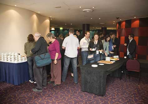
Figure 1—A break between sessions
Break between sessions

The line-up of presenters represented a good selection of local expertise, plus a number of international speakers. While the aim of an Australian conference should surely be to promote local knowledge, it would have been good to have more international speakers. After all, part of the problem for practitioners working in Australia is the difficulty in getting overseas to see the big names and thought leaders. So we should be bringing them to us rather than us going to see them elsewhere, a strategy that has worked well for other local events such as Web Directions South.

Some things one might expect in a conference did not feature in this year’s OZ-IA, including tracks on different topics, workshops, and keynote speakers. Parallel tracks would allow a greater number of speakers and cater to different audiences’ needs more effectively. Pre-conference workshops are often a valuable component of other conferences, especially for those who are new to the field. Keynote, or plenary, speakers often effectively set the overall direction for a conference—and a community of practice—providing much needed thought leadership. In fact, I often find the keynotes to be the best part of a conference.

In the following sections, I’ve summarized each session, but you can find more information on each presentation—as well as slides, podcasts, and, in some cases, video—on the OZ-IA Web site.

The Big Picture Theme

As information architects, we often need to take a step back and see the big picture. This might include viewing our work in a business context—including dealing with clients and contracts and having to sell our expertise. We also sometimes need to compromise—recognizing that there are other factors besides what we think is the right way to do something. Therefore, the conference’s big picture theme is very important—though it does require a departure from our typical discussions about wireframes and Visio tricks.

Designing Sites People Love—Balancing Emotion with Business Reality

Presenters: Elizabeth Pek and Andy Coffey

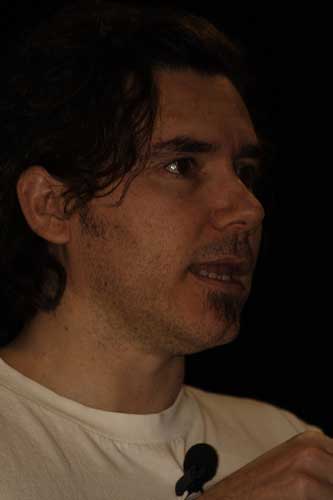
In “Designing Sites People Love—Balancing Emotion With Business Reality,” Elizabeth Pek and Andy Coffey, who is shown in Figure 2, talked about balancing user and business objectives, something we all need to deal with. They also discussed the new design for the Sydney Morning Herald Web site, including its use of “quiet structure.” Of interest to me was their construction of a persona for one of their competitor’s users, allowing them to focus on enticing such users away from other Web sites.
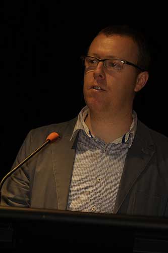
Figure 2—Andy Coffey
Andy Coffey

Love in an Elevator—Selling the Value of IA to Business

Presenter: Stephen Collins

In his presentation “Love in an Elevator—Selling the Value of IA to Business,” Stephen Collins talked about the relationship between UX professionals and other disciplines—particularly management and business folks. Again, this is something we all need to deal with, and the consequences of getting this wrong can be difficult to reverse later on.

Rise to Play a Greater Part—Delivering Specs in the Bigger Picture

Presenter: Faruk Avdi

Faruk Avdi continued the big picture theme with his presentation “Rise to Play a Greater Part—Delivering Specs in the Bigger Picture,” discussing how we can improve the planning and scoping of IA work and manage client expectations. There were some interesting discussions around this topic, but there wasn’t sufficient time to explore all of the issues.

ROI in Information Design: Where IA Figures in ID

Presenter: David Sless

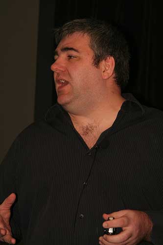
David Sless, shown in Figure 3, presented “ROI in Information Design: Where IA Figures in ID,” which focused on the methodology his organization uses. This presentation elicited a strong reaction—though perhaps not immediately apparent. As David is more a member of the Information Design (ID) community than part of the IA community, it was interesting for me to hear his comments regarding diagnostic testing—as opposed to usability testing. Much of the discussion that arose from this presentation centered on the rigor and consistency with which IAs use some techniques—specifically, while some people might not do things in the right way, not all IAs fall into that category.
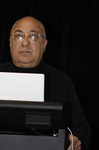
Figure 3—David Sless
David Sless

Fast, Cheap, & Somewhat in Control—10 Lessons from the Design of SlideShare

Presenter: Rashmi Sinha

Rashmi Sinha, shown in Figure 4, closed the first day with a presentation on IA and user experience in the context of a startup business, entitled “Fast, Cheap, & Somewhat in Control—10 Lessons from the Design of SlideShare.” Rashmi is an engaging speaker, with a no-nonsense attitude, which was both refreshing and entertaining.
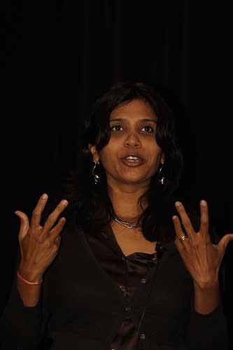
Figure 4—Rashmi Sinha
Rashmi Sinha

As a core member of the team behind SlideShare, Rashmi revealed the strategy they adopted with regard to usability testing: very little. But this was entirely sensible when you consider they weren’t innovating the user interface to any great extent. Instead, they used conventions other successful Web 2.0 ventures had already established. This brings up an interesting point: How often do we reinvent the wheel simply in the name of best practice? In the agile environment of a startup, is just-in-time design not only helpful, but a necessity?

Ethical Issues and Information Architecture

Presenter: Donna Maurer

On day two, Donna Maurer presented “Ethical Issues and Information Architecture,” discussing what it takes to be an ethical designer. In typical Donna style, she had much to say, and her passion for this topic was obvious. Her presentation quickly got into full swing and raised some interesting questions.

This is a topic I don’t think people generally give much thought. For instance, do we want to help a client design their Web site if we don’t agree with their stance on environmental protection? Donna suggests we each need to devise our own personal moral guidelines and use them to determine what work we do and who we work with. Generally, as a profession, we need to take a much broader view of what we’re doing and understand the real-world consequences. While this was definitely big picture stuff, Donna also gave some practical tips for practitioners.

Information Architecture of Wikis

Presenter: James Matheson

James Matheson, shown in Figure 5, presented “Information Architecture of Wikis,” more or less giving an introduction to wikis and how information architects can play a role in their development within the enterprise. While there are definitely benefits to using a wiki, this was a topic that could have done with some more time to discuss the practical considerations. Approaching the use of wikis in an enterprise without a clear strategy and an understanding of their suitability can lead to as big a mess as you intended to fix. One good tip James gave us was that it is better to take the role of a gardener, as opposed to trying to strictly control content publishing on an intranet.
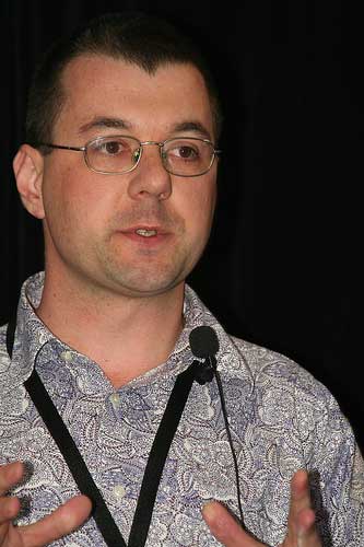
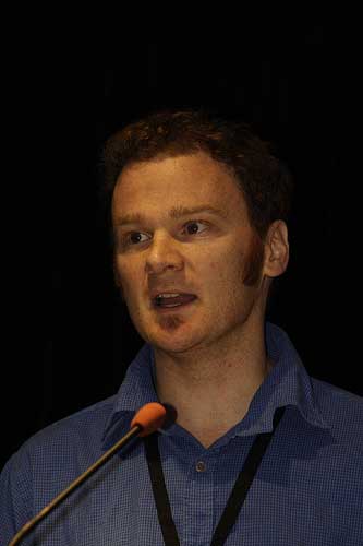
Figure 5—James Matheson
James Matheson

The Methodology Theme

Because it is part science and part craft, information architecture includes a great deal of discussion around methodology and the techniques we use on a daily basis. Attendees following the methodology theme received practical information they could take away and apply. In combination with the big picture theme, these methodological presentations gave the conference a well-rounded balance.

Is Length Still an Issue?

Presenter: Iain Barker

In his talk “Is Length Still an Issue? Iain Barker, shown in Figure 6, discussed one of the old chestnuts of IA on the Web: page length and the myth of the fold. This is something the IA community has hotly debated in the past, but we rarely have a proper talk about it. As a profession, these are the sorts of things on which we don’t yet have a consolidated view, so the people we work with and for get inconsistent answers from us. It was interesting to hear that a survey of many successful Web sites—admittedly, many news and media sites—revealed an average home page length in the neighborhood of 4000 pixels, which is definitely below the fold.

Figure 6—Iain Barker
Iain Barker

Landing Page Optimisation

Presenter: Hurol Inan

Hurol Inan entitled his presentation “Landing Page Optimisation,” but it was more a discussion of the value of Web analytics as a source of intelligence on what’s happening with a Web site. Over the years, there has been much hype surrounding Web statistics that has done a lot of damage to their reputation—as did the misguided obsession with chasing hits. I think we need to turn again to analytics—now that a new breed of Web analytics tools and expertise in using them are available, making the strategic use of Web site usage data a realistic proposition.

Analysing Quantitative Data

Presenter: Steve Baty

Steve Baty, shown in Figure 7, gave us a good discussion on quantitative analysis and statistics, under the banner “Analysing Quantitative Data.” Steve gave us plenty of warning before presenting mathematical formulae and reminded us all to “breathe deeply.” Despite this being a scary topic, it is always good to learn practical ways in which we can use statistics to help us, as well as traps to avoid. It’s one of those things that, I for one, can’t be reminded of too many times.

Figure 7—Steve Baty
Steve Baty

Listening to Steve was very interesting, and there’s no denying his knowledge of and passion for mathematics! Plenty of humor goes a long way when talking about statistics on a Saturday afternoon.

There’s No I in Team—A Case Study in Collaborative Information Architecture

Presenter: Patrick Kennedy

Making my contribution to the methodology theme, I gave a presentation entitled “There’s No I in Team—A Case Study in Collaborative Information Architecture,” in which I discussed a recent project during which I mentored an inexperienced team as they collaborated on the redesign of a large Web site’s information architecture.

Get Out Your Pinking Shears, It’s Time to Cut a Few Patterns

Presenter: Sharon Varley

Sharon Varley opened the second day with “Get Out Your Pinking Shears, It’s Time to Cut a Few Patterns,” focusing on the benefits of pattern libraries in IA and UX design. Using patterns is established practice in other professions such as architecture and software engineering, but members of the IA world do not often use them formally. Sharon shared a success story from her work on a large, fast-paced project and listed some of the many pattern libraries that are available. As the discussion progressed, many people realized that they are indeed using patterns, but have not formalized their use. In one of the most interesting parts of the discussion with the audience, someone said there is a fine line between a UX pattern and style guide or visual design template.

Exploring Multidimensional Tagging Frameworks

Presenter: Scott Parsons

Scott Parsons, shown in Figure 8, presented “Exploring Multidimensional Tagging Frameworks,” in which he shared his ideas regarding new ways in which Web sites can use social tagging. Scott has a great presentation style, with an ingenious method of using slides that blends speech and text into a clear and entertaining stream of thought.

Figure 8—Scott Parsons
Scott Parsons

More of a thought piece than any other presentation, Scott’s talk simply posed some questions and suggested concepts that might provide useful ways of evolving the user experience. For example, multidimensional tagging, overlaying—or is it underlaying?—user tagging with hierarchical structures, and intelligent systems for assisting users with tagging—for example, obfuscation of synonyms.

User Research in Virtual Worlds

Presenters: Gary Bunker and Gabriele Hermansson

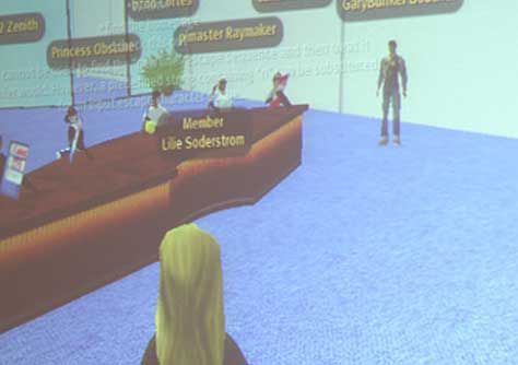
User Research in Virtual Worlds,” shown in Figure 9, was a most intriguing presentation by Gary Bunker and Gabriele Hermansson. They related their experiences in conducting user research and usability testing using Second Life. As this is a fairly cutting-edge technique, their findings were intriguing. They found that, in some ways, testing in the virtual world was easier than in real life—and of course, in some ways, it was harder. While there are some obvious teething problems, this virtual approach might become increasingly necessary to obtain sufficient reach, while keeping costs low.

Figure 9—User research in Second Life
User research in Second Life

Semantic Analysis in IA

Presenter: Matthew Hodgson

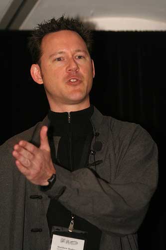
Matthew Hodgson, shown in Figure 10, gave us “Semantic Analysis in IA to ponder over. Matthew had an almost Zen-like quality, which made for a great presentation style—engaging the audience well and ensuring we didn’t get lost as he introduced us to the world of linguistics and semantic analysis.

Figure 10—Matthew Hodgson
Matthew Hodgson

This was a fascinating exploration of analysis of the language in content in order to allow a more useful information architecture. The UPA conference touched on this idea this year, but Matthew put his audience at ease and gave us some really good insights. I went away thinking this type of analysis might be something I could realistically use. Quite often, the level of granularity at which we deal with content is actually fairly high—for example, a page, paragraph, or heading. However, by understanding the structure of the very language that makes up the content—for example, subject, verb, or object—you can perform a much deeper analysis.

Open Your Mind—Map It!

Presenter: James Breeze

James Breeze wound up the conference with his presentation “Open Your Mind—Map it! exalting the virtues of mind mapping, as well as giving away free software, which always gets an audience’s attention. This is one of those things that either suits the way you work and think or doesn’t. Having only toyed with mind maps in the past, it was fairly interesting to see that the software tools have evolved to a point where they are no longer too clunky to let you work at the speed of thought.

I must commend James for giving his entire presentation within the context of a mind map, as opposed to using PowerPoint or Keynote. While it was challenging at times, it was an excellent way to walk the talk and demonstrate a less than obvious use for mind maps.

An Open Session

The organizers reserved the final time slot of the conference’s last day for an open discussion on any topic. During the conference, attendees were asked to suggest topics for this session. Unfortunately, I wasn’t able to stay for this session, but I’m told there were some good discussions.

I would have preferred some interactive panel discussions, with topics arranged ahead of time rather than at the last minute. Perhaps the organizers could use suggestions and feedback from the previous year’s conference to plan the panel discussions.

Proceedings

No conference would be complete without its promotional swag, and OZ-IA was no different. Attendees received a simple black conference bag of the type we usually see at conferences and trade shows. This contained various marketing paraphernalia and the printed conference program booklet—with my mug shot in the centerfold. Each presenter and sponsor had an entry in the booklet, and it provided complete information about the conference.

Most of the information in the booklet was also available on the conference Web site. Rather than providing a CD or DVD of the proceedings—as is typically the case with larger or more academic conferences—presenters provided copies of their slides for the Web site, along with podcasts and video recordings of the sessions. This is, of course, in addition to the many blog posts, photos, and Twitter messages attendees created.

Each attendee’s name tag was clearly labeled and contained a mini-schedule for the conference. This is a great idea conferences have adopted in recent years, letting you quickly look up what’s on next. As an added bonus, the metal swivel joints connecting the name tags to their lanyards jiggled whenever people moved, causing a Christmas-like jingling noise during presentations.

It is becoming increasingly popular to show exhibits or posters at conferences. These often offer a welcome change of scene between sessions and give attendees a chance to explore products and service providers or simply browse ideas—as at the UPA idea market. OZ-IA featured neither, with the exception of what seemed like a last-minute software demo one presenter set up. It might be that some people dislike such distractions and prefer to do without them, but judging by the popularity of exhibitions and, in particular, posters at other conferences, I think it’s something to consider adding to OZ-IA.

Venue

The Mercure Hotel on Broadway, shown in Figure 11, is a great location for a small conference. Close to Sydney’s major transport hubs and the city center, it provides a pleasant setting for an event of this size. The conference rooms and common areas are tidy and attractive, if a little odd in layout.

Figure 11—The Mercure Hotel on Broadway
Mercure Hotel

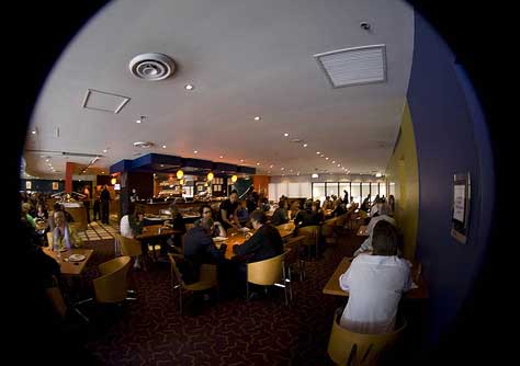
The food and beverage service was great, as always, with a buffet lunch served in the restaurant downstairs from the conference room, shown in Figure 12. Coffee, tea, and a range of biscuits, cakes, and sweets were in plentiful supply between sessions. On one special occasion, the caterers even pampered us with flavored milk! There was plenty of water on tables in the conference room, which the hotel staff replenished during each break.

Figure 12—Lunch in the restaurant
Lunch

Since attendance was up from the previous year, the choice of a bigger room was wise. Rather than a long, low, and narrow room like we had last year, this time the room was wider, with the stage elevated a few steps. This gave most attendees an excellent view, although two large columns did mean some people had to shift spots to see both the lectern and projection screens. One problem that remained from last year was a low ceiling, which meant the screens were not mounted high enough for people at the back of the room to see the bottoms of presenters’ slides.

With regard to the future, organizers might need to seek a new venue for next year. As good as the Mercure is, it’s simply too small for a big conference, and if OZ-IA continues to grow at the same rate, we just wouldn’t be able to fit into the Mercure comfortably.

Hospitality

In addition to the frequent breaks between sessions, there were a number of other networking opportunities during the conference. One of these was a pre-conference dinner, but this was an impromptu social gathering and not publicized as far as I know. For those new to IA or the local community—especially if arriving from interstate or overseas—getting to meet some people in a relaxed environment prior to the conference would be welcome.

At the end of the first day, a social gathering dubbed IA Beers gave all conference attendees a chance to get to know each other a little better. This kind of event is typical of the Australian IA community. Possibly even more than talking shop, we like to relax and have a chat over a good drink. This was a sponsored event and thus was mentioned several times throughout the day and included in the official program.

Following the second day of the conference, another informal dinner took place, with some attendees wandering off after the last session to find a good place to eat. This is where the Mercure comes into its own, as it’s within a walkable distance of plenty of great nightspots and restaurants that Sydney offers.

Conference volunteers and hotel staff were friendly and helpful, adding to the hospitality attendees experienced.

Community

Approximately 60% of OZ-IA attendees were IA practitioners, with the rest being people on the fringes of IA. Those who were not dedicated IA practitioners either work in related fields, are interested in learning more about IA, or are attempting to move into IA. Those working in related fields include managers, business strategists, Web developers, and Web designers.

Even among the IA practitioners, there are different areas of expertise. For example, UX design and the more academic side of IA. Add to this mix the attendees’ varying levels of experience, and it’s clear the audience was made up of quite a few different groups, each looking to get different things out of the event.

OZ-IA probably does not cater well to the needs of the academic members of the audience. However, there are other events such as OZCHI at which they can get their scientific fix. It’s a similar story with the business folks, the techies, and the UX and Web designers—for whom there are events such as Web Directions South.

Typically, there is some friction between these different groups, and disagreements over conference content plague some of the larger international events. But OZ-IA showed no sign of that and seemed fairly successful in catering to the entire audience. How long will this continue using the current approach? I get the impression that, because the conference is still quite new, the audience is more forgiving than they normally would be.

By its very nature, IA involves elements from all of the other areas I mentioned. However, if OZ-IA continues to sit at the crossroads of all these different disciplines, catering to a wide audience, there is the danger of overlapping with other conferences to the point of redundancy. And one might also argue that doing so would also reduce the value of the conference to those who are more experienced IAs.

From that point of view, it’s not a giant leap to the prospect of an experts-only conference. Such an event could be less formal, since most experienced IAs already know each other quite well. Perhaps this was the idea behind OZ-IA’s ostensibly being a retreat? The main problem I can see with this kind of specialization is that it really does leave a very small audience.

So perhaps just having parallel tracks, each catering to a different audience group, would be a better answer. Another solution might be to introduce an inexperienced practitioner track. Unlike other conferences that cordon off experts into their own track, perhaps we could do the opposite to cater to those who are not quite ready for expert material. This would leave the bulk of sessions for advanced topics and direction setting for the IA community.

Conclusion

At the end of the day, OZ-IA is leading the way and unique in the local IA community in Australia. Despite some rough edges, we are off and running and growing. In some ways, the hardest part is over, and we are reaping the benefits. Everyone I know is glad to have a local conference.

That said, I think the Australian IA community needs to think about what it is we want from events such as OZ-IA. At the moment, some i’s need dotting and t’s need crossing. While the community currently seems to have a fairly high tolerance for the event’s lack of polish, its organizers will increasingly need to attend to details to avoid coming off looking more amateur than professional and ensure long-term momentum.

The Future of OZ-IA

Success in the future seems to hinge on the question: What do we want from OZ-IA? Do we want a big conference or a more informal event? Attendees’ answers to this question will play a significant part in shaping the future of the event, but also influence how they might reflect on this year’s conference.

One option would be to become a major, more highly organized conference akin to the many well-known professional and academic conferences, having a set theme, multiple tracks, keynote speakers, and the typical schedule.

Another approach would see the event stay more a relaxed social event than a conference. This approach would respond to the general backlash against conferences in recent years. Many suggest informal events are more useful than traditional conferences, and some even suggest that Webinars and file or slide sharing eliminate the need for face-to-face events altogether. Why spend a few days at a conference for the sake of two or three presentations of interest?

OZ-IA is currently a little of both. It’s interesting that the event was originally positioned as a retreat. However, organizers haven’t really carried this approach through to the finished product. I don’t think there’s any right answer. Each style of event has its pros and cons, and both cater to their potential audiences in different ways.

So where to from here? Will OZ-IA go down one of these two paths, or perhaps try something totally different? Either way, 2008 will be a crucial year for OZ-IA, with the dreaded third-album syndrome coming into affect. That will be the year in which this event will either grow bigger or start to lose traction.

Personally, I would prefer a typical conference, something slightly bigger and similar to the major conferences in the US such as the IA Summit, CHI, or UPA—for better or worse. I am, however, well aware that there are people in the other camp who would prefer a smaller and more relaxed style of event.

My argument is that we already have events such as IA Peers for socializing within the IA community. What is missing is the projection of a professional image, effective knowledge sharing, and the establishment of thought leadership within our community. I’m not suggesting organizers blindly follow the conventional wisdom of big conferences. Everything they do must be relevant and appropriate to the Australian IA community. But I don’t think we want to go too far in the other direction.

It’s worth asking, however, whether there is even enough room in the local conference landscape to build OZ-IA into a big, premier event. Considering our population and market size, there may already be too many industry associations and events. As I discussed earlier, there is already considerable audience overlap—dare I say cannibalization?—between events. Perhaps consolidation is the only viable answer. There might be some economies of scale to be found in merging a number of related events together to form one big conference with specific tracks for particular disciplines. The formative stages of a conference are always interesting, and many possibilities present themselves.

My Suggestions

Reflecting on this year’s OZ-IA, there are a number of suggestions I would like to make to the organizers:

  • better advance planning—plan early
  • keynote speakers
  • fewer, but better speakers, giving each speaker more time
  • fewer and longer breaks
  • a later starting time and an earlier finishing time
  • more international speakers
  • parallel tracks, focusing on different themes
  • accompanying workshops
  • a bigger venue
  • making more social activities an official part of OZ-IA
  • panel discussions
  • better branding, signage at the venue, and so on
  • polling community opinion regarding a weekday or weekend schedule

The way organizers currently run OZ-IA reflects its origins as a personal project. I think, to move forward, this event must come under community ownership. 

Thanks to James Robertson, Ruth Ellison, and Linda Gehard for their photos. To see more photos, please follow these links.

Senior Experience Manager - Digital Wealth & Business at Commonwealth Bank

Sydney, New South Wales, Australia

Patrick KennedyPatrick has over 10 years of experience in the digital media and Web industries, and his expertise covers many areas, including information architecture, ethnographic and design research techniques, and best practice Web design and development. Over the years, Patrick has advised a wide range of clients, across private and public sectors, both in Australia and the United Kingdom. Patrick is a member of the Sydney chapter of the Usability Professionals’ Association (UPA), the Computer-Human Interaction Special Interest Group of Australia (CHISIG), the Web Standards Group (WSG), the Australian Interactive Media Industry Association (AIMIA), the Web Industry Professionals Association (WIPA), and the Information Architecture Institute (IAI), as well as several smaller special interest groups. Patrick holds a degree in Computer Systems Engineering from the University of Technology, Sydney.  Read More

Other Articles on Conference Reviews

New on UXmatters