Top

Need Better Data? Pay More Attention to Your Web Forms

December 6, 2010

Web forms are like the poor relations when it comes to their getting the attention they deserve from the usability community. Usability bibles, when they make mention of Web forms at all, have barely enough to say about them to fill more than a page. Where authors have given Web forms more attention, their appearance and the placement of elements get the lion’s share of the coverage, while the quality of the actual data researchers have gathered hardly gets mentioned. And on those few occasions where authors do provide data from research, they fail to be truly mindful of the problems people from different countries encounter using Web forms.

When you put all of this together, you can see that usability experts are focusing just a tiny part of a single percent of their attention on looking at Web form design. But Web forms are an essential part of the strategy of any organization that has a Web presence. Getting customers to our Web sites, then keeping them there is challenging enough. Once we accomplish that, we need to open a channel of communication with our customers. Web forms are often the channel of choice.

Champion Advertisement
Continue Reading…

The miniscule amount of attention the usability community has given to the design and layout of Web forms is clear to see. Consequently, deficiencies in the design of Web forms result in huge numbers of potential customers giving up on their attempts to make contact with us through them. A 2008 survey—which Tealeaf commissioned and Harris Interactive conducted—found that a hugely significant 87% of adults attempting to carry out an online transaction using a Web form in the previous year had encountered problems with the process; with 41% of them either giving up on the transaction altogether or moving to a competitor as a result of these problems. Plus, 84% of those who encountered problems shared their experiences with others, both online and offline.

It is a privilege when somebody chooses to give us their personal information. We need to make more effort to improve Web forms. This is especially true when we’re asking for information that requires us to create variations of Web forms for customers throughout the world—information such as names and addresses. Yet everywhere we look on the Web, there are forms that seem determined not only to prevent the correct information from getting through, but also to dissuade prospects from becoming our customers. The costs of lost custom to companies are enormous.

Web forms need our attention. Now!

What’s Wrong with Web Forms?

Often problems with Web forms are not down to design—for example, the use of color or the placement of elements. Problems more often have to do with much more basic issues relating to the data a form is gathering—for example, a form’s insisting that customers provide information they do not have, so cannot give, or making customers choose an option from a set of options that are not relevant to them.

We should be bending over backward to make our Web forms as quick and painless for customers to complete as possible. But, in reality, most Web forms make customers jump through hoops to fill them in and constantly present hurdles for them to get past—especially where their developers have designed forms to fulfill the demands of back-office processes that have little reference to customer needs. On top of that, we too often forget that people from every corner of the planet may need to fill out our forms. Making false assumptions about the world beyond our own country’s borders is a common error in Web form design. For example, we might assume that everybody writes their name and address in the same way, in the same order, using the same terms. These assumptions are wrong.

It is not easy to create a form that both enables our customers to easily provide all of the data they need to provide and enables us to collect high-quality data about our customers. Any information we derive from the low-quality data most Web forms provide may, in turn, be flawed. Often, it takes companies several years to start addressing problems resulting from poor data quality—if they ever do.

Designing Better Web Forms

How can a single Web form layout take into account the complexities of the world in which we live? There are currently about 245 countries and territories, whose citizens are using upward of 130 postal-address formats and almost 40 different personal-name formats. The world’s people speak one or more of over 6,000 languages and write their languages—if they have a written form at all—using one or more of forty scripts, or writing systems. Have you designed your Web forms with all of these people in mind?

How can you make your Web forms more usable? When it comes to ensuring the data you gather is good data, these are the main points that deserve your attention:

  • Ask one or more filter questions either before loading a page containing a Web form or before loading a Web form that is on the same page as the filter questions. These questions should include the country in which a customer either currently is or resides, depending upon the purpose of the form.
  • If a Web form is available in more than one language, one of these filter questions could ask customers in what language they would prefer to view the form. Do not automatically present a form in a country’s national language. Instead leave that choice to the customer.
  • If your Web form is for both consumers and businesses, but includes some fields that are relevant only to businesses—for example, company name, job title, and so on—a filter question could ask whether a customer is filling out the form in a personal or business capacity.
  • On the basis of the answers a particular customer gives, present a form containing only the fields that are relevant to that customer.
  • Present those fields in the order that is familiar and logical to particular customers, so their workflow through the form is as natural and frictionless as possible.
  • Avoid moving the focus to the next field automatically.
  • Display field labels in the language a customer has requested. Adjust them for the pertinent country. Labels should be clear and unambiguous. Where necessary, display an example value or Help text.
  • Never display fields a particular customer could not complete.
  • Do not demand that customers fill out required fields when it’s possible they may not be able to provide a response. Make sure every customer would be able to provide a response before making a field a required field.
  • Adjust field sizes, field-length constraints, validation, and formatting rules for the pertinent country. As much as possible, process data on the fly, so you place only minimal error-handling demands on customers.
  • Make sure multiple-choice questions—for example, drop-down lists and other similar form elements—contain only items that are relevant for the pertinent country, and present them in a logical order. Use drop-down lists only where there is a finite number of options and include all possible options on the list.
  • Error messages should be clear, unambiguous, and helpful and guide customers to the correct solution. They should appear in positions on a page where customers will be sure to see them. As far as possible, carry on a dialogue with your customers.
  • The text in Web forms should contain no spelling or grammatical errors.

Finally, thoroughly test your Web forms, and give one or more people responsibility for ensuring that your forms and the elements they comprise remain valid and relevant as the world changes.
How Web Form Design Affects Data Quality: An Example

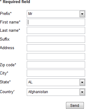
To demonstrate how Web form design can affect data quality, let’s look at a typical Web form and explore how we might improve it—making it useful to an international audience, reducing friction so more customers can successfully complete it, and improving the quality of the data it gathers. Figure 1 shows the form’s original design.

Figure 1—The original Web form
The original Web form

This simple form has a number of issues that make it unsuitable and frustrating for many customers, resulting in reduced data quality, as follows:

  • Prefix, or form of address, is a required field, but its drop-down list does not contain all possible forms of address, so some customers won’t find one that’s suitable in the list.
  • The labels of the form’s name fields indicate their relative position—First name and Last name—rather than the type of name.
  • Last name, or surname, is a required field, but some people do not have a surname.
  • ZIP Code—rather than Zip code, as in the form in Figure 1—is the appropriate term for postal codes only in the United States and other regions its postal service serves. Some people won’t understand this term, and it will annoy others.
  • The postal code field is a required field, even though some countries don’t have postal codes.
  • The State field—which is a drop-down list containing states for only one country, the United States—is a required field, even though most people do not live in states.
  • The Country field is last.
  • The drop-down lists default to the first item in a list, allowing customers to skip over that field, leaving the default selected by mistake.
  • All of the fields are of the same size, eliminating any visible clues to what data belongs in each field.

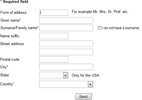
The redesigned form shown in Figure 2 is more acceptable for an international audience.

Figure 2—The same, nondynamic Web form, with the main errors fixed
The same, nondynamic Web form, with the main errors fixed

The changes I’ve made to this Web form are as follows:

  • The field labels are more generic—for example, Given name, Surname, and Postal code. However, this has its own consequences. How many Americans realize that their ZIP Code is a postal code?
  • Form of address is no longer a required field, and there is no drop-down list. Customers can leave that field empty if they don’t want you to use a particular form of address.
  • Some Help text provides further explanations where a field label may not be sufficiently clear on its own or when a field is appropriate for only a single country.
  • If the Surname field gathers essential information for a company, it would be problematic to make the field optional, because this would encourage customers to skip over it. In this redesign, the Surname field remains a required field, but a customer can override this by choosing an I do not have a surname/family name check box. This encourages most people to provide their surname, but gives those who cannot an escape route.
  • Postal code is no longer a required field.
  • State is no longer a required field.
  • The drop-down lists no longer have default values.
  • The field sizes give visible clues to what information customers should provide.

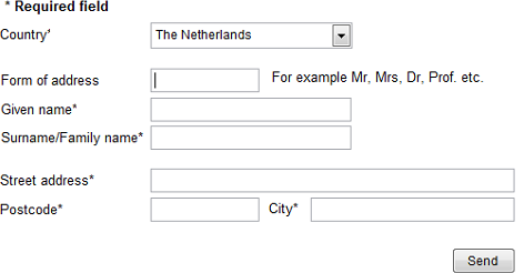
However, some potential for errors and confusion still remains. Designing the Web form for a particular country would work much better. Figure 3 shows an English-language version of this form that I’ve designed for customers in The Netherlands.

Figure 3—A Web form for customers in The Netherlands, in English
A Web form for customers in The Netherlands, in English

To make this Web form suitable for customers in The Netherlands, I’ve made the following changes:

  • The form asks for the customer’s country first, then displays the proper form for the selected country.
  • The fields appear in a correct or familiar order—most in a vertical layout, but Postcode and City in a familiar horizontal layout.
  • Only those fields that a person from the selected country can fill out appear in the form—in this case, The Netherlands, so no State field, for example.
  • Only fields that all customers can complete are required fields.
  • Some countries have strict naming conventions or are intolerant of alternative name forms for their residents. Therefore, for those countries, you can expect a person to have a surname, or family name, and you can make Surname/Family name a required field.
  • Even if a form is not in a country’s local language, you can alter the field labels to make them better understood in that country—for example, Postcode instead of Postal code.

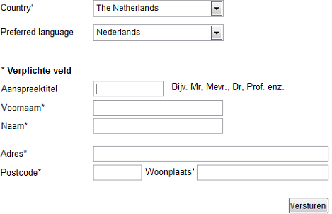
Even better for Dutch-speaking customers in The Netherlands would be to present the form in their language, as shown in Figure 4.

Figure 4—A fully localized form for customers in The Netherlands, in Dutch
A fully localized form for customers in The Netherlands, in Dutch

This form now leaves little to chance. The field labels are clear, the fields are familiar to customers from The Netherlands, and I’ve presented them in a familiar way. Therefore, filling out this form causes very little friction for these customers, in comparison to their negative experience when trying to fill out the form shown in Figure 1.

Keeping Your Web Forms Current

Once you’ve designed a successful Web form, this is no time to rest on your laurels. The world is dynamic—telephone numbers, addresses, and postal-code systems change with dismaying frequency. Countries adopt new currencies. Even countries themselves come and go.

It is a matter of great concern how slowly organizations typically react to such changes and, therefore, fail to meet the needs of their international customers. On October 10, 2010, one country disappeared—Netherlands Antilles—and five nations and territories took its place. Many organizations have failed to notice this, so have not changed the options in their Country drop-down lists. This is hardly surprising given their record in this respect. For example, Saint Martin and Saint Barthélemy have been in existence since 2007, but are still largely unknown and frequently get left out of these lists. Serbia and Montenegro are still far too commonly lumped together, though they split in 2006. Some organizations still list Yugoslavia as a country, though it ceased to exist in 2003.

It is always better to collect correct data in the first place rather than to attempt to correct erroneous data you’ve collected with a less than optimally designed Web form. The best way to ensure you collect good data on your Web site is to give the design and layout of your forms the attention they deserve. 

You can download Graham’s free ebook titled Better Data Quality from Your Web Form—and you don’t even have to fill out a form to get it!

Owner of GRC Database Information

Münster Area, Germany

Graham RhindAn acknowledged expert in the field of data quality, Graham runs his own consultancy, GRC Database Information, where he researches postal code and addressing systems, collates international data, writes data-management software, and since 1995, has run the busy postal code and address Web site Graham is the author of four books about international data management and speaks regularly on this topic.  Read More

Other Articles on Information Design

New on UXmatters