Top

Mockups Explained

July 10, 2023

Creating mockups is a central part of visual-interface design. They are a helpful tool for visualizing a product or page long before it’s launched and released to the general public. A good mockup can put a design into perspective by anticipating potential modifications to its layout, colors, images, styles, and so forth.

In this article, I’ll take a closer look at what mockups are, when you should create them, and how they can make your UX design work more accessible. I’ll also explore a few practical reasons why modern design teams should embrace mockups as a valuable and helpful tool. Let’s dive right in, shall we?

Champion Advertisement
Continue Reading…

What Is a Mockup?

A mockup is a visual representation or nonfunctional prototype of a digital product—whether a desktop application, a mobile app, a Web site, or anything else. Designers create mockups in designing the final product’s layout, color scheme, fonts, graphic elements, and overall appearance. Mockups provide a realistic preview of the end product.

Benefits and Purposes of Creating a Mockup

The primary purpose of creating a mockup is to preview and test the product before it’s implemented in code. This lets designers make any necessary changes and adjustments when it’s cheaper to do so—before investing in the product’s development.

For instance, designers can experiment with visual design, colors, and layouts to find the most suitable solutions for branding, usability, and other critical elements of a digital product. As a result, product teams can save the time and resources that would have been necessary to correct any errors that might have popped up further on during the development process.

Designers can use mockups to elicit feedback from clients and other stakeholders. By presenting a mockup of the end product, designers can get feedback on the product’s overall look that provides the grounds for further ideation and constructive criticism. Creating mockups is crucial when it comes to communicating the value of a product, experimenting with visual design elements, and finding better solutions.

Mockups Versus Wireframes or Prototypes

The differences between mockups, wireframes, and prototypes can get a bit fuzzy, depending on the context. I’ll try to compare them and clarify their differences and similarities.

  • mockup versus wireframeWireframes are very rudimentary representations of a user interface. They’re basically blueprints. Designers create wireframes at different levels of fidelity, depending on how close to the real thing they need to be. High-fidelity, or hi-fi, wireframes provide more visual detail. Low-fidelity, or low-fi, wireframes could be sketches on a whiteboard or drawn using pencil and paper. Both wireframes and mockups sometimes use placeholders—whether filler text, borrowed color palettes, or even free icons that are available online. Very high-fidelity wireframes can approach mockups in many contexts.
  • mockup versus prototype—Prototypes are very realistic, functional representations of a product. They actually work. Assessing a product’s functionality is one of the central purposes of creating a prototype, which highlights a product’s flow and capabilities. Here lies the main difference between a prototype and a mockup. A prototype highlights the product’s features and functionality, while a mockup highlights its visual design.
Some Uses of Mockups in Visual-Interface Design

Now that we’ve considered the overall value and function of mockups, it’s essential to emphasize that they come in different forms. Next, I’ll discuss the following types of mockups:

  • Web-site mockups
  • mobile-app mockups
  • branding mockups

Let’s explore some of these in more detail.

Mobile-App Mockups

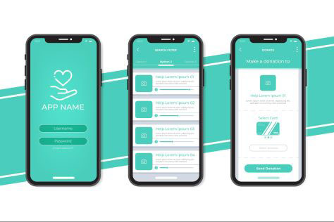
Mockups are an essential tool in mobile-app design, and they come in handy in many different scenarios. The most common use case for mobile-app mockups revolves around creating proof-of-concept designs that designers can present to their clients, potential investors, and other stakeholders. Figure 1 provides an example.

Figure 1—A mobile-app mockup
A mobile-app mockup

Image source: Freepik

Proof-of-concept mockups are essential for both brand-new app concepts and established apps for whose branding identify you need to refresh. By using mockups to experiment with new design ideas, design teams can create more usable, engaging experiences for their intended users.

However, it’s important to underline that mobile-app mockups aren’t just for creating proofs-of-concept. Designing a mobile app is an iterative process that requires getting input and feedback from both users and a range of team members. Everyone who is involved in the mobile-app development process can benefit from the creation of mockups, from designers to developers and project managers to marketing professionals.

Web-Site Mockups

Similar to mobile-app mockups, Web-site mockups enable designers to showcase their final designs by presenting them to relevant stakeholders. However, Web sites typically have different goals than mobile apps—their primary objective often is to convert visitors into customers.

Through the creation of Web-site mockups, designers can experiment with various designs to determine which would most effectively attract users and achieve the Web site’s conversion goals. By testing different designs and layouts before committing to a final product design, designers can save development time and resources, while ensuring that the Web-site design is effective.

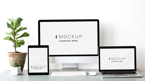
Mockups often employ responsive design, so cover the full spectrum from a Web site on the desktop, on a tablet, and on a mobile device, as shown in Figure 2.

Figure 2—A responsive mockup
A responsive mockup

Image source: Freepik

Some Uses of Mockups in Graphic Design

Other types of mockups such as print mockups are useful in graphic design.

Print Mockups

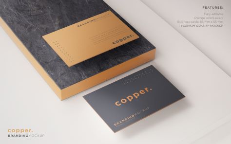
Print mockups provide a realistic representation of the materials a designer would use in creating the designs for a magazine or other print media. They let you to assess how a particular image or composition would look on paper or even clothing such as a T-shirt mockup. Plus, it’s beneficial to explore how the designs would look in other deliverables such as flyers, banners, and business cards. Figure 3 provides an example.

Figure 3—Print mockups
Print mockups

Image source: BiZkettE1 on Freepik

Device Mockups

But mockups aren’t limited to digital products. You can also create them when designing physical devices such as smartphones, kitchen appliances, and more. In this context, mockups can facilitate the alignment of a large team around a common purpose.

Device mockups are also helpful in generating excitement among fans and the broader community before a product’s release. In addition, they can assist mobile app and Web-site designers in demonstrating what their product would look like on a physical device, thus providing a better understanding of the finished product.

Figure 4—Device mockups
Device mockups

Image source: rawpixel.com on Freepik

The Bottom Line

In conclusion, mockups are a valuable part of both UX design and graphic design. They are an effective way of visualizing a final product before its implementation. They allow design teams to improve, adjust, and modify a product’s appearance before it’s ready to go to market. 

Lead Writer at TROUBADOUR


Chisinau, Moldova

Adrian StefirtaAdrian is a UX writer and content strategist. He spends most of his time overthinking content and developing tone of voice guidelines. He holds Bachelor and Master of Arts degrees in Linguistics
.  Read More

Other Articles on Visual Interface Design

New on UXmatters