This is a sample chapter from Luke Wroblewski’s book Mobile First. 2011, A Book Apart.
Chapter 7: Layout
Appropriate adaptations of how we think about organization, actions, and input on the desktop take what we know about Web design and make it usable on mobile. But how do we ensure it’s also usable across the wide range of mobile devices available now and in the coming months—not to mention years?
Come to terms with the fact that mobile is going to change at a breakneck pace for the foreseeable future.
Let mobile browsers know you are creating designs that fit them.
Be flexible, fluid, and responsive in your layouts.
Know where to sketch the lines between device experiences.
Reduce to the minimum amount necessary.
Champion Advertisement
Continue Reading…
The Only Constant Is Change
During the time I’ve been thinking about and writing this book, the mobile industry has changed dramatically several times. Mobile platform leaders have been unseated. Devices with new capabilities and constraints have been released. New partnerships between device manufacturers, mobile platform vendors, and network carriers have been announced.
Welcome to mobile where the only thing you can count on is change. Because things are currently in a continuous state of flux, I’ve focused this book on design principles for mobile device trends that have been holding steady for quite a while: more powerful processors, faster networks, touch-screen interfaces, and better Web browsers. Despite my best attempts to give you mobile design principles that will endure, change is coming.
So what’s a Web designer to do—get swept up in a sea of constant instability? Quite the opposite. Because things continue to be so Wild West out there, you need to be a cowboy. Take risks, try new things, and accept that not all the boundary lines between devices, browsers, and the Web have been drawn yet.
With that in mind, let’s saddle up and talk about how to round up the diversity of devices out there with mobile layout skills. (And I promise that’s it for the Old West analogy.)
You’re Here for Them
Perhaps the most important thing we can do to create effective mobile layouts is to let mobile Web browsers know we’ve taken the time to design for them. While I promised not to get into code, knowing about the meta viewport tag is really useful for designing mobile Web experiences.
To quote Peter-Paul Koch, who has written about viewports and mobile development extensively:
“Normally the layout viewport takes a width that the vendor has decided is optimal for viewing desktop sites. By setting the meta viewport to device-width you’re sure that your site’s width is optimized for the device it’s being viewed on.”
Viewports can also help manage differences in pixel density. Pixel density (or ppi) measures the resolution of a screen by looking at the total number of pixels available horizontally and vertically within specific physical dimensions. Apple’s original iPhone had 320×480 pixels available on a 3.5in screen, which meant it had a pixel density of 164ppi. The Google Nexus One had 480×800 pixels available on a 3.7in screen, which meant it had 252ppi. Why does this make a difference?
Pixel density impacts how physically big or small elements appear on a screen. A higher pixel density means each pixel is physically smaller. Consider a set of buttons viewed on an Apple Cinema Display, which has a ppi common to many desktop computers of about 94ppi. View the same pixels on a Nokia N900, which has a pixel density of 266ppi, and you can clearly see the difference. A big difference in pixels per inch (ppi) can adjust the visual size of images dramatically. What was large and legible is now tiny and invisible, as Figure 7.1 shows.
Figure 7.1—Apple Cinema Display (94ppi); Nokia N900 (266ppi), below
When you design for devices with different pixel densities, these differences can become a problem. On the Web, however, the viewport width that mobile browsers use can help us manage this issue. As Peter-Paul Koch pointed out, Apple’s first set of iPhones (164ppi), Google’s Nexus One (252ppi), and the iPhone 4 (329ppi) all used the same device-width of 320 pixels.
This provides some much-needed layout consistency across the various pixel density devices out there. Where we still need to do some work, though, is with high-resolution images. Unlike browser-rendered controls, text, and visual elements, image files won’t automatically adjust to higher pixel density screens. They’ll render at the correct size, but lack crispness and definition when pixel density is high. When ppi is doubled, the edges of Yahoo!’s logo image appear jagged and blurry, as Figure 7.2 shows.
Figure 7.2—Doubling ppi makes Yahoo!’s logo jagged and blurry
To account for this, you’ll need two sets of images: one large—at twice the resolution—and one at standard resolution. You can then tell Web browsers—using CSS3 media queries, JavaScript, or a server-side script—to include only the higher resolution graphics on devices with a high-resolution display.
If you’re not interested in maintaining two sets of images—and who would be?—lean more heavily on CSS for your mobile Web experience’s visual design. The gradients and rounded corners in Yahoo!’s design, shown in Figure 7.2, are rendered using CSS3 and look great on both high and low resolution screens, saving you the need to manage multiple images and your customers the need to download them.
Mobile browsers that don’t support CSS3 properties like gradient and rounded corners can simply default to a solid background and square corners. No harm done.
Be aware though that too many CSS3 effects could diminish performance, as excessive shadows and gradients can slow down rendering on some devices. This is being addressed with faster rendering engines so it probably won’t be much of an issue soon. But you’ve been warned nonetheless!
Fluidly, Flexibly Responsive
Despite the fact that some mobile devices with different pixel densities will use common viewport widths, we can’t count on a single width for our mobile Web experiences. For starters, even if every mobile device used 320 pixels for its device-width, we’d still have different widths when one of these devices changed its orientation.
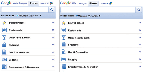
To cope with this and whatever new device widths may come our way, we need to be highly elastic in our layouts. Whether you call them fluid, liquid, or flexible, designs that expand and contract based on available screen space are a must. In a fluid layout, interface elements—such as the search box and menu items in the Google Places—are designed to adapt to the space available to them. The Google Places mobile Web experience, shown in Figure 7.3, uses a fluid layout to adapt to various screen widths.
Figure 7.3—Google Places’ fluid layout adapts to various screen widths
While fluid layouts are essential, they’re really just the start.
Responsive Design
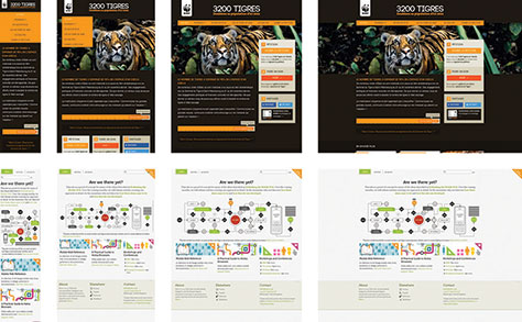
When the differences between screen sizes grow, flexible layouts can be stretched to their limits. Consider the layout possibilities on a 768-pixel device width versus a 320-pixel device width. Surely, we can do more than just stretch the interface to fit? After all, a 768-pixel device width has two-and-a-half times more space! Enter responsive Web design.
Through the application of fluid layouts, flexible media, CSS3 media queries, and, sometimes, a bit of JavaScript, responsive Web design allows you to adapt to devices more significantly. With responsive Web design, you can set a baseline, mobile experience first, then progressively enhance or adapt your layout as device capabilities change.
This is accomplished by setting resolution breakpoints and applying a different set of layout rules and media assets to each. A breakpoint can be thought of as a conditional statement that determines if a device meets specific criteria like a minimum width of 600 pixels. If that condition is true, then the browser applies a different set of layout rules, usually through CSS, though sometimes with a little JavaScript as well. (You can get all the details in Ethan Marcotte’s awesome book on the subject, Responsive Web Design.)
These layout rules can include repositioning elements, increasing image sizes, or removing elements altogether. They don’t have to be dramatic, but they don’t have to be subtle either. As a different resolution breakpoint is passed, the layout adapts to make the best use of the space available to it. Figure 7.4 shows responsive Web design in action on the 3200 Tigres and Yiibu sites.
Figure 7.4—Responsive 3200 Tigres and Yiibu Web sites
Device Experiences
Devices are different not just because they have different technical capabilities and limitations, but because people use them differently as well. Consider the differences between connected TVs, desktops / laptops, tablets, smartphones, and feature phones. Each of these device experiences has a unique:
common user posture—a 10-foot, lean-back experience on the couch; long periods of use at a desk, casual couch or bed use, or quick bursts of activity in various locations throughout the day
average display size—wall-sized, desk-sized, lap-sized, palm-sized, or smaller still
The combination of these differences is often significant enough to define a device experience. And different device experiences may require different user interface design solutions. The relative importance of primary tasks can differ between device experiences—because of user posture—as can the layout and interaction design needed to accommodate different input modes and average display sizes.
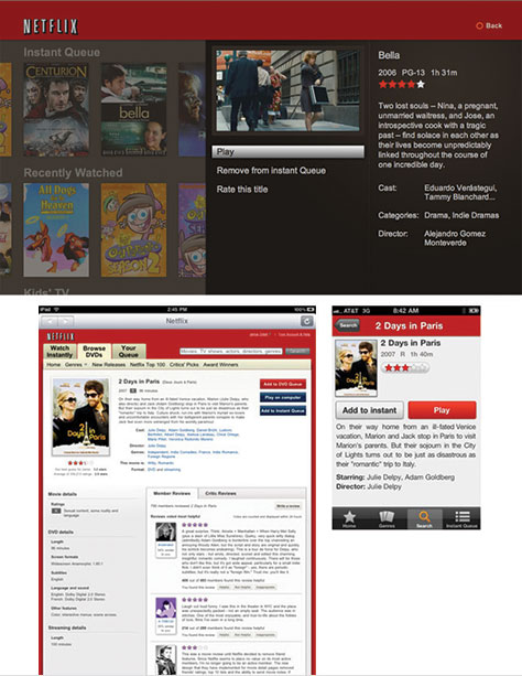
As a result, many Web applications take the time to design and develop unique solutions for distinct device experiences. For example, the movie streaming service Netflix has distinct HTML5 solutions for connected TVs, tablets, desktop Web browsers, and mobile devices. As Figure 7.5 shows, although the Netflix experiences on the Playstation3, iPhone, and iPad are built using the same Web technologies, the user interface is designed for each unique device experience. While this requires them to maintain a number of different interfaces, each of these interfaces is optimized for the user posture, input method, and average display size of a distinct device class.
While it’s possible to have a single user interface work across more than one device experience, developing a single interface that works across all device experiences may result in compromises or bare-bones features that don’t take advantage of what makes each device experience excel—or, conversely, in rich solutions that fail to work on lower-end devices.
So while a connected TV could browse a text list optimized for feature phones, it is unlikely anyone would want to use it that way. On the other hand, a tablet-optimized Web application might feel simpler to use on a desktop Web browser because the number of actions has been reduced to work on a smaller display size, and the size of the actions has been increased to accommodate touch interactions. While this interface wouldn’t be optimized for a desktop computer’s user posture, input methods, or display sizes, it would still be really functional.
Device experiences can also be useful for thinking through how each breakpoint in a responsive Web design solution should not only look but act as well. Layout and media assets can be adjusted to make the best use of available screen space and to optimize for specific input capabilities—such as appropriately sized touch targets.
The right combination of device experience-specific designs, responsive Web design, and fluid interfaces can ensure your mobile Web experiences work on today’s mobile devices and beyond.
But there’s still one more thing.
Reduce
Just in case it hasn’t been made abundantly clear in this book, I want to remind you that reduction is the best layout approach available to you on mobile. Appropriately sized touch targets need room to respond to our imprecise fingers. Responsive Web designs need to adapt to a variety of screen sizes and resolutions. Distinct device experience solutions need to be maintained as content and features change and grow.
All of these factors push us toward less on our screens—fewer variations to manage and fewer options for people to consider and select without making errors. Across all your mobile layouts, aim for the minimum amount necessary to help people meet their needs whether they’re looking up or finding information, exploring and playing, checking in on important updates, or editing and creating content.
Not only will reduction make putting mobile layouts together easier, it will also give people focused ways to get things done. If you start to hear customers asking for your desktop Web experience to be more like the simple, easy-to-use mobile one—you’re doing it right.
Laying Out the Land
As the mobile landscape continues to change, we have to be ready with layouts that adapt to the task at hand—from big differences between device experiences to filling in the small gaps between device screen sizes and orientations.
Accept and embrace the rate of change in mobile isn’t going to change anytime soon.
Use the meta viewport tag to let mobile browsers know you’ve thought of them in your designs.
Account for differences in screen density by making higher resolution images available to the devices that support them.
Adapt to device variations with responsive and fluid layouts.
Account for the differences between device experiences in your responsive Web design or server-side solutions.
Reduce complexity for yourself and your customers by cutting down to the minimum amount of functionality necessary for your Web site or application.
Though we’ve covered a number of techniques for managing our layouts across an ever-increasing number of devices, there’s more to come. As mobile continues to grow and the definition of what a mobile device is continues to blur, expect new techniques for managing layout to emerge. In other words, watch this space.
Before joining Google, Luke was CEO and cofounder of Polar and Chief Product Officer and cofounder of Bagcheck. He is the author of three popular Web-design books—Mobile First, Web Form Design, and Site-Seeing: A Visual Approach to Web Usability—in addition to many articles about digital-product design and strategy. He was also the founder of LukeW Ideation & Design, a product strategy and design consultancy. Luke is a top-rated speaker at conferences and companies around the world, and was a cofounder and former board member of the Interaction Design Association (IxDA). Read More
 Chapter 7: Layout
