We can add value by introducing the user or customer perspective and narrative, which helps both the designer and anyone who reviews a design to understand what the user is thinking at various stages of a user journey. These insights remind us why the user might have made certain decisions, but also helps us to understand the user’s reactions to what was happening at that moment.
Not only should we use words to describe what the user is feeling, we can also benefit from visualizing experience triggers. One way of doing this effectively is using visual languages. The use of illustrative elements to communicate a message to an audience is fundamental to any visual language. For visual elements to communicate effectively, they need to be clear, show connections, and ultimately, be easy to follow, understand, and replicate.
Visual Languages from Wayfinding
Visual languages are in every-day use to communicate messages of various types of wayfinding. They are in common use in transportation networks such as highways, metros, and aviation. Their objective is to guide, inform, highlight, and provide feedback about the environment. We apply the same principles when creating journey maps for a Web site, application, or service experience.
Whether analyzing an existing flow or representing a new one, using existing travel frameworks is helpful in communicating your insights. They already have an existing symbology in place that you can adapt and apply in representing a journey for a Web site, application, or service.
Mapping with Metro Symbols
Ever since Harry Beck introduced his map of the London Underground in 1933, its distinctive style has become synonymous with mapping interconnected routes and travel journeys alike.
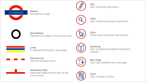
Eighty years on and Harry Beck’s design is just as relevant today as it was then. It seems only fitting to see it adapted for use in mapping digital journeys, as shown in Figure 2. There is an existing framework in place to communicate single and multiple paths, changes, interconnections, and diversions and, in general, to represent an interconnected Web.

The simplicity of the London Tube map and all the other city metro maps makes them accessible to the general public. They do, however, have some shortcomings as wayfinding systems. Their main objective is to help people find the right journey to take and see where to switch trains to reach a destination, which they does very well. But they don’t allow us to understand the experience of a journey. Journey mapping lets us see the interconnections and get a broader view.
Mapping with Highway Symbols
In Britain, the Department of Transport and Driving Standards Agency created the Highway Code and launched it in 1931. There are over 300 numbered rules, plus the nine annexes that cover pedestrians, animals, cyclists, motorcyclists, and drivers.
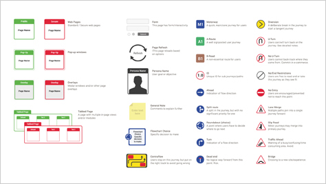
The extensive number of symbols that are part of the Highway Code makes it a really useful visual language for digital applications. The symbols relate to road signs, road markings, vehicle markings, and road safety, which you can adapt and incorporate when digitizing them. Because there are a lot of symbols and a high level of crossover, you can create detailed journey maps without compromising the meanings that are associated with the symbols that you use, as shown in Figure 3.

The Highway Code is globally recognizable. Though the road symbols in each country differ slightly, their fundamentals are still the same. There are symbols for the main roads, actions, diversions, and directions. There is some variation in the details, but this helps to localize them. Nevertheless, this is a framework that communicates well internationally wherever there is an extensive road network in place. Since there is a reliance on already having an extensive symbol library in place, this communication tool does’t work well in countries where there is a less developed highway code.
Barriers to Globalization
In practice, travel-symbology systems are very effective in getting all project stakeholders and resources engaged in journey mapping, resulting in better co-design, collaborative results, and acceptance.
There is, however, a problem with the techniques that I described earlier. They can be less effective if you need to work with or share documents with people from multiple geographic locations. A highway map that is easy to understand for one audience could be confusing to another—thus, defeating the purpose of using a visual language to enhance efficiency and effectiveness. While it’s possible to apply some of the systems in different geographic locales, when you have teams that comprise people of multiple nationalities, using systems that are specific to one geographical area can become problematic. In the diverse society in which we live—which is further intensified online—multicultural teams are fast becoming the norm rather than the exception.
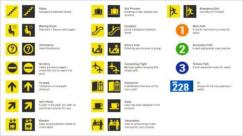
It’s tempting to just use boxes and arrows to be safe, but there are ways to retain the power of the travel-symbology systems in creating user journeys, while addressing the geodiversity issue. One way we do this at Entropii is by using air travel as our metaphor.

