Ding. “This is your train manager. I’d like to apologize for the impromptu stop in the middle of nowhere….”
Delays happen. Complex systems such as a train from London to Leeds encounter situations that get in the way of our expectations. The Virgin EC train manager adjusted our expectations well by announcing exactly what had happened, right away, then kept reminding the passengers about the exact delay and the updated arrival times throughout the rest of the trip.
Compare this messaging to what happens with most airplane flight delays, which are typically unannounced. Even when an apology finally arrives, it never communicates a specific cause for the delay—just something vague such as “because of a mechanical issue.”
Champion Advertisement
Continue Reading…
Digital tools generally promise instant gratification, but we all know that doesn’t always happen. For example, there are delays in scanning for networks, connecting to devices or data sources, retrieving large amounts of information, or just because the network isn’t as fast as we’d all hope.
A big part of making your app or Web site feel fast is setting expectations for your users, then meeting them. You need to design how a product handles delays from the start—not have it behave like an error or exception condition has occurred that is a surprise to everyone.
Avoiding Delays
Whenever possible, avoid delays. A lot of the most important ways of avoiding them are technical, but unfortunately, these often get forgotten or set aside because of costs, expediency, or simply not thinking of your system from the user’s point of view.
It’s our job as UX professionals to push for improved performance and reduced delays—not just to handle delays by drawing pretty screens. To reduce delays, do the following:
Make sure your company hires good database analysts (DBAs) and other relevant technical personnel and empowers them to make substantive decisions about how to store, retrieve, and pass information within the system.
Set good goals and objectives that follow human-centric best practices. Ensure that timeouts last for seconds, not minutes, and that the scale and response speeds for databases and APIs are appropriate. Handling 1,000 records or 1,000 users is not a lot, so a system should respond in milliseconds.
Use predictive analysis to prefetch data. For example, online maps display little chunks of data just like infinite scrolling lists do, but never display a spinning delay indicator. They load the immediately adjacent maps that the user does not initially see in the viewport to avoid their experiencing delays.
Cache information that the user will need again. Don’t build your app or Web site as separate pages, but as a service. If the system has already retrieved information once, having users wait for it again just three minutes later will annoy them and cost more money as well. Keep the data around for later use.
Don’t do everything on the client—or even through the client. We’ve become enamored of displaying and processing lots of data on the user’s computer or phone, but doing this on the client is very inefficient. I once participated in a collaboration session to solve a problem: a system had to transfer 1.2 MB of data just to start each session. But once we examined what was being transferred, we eventually worked that down to zero. We needed the information only on the server, where it already lived. There was no need to transfer anything.
Always think in terms of latency. Contrary to popular opinion, networks are pretty fast—even mobile networks. What kills speed between the user’s fingers and eyeballs is latency—the overhead of starting each data request. So reduce the number of data requests. Don’t ask for information again and again. Instead, use one API call with many endpoints rather than lots of API calls.
Handling Delays Rather Than Ignoring Them
Because I’ve been traveling in other countries over the past month, my network performance has varied a lot, but has mostly been bad. I have been disappointed to find just how many apps and Web sites simply cannot handle poor performance gracefully.
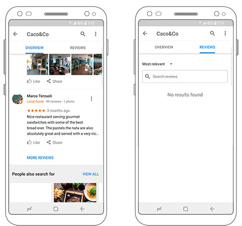
Take Google Maps as just one example. Very often, I’ll search for information and get no results. Not a delay message or an error indicating a bad network connection, but no information at all. While waiting to order at a restaurant in London, I went online to read reviews and see what was good there. As Figure 1 shows, some useful information loaded, but when I tried to see the rest of the reviews by clicking the More Reviews link, Google told me: “No results found.”
Figure 1—Google Maps’ More Reviews page
This behavior is simply wrong—and the result of lazy, brittle design and development work. Make sure your system never lies to users, even when things aren’t going well.
Another similarly bad tactic is to display an error message when the system is not ready to execute the requested user action. Instead of just loading a delay message, the app or Web site loads a pop-up message box to inform users that they cannot proceed with the action until the data has loaded—usually with no indication of how long that will take. Don’t blame your users for trying to use your product.
Indicating Delays
Ideally, you don’t have delay indicators because your app or Web site is as speedy as people expect. But, for whatever reason, delays can happen. When they happen, you must explicitly address them.
Never allow the system just to appear to have stopped working. It should always act as though it is responding to user input or working on a response. Delay indicators remind users that the system is working and inform them what the issue is, why it has occurred, and whenever possible, how long they will have to wait.
Delays fall into two basic categories:
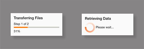
determinate—A delay that is of a fixed length because of a known time span or quantity. We have all encountered the most common of these: upload indicators. A progress bar shows the actual status changing from moment to moment.
indeterminate—A delay that will last an unknown length of time. Most often, these occur because of inconsiderate design at some level. There is no feedback regarding the delay so you cannot provide an estimate or progress indicator.
Examples of these two categories of delay indicators appear in Figure 2.
Figure 2—Determinate and indeterminate delay indicators
Always display the most accurate information possible. Never use an indeterminate delay just because it is easier than getting or calculating the information about the actual delay. I mean, never ever. Not even in your first release or MVP. Because bad delay indicators give an awful impression of your digital product, they’ll also give you a poor indication of how well users would understand your final product.
Indeterminate messages may not be entirely indeterminate. So, if you cannot give an accurate indication of progress, but know from testing that something usually takes 45–70 seconds, add an explanation to the delay message: “This should take about one minute.”
Multistep processes may display several delay indicators strung together. Always display the number of the current step of a total number of steps, instead of displaying a set of discrete messages that give an incorrect impression of how long the delay will last. These may mix determinate and indeterminate delays as necessary.
Depending on what the delay means to the user and the software process, there are three ways of handling delays:
blocking delay messages
interstitial delay messages
inline delay messages
Although it often seems that developers and product owners always specify popups, none of these types of delay messages is actually automatic. You should choose the delay method that makes the most sense.
Blocking Delay Messages
Variations of the default dialog box exist that support simple delay messaging. As shown in Figure 3, the delay indicator and a brief message appear in a simple pop-up message box without a title or—of course—any buttons.
Figure 3—A delay indicator appearing over a page
Since there are no buttons, the pop-up message box blocks the page behind it until the delay clears. While it is possible to code such dialog boxes to display only a delay indicator—just as with using icons alone—you should never do this. Always describe what is happening and why.
Avoid vague terms and technical jargon. Not all users understand what a server is or the cloud, and many such terms don’t translate well for non-native speakers.
Traditionally, the value of a dialog box is that it is contextual to the page behind it. But many apps block the loading of the requested page with a delay message that appears over the original page, then load the target page only once its data has finished loading. This makes very little sense because the contextuality of the pop-up message is lost. Data is loading, but not data for the page that appears in the background. Watch out for this when designing blocking delay messages.
All of these problems mean you should rarely use a blocking delay dialog box.
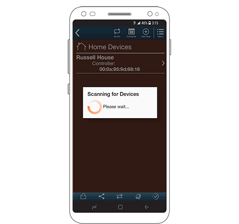
Interstitial Delay Messages
The next most useful method is the interstitial page, which is just a screen of information that appears between other contexts.
In interactive design, interstitials typically block actions, and the user must deal with them by clicking or tapping buttons on the interstitial page. However, in this case, there are no buttons, so the user must wait for the process to complete.
An interstitial delay indicator is most useful when there is a lot to say about a delay or when the user must wait to avoid danger to themselves or others, destroying hardware, or loss of data.
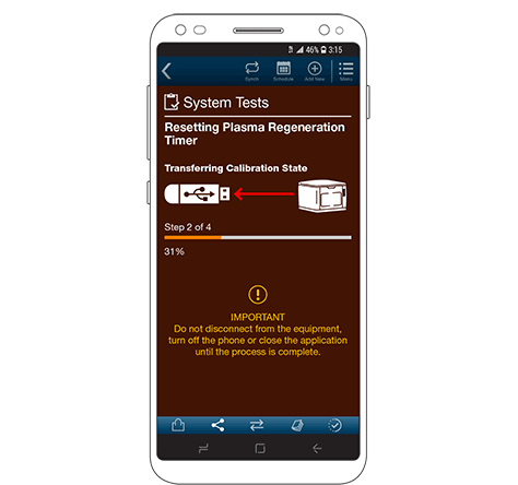
Since the entire area of the page is available, you can use that space to provide quite complete information about the delay. For example, the interstitial delay message in Figure 4 includes the following:
a section title
a function title
the step in the process
an illustration of the current step
a determinate progress indicator
warnings
Figure 4—An interstitial delay message
Whenever there is a multistep process delay, because there is so much detail to display, you should almost always use an interstitial.
Note also that, because an interstitial delay message blocks user control and the user cannot interact with any menu or Back button, most actions should appear dimmed.
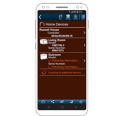
Inline Delay Messages
The best way to deal with delays is to make users wait only for the specific information they don’t yet have. Most of the time, some information should be cached from earlier in the session, from user registration, and so forth.
Always build digital products that separate content from code so you can load the page framework and the data you already have, indicating delays only for what is still being loaded, as shown in Figure 5.
Figure 5—Several delay messages appear inline as part of a list view
This is sometimes called lazy loading because content on the page does not load all at once, but gradually, as the system retrieves the information, bit by bit.
Try to make the information load in the order the user needs it. This should also mean it loads pretty much from top to bottom on the page. Once the information within the viewport has loaded, the user will perceive that the page has loaded. This improves the perceived speed of the product, even if the app or Web site is still working at loading information outside the viewport.
As the example shows, you can break delays down into fine increments, but do this only if you really need to because of the loading speed. Still be careful. How many of these indicators can you have spinning at the same time before they become distracting? Fewer than you might think. So plan carefully and, if necessary, try things out to see how they work before committing to a design.
Keeping Your App’s Behavior Calm
One major problem that occurs whenever any delay indicators are implemented without clear and specific rules for their behavior is that the indicators appear and disappear constantly, for tiny periods of time. This makes the whole application seem unstable and makes users nervous because the indicators flicker into existence and disappear before users can even tell what they are communicating.
This occurs simply as a result of having delay indicators appear any time the system is working. But remember, we build systems for humans. So, if a particular action occurs quickly enough—so any delay is short enough—there is no need to display a delay indicator at all. Whether the delay is short enough cannot easily be determined at runtime, so this behavior should be determined by testing and estimating the response of the actual system. If a delay is almost always less than about 750 milliseconds, there is probably no need for a delay message.
It is always critical that the system respond to user interactions. While no delay message may be necessary, users must still see some response to their actions. Buttons and links must respond to clicks, unless the next page or view starts loading within about 150 milliseconds. Often, you can spread these responses out in sequence to hide short, but expected delays. The link responds, the page loads, the page paints its framework, and finally, the actual data loads.
Likewise, delay indicators must always be visible long enough that the user can recognize them—rather than their looking accidental. As a general rule, delay indicators should never be visible for less than 1.5 seconds—though longer times may be necessary for systems with less user focus. Even if the process completes 20 milliseconds after the indicator appears, avoid the flickering effect. Continue showing the indicator for the minimum time you’ve established.
You can also use other tactics to suppress delay indicators—such as slowing screen refreshes very slightly or making the data populate the page in a progressive—or even animated—manner, which makes the page look like it is actively retrieving and loading information even when it is not.
When Delays Are Good
You can use such indicators not just to hide delays, but also to make information seem more engaging or interesting. But be careful that you don’t add so much activity that it starts seeming like needless animation and gets annoying—especially for regular users who may become accustomed to the scripted dance.
Sometimes, you might even want to add delays. If information loads too quickly, it may lose its apparent value to the user. A few years ago, my team built a mobile-phone plan advisor, a tool that helps people find the best service plan for their needs. Users experienced its loading quickly as a serious problem. People often picked the wrong plan, so ran out of minutes, got the wrong services, or wasted money. It wasn’t actually that hard to get the answers, and the technology our developers used was pretty slick, so we could get them almost instantly. But, in testing, we found that no one trusted the information. We eventually discovered that users assumed that a fast response meant a lie—a canned response pushing what the company wanted to sell.
We simply added a delay indicator—with a bit of randomness for the time so it didn’t seem fake—and people immediately became engaged with the results, leaning into the computer screen eagerly awaiting their personalized answer.
People anthropomorphize most sufficiently complex systems, so they assume that difficult things act as they would for humans. Thus, they expect to see visible effort such as spending additional time to perform a task. Never try to change people’s expectations. Change your system to work for people.
Designing for the Gaps
When everything is just fine, it’s easy to design good experiences. It’s in the gaps in the experience where the wiring shows through—when things like errors and delays occur—that UX designers really make their money.
Work hard to ensure that your digital products are as seamless and easy to use as possible. But, when things go wrong, make sure to preserve the same seamless experience, even creating great versions of otherwise boring stuff like delay indicators.
For his entire 15-year design career, Steven has been documenting design process. He started designing for mobile full time in 2007 when he joined Little Springs Design. Steven’s publications include Designing by Drawing: A Practical Guide to Creating Usable Interactive Design, the O’Reilly book Designing Mobile Interfaces, and an extensive Web site providing mobile design resources to support his book. Steven has led projects on security, account management, content distribution, and communications services for numerous products, in domains ranging from construction supplies to hospital record-keeping. His mobile work has included the design of browsers, ereaders, search, Near Field Communication (NFC), mobile banking, data communications, location services, and operating system overlays. Steven spent eight years with the US mobile operator Sprint and has also worked with AT&T, Qualcomm, Samsung, Skyfire, Bitstream, VivoTech, The Weather Channel, Bank Midwest, IGLTA, Lowe’s, and Hallmark Cards. He runs his own interactive design studio at 4ourth Mobile. Read More