New Findings from Research
As I’ve said before, when we’ve reached the boundaries of our knowledge, we should go back to the original research. So I’ve re-read some of the reports to which I have previously referred in my columns, looked up their references, and done some of my own analysis. As a consequence, I’ve found out two really interesting things:
- Tapping targets at the edges of a screen is problematic.
- Liftoff and reach make targets at the edges of a screen hard to hit.
The Edges Are the Problem
Certain parts of the screen are either harder to touch, take more time to achieve an adequately precise touch, or both. Since much of the screen offers the same level of precision, I had previously more or less averaged touches across the viewport for my guidelines.
This wasn’t crazy, because no other guidelines that I am aware of account for accuracy by screen position. But several research papers do, with enough precision and consistency that the results are quite believable. The results are simple: edges are hard to hit.
Well, not really hard to hit in the classic sense—causing people to avoid them—but are more difficult to hit accurately, take more time to hit accurately, and cause users to have reduced confidence in their ability to hit them accurately. It turns out that users actually realize they are bad at targeting the edges of the screen.
And I do mean edges. There are such small—and inconsistent—variations in accuracy and speed between left- and right-hand users that it is safe to say that both the left and right edges of a screen are equally hard to reach for all users. However, the top and bottom edges are much worse than the sides.
Why Are the Edges Hard to Hit? Liftoff and Reach
We often refer to a non-gestural touch as a tap on the screen. But that might lead you to miss noticing a key part of how users interact with an application through touch.
When users press the down arrow on their keyboard, the insertion point moves or the scrolling action occurs immediately, on key down. Holding the key down causes the key’s action to repeat. In contrast, if users click a link on a Web page with their mouse, the mouse down action does nothing. The click, like most mouse actions, occurs on mouse up, or when the user releases the mouse button.
Touchscreens inherited this same behavior long ago. Usually, this is a good thing because it gives users a chance to adjust where they’re pointing or change their mind and scoot off a link. Well, in principle that is. I have no evidence that users do this. But it also means that long click actions, or presses, are available, so this is probably the right way to do things in general.
However, it also means that users can accidentally move off their target—after they’ve begun clicking. Biomechanical analysis of these interactions gets pretty involved, so we’ll skip that. But in short, this appears to be a key mechanism of why edges are hard for users to hit. Once the angle between a person’s thumb and a device’s screen gets below a certain threshold, both parallax and deflection—that is, what users can reach and how they see targets—can cause lift-off errors, causing their clicks to occur in the wrong place.
Touch by Zones
When I reviewed the data, I had to re-analyze what the findings meant. And the first thing that became apparent was that they didn’t represent a linear progression. For over five years, within my various organizations, I have been establishing an understanding of touch interactions. Over time, we’ve tweaked recommended target sizes as new knowledge has come to light. Later on, it was easy to overlay our understanding that interference is a separate size, though part of the same system.
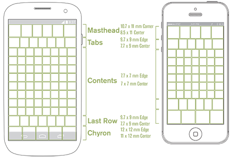
But now we know that accuracy is related to position on the screen. That’s a paradigm shift. So we can’t simply create designs, then uniformly account for target and interference sizes or avoid putting targets in certain areas of the screen. Instead, we can place any target anywhere, according to normal, hierarchical rules of information architecture and information design. We just have to allocate sufficient space for them. As Figure 1 shows, we can correlate touch accuracy across the screen to a few zones where we already commonly place elements.

The diagram in Figure 1 summarizes the interference sizes that are necessary for targets in various parts of the viewport. There are no out-of-bounds areas, just a large area in the center that allows quite dense touch targets, left and right edges that require slightly larger interference zones, and significant areas along the top and bottom that require substantially more space between targets.
Since the whole viewport seems to be filled with a few large strips of content, it is possible to consider and discuss these as zones.
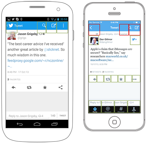
- masthead—Notification and title bars often occupy the top of the viewport, or masthead. The tappable title bar usually comprises relatively few, large elements—such as the iOS Back button. This convention typically works well within the new guidelines.
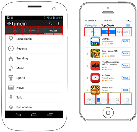
- tabs—Tab bars commonly reside below the masthead. We must keep that zone’s slightly lower targeting accuracy in mind when designing any elements in that position.
- content—The entire middle of a page is similar in size and usually scrolls, so we can consider this area as a single large zone. Using simple lists, with full-width selection, eliminates worries about slightly poorer targeting at the sides.
- last row—This zone doesn’t usually correspond to any specific element—like the others do—and for many designs, it does not matter. If there is a scrolling list comprising selectable items, users tend to scroll up to place items of interest comfortably within the middle of the viewport.
- chyron—The word chyron is a term for bars that dock at the bottom of the viewport. The iOS menu bar works well in this location, but only if there are four or fewer elements on it.
In case you are suspicious of lab research and the application of theory in the real world, a few notes are in order. Some of the research I refer to is on a very large scale and involved real users in their actual environment. So, not all of the research occurred in a lab, despite its being academic research. While I haven’t taken the time to set up and perform my own tests of these theories, looking back at some raw data from my previous usability research does point to their being true. And as a last gut-check, when I did some anecdotal research by observing my children and coworkers using specific user interfaces, I got results that are consistent with this theory.
Cadence and Viewports
Please do not think the chart in Figure 1 is about cadence or extending a grid along those exact lines. The boxes represent touch targets in a general zone, but you can shift them to wherever you’ve placed your grid or elements on a page.
However, the chart does bring up issues that arise from the current overuse of the grid in digital design. I’ve always been leery of extending the typographic grid up to page scales, and my new understanding of how people prefer to tap elements on a screen, which this chart represents, counters the principle of absolutely regular, high-density grids such as the Apple iOS 44-pixel cadence.
Any grid you use should both follow principles based on human factors and support the template and structure that you are using. You must fully account for mastheads and chyrons with larger targets and greater spacing. This might not work if those parts of the screen inherit the dense grid of the middle of the viewport. And I do mean viewport, not page. For these physiological reasons alone, you must consider where elements should live on the screen to facilitate a user’s seeing and tapping them. So, once you account for scrolling and reflow, you may need to reconsider your page design.
There is some indication that people scroll to the point where they are comfortable. If you allow your user interface to scroll and provide sufficient space below the last item in a list, this seems to give users another way to self-correct some of their touch inaccuracies.
A Summary of Touch Guidelines
The following touch guidelines summarize these findings from research:
- In the center of the screen, you can space targets as close as 7 mm, on center.
- Along the left and right sides of the screen, elements are slightly harder for users to tap. Use list views whenever possible, and avoid things like small icons and checkboxes at either side of the screen.
- At the top and bottom edges of the screen, you must make selectable items larger and space them farther apart. Depending on the area of the screen, spacing between elements in these zones should be 10–12 mm.
- Account for scrolling. These guidelines are for the screen, or viewport, not the page.
- Account for scaling. In Figure 1, you can see that five icons might fit on the example Android phone’s screen, while the iPhone screen accommodates only four icons. Be aware of what users are targeting, and make sure that what works on your phone doesn’t become unusable for those with smaller screens.
- Don’t get confused about the differences between visual targets, touch targets, and interference. All of these guidelines are about interference. You don’t need giant icons and large words, just elements that have sufficient selectable size and spacing around them to prevent misses and selection errors.


