Top

Defining an Interaction Model: The Cornerstone of Application Design

January 23, 2012

In March of 2011, I joined HP to lead the User Experience and Front-End Development organization for Consumer Travel. My goal? To design products that transform the future of travel. At the time, eleven UX professionals had already been working on the design for one of our travel applications for several months. Unfortunately, I had to throw the entire design away and start from scratch. Why? In addition to other challenges, the team could not articulate an interaction model.

Champion Advertisement
Continue Reading…

What Is an Interaction Model?

What is an interaction model? An interaction model is a design model that binds an application together in a way that supports the conceptual models of its target users. It is the glue that holds an application together. It defines how all of the objects and actions that are part of an application interrelate, in ways that mirror and support real-life user interactions. It ensures that users always stay oriented and understand how to move from place to place to find information or perform tasks. It provides a common vision for an application. It enables designers, developers, and stakeholders to understand and explain how users move from objects to actions within a system. It is like a cypher or secret decoder ring: Once you understand the interaction model, once you see the pattern, everything makes sense. Defining the right interaction model is a foundational requirement for any digital system and contributes to a cohesive, overall UX architecture.

Let’s look at some examples—Microsoft products that all of us have probably used. In Microsoft Word, the interaction model supports the conceptual model of users’ putting a piece of paper into a typewriter and typing. It also happens to have a lot of features that enable users to format a page and content in almost any way they can imagine. But that interaction model sits at its core. With Microsoft Excel, the interaction model reflects the conceptual model of accountants’ working with accounts in ledgers that contain rows of entries and columns of numbers and show a balance. Excel has additional features that make it a much richer experience than creating a spreadsheet on paper. But at its core is an interaction model that all users can internalize quickly. The interaction model for Microsoft PowerPoint reflects the conceptual model of users’ writing on a sheet of transparent plastic, then placing it on an overhead projector—for those of us who are old enough to have actually seen this! The interaction model for each of these products is very different, yet each, in itself, is very clear.

The interaction model is something that users internalize, but probably could not articulate—and wouldn’t care whether they could. Users internalize well-constructed interaction models, which make most actions within a system more predictable. Just as the book The Invisible Computer suggests, we usually don’t notice a product or application when it works well.

Clearly, then, there is no one-size-fits-all interaction model. Every product solves a different set of problems for different users, and therefore, requires a model that, as much as possible, reflects and supports their real-world interactions.

I often hear people—even experienced designers—suggest that, once they’ve created a global template or an information architecture, they’re ready to design. Now, if they’re designing a simple Web portal, they may be right. However, any time a product needs to scale to support complex interactions or comprises more than a dozen pages or so, its designers need to step back and define its interaction model first.

Drawing Some Contrasts

A global template is akin to a design style guide that rigidly enforces exactly where every element goes—not on just one page or screen, but across many of them. An interaction model, on the other hand, is more like a foundational design pattern that describes the ways in which objects interrelate, with many subpatterns that together describe the overall model. The difference is that interaction models leave room for designers to solve users’ real problems.

An interaction model describes how to represent an application to users. For example, should our PC-based, non-mobile application use more Web-portal affordances or desktop-application affordances? In our case, we decided that, although we would develop a Web application, it would use only desktop affordances. It would minimize the underlining of links and use more buttons instead. It would have a Maximize/Restore button that hides or shows the browser chrome, enabling the application to take up 100% of the usable space on the screen, similar to that on Cooliris, shown in Figures 1 and 2. The upshot is that, though we are designing the application technology to be highly performant, we have chosen a desktop application metaphor over a Web portal metaphor for the application. Often, what model you choose doesn’t matter as much as just choosing a model and sticking with it.

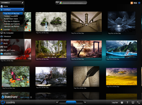
Figure 1—Cooliris application with browser chrome visible
Cooliris application with browser chrome visible
Figure 2—Cooliris application maximized, with the browser chrome hidden
Cooliris application maximized, with the browser chrome hidden

An information architecture maps the relationships between pages. I tend to not use the term information architecture when talking about designing a complex Web portal or application, because it suggests that we, as designers, are just structuring information. When designing a complex system, we are defining more than its information architecture. We are defining the way users move through a system consisting of many complex elements and how they use them to perform complex transactions, then find their way back.

Thus, an interaction model is much more than just a navigation model that describes how users can move from one page or section of an application to another. Of course, an interaction model must take a product’s navigation model into account. Certainly, we need to be aware of the relationships between an application’s pages. But an interaction model supports users’ establishing their conceptual approach to reaching their objectives—employing affordances that support real-life tasks—as well as following the structure of its information or pages.

An interaction model might describe how users navigates to a page, perhaps how they select an object of interest on the page—for example, a book, a passenger, or an expense—how they perform an action on that object—purchasing it, booking an itinerary for it, or adding it up. An interaction model also uses design patterns that describe the model. Our brains are wired to recognize patterns. An interaction model is a discernible pattern that supports the way users think about and approach real-life activities, which also reveals subpatterns in easily discernible ways.
Defining an Application’s Interaction Model

How, then, do you define an application’s interaction model? It can take months, but in the end, when stakeholders look at the model, they typically say, “Of course! I get it! It’s simple!” In this way, an interaction model is not unlike complex mathematics. You work hard to understand it—maybe for hours or even days or weeks—but then, once you finally understand how to solve a type of problem, it seems so simple that you wonder why it took so long to understand it in the first place.

At HP, defining our interaction model took us several months of very intensive work. We conducted user observations to understand how users conceptualized their goals, how they thought about objects supporting those goals, and the actions they performed on or using those objects in order to achieve their goals. On this particular project, we’re designing consumer user interfaces for mobile, tablet, and the Web, as well airline agent user interfaces for the Web and tablet. Now, I’ll tell you a little about how we crafted the interaction model for the airline agent side of the product.

When focusing on agent interactions, we recognized that each type of agent had a different primary object for which they needed to solve problems. For example, reservation agents taking calls—say to book a new flight or change an existing flight—are focused on a customer who is on the phone—or a caller who has permission to act on behalf of a customer. They need to solve problems for customers—such as booking a flight or changing a profile.

On the other hand, gate agents at an airport have a different goal, which they call closing a flight, and, thus, a different primary object on which they focus. Their supervisors measure their performance based on their ability to close flights, or get their flights away from the gate on time. Gate agents have several activities going on at the same time—all with a focus on getting a flight away from the gate on time. They need to make sure the passengers all have seats, award some upgrades, accommodate those on a waiting list either on the current or a later flight, and so on, but all of these activities are in service of closing a flight. Most of the gate agents I have observed care deeply about serving their customers—even if we don’t recognize it—but their continued employment depends on their getting flights away from the gate on time.

So, the primary object for a reservation agent is a customer, but the primary object for a gate agent is a flight. The primary object for a baggage handler or lost-baggage agent is a piece of luggage. The interaction models we crafted for these different users put the object of their primary focus front and center for them. We also give agents a summary of key information about each object, permitting agents to perform actions against their primary objects.

Once we understood the object-action relationships for these users, we spent a couple of months brainstorming various ways in which we could structure the overall product to permit these object-action relationships to take place in the most efficient, delightful way. During the brainstorming process, the team explored options, produced a set of screens for each user scenario, and looked at how well the model held together across scenarios. We did not just create simple screens. Rather, we crafted some of the most complex scenarios, with some of the most complex screens, to ensure that the interaction model supported big challenges. Sometimes, we recognized early that a model didn’t work. At other times, a model looked pretty good at first, but then we found that it wasn’t scalable.

Doing this kind of design exploration is as critical a process in getting a product right as the development itself. Although a good interaction model makes us say, “Of course—that makes sense,” coming up with a model for a complex product often takes several iterations and vigorous design debate about the pros and cons of each model.

Of course, we also had a deadline by which we had to produce our designs. In the end, it was my job as leader of the organization to buy the team the time we needed to define this model, craft wireframes, and confirm through usability testing that our model in fact met the goals we set forth for the product.

The key point I made to both senior leaders and my peers was that redefining the future of travel, designing a product that differentiates itself in the marketplace based on its user experience, is no small result. To achieve true differentiation and transform the marketplace, we needed lead time to get it right. I positioned this as a black-and-white, or binary, decision: Either we had the time to get it right, or all of the effort of hundreds of engineers, product managers, and people in other disciplines would be for naught. Make no mistake though—saying this presented a risk, calculated though it was. If I and my team could not produce something inspiring, the entire team might be at risk. In the end, I weighed the risk against the projected rewards and made the decision to go big.

I also needed to ensure that some members of the team were producing short-term deliverables to keep our road map moving forward—because business always needs to move forward. We had to find a balance and received support from our adjacent disciplines, including Product Management, Engineering, and Program Management.

However, pushing back on schedules meant that the end result had to be the creation of truly inspiring, marketable artifacts. It is my belief that the job of a UX team is to produce great work. If we produce average work, there’s really no reason to have a UX team on board. The end result had to make reluctant supporters nod their heads in support—and it did. Thus, my peers gained some significant trust from other organizations through this effort.

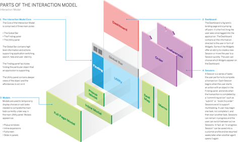
If we can show how an interaction model can result in breakthrough solutions, we can build the right level of support for having User Experience at the center of the strategic dialogue. This is especially the case when you’re working on consumer products—given the great examples of design in the marketplace today. But enterprise users in the IT world are also users of consumer products such as tablets and cool applications on their smartphones and on the Web. The consumerization of IT is a genuine trend that businesses need to embrace to remain competitive. Almost all of us are consumers of cool products today. People’s expectations have changed. (Just do a Web search on the “consumerization of IT.”) Figure 3 shows just one of the 110 pages that our Interaction Model document comprised. (It’s not important that you be able to read the callouts; the illustration is conceptual in nature.)

Figure 3—Part of an Interaction Model document
Part of an Interaction Model document

I’d like to show you more, including how we’ve tangibly instantiated this model into a set of screens, but because our product is still in development, I cannot for now. Suffice it to say that the Interaction Model document itself must market your organization’s capabilities.

Defining an Interaction Model to Meet UX Goals

Knowing whether an interaction model works requires not only usability testing, but also a very seasoned designer—one who can recognize when a model will not scale and predict what challenges users would encounter with the model. In the end, for the travel product at HP, I and my most senior design lead made the final decisions about the interaction model. Only later did our less experienced designers internalize it. But once they did, it provided a framework for their ongoing design efforts.

You cannot create an interaction model without first understanding the user experience goals for a product—allowing a team to measure the success of the model and the individual design decisions you’ve made within the model. In the case of the travel product that my team and I are designing, we established metrics around the following goals:

  • discoverability—Can users quickly find the model’s primary object and understand how to perform the actions they care about? Can they use the system successfully the first time?
  • learnability—How long does it take for users to internalize how to use the system competently? Even consumer products often have a slight learning curve today. For example, my company just gave me a new smartphone, and it took me a bit of exploration to understand how to use all of its cool features—not to mention how to avoid draining the battery in three hours.
  • user efficiency and productivity—Once users are competent using the system, how easy is it for them to perform common or repetitive tasks? Can they perform bulk actions all at once, or do they have to perform dozens or even hundreds of separate actions?
  • system response time—Once users take an action, how long does the system take to respond? In a production environment, user efficiency and system response time combine to define the total task time. Designers have a responsibility to understand the expectations and constraints on system response time and design a product that meets or exceeds those expectations.
  • delight—How cool does the product feel to users? Do users like using it? How much do they like it—especially in comparison to other products? I set up a Customer Listening organization, and we’ll be systemically gathering this type of data—along with Net Promoter Score data—to drive the top five to seven product improvements each quarter.

Each organization needs to set specific targets against their metrics, but these have given us the insights we need regarding how we’re doing from the standpoint of product design. If we were measuring engagement, we would use different metrics.

Once a design team has defined an interaction model, they can—and, in my opinion, should—craft a framework that supports specific designs. A framework defines reusable design patterns and instantiates them into reusable design and development components that subsequently enable designers and developers to rapidly produce additional parts of the design. In my case, we have a team of a few designers and a few front-end developers working together to produce framework releases in a regular cadence. The framework includes all of the design patterns that multiple teams need, including title bars, accordion widgets, table formats, date pickers, and hundreds of other user interface elements.

Conclusion

Defining an interaction model is a foundational requirement for a digital system. By first defining interaction models for our products, we crafted a product vision that our peers, senior leaders, designers, stakeholders, and users could understand and rally around. When I showed our interaction model and application simulations to customers back in November, they wanted to move directly to talking about product schedules. Their question? When can I have this product? If you have any questions about creating interaction models, give me a shout! 

Chief User Experience Strategist at Experience Outcomes

Los Altos, California, USA

Jim NietersA design leader for 17 years, Jim loves every minute of helping companies create competitive advantage by designing experiences that differentiate. He has worked with a range of companies—from startups to Fortune-500 companies—most recently as Senior VP of Customer Engagement at Monaker Group. He previously led User Experience at HP, Yahoo, and Cisco and has advised numerous startups. Jim chooses to work with brilliant clients, helping them unlock their unbounded potential by envisioning and designing end-to-end experiences that disrupt markets and engaging users emotionally. He often works with UX leaders to help them work through organizational challenges and ensure User Experience has the visibility it deserves and can design experiences that make the team proud. Jim also conducts design-value assessments for his clients, identifying gaps in their ability to differentiate on the experience, then helping them close those gaps and become extraordinary.  Read More

Other Columns by Jim Nieters

Other Articles on Interaction Design

New on UXmatters