Top

Book Review: The Design of Everyday Things

March 22, 2021

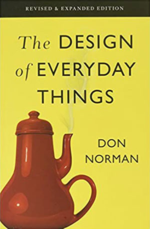
Cover: The Design of Everyday ThingsAfter reviewing some more recently published books, I decided to review a title among the foundational writings for User Experience: Don Norman’s The Design of Everyday Things. This book was originally published in 1988 and has been expanded and updated to apply the principles of human-centered design to Web sites, software, and mobile apps.

Don Norman is a key figure in the history of UX design and the second N of the Nielsen Norman Group. Norman began his career as an electrical engineer, then later earned a PhD in Psychology. His contributions as a researcher and UX consultant have spanned decades. Highlights of his career include his research into the Three Mile Island nuclear accident and his five-year stint as Vice President of the Advanced Technology Group (ATG) at Apple in the mid-1990s. His writings and talks have been widely credited as foundational to our application of psychology to product design and our understanding of the relationship between people and technology.

Champion Advertisement
Continue Reading…

Book Specifications

Title: The Design of Everyday Things: Revised and Expanded Edition

Author: Donald A. Norman

Formats: Paperback, Kindle, Audiobook

Publisher: Basic Books, revised edition

Published: November 5, 2013

Pages: 370

ISBN-10: 9780465050659

ISBN-13: 978-0465050659

Emphasizing the User and the Process—Not the Industry

Some time ago, I read an article on a business news Web site that described User Experience as a new way of designing Web sites.” Of course, this is a fundamental misunderstanding of what User Experience is. I’ve long advocated for User Experience refocusing on a philosophy that starts with people and their needs and behaviors—not on the products to which we apply UX methods. Wrongly assuming that User Experience is synonymous with Web design is similar to saying that an assembly line is a new way of building cars. While the assembly line had its first application in the automotive industry a hundred years ago, it has clearly found broad application in industries as diverse as firearms, appliances, toys, and more.

The question is: what knowledge and expertise are critical to understanding how to solve UX design problems? I frequently see job postings for UX researchers or designers who have three to five years of experience in designing mobile apps. These were particularly amusing in 2008—because almost nobody had designed a mobile app at that point. But, in 2021, I find them sad because they reinforce the notion that UX professionals should be industry or product focused when, in fact, they should be user focused. A bona fide UX professional can do UX research and design across any product or industry, regardless of their experience, because their job is understanding people and their needs.

Similarly, when Norman went to Three Mile Island to bring clarity to the root cause of the accident, he was not a nuclear engineer. Granted, his background was as an electrical engineer, but the fact that he was not immersed in the intricacies of building a nuclear power plant likely made it easier for him to disregard the assumptions that led to the plant’s design and let him focus on the interactions between the plant operators and with the control room.

The brilliance of Norman’s book is that it relates his principles of interaction to products and experiences with which people are already familiar. As Norman notes:

“All artificial things are designed. Whether it is the layout of furniture in a room, the paths through a garden or forest, or the intricacies of an electronic device, some person or group of people had to decide upon the layout, operation, and mechanisms.”

In The Design of Everyday Things, Norman spends considerable time describing the conflict between engineering for products and interactions with people. Engineers design machines or systems that can achieve some type of interaction in a predictable, repeatable manner. They—and the rules that govern them—are largely inflexible. These engineers tend to discount the need to make the effort to understand the people who use these systems because they take their humanity for granted. In Norman’s words:

I used to be an engineer, focused upon technical requirements, quite ignorant of people…. It took a long time for me to realize that my understanding of human behavior was relevant to my interest in the design of technology. As I watched people struggle with technology, it became clear that the difficulties were caused by the technology, not the people…. ‘You are designing for people they way you would like them to be, not for the way they really are.’”
Applying Norman’s Principles of Interaction in the Real World

Norman outlines a set of concepts that can help UX designers create products that communicate their purpose, usefulness, and how to interact with them effectively.

Affordance is the most basic principle that Norman discusses, but people frequently misunderstand it. In short, an affordance is what an object is supposed to do. For example, a door provides a way to close a doorway. It might latch and lock. These are the door’s affordances.

Signifiers communicate an object’s possible affordances and provide hints on how to achieve them. A label on a door that says PUSH helps users to realize that they should push the door.

While affordances and signifiers are just two of Norman’s design principles, they can illustrate the flexibility of a user experience. We can trace much of the confusion that users encounter when using a tool back to the omission of one or more Norman design principles or conflicts between them. The obvious example that people frequently use is the concept of the Norman Door—a door or a set of doors whose affordance indicates they swing in one direction, while the attached handles signify that they swing in the opposite direction. Of course, intentionally attaching signifiers to the doors in a vain attempt to reduce people’s misunderstandings of their affordance can exacerbate users’ confusion, as the photo in Figure 1 shows.

Figure 1—Confusing doors
Confusing doors

Obviously, we can apply these principles to the usability of Web sites. For example, if a string of text has the affordance of being a link, but lacks some text decoration that would provide a signifier that the text is indeed a link, its usability would be challenging.

Norman provides detailed explanations of all of his principles, which UX designers can apply to influence users’ experience in positive ways. Plus, he provides assessments of the cognitive responses that users experience when interacting with an object, as well as when evaluating their expectations of an interaction’s result and the actual result. Naturally, when the observed result of an interaction doesn’t match the user’s expectation, this can cause confusion and make the user reject the tool.

Conclusion

The Design of Everyday Things is required reading for anyone who is interested in the user experience. I personally like to reread it every year or two.

Norman is aware of the durability of his work and the applicability of his principles to multiple disciplines. As he notes in the final chapter of his book:

“It should be no surprise that I believe they will always be just as relevant as they were twenty-five years ago, just as relevant as they are today. Why? The reason is simple. The design of technology to fit human needs and capabilities is determined by the psychology of people. Yes, technologies change, but people stay the same.”

Pittsburgh Steelers Coach Chuck Noll said, “If you want to win, do the ordinary things better than anyone else, day in and day out.” While the UX community discusses and debates trends such as augmented reality (AR), artificial intelligence (AI), skeuomorphism, neumorphism, and flat user interfaces while confronting tool-selection and ethical dilemmas, it is important to recognize the value of the fundamental principles to our profession. I value a UX professional’s ability to recognize the value of Norman’s principles of interaction over their choice of Sketch or Zeppelin or whether someone has designed one or a hundred mobile apps for a given industry. If you know the basics of design better than anyone else, you can apply them flawlessly anywhere. 

Owner and Principal Consultant at Covalent Studio LLC

Akron, Ohio, USA

D. Ben WoodsBen’s global design and technology firm specializes in software design and development for the Web, mobile, and ecommerce. The company serves clients ranging from small startups to some of the largest companies in the world, including General Electric, Rio Tinto, and Fidelity. His career in User Experience began in the late 1990s. Ben has held diverse roles, including UX management at a global B2B firm, full-time and part-time academia, and executive roles. He enjoys solving complex business problems and coaching talent to be competitive UX design professionals. Ben earned his MS in Information Architecture and Knowledge Management at Kent State University and is a graduate of the Executive MBA program at Case Western Reserve University’s Weatherhead School of Management. He has presented long-format talks, speed presentations, and posters at many conferences and events and has conducted training and workshops for organizations throughout the United States, Europe, and Asia.  Read More

Other Articles on Book Reviews

New on UXmatters