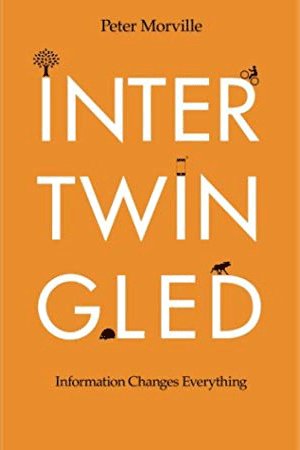
The lesson I took from this first part of Morville’s book—and the remainder of the book as well—is that our information experiences are part of an ecosystem. Many UX professionals consider themselves specialists—perhaps specializing on design for a particular platform such as the Web, mobile, or voice. Even those who have wide experience may narrow their focus for a specific project. However, this does not reflect the way people experience information. A person might interact with a firm’s Web site at their dining room table, on a mobile app while on a subway, and with a kiosk at a bricks-and-mortar store. Information is part of a system—albeit one that is largely invisible to most people—but a system of profound utility and consequence.
Book Specifications
Title: Intertwingled
Author: Peter Morville
Formats: Paperback
Publisher: Semantic Studios
Published: August 11, 2014
Pages: 199
ASIN: B00MOR4B0W
Don’t Try to Build the Perfect Taxonomy
As you might expect of someone who was a very early practitioner of information architecture, Morville spends considerable time discussing taxonomies, categories, and labels. He describes the folly of many hierarchically organized information systems. The example he uses is locating the Luggage department in a store. A shopper at a bricks-and-mortar store can visually scan the area for clues to the location of Luggage or might even be able to ask an employee. In contrast, on a typical ecommerce Web site, a customer must intuit how luggage might be categorized. Unless a customer is on the Web site of a luggage brand, Luggage is likely to be under Home and Kitchen or some similar category. This is somewhat confusing because people typically use luggage away from their home. This problem is exasperated in mobile contexts, where a hamburger menu typically further obscures information scent. While this sort of menu is a necessity on small screens, on a large screen, many would call it “mystery-meat navigation.”
The Dewey Decimal System demonstrates how an information architect’s outlook impacts that architect’s categorizations and priorities. For example, of the 100 numbers that this system reserves for religion, 88 are dedicated to Christianity. Buddhism gets a decimal point. While the system assigns major categories to topics such as Christian pastoral practice & religious orders (250), it is difficult to find similarly fine-grained topics in categories under Other religions (290).
In such cases, categorization becomes a filter—hiding information. Morville notes that even something as simple as the Facebook Like button forces a false duality. Like generally affirms something. How does one like hearing bad news? Granted, this may focus users on positive news rather than negative feelings.
 Peter Morville is a prolific author on the subject of information architecture and his writings are always insightful. As the coauthor of the “polar bear book,” as many people refer to Information Architecture for the World Wide Web, which is now in its fourth edition, I can think of few non-academics who could provide a more authoritative assessment of information theory and the practical application of information architecture to our lives.