In Part 2 of this series, I explained the user interface of Axure RP in detail. Now, in the final part of this series, I’ll describe how you can add interactivity to your prototype using Axure RP.
To create a prototype that meets your client’s expectations, you must have all the necessary skillsets in your repertoire. By using various user-research and user-centered design techniques, you can understand what your users expect from a particular application, product, or Web site. These techniques include contextual inquiry, stakeholder interviews, persona development, scenario creation, and user-journey mapping.
While there are quite a few prototyping tools available on the market—such as JustInMind, Balsamiq, InVision, and Adobe XD—Axure RP is my tool of choice. Now, in Part 3, I’ll explain some complex concepts that you’ll need to understand when adding interactivity to your prototypes in Axure RP.
Champion Advertisement
Continue Reading…
Adding Interactivity to Your Prototypes
Axure’s greatest value is in its capabilities for creating interactive prototypes to communicate your design concepts to clients, developers, and your other stakeholders. We’ll look in detail at Axure’s conditional logic, Dynamic Panel, masters, variables, repeaters, and adaptive prototypes.
Using Conditional Logic
Just like any other programming language, Axure supports conditional logic for creating complex interactions. First, you must learn how to add interactions to your prototype, then how to add conditional logic to them. The simple, concise flow for conditional logic is as follows:
If the user clicks a specific widget or screen…
Then, perform a certain action…
Else, retain or change the state of the widget or screen.
Exercise 1: Login Validation
In this exercise, you’ll become familiar with Axure’s Condition Builder and learn how to implement one of the most common interactions for your prototypes: logging in. This requires prototyping two conditions, as follows:
On the user’s entering valid credentials, the login is successful.
On the user’s entering invalid credentials, the following error message appears: Your user name or password is incorrect. Please try again.
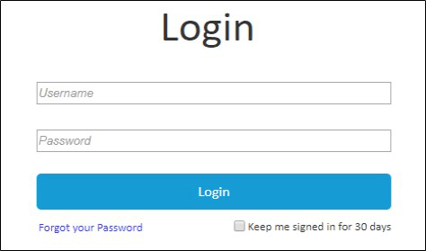
Drag the appropriate widgets from Libraries and drop them onto the canvas. Add styles to them by selecting the widget, then making the requisite changes on the Styles tab. Let’s start with a basic interaction: how to add interactivity and validation to a login page by doing the following:
Step 1: After starting Axure RP, under Pages, rename Home as Login and Page 1 as Landing Page.
Step 2: Drag a label to the canvas, then:
Select its font and size on the Style tab. In this case, we’ll keep the font family as Calibri and the font size at 48.
Change the label to Login.
Step 3: Drag two text boxes from the Libraries section to the canvas and name them: Username and Password.
Step 4: Select the first text box, then on the Properties Tab, select Text in the Type drop-down list. Type the username you want to keep in the Hint box.
Step 5: Select the second text box, then on the Properties Tab, select Password on the Type drop-down list. Enter the password you want to keep in the Hint field.
Step 6: Drag a primary button from the Libraries section to the canvas, then rename it Login.
Step 7: Vertically align the Login button with the Username and Password text boxes.
Step 8: Drag a checkbox from the Libraries section to the canvas, then rename it: Keep me signed in for 30 days.
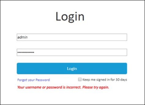
Step 9: Drag a label from the Libraries section to the canvas, then rename it Forgot your password. Figure 1 shows the completed Login page.
Figure 1—Login page
Step 10: Drag a box from the Libraries section, then type the error message: Your login credentials are incorrect. Try again.
In the right pane, name the box Error Message.
Right-click the box, then select Set Hidden on the contextual menu that appears.
Step 11: Select the Login button, then select the OnClick event on the Properties tab.
Step 12: Click Open Link in the left pane of the Case Editor dialog box, then select Landing in the right pane. This defines an OnClick event on the Login button that navigates to the Home page.
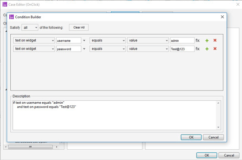
Step 13: Select the Login button, then select the OnClick event on the Properties tab in the right pane.
Step 14: Click the Add Condition button, then in the Condition Builder dialog box that appears, which is shown in Figure 2, define the following case: Username=admin; Password=Test@123.
Figure 2—Condition Builder dialog box
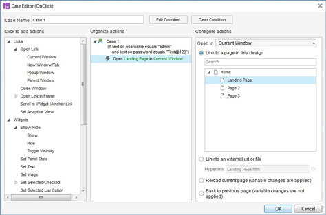
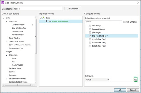
Step 15: In the left pane of the Case Editor dialog box shown in Figure 3, select Current Window, then select Landing in the right pane.
Figure 3—Case Editor dialog box
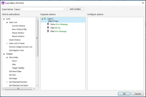
Step 16: Click Add Case on the Properties tab to define the Else If statement that would display an error message if login fails.
Step 17: Click Show in the left pane of theCase Editor dialog box, then select the error message that you defined in Step 10.
Select the Wait event in the left pane of the Case Editor dialog box, then to display the error message for three seconds, set its value to 3000 ms.
Select Hide in the left pane of the Case Editor dialog box, then select Error Message to hide the error message. Figure 4 shows this Else If condition in the Case Editor dialog box.
Figure 4—Defining an Else If condition in the Case Editor
On a computer running Windows, to view the final output in your browser, click F5. Figure 5 shows the error message that appears when the user enters the wrong login credentials.
Figure 5—Error message on the Login page
Using Dynamic Panels
Dynamic panels provide a group of widgets that you can target for an action as one unit. These panels help you to introduce dynamic functionality to a prototype—for example, a modal pop-up dialog box, accordion, or carousel. You can create interactions to show and hide these panels or treat a dynamic panel as a light box, fly-out panel, or push widget.
Exercise 2: Creating a Bulleted Carousel
In this exercise, you’ll learn how to create a simple, bulleted carousel.
Step 1: Drag a dynamic panel from the Libraries section to the canvas area.
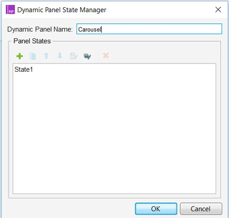
Step 2: Double-click that dynamic panel to display the Dynamic Panel State Manager dialog box, shown in Figure 6, then name the panel Carousel.
Figure 6—Dynamic Panel State Manager dialog box
Step 3: Double-click State1.
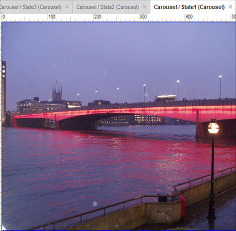
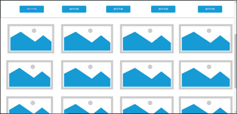
Step 4: Drag an image widget to the State 1 panel, then double-click the image widget to upload an image that meets your requirements. Figure 7 shows State 1 for the dynamic panel.
Figure 7—Carousel / State 1 for the dynamic panel
Step 5: Double-click the Carousel dynamic panel.
Step 6: Click the plus sign to add more states—State 2 and State 3—renaming these states as appropriate.
Step 7: Repeat Step 4 for State 2 and State 3.
Step 8: Drag a left arrow and a right arrow from the Libraries section, centering them vertically at the left and right sides of the image on the Carousel, respectively.
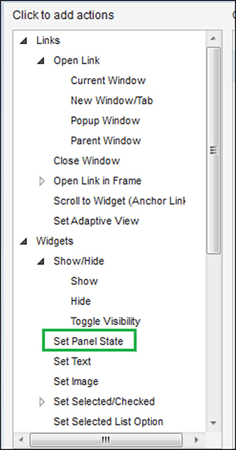
Step 9: Click the left arrow on the carousel to select it, then select the OnClick event, Set Panel State, for the dynamic panel, as shown in Figure 8.
Figure 8—Set Panel State
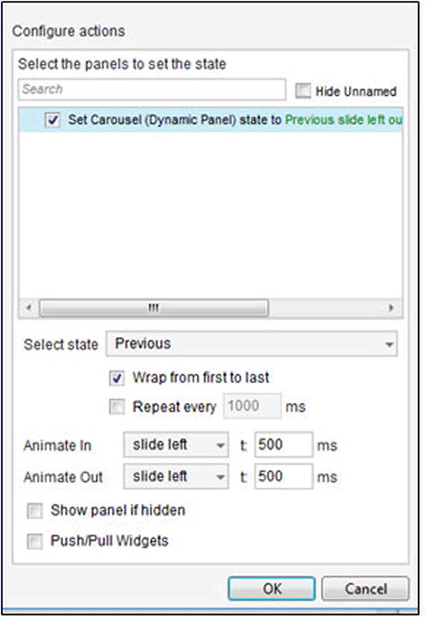
Step 10: Select SetCarousel (Dynamic Panel) state in the Configure actions pane of the Case Editor dialog box, shown in Figure 9, where you can set up carousel interactions in the pane below by doing the following:
Select Previous in the Select state drop-down list.
Select Wrap from first to last.
Select slide left in both the Animate In and Animate Out drop-down lists.
Figure 9—Setting up the left-arrow interaction for the carousel
Step 11: Click the right arrow on the carousel to select it, then select the OnClick event, Set Panel State.
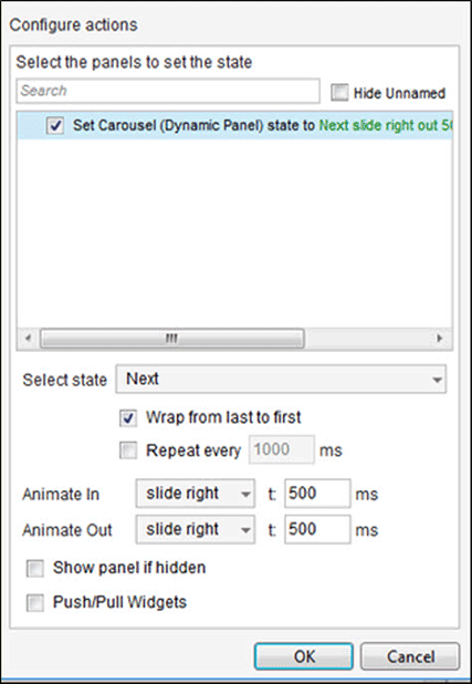
Step 12: Repeat Step 10 for the right arrow, but set up the right arrow on the carousel, as shown in Figure 10:
Select Next in the Select state drop-down list instead of Previous.
Select slide right in both the Animate In and Animate Out drop-down lists.
Figure 10—Setting up the right-arrow interaction for the carousel
Step 13: Drag a dynamic panel from the Libraries section to the carousel in the canvas area, centering it at the bottom of the carousel.
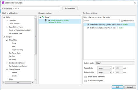
Name the dynamic panel Bullet Carousel, then create its three states in the Case Editor dialog box shown in Figurer 11.
Select State 1:
Add three dots, aligning them horizontally, to create an ellipsis, then fill in the first dot in gray.
For the OnClick event, set Bullet Carousel to State 1 and Carousel to State 1, as shown in Figure 11.
Select State 2:
Create the same ellipsis, but fill in the second dot in gray.
For the OnClick event, set Bullet Carousel to State 2 and Carousel to State 2.
Select State 3:
Create the same ellipsis, but fill in the third dot in gray.
For the OnClick event, set Bullet Carousel to State 3 and Carousel to State 3.
Figure 11—Defining a bulleted carousel in the Case Editor dialog box
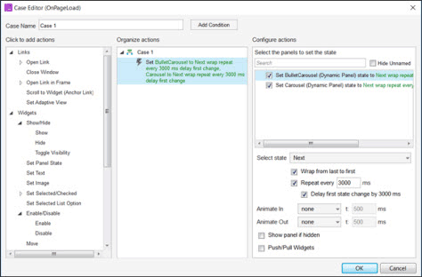
Step 14: In the Case Editor dialog box for the OnPageLoad event, shown in Figure 12, set both the BulletCarousel (Dynamic Panel) state and the Carousel (Dynamic Panel) state to Next and select Delay first state change by 3000 ms.
Figure 12—Defining an OnPageLoad event in the Case Editor
Now, when you run the prototype, the carousel starts running as defined by the OnPageLoad event. The user can change the images in the carousel by clicking either the arrows on the carousel or the bullets or by using the left or right arrow keys. Figure 13 shows the run-time view of the BulletCarousel.
Figure 13—Run-time view of the carousel with bullets
Specifying Variables in Axure
Use variables for storing information that is likely to change. This is one of the more complex features of Axure and, as a consequence, UX designers are often quite reluctant to use variables. There are two different types of variable in Axure, as follows:
local variables—Use them for information that appears on a single page. For example: multiply the values of three widgets, then display the result in a fourth widget—perhaps on the click of a button.
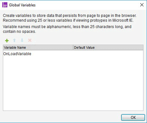
global variables—Use them for information that gets passed between pages. For example: after the user has entered his name in a form field, pass text to a subsequent page that reads Thank you, Andrew. To define a global variable, go to Project > Global Variables. Click the green plus icon to add the variable. Figure 14 shows the Global Variables dialog box.
Figure 14—Global Variables dialog box
Exercise 3: Multiplying Text Values in Widgets Using a Local Variable
Now, let’s do an exercise to help you understand the use of local variables. In this exercise, there are four widgets: w1, w2, w3, and Total. There is also a button that displays the multiplication result of w1, w2, and w3 in Total. Figure 15 shows how you can set up an interaction using a local variable.
Figure 15—Setting up an interaction for a local variable
Step 1: Drag four text widgets from the Libraries section to the canvas, then name them text b1, text b2, text b3, and Total. Drag a button to the canvas and name it Multiply.
Step 2: Define an OnClick event on the Multiply button, then Set Text to Total.
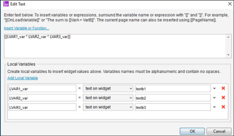
Step 3: Click the fx icon—highlighted in green in Figure 15—for the text value you are setting.
Step 4: Click the Add Local Variable link, then add the local variable to the three text boxes you defined in Step 1.
Step 5: You can name the local variables whatever you want. I like to prefix the names of local variables with LVAR_ so I can distinguish local variables when I look at expressions. (Note that the drop-down list to the right of the variable name is set to text on widget, which is the property of the widget you’ve chosen at the far right.
Step 6: Type the expression [[ LVAR1_val * LVAR2_val * LVAR3_val ]] in the Insert Variable text area. (Note that the expression is surrounded by double brackets.) Figure 16 shows how you can set up the insert function for local variables.
Figure 16—Setting up the insert function for local variables
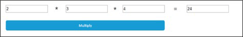
Figure 17 shows the run-time view of the value that you get by multiplying text values in various widgets, using a local variable.
Figure 17—Run-time view of the declaration of local variables
Exercise 4: Create a Sticky Web-site Header
Since you’re creating a header for reuse on a number of pages in your prototype, you’ll first need to learn how to create a master.
Step 1: Click the Add Master icon in the left pane, then rename the master Header.
Step 2: Click the Add Master icon in the left pane, then rename the master Footer.
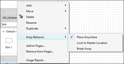
Step 3: Right-click the Header icon in the Masters section, then choose Drop Behavior on the contextual menu that appears and select Lock to Master Location on the submenu. Figure 18 displays the Drop Behavior submenu, whose options are the drop behavior for masters.
Figure 18—Drop Behavior submenu on the Masters contextual menu
Step 4: Drag a box from the Libraries pane and keep its default width and height—width = 1366 and height = 100.
Step 5: Drag five buttons from the Libraries pane and align them horizontally in the box.
Step 6: Select the box and all of the buttons, then right-click them. Select Convert to Dynamic panel on the contextual menu that appears and name the dynamic panel Header.
Step 7: Right-click the Header dynamic panel, then select Pin to Browser on the contextual menu that appears.
Step 8: Drag the header onto any of your prototype pages.
Step 9: Drag a placeholder from the Libraries pane to a page and place it below the header on that page. Keep its default width and height—width = 1300 and height = 350. Give it the name Main Content.
Step 10: Drag four placeholders from the Libraries pane and place them below the Main Content. Align these placeholders horizontally with the Main Content. Name them Placeholder 1, Placeholder 2, Placeholder 3, and Placeholder 4.
Step 11: Repeat Step 10 three times. Figure 19 shows the run-time view of your sticky header.
Figure 19—Run-time view of the sticky header
As you can see in Figure 19, the header stays at the top of the page, while the vertical scroll bar scrolls the main content area.
Setting Up Adaptive Views
In Axure, you can set up adaptive views of pages. You’ve likely heard about responsive and adaptive Web design, which help make a Web site accessible on different types of devices, including the desktop, mobile, and tablets. Adaptive design requires that you create Web-page layouts in such a way that their content resizes or rearranges in the browser window on smaller or larger screens.
Exercise 5: Create an Adaptive Prototype of the Sticky Header
In this exercise, you’ll create an adaptive prototype of the sticky header that you created in Exercise 4, using a desktop-first approach. You could alternatively use a mobile-first approach, depending on what would best meet your requirements.
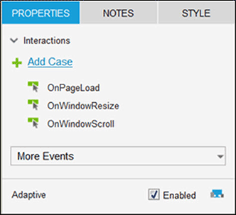
Step 1: On the Properties tab, under Adaptive, select the Enabled checkbox to make your prototype adaptive, as shown inFigure 20.
Figure 20—Enabling an adaptive prototype
Step 2: Click Manage Adaptive Views, which appears once you’ve completed Step 1.
Step 3: In the Adaptive Views context window, type the name Base and keep the default width and height—width = 1366 and height = 1400. For a desktop-first approach, this is the default layout you’ve used while designing your page in Axure.
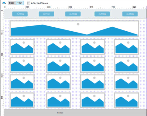
Step 4: To insert your first breakpoint, click the Add icon and add the breakpoint for the tablet landscape view. Enter the name Tablet, width = 1024, and height = 768. (Note that specifying the height is optional, but you must specify the width.)
Step 5: Click the 1024 tab and rearrange the elements as necessary for that breakpoint. Figure 21 shows how you can create a tablet breakpoint.
Figure 21—Tablet breakpoint
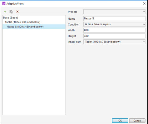
Step 6: Repeat Step 2 to add your second breakpoint, specifying the values for an Android device.
Step 7: Click the Android device’stab and rearrange the elements as necessary for that breakpoint. Figure 22 shows the Adaptive Views dialog box with settings for an Android device.
Figure 22—Android phone settings in the Adaptive Views dialog box
Step 8: Run the prototype to see the results.
Setting Up Repeaters
The repeater widget is one of the most advanced features of Axure and is really hard to understand for beginning prototypers. You can use the repeater widget to display recurring collections of widgets and other elements. You can apply a repeater to a container, which holds a single set of widgets of the same style and structure that you can repeat several times on a given page. Repeaters let you create custom grids, custom dynamic tables, and panels. The repeater widget is the only widget that effectively evaluates interaction cases within Axure. Therefore, you do not have to run a preview to see the effect the default case has on your repeater.
Exercise 6: Create a Data Grid with Sorting and Pagination
Step 1: Drag a repeater from the Libraries section and name it Table.
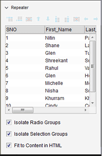
Step 2: In the Repeater section of the right pane, specify values that meet your requirements for the repeater, as shown in Figure 23.
Figure 23—Inserting values for a Table Repeater
Step 3: Double-click Case 1 in the OnItemLoad in the Case Editor dialog box. Select the Set Text action in the left pane, then select all the columns of your grid so the repeater can read all the data and display it at run time.
Step 4: Select an appropriate icon for sorting and place it above the upper-right corner of the Table Repeater.
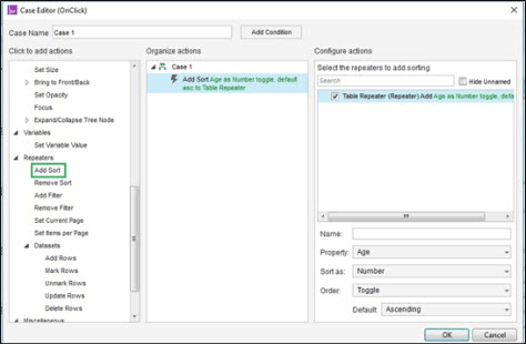
Step 5: On the OnClick event for the Sort icon, select Add Sort in the Repeaters section of the Case Editor dialog box.
Step 6: Select the Table Repeater, then enter the fields shown in Figure 26. Figure 24 shows the Case Editor dialog box for the sort options.
Figure 24—Add Sort for the Table Repeater in the Case Editor
Step 7: To create the pagination interface, place left and right arrows in the lower-left corner of the repeater.
Step 8: Select the Table Repeater, then the Style tab.
Step 9: To allow pagination, select the Multiple Pages checkbox and provide appropriate values for the Items per page and Starting page fields.
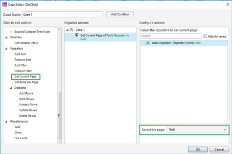
Step 10: Select the right arrow and do the following:
On its OnClick event, select Set Current Page.
Select the Table Repeater, then select Next in the Select the page drop-down list.Figure 25 shows the Case Editor dialog box for the pagination options.
Figure 25—Set Current Page for the Table Repeater in the Case Editor
Step 11: Select the left arrow and repeat same steps you followed under Step 10 for it. However, select Previous instead of Next in the Select the page drop-down list.
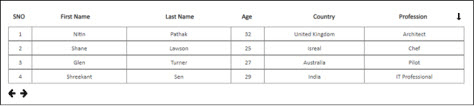
Step 12: Run your prototype to see the results. Figure 26 shows the data grid with sorting and pagination.
Figure 26—Data grid with sorting and pagination
Conclusion
The Axure RP features I’ve discussed in Part 3 of this series are super useful, but the learning curve for some of them is fairly high. Nevertheless, once you are comfortable using Axure, you might find using this popular tool for interactive prototyping easy. Learning any worthwhile skill takes hours of preparation and practice. The key to your success with interactive prototyping is practice.
While low-fidelity wireframes work perfectly for communicating new design concepts, your clients will eventually want to see an interactive prototype. Creating an interactive prototype in Axure RP fits the bill perfectly.
Thanks for your comment. The concepts explained in this article would remain the same in both Axure 8 and Axure 9, only the user interface of the latter has changed.
As a UX Specialist at HCL Technologies, Apurvo works within a multidisciplinary team to deliver compelling UX designs and services that support business objectives and enhance the way people live, work, and communicate. Apurvo takes a keen interest in helping the team to cope with UX design technology transitions and adds value across teams. He creates solutions that address new challenges in UX design and the visualization of complex data. Apurvo is a Certified Usability Analyst. Read More
