In Part 1 of this series, I discussed the importance of wireframes, mockups and prototypes to your product’s overall success. Also, I stressed the importance of your clients’ understanding the significance of creating these design artifacts. Now, in Part 2 of this series, I’ll explain the user interface of Axure RP in detail.
Axure RP is quite a handy tool, and you can use it for wireframing, prototyping, and creating specifications. UX designers, information architects, user researchers, business analysts, and product managers commonly use Axure RP to design applications and Web sites. Without writing a single line of code, you can quickly prototype, then visually present your application or Web site.
Champion Advertisement
Continue Reading…
You can use Axure RP to do the following:
Help your clients to visualize design concepts.
Provide clear, interactive, visual prototypes to development teams who will build an application, product, or Web site.
Enable UX researchers to test design ideas before spending money on development.
Allow business analysts to create flowcharts and entity-relationship diagrams (ERDs).
Create beautiful animations that enhance a prototype.
Develop effective prototypes using dynamic panels.
Create dynamic grids using the repeaters concept.
Provide more sophistication to your prototypes by using conditional statements and adaptive views.
Axure created this tool specifically to enable UX designers to create rapid prototypes—which is what RP stands for. You can use Axure RP to create a very rough, quickly constructed prototype for the sole purpose of presenting and vetting an idea early in the design process. But, when necessary, you can also create very high-fidelity prototypes, enabling UX researchers to test their prototype with users in real time. Axure is a fantastic application. It offers a robust set of tools for communicating your design ideas, helping you to take your designs to a whole new level.
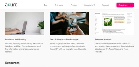
Two reasons for Axure’s immense popularity are its online Help and the fact that the product keeps getting better with each newly released version. Figure 1 shows Axure’s support page.
Figure 1—Axure’s Support page
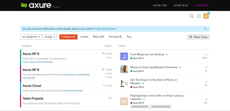
An online forum is also available on the Axure Web site, where experienced designers can discuss design problems, provide solutions, and suggest workarounds for how to prototype the perfect solution. You can share your expertise with the community on this forum. Figure 2 shows the Axure forum.
Figure 2—Axure Forum
Backing Up Your Files
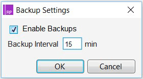
The lack of a traditional auto-save feature in Axure trips up a lot of people. However, if you enable backups and specify a backup interval, your files will get backed up rather than being saved automatically. So, before getting started with any project in Axure, check your backup settings. Open Axure RP and go to File > Backup Settings. The Backup Settings dialog box appears, as shown in Figure 3.
Figure 3—Backup Settings dialog box
In the Backup Settings dialog box, shown in Figure 3, the Enable Backups checkbox is selected by default and the Backup Interval is set to every 15 minutes. If you are working at a really fast pace, you can decrease the interval for the backup to say every 4 minutes. You want to make sure that you are saving your work.
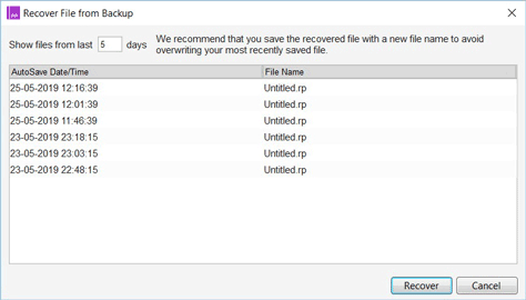
If Axure crashes while you’re working, you can recover the data you last backed up in your Axure file by choosing to File > Recover from Backup. Figure 4 shows the Recover File from Backup dialog box.
Figure 4—Recover File from Backup dialog box
The Recover File from Backup dialog box lists every instance of a file that you’ve backed up.
Navigating the Axure User Interface
When you open Axure for the first time, you’ll see three panes. Let’s look at each of them in detail.
The Left Pane
The left pane consists of Pages, Libraries, and Masters sections.
Pages Section
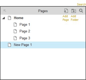
As Figure 5 shows, you can see the Pages section in the upper-left corner of your screen, listing a Home page, Page 1, Page 2, and Page 3. The Pages section is a kind of table of contents for your project and lets you navigate to any page by double-clicking it in the list. That page then appears in the central canvas. To add a new page, click the Add Page icon. By default, the new page gets added under Home. You can add folders in which to organize your pages by clicking the Add Folder icon.
Figure 5—Pages section of the left pane
You can delete any page by right-clicking that page, then selecting Delete from the contextual menu that appears. Depending on your needs, you can also move a page up or down and outdent or indent it in the list. Use the Search icon to search for a specific page.
Libraries Section
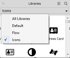
In the Libraries section, shown in Figure 6, you’ll find most of the widgets you’ll need for creating your prototypes. The widgets that are typically available in this section include Box, Image, Placeholder, and Buttons. The Libraries comprise the stencils you can use in your project. In this section, a drop-down menu lets you select the following:
All Libraries—Displays all of the widgets that are available in the Libraries section.
Default—Displays the default widgets, which you’ll most commonly use for creating prototypes.
Flow—Displays widgets for creating flowcharts.
Icons—Displays the icons you can add to your prototypes.
Figure 6—Libraries section
Masters Section
Masters are predefined collections of widgets that you can use in creating wireframes or prototypes just as you use individual widgets. The advantage of using masters is that you can create them once, then reuse them any number of times in your prototypes.
The Workspace or Canvas
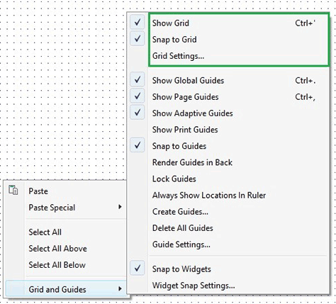
To create a prototype, you’ll drag widgets from the left pane to the central pane, or canvas. Figure 7 shows the contextual menu for the canvas.
Figure 7—Contextual menu for the canvas
The contextual menu for the canvas includes the following options on the Grid and Guides submenu:
The first three options on the submenu relate to grids, as follows:
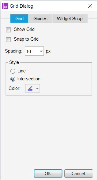
Show Grid—Displays a grid within the canvas. The grid is very helpful in aligning widgets on the screen. Figure 8 shows the Grid dialog box.
Snap to Grid—Automatically aligns widgets to the grid when you drag them to the canvas.
Grid Settings—Displays additional settings relating to grids in a dialog box. You can select the spacing for the grid, the type of grid, and the type of intersection for the grid.
Many other options on this submenu relate to guides. You can drag guides from either the horizontal or the vertical ruler. There are four types of guides, as follows:
Show Global Guides—Displays guides in the canvas for all pages in a prototype.
Show Page Guides—Displays page-level guides.
Show Adaptive Guides— Displays guides for adaptive devices.
Snap to Guides—Automatically aligns widgets to the visible guides when you drag them to the canvas. This feature helps you to align particular widgets on the canvas with the other widgets.
Figure 8—Grid dialog box
The Right Pane
The right pane provides inspectors that let you specify interactions, notes, styles, and events for widgets. This pane includes the Properties, Notes, and Style tabs.
Properties Tab
As its name suggests, the Properties tab lets you set the properties of pages and widgets. You can add on-page events, including OnPageLoad, OnWindowsResize, OnWindowsScroll, OnPageClick, OnPageDoubleClick, OnPageContextMenu, OnPageMouseMove, OnPageKeyDown, OnPageKeyUp, OnWindowsScrollUp, OnWindowsScrollDown, and OnAdaptiveViewChange. You can also add events to a widget, including Onclick, OnMouseEnter, OnMouseOut, OnDoubleClick, OnContextMenu, OnMouseDown, OnMouseUp, OnMouseMove, OnMouseHover, OnLongClick, OnKeyDown, OnKeyUp, OnMove, OnResize, OnRotate, OnShow, OnHide, OnFocus, OnLostFocus, OnSelectedChange, OnSelected, OnUnselected, and OnLoad.
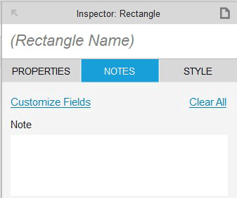
Notes Tab
You can add comments to a page or widget using the Notes tab. These notes are visible when you publish your prototype in a Web browser or on AxShare. Figure 9 shows the Notes tab for a widget.
Figure 9—Notes tab for a widget
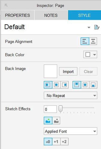
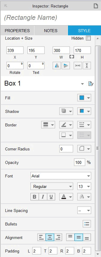
Style Tab
You can style pages or widgets using the Style tab. Figure 10 shows the settings for styling the page that currently appears on the canvas; Figure 11, the settings for styling widgets.
Axure RP has quickly become one of the most popular tools for rapid prototyping in use today. There are many reasons for Axure’s popularity. With no trouble whatsoever, you can easily create wireframes, as well as generate specifications documentation. Axure lets you rapidly develop prototypes for Web browsers or native Android, iPhone, Tablet, or iPad applications. With Axure RP, you can create low-fidelity, medium-fidelity, high-fidelity, or interactive prototypes to present your design ideas and communicate them to your clients or product teams.
It is no wonder that Axure has become one of the most widely used tools within Fortune 500 corporations, as well as among UX professionals worldwide.
Now that I’ve described the basics of the Axure user interface, in Part 3, I’ll discuss how you can add interactions to your wireframes using Axure. You’ll be ready to send your interactive prototypes out for review in an hour or less.
As a UX Specialist at HCL Technologies, Apurvo works within a multidisciplinary team to deliver compelling UX designs and services that support business objectives and enhance the way people live, work, and communicate. Apurvo takes a keen interest in helping the team to cope with UX design technology transitions and adds value across teams. He creates solutions that address new challenges in UX design and the visualization of complex data. Apurvo is a Certified Usability Analyst. Read More