This is a sample chapter from Daniel Schwarz’s book Jump Start Adobe XD. 2017 SitePoint.
Chapter 3 continues a tutorial that began in Chapter 2, “Learning the Basics with Low-Fidelity Prototyping.”
Chapter 3: Prototyping User Flows and Receiving Feedback
Now we have two screens in our design—a welcome screen with a search function and a location-filter screen with a list of recently selected locations. Let’s demonstrate how the user would flow from one screen to the other. This is the first time we’ll be switching to the prototype workspace, but it won’t be the last.
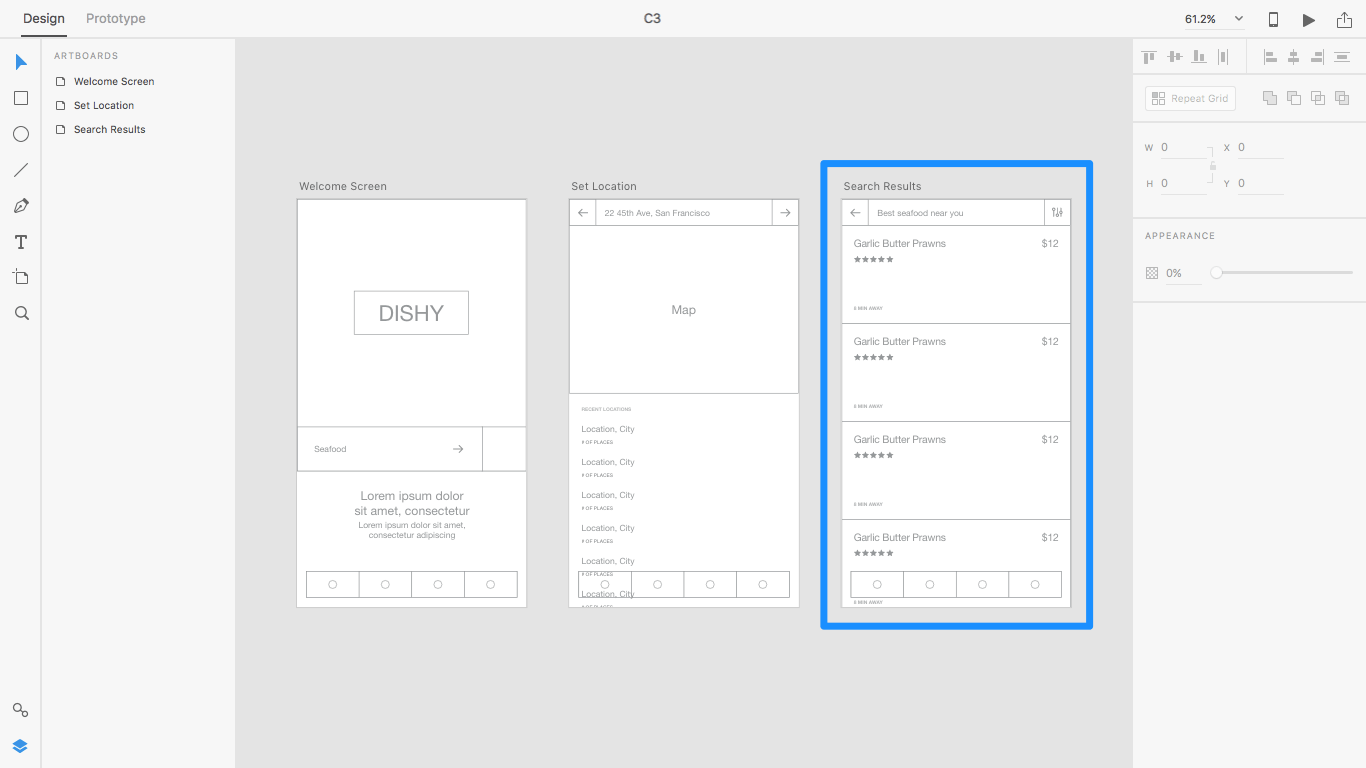
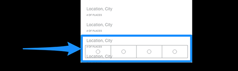
So we have more screens to work with, I’ve once again added another low-fidelity screen to the design. This is the screen that the user sees after selecting a type of food and a location where they’d like to eat—the Search Results screen. I’ve also downloaded and copied some temporary icons into the mockup. (We’ll learn about using vectors and iconography in Chapter 6.)
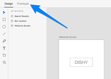
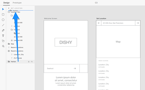
Start by switching to the prototype workspace by clicking the Prototype tab in the top-left corner. You can also quickly toggle between the design and prototype workspaces with the keyboard shortcut Ctrl + Tab, or Ctrl + Tab in Windows.
Figure 3-2—Switching workspaces
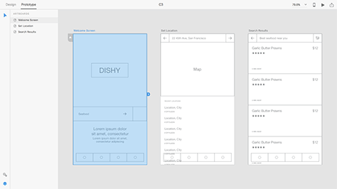
You will now be in the prototype workspace, where the interface and tools available are catered towards prototyping user flows.
Figure 3-3—Prototype workspace
Prototyping Interactions
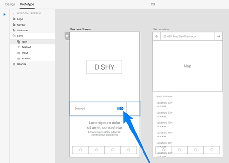
Let’s start by linking the welcome screen to the location-filter screen, effectively demonstrating a user flow where the user searches for a type of cuisine and is then asked to specify where they’d like to eat on the location-filter screen. Click the right arrow icon—inside the input field on the welcome screen—where a blue arrow-tab will appear alongside it.
Figure 3-4—Creating a user flow
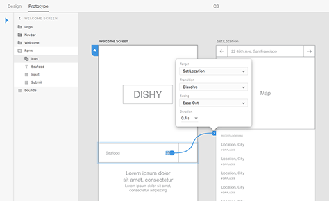
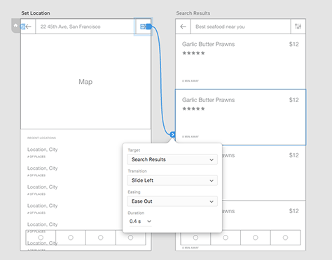
Drag and drop this blue tab into the location-filter screen. A user flow will have been created, and a small modal will appear where you can specify transition settings for this user flow—that is, how the screen will transition into the next one, including the type of animation effect and the duration of that animation.
Figure 3-5—Flow and transition settings
Later on—when we learn how to preview/test our prototypes—we’ll be able to literally click this icon and be taken to the next screen, as if we were using a real app. This is how we—and our developers, and maybe even our clients—use the prototype workspace to test our concept before committing to it.
Next, we’ll specify the transition settings for this user flow.
Designing Transitions
Animation comes with its own set of UX challenges. A slow transition can make the user feel like your app is taking too long, whereas a transition that’s too fast can leave the user wondering what even happened. And then there’s the style of the transition itself. You don’t need to do a fade-flip-slide combo to wow the user; a subtle motion is enough to illustrate the result of the user interaction. Let’s explore some of the transitions and transition settings that we can use in Adobe XD.
Target—What the screen transitions to:
None: Essentially removes the flow
Previous Artboard: Returns to previous screen
[Artboard Name]: Links to another screen
Transition—The visual effect:
None: No transition
Dissolve: Simple fade transition
Slide Left: Slides over from the left
Slide Right: Slides over from the right
Slide Up: Slides over from the top
Slide Down: Slides over from the bottom
Push ←/→/↑/↓: Same as slide transition, except the screen sliding in pushes the current screen out
Easing—The speed of each interval of the transition:
Ease-Out: Transition will start at full speed/finish slowly
Ease-In: Transition will start slowly/finish at full speed
Ease-In-Out: Start slow, full-speed at middle, finish slow
None: The transition will not accelerate/decelerate—it’s linear.
Duration—Overall time it takes for the transition to complete
Using Transitions
Page transitions are less common on Web sites; therefore, a None transition is quite normal for Web-site prototypes. Some Web applications, on the other hand, do support transitions, which is why the transition options are nonetheless available in all cases.
For further reading on easings—notably, the different types of easings and their effect on user experience—check out my article on microinteractions and easings on SitePoint.
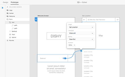
Because we linked the welcome screen to the set location screen, the Target setting has already been defined. Slide Left is a suitable option for the Transition setting because it creates motion—the destination screen slides in from the right, implying that it was the next screen in a series of screens. This is the default setting on iOS and some areas of Android.
Ease-out is a suitable easing for this user flow because it forces the animation to be faster at the beginning, creating a seemingly swift transition that doesn’t delay the user too much, then gracefully slows down so the user has a little extra time to understand what’s happened. In most cases, the default Duration setting of 0.4 seconds is more than optimal.
Let’s roll with these settings.
Figure 3-6—First-screen settings
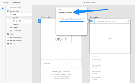
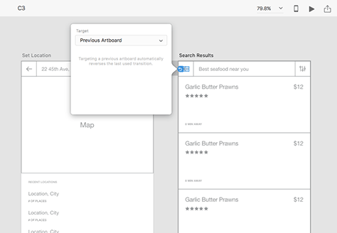
From the Set Location screen, create a user flow back to the Welcome Screen. Select Previous Artboard as the Target, which will automatically reverse the transition last used. For example, if you used Slide Left to enter the screen, Slide Right will be used as you return to the previous screen.
Figure 3-7—Previous artboard settings
Repeat these steps, linking Set Location to Search Results.
Figure 3-8—Linking a second screen
And vice versa.
Figure 3-9—And vice versa
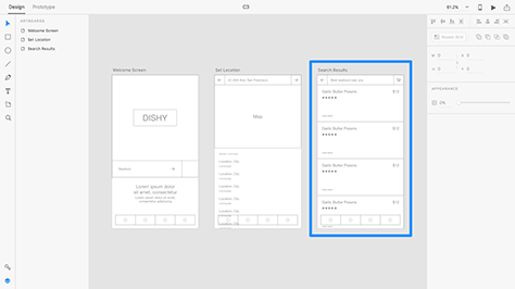
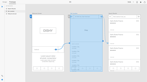
At any moment you can click an artboard to see an overview of which screens link to it, and which screens it links to. Prototyping is wonderfully visual in Adobe XD!
While apps like Marvel, Framer, Origami, and InVision are certainly more powerful when it comes to prototyping—functionality like fixed elements, dynamic input fields and embeddable Web content has existed in these apps for a while now—Adobe XD releases feature updates on a monthly basis. It’s catching up fast, and each version is reasonably stable.
Besides that, Adobe XD offers something that no other design app does: a unified design + prototyping experience. XD is not a companion to a design app like Photoshop or Sketch, it is the design app, and the prototyping app. Being able to seamlessly switch between the Design and Prototype workspaces makes designing and prototyping with Adobe XD silky smooth.
Figure 3-10—A user flow overview
Previewing Prototypes
Shall we try it out?
Desktop Preview
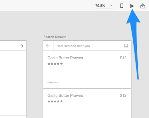
Hit the Desktop Preview icon.
Figure 3-11—Desktop Preview
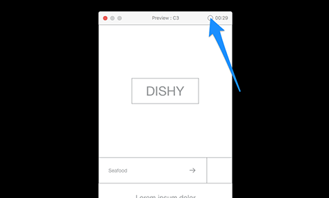
Desktop Preview is an opportunity for you to test the prototype before you hastily send it off to others for feedback. Click the hotspots we defined earlier to navigate the prototype. Is there anything we’ve overlooked? Hint: there is.
Figure 3-12—Ah, there’s a mistake
Firstly, in the Set Location screen, the navigation is drowning under the content. It needs to be on top, so switch back to the Design workspace and reorder the component in the layer list by moving—that is, dragging—it higher up in the hierarchy.
Figure 3-13—Fixed
Creating Scrollable Prototypes
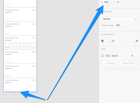
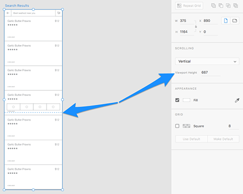
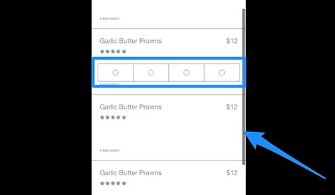
Secondly, we have overflowing content in Search Results. However, we can’t scroll down to view this content when previewing the prototype in Desktop Preview mode. We can fix this by selecting the artboard in the Design workspace and resizing it until it holds all of the content in artboard.
Figure 3-14—Resizing an artboard
Will this undesirably make the screen longer in Desktop Preview mode? No, because the viewport height is still 667px—this is the height in which you view the prototype—as indicated by the dashed blue line in Design mode—versus its total height.
Figure 3-15—Viewport height
Now you can scroll the prototype in Desktop Preview mode.
Creating Sticky Elements
Even though you can scroll prototypes, we cannot yet create sticky elements like fixed headers and footers, hence why the navigation component floats awkwardly in place. (It doesn’t remain on the screen while you scroll.) Adobe have assured me this is a feature they’re working on right now.
Figure 3-16—Scrolling prototypes
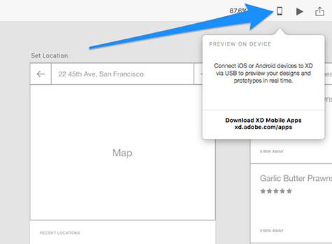
Device Preview
Now that we’ve ironed out the creases, let’s test our prototype on a real device. Desktop Preview is fine for first-round testing, but this is a mobile app that’s intended to be navigated with fingers and thumbs, not mice and touchpads.
Start by downloading the Adobe Experience Design app for iOS from the iTunes store, which is free.
What About Android?
For designs intended for Android, there is an Android-equivalent app available from the Play store.
When you’ve installed the app on your device, hit the Device Preview button to begin. As the instructions say, connect your iOS or Android device to your computer using the USB cable.
Figure 3-17—Connecting to a device
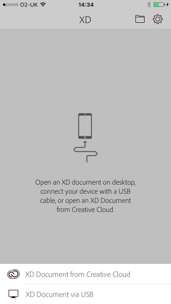
Ensure you have your document open on the desktop when you connect, or, alternatively, load the file from Creative Cloud from within the Adobe XD app. (You’ll need to ensure the file exists in the Creative Cloud folder on your computer.)
Figure 3-18—Loading a file via Creative Cloud
No Internet Access?
If you don’t have Internet access, but you’ve loaded a prototype previously, Adobe XD for iOS or Android will automatically load the last version cached by the app. Either way, you must be connected via the USB cable at all times.
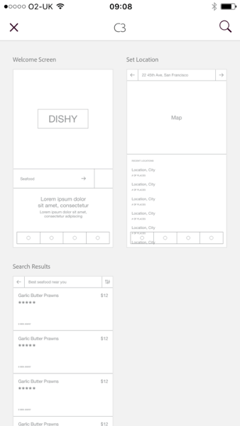
When you’re all set up, simply select a screen to test it.
Figure 3-19—Selecting a screen to test
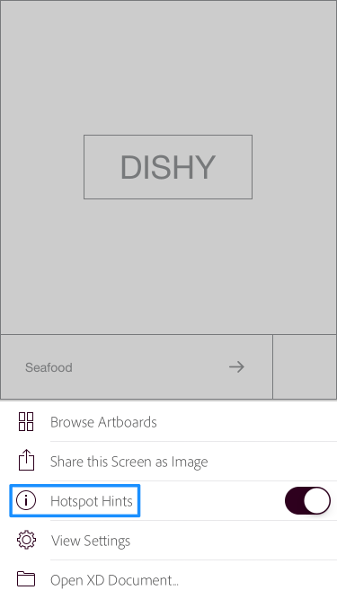
Device Preview is pretty straightforward. However, one feature that’s easy to miss is the ability to disable hotspot hints. You should disable hints when you need to figure out if a call-to-action is obvious enough, and enable them at any other time.
Figure 3-20—Disabling hotspot hints
Recording Your Tests
Another noteworthy feature is the ability to record a screencast where you demonstrate the prototype. This is a useful way to quickly showcase prototypes to teammates or clients. While in Desktop Preview mode, simply hit the record button, although be aware that you can’t record user flows in a maximized window.
Figure 3-21—Recording user flows
When you close the window, select an export location from the file chooser modal to export the recording as a .mov file.
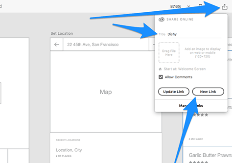
Sharing Prototypes and Gathering Feedback
Now let’s open ourselves up to feedback. Begin by clicking the Share Online button and giving this prototype a name. You can optionally deselect the Allow Comments box to disable comments, but for now let’s allow comments. Click New Link to continue.
Figure 3-22—Sharing prototypes online
Sharing Shortcuts
You can also use the Cmd + Shift + E shortcut, or Ctrl + Shift + E on Windows, to begin sharing online.
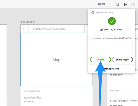
Press the Copy Link button to copy a shareable URL to the clipboard, then hand it out to your teammates.
Figure 3-23—Creating share links
Paste the copied URL into the browser.
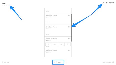
Pretty straightforward stuff. From this shared Web page you can:
See when the prototype was last updated.
Interact with the prototype from a user perspective.
Cycle through screens using the left, right, and home buttons.
Figure 3-24—Viewing shared prototypes
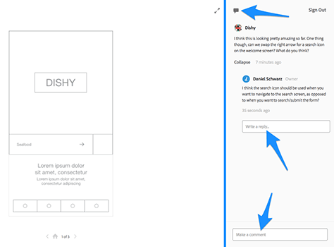
And finally, make comments. This is where the feedback happens.
First, click the comment icon, then use the comment box to start a conversation. So that comments remain contextual, conversations are unique to each artboard—that is, if you switch to another screen, only comments for that screen will show.
Click Reply to respond to a comment.
Figure 3-25—Making comments
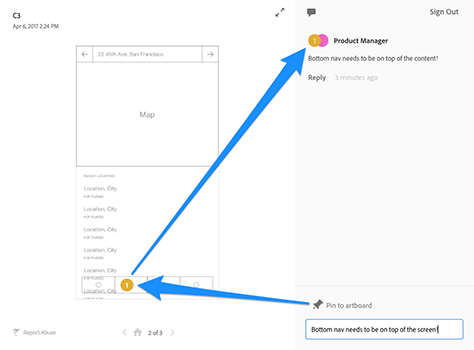
To ensure it’s crystal clear what you’re referring to in your comment, you can drop a numbered pin onto the artboard. Your comment will then be associated with that number. Click the Pin to Artboard button, then click the artboard to drop the pin.
Figure 3-26—Pinning comments to artboard
If you click Share Again, then New Link from the Share Online modal—in the prototype workspace—teammates can view an updated version of your prototype with an empty, refreshed comments section. Comments are unique to the share link on which they were made. Don’t worry, creating new share links won’t erase the existence of the older links—they’ll still work.
Share Links Don’t Update Automatically
Share links do not automatically sync to the current state of your design. If you have changes to show off, you must create a new share link and share it with your teammates.
Next: Getting Visual with the Property Inspector
In the next chapter we’ll start to tackle the visual design of our app by defining colors, fonts and text styles. Well learn about the property inspector’s primary use—it’s ability to style layers—and we’ll learn about each of the styles, how to apply them, and how to customize them. We’ll then wrap up the chapter by applying some of those styles to our design.
As part of Airwalk Studios, a husband and wife content team, Daniel is a digital nomad who travels the world, working remotely as a UX designer, coder, design editor, and writer. He is a four-time author and loves helping designers level up their skills. His most recent book, from SitePoint, is Jump Start Adobe XD. Read More
