UX design for an ecommerce Web site is all about creating a pleasant purchasing journey for customers. Because UX design comprehends everything from aesthetics to the design of interactive features, it involves crafting each element of the ecommerce Web site so it leads to a conversion. In fact, as Figure 1 indicates, a Web site’s aesthetics have great influence on its credibility with users.
UX design uses information in the form of text and visual elements to communicate with users and structures the presentation of this information to convey both direct and subliminal messages. These messages evoke certain emotions and desires in the mind of the visitor, which encourages people to make purchases on the Web site.
In this article, I’ll discuss a few ways in which you can create an immersive user experience to increase the probability of conversions on your ecommerce Web site.
Inspect Your Ecommerce Web Site for UX Design Issues
Before you can improve user experience, you need to understand its current state. The first step in this journey is identifying the Web site’s problem areas. You can conduct an analysis, or audit, of an ecommerce Web site either manually or using tools that conduct the analysis for you. Determining the current status of an organization’s customer-support solutions also plays a vital role in understanding current state of the user experience.
In conducting such an audit, you need to track user behaviors on your Web site. You can understand user behaviors through metrics such as bounce rates, time on page, average page views, and conversion rates. Each of these metrics tells a different story about the user experience of your Web site.
Such an analysis can help you pinpoint the user-experience problems that you need to fix to increase conversions. Once you identify the site’s weaknesses, you can work on creating solutions.
Create a Hypothetical Purchase Journey
Create a hypothetical purchase journey that outlines the user experience for your ecommerce Web site, from the marketing channel to the purchase order. When you create such an outline, be sure to include all the steps that a customer would take to buy a product.
Based on these steps, you can decompose the journey into pages, decide what user-interface elements would be most effective on each page, and design each of the Web site’s pages accordingly. The user experience of each page should encourage visitors to move ahead in their purchase journey.
At the same time, you need to highlight attractive features and information about the products and services that you offer. This information can help you counter any customer objections. For instance, if you are offering international air freight for fast delivery, you need to highlight that on your product details page. This could help attract customers who want a product urgently.
Each step in this journey should bring the customer closer to making a purchase on your ecommerce Web site. You can use the insights from your UX audit to address issues that a customer might face during the journey, fixing the issues and, thus, improving the user experience for the corresponding pages.
Simplify the Navigation
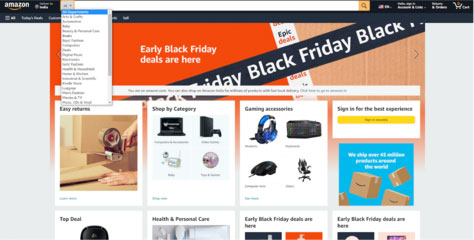
If you were to exhibit all of your products at once, customers would become confused, and it would be difficult for them to find their desired product. A simple navigation system makes it easy for customers to go from one page to another. Your navigation system could comprise different product segments based on their type, popularity, or use, as Figure 2 shows; or menus could help the user find important pages on your ecommerce Web site. You must position navigation elements to give your most attractive products the most visibility.
Figure 2—Product categories on Amazon
Providing a search capability makes navigation easier. Consider adding search suggestions to further reduce the burden on visitors. These search suggestions should drive customers toward their preferred products.
Offer Personalization
While people appreciate having choices, giving them too many choices makes it hard for them to choose, as Hick’s Law teaches us. That is why you should personalize your ecommerce Web site’s user experience.
Personalization can help users complete their purchase journeys faster. You could offer a variety of filters that are based on different aspects of your products. For instance, fashion Web sites usually let users find products based on gender, style, size, color, and brand.
You can also personalize the user experience by creating different landing pages for different marketing campaigns. For instance, if a visitor has come to your Web site through a blog about formal attire, your landing page should feature only products belonging to that category.
Use Minimalistic Visual Design
A minimalistic design helps the user to focus on the most important elements. The idea behind minimalistic visual design is to remove all possible distractions so you can effectively guide a user’s purchase journey.
For every element on a page, ask yourself this simple question: “Would this element help visitors complete their purchase journey?” If the answer is no, that element needs to go. The same is true for elements within elements.
Instead of bombarding visitors with a lot of information, minimalism can help you make important information more attractive. You can use whitespace and positioning to draw attention to your products and their best selling points.
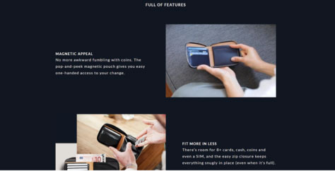
Create Visuals for Product Information
Stuffing product pages with textual information often makes them more confusing rather than being helpful. Use design to reduce customers’ effort by turning text into visuals. For example, you could create smart infographics to educate visitors about a product. Or you could depict various use cases for a product using images, animated GIFs, or videos. Figure 3 provides an example of showing a product’s benefits visually.
Figure 3—Showing a product’s features
Such visuals can make it easier for users to digest the product information and understand the product’s benefits. You could design such a section as an inverted-pyramid sales pitch, with the most enticing aspects of the product at the top. You might provide supporting elements following this visual section, such as customer ratings or reviews.
People are more likely to consume the information you put in visuals, which increases the chances of conversion.
Use Clear Calls to Action
A call-to-action (CTA) button is the bridge that connects one step of a purchase journey to the next. It basically lets the customer know what to do next.
On the home page, a CTA should encourage users to select their desired product. On a product page, a CTA should encourage customers to add that product to their cart. In this way, CTA buttons guide the user toward making a purchase.
Any CTA button should be clearly visible and stand out from the rest of the page. Most importantly, it should look like a button. Use contrasting colors, bold fonts, and clear outlines when creating a CTA button.
Offer Transparent Price Calculations
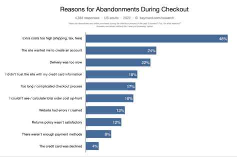
Extra costs and hidden charges are some of the biggest reasons for cart abandonment. Collectively they contribute to 64% of abandoned purchases, as Figure 4 shows. If customers see different prices on the product page and the checkout page, they might feel cheated.
Of course, it would be difficult for ecommerce businesses to provide all the charges up front before they know customer details such as their shipping address, purchase volume, or applicable offers. To resolve this problem, consider offering a cost calculator on the product page, to which which the customer can add all the relevant details to learn the total cost of the product. Be sure to ask only for relevant information that is necessary to calculate the cost. If you ask users to subscribe or provide credit-card details at this point, they might not complete the cost calculation—let alone go through with the purchasing process.
Simplify Checkout and Payment
An overly complex checkout or payment process is another major reason for cart abandonment. In fact, 24% of shoppers abandon a purchase if an ecommerce Web site asks them to create an account. Plus, 17% of shoppers are likely to abandon their cart if the checkout process is too long or complicated.
The user experience for this final step in the purchase journey should be as simple and straightforward as possible. Do not introduce any hindrances between checkout and final payment. Include only options that directly concern the product, payment, or shipping.
The UX design for the checkout page should be simple and clear. You must tell customers exactly what you need them to do to buy the product. This includes giving them clear instructions for providing their delivery address, payment method, and shipping options.
If you want the customer to take any subsequent action, you should defer providing that option to the order-confirmation page.
Conclusion
The suggestions in this article highlight best practices for ecommerce UX design. But each brand could interpret these suggestions differently. The appropriate presentation of the elements of an ecommerce UX design depend on the creator’s intention.
You should create your UX design based on the actions you want users to take. To create a conversion-driven ecommerce Web site, you must create a UX design that establishes trust and engenders a desire for a product in the user. If the design of each page of your Web site creates such an experience, you can increase the probability of conversions through each page your users visit.
Tim has 20 years of experience in sales and marketing and is currently Digital Marketing Manager at PACK & SEND, a more than 25-year-old, respected brand in ecommerce, logistics and freight delivery solutions. His core expertise is in logistics, direct-to-consumer (D2C) commerce, franchising, business planning, and operations management. Read More