“A style guide is an artifact of design process. A design system is a living, funded product with a roadmap [and] backlog, serving an ecosystem.”—Nathan Curtis on Twitter
As Nathan Curtis described on Twitter, a style guide is a document that a UX designer creates to document a growing and ever-evolving set of design guidelines that arise from the design process. In creating a style guide, UX designers are basically documenting their own thought process as they design a Web site, application, or system. Thus, the essence of creating a style guide is documenting your own design decisions. Who is the audience for this document? In this article, I’ll answer many important such questions about style guides to help UX designers create effective documentation.
Champion Advertisement
Continue Reading…
The Process of Creating a Style Guide
On my very first industrial-design project, I was asked to create a style guide for an application. This style guide would be one of the Design team’s key outputs and was to serve as the single source of truth for user-interface design guidance to ensure that the Development team implemented a consistent design for the application we were building.
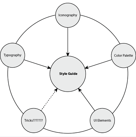
While, in my initial attempt at creating a style guide, I did not follow a strict process, the style guide did include the key components shown in Figure 1.
Figure 1—Components of a style guide
Documenting Your Color Palette and Typography
A Web site or application’s color palette and typography are typically the first things that get frozen, early in the visual-design process. These are key design decisions that almost everybody on a product team will have an opinion about.
Specifying Your Color Palette
Depending on how much detail you want to include in your style guide, the documentation of your color palette might consist of the following mandatory and optional sections:
Mandatory sections:
“Primary Color Palette”
“Text Colors”
Optional sections:
“Secondary Color Palette”
“Tertiary Color Palette”
“Palette of Grays”
Later in this article, I’ll cover how to use these color palettes optimally to ensure a consistent visual design for your Web site or application.
Choosing Your Primary Color Palette
While my general rule of thumb is to limit the primary color palette for a Web site or application to just two colors, depending on the contexts within a site, you can choose as many primary colors as necessary.
Tip—If your Web site or application does require more than two colors in your primary color palette, choose your colors based on color harmony.
However, when I suggest that you choose only two colors for your primary color palette, this does not mean limiting yourself to just a couple of hex codes for colors. You can always use tints and shades of the colors in your primary color palette, as Figure 2 shows.
Figure 2—Expanded color palette with tints and shades of primary color
Apply your primary color palette to key user-interface (UI) elements of your Web site or application, such as the following:
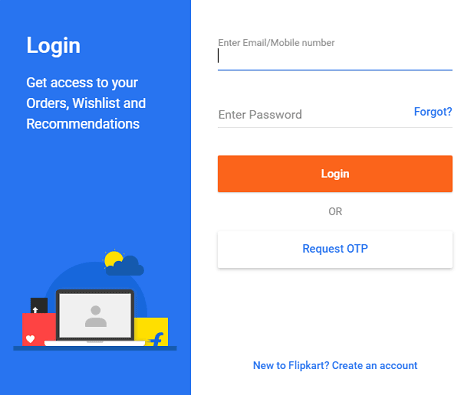
call-to action buttons—On Flipkart.com, call-to-action buttons are in complementary colors from their primary color palette—blue, as shown in Figure 3, and orange, as shown in Figure 4.
links—On Flipkart, links also appear in blue, as shown in Figure 4.
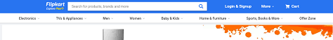
page headers—On Flipkart, page headers are also in the blue from their primary color palette, as shown in Figure 5.
active states of interactive elements—These include interactive elements such as tabs and drop-down menu items. Their active states commonly employ colors from a site’s primary color palette—or tints or shades of those colors, as shown in Figure 5.
Figure 3—Call-to-action button on Flipkart Figure 4—Buttons and links in Flipcart’s primary color palette Figure 5—Flipkart’s page header Figure 6—A tint of a primary color highlights the active tab state Figure 7—A blue tint highlights the active state of the drop-down menu
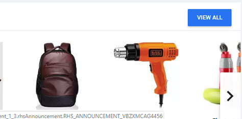
Depending on an application’s scope, you might need to add a secondary or even a tertiary color palette. The children’s learning app Byju employs such a color palette, as shown in Figure 8.
Figure 8—Byju’s user interface
Visual designers often use color coding or gradients to add visual interest or a little playfulness to a user interface. The use of color coding is typically limited to the highest levels of an application’s navigation system.
Defining System Colors
It is also important to define system colors for elements that show state—such as warnings, errors, information, and success.
Defining the Background Color
Define the background color even if it is white. A white or gray background with shadows on elements often creates a layered look for an application. But always be careful in choosing a shade of gray for your background. Too much gray in your application can make your design appear dull or out of date. Plus, a background in the wrong shade of gray can create value-contrast issues, making text hard to read.
Choosing Text Colors
Take care in defining each and every color in your user interface, including text colors. While working on your initial designs, it’s easy to get carried away with colors, especially those for text. But you’ll need distinct colors for the following types of text:
paragraphs of text
system messages such as warnings and errors
links
Limit your color palette for text in your application to no more than three or four colors. This will not only make your design look more consistent but also eliminate a lot of overhead for the Development team in creating a site’s CSS.
Designing Typography
Understanding the right font to choose for a Web site or application is the province of the most skillful visual designers, who understand branding. But typography design is not limited only to knowing what font to use. You also need to ensure that a font is legible, readable, and aesthetically pleasing across different platforms. This requires comprehensive knowledge of all the devices and platforms on which your Web site or application will be used. For legibility, a good rule of thumb is to use a font size of not less than 12 to 14 points.
I could write a whole article just on choosing the right font for your application, but in this article, I’ll limit myself to covering the following key points that you should keep in mind when defining the typography for your application:
Define a minimum font size to ensure optimal legibility.
Either stick to a single font family or, when using more than one font, make sure you have at least a basic understanding of font pairing.
Define font sizes for page titles, various levels of subheadings, and paragraphs. Clearly distinguish these elements using font size, weight, and color.
Employing Atomic Design in Designing UI Elements
Now that I’ve covered documenting your color palette and typography design, let’s consider what the remaining 99% of the style guide comprises: the design of user-interface (UI) elements. It’s important to follow a design methodology when creating a style guide to prevent gaps in its coverage that could negatively impact development, so I’ll begin by discussing Atomic Design.
What is Atomic Design? Its creator, Brad Frost, drew his inspiration for the creation of Web pages and other types of screen design from the basics of chemistry. In Atomic Design, the smallest design elements—such as buttons, drop-down menus, and text fields—are the atoms that combine to form molecules—the larger, more functional UI elements such as search bars and headers. These molecules, in turn, combine to form more complex organisms: templates and entire pages.
While the atoms, or types of UI elements, can vary from application to application, common atoms such as buttons, drop-down menus, text fields, tabs, and progress bars are present in many applications. When documenting atoms, be sure to define the following:
states—The ways in which interactive UI elements respond in different states give your application its unique identity and shape the application’s user experience. Interactive UI element have the following states:
default
active
disabled
mouseover or touch
different sizes—As I’ll discuss in detail later in this article, defining UI elements in just one size might not work well for all screens. So, instead of giving developers the liberty to choose the sizes themselves, define a maximum of three different sizes for atoms such as buttons.
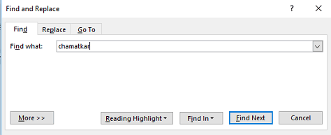
Molecules are where things get really interesting—for example, the Find and Replace dialog box in Microsoft Word shown in Figure 9. Another good example of a molecule is the Google search bar, which comprises a simple combination of a text field and a Search button.
Figure 9—Find and Replace dialog box in Word
Specifying Dimensions
In the section of the style guide that I originally titled “Tricks????”—as shown in Figure 1—I discussed guidelines for specifying dimensions for an application. This includes defining the sizes of UI elements, as well as the spacing between them through padding and margins.
While there are no hard-and-fast rules for specifying the dimensions of UI elements, it is always good practice to define them. Many common platforms do provide some guidelines that developers can use when specifying padding for UI elements in your application or Web site. For example, Universal Windows Platform (UWP) app design suggests specifying the size, margins, and padding of UI elements in multiples of 4 epx, or effective pixels.
Whether you’re working on a project alone or with a team of UX designers, it is imperative that you specify guidelines relating to spacing and layout for your Web site or application. In the latter case, a design lead should specify such guidelines to ensure that the designs of every designer will have a consistent look. One way of doing this is to create high-fidelity visual designs for every screen of your application and specify all dimensions. However, in some cases, your project timeline and costs won’t allow such extensive visual-design activities. Plus, the scope of your design might be so broad that it would be impossible to define the spacing for every individual UI element in your application.
Visual Ergonomics
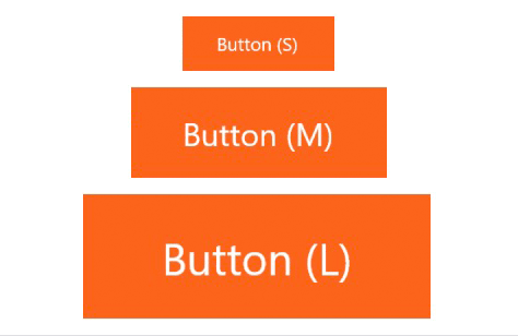
A visual designer should have at least a basic understanding of the principles of usability and visual ergonomics. Apply visual-ergonomics principles rigorously when creating high-fidelity visual designs for different devices. For example, always define UI elements in multiple sizes. In the case of buttons, specify three different sizes for them—small, medium and large, as shown in Figure 10.
Figure 10—Buttons in three sizes
You might use each of these sizes for specific screens or workflows. For example, on a product page on an ecommerce site, the Buy Now button should be a larger size than the Reviews button.
When you’re designing a user interface for touch interactions, you should always define a minimum height and width for buttons and other touch targets, keeping in mind the principles of usability and accessibility.
Conclusion
As I mentioned earlier, a style guide is a key deliverable for the Design team. The audience for a style guide includes both the Development team, who utilize the document when implementing an application’s user interface, and other UX designers—especially those who join a project at later stage. A style guide is also useful in educating other stakeholders about UI design. When preparing a style-guide document, it is important to design it from the perspective of its users.
“Focusing on style guide delivery as the climax is the wrong story to tell. A system isn’t a project with an end, it’s the origin story of a living and evolving product that’ll serve other products.”—Nathan Curtis
Remember, a style guide is not a one-time document that you can deliver and be done with. It is a continuously evolving document that changes as your design solution evolves throughout an iterative design process. Plus, a style guide is often applicable to the design of more than a single product, so it’s evolution may continue beyond the delivery of the product for which it was originally created.
Senior User Experience Designer at HCL Technologies Ltd.
Noida, Uttar Pradesh, India
In addition to his work as a UX designer at HCL Technologies, Vineet is a design enthusiast who believes in creating beautiful, meaningful experiences and loves to talk about automobile design, product design, and furniture design. Vineet completed his Masters in Design at the Indian Institute of Technology, in Delhi. Read More


