The inaugural O’Reilly Design Conference took place at Fort Mason in San Francisco, January 20–22, 2016. O’Reilly Media formed its conference division in 1997 and currently hosts nine different conferences for software-development professionals, in various locations around the world. O’Reilly has extensive experience organizing professional conferences and a stable of 55 authors who have written O’Reilly books on user-experience topics, so this was bound to be a very good conference.
In this review, I’ll provide an overview of the conference, including its
organization
content and presenters
proceedings
venue
hospitality
community
Champion Advertisement
Continue Reading…
Organization
Organization
Content
Presenters
Proceedings
Venue
Hospitality
Community
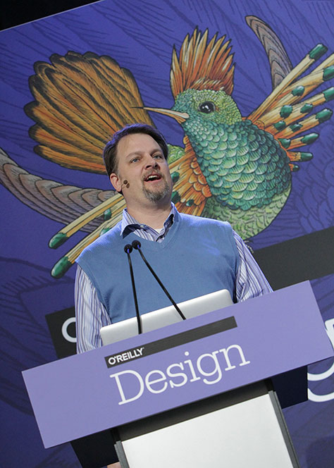
The O’Reilly Design Conference 2016 was an exceptionally well-organized conference. The Program Chairs for the conference were Mary Treseler, Director of Strategic Content, Design, at O’Reilly Media; and Rochelle King, Global VP of Design and UX, at Spotify. They led a Program Committee comprising 20 UX professionals in planning the conference. The first day, on Wednesday, January 20, consisted of half-day workshops. The conference proper took place on January 21 and 22 and had a sort of a hybrid single-track and multitrack format.
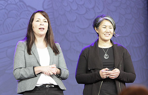
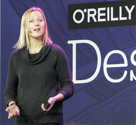
Each morning, Mary Treseler and Rochelle King welcomed the audience to the plenary sessions in the Festival Pavilion, as shown in Figure 1. Since I prefer single-track conferences, I appreciated having two full mornings of keynotes. Each hour of Thursday and Friday afternoon consisted of five or six tracks of conference sessions, one track in the Festival Pavilion; the rest scattered across Fort Mason.
Figure 1—Mary Treseler and Rochelle King
Content & Presenters
The conference comprised one day of workshops and two days packed with keynotes and sessions. The speaker roster included 88 speakers—many leading lights in the UX community.
Each of the conference workshops, keynotes, and sessions belonged to one of these three themes:
new fundamentals—This theme’s sessions provided a solid foundation to help designers take their skills to the next level. Many of these were too basic for someone with a lot of experience like me—the exceptions being some of the sessions that focused on relatively new design domains such as IoT and wearables.
design and business—This theme comprehended sessions on topics such as selling a design, designing for conversion and performance, leadership, branding, metrics, and analytics—key learnings for designers who want to drive business success. My favorite sessions tended to belong to the design and business theme.
design for a greater good—This sessions belonging to this theme demonstrated how design can have a positive social impact—in areas as diverse as education, government, healthcare, and sustainability—for the good of the global community. Some of these weren’t relevant to people working in product or service design.
Workshops
The first day of the conference, on Wednesday, January 20, comprised six half-day workshops. In the following list, the links go to those workshop presentations that the presenters made available.
The three workshops that were of greatest interest to me were all on Wednesday morning. (Pamela Pavliscak, Dan Brown, and Greg Nudelman are UXmatters authors.) I’d attended Pamela’s workshop at UX STRAT 2014. Though I’m sure her workshop has evolved since then, you can read my review on UXmatters. Greg is local to the Bay Area, so I’ve had plenty of opportunities to hear him speak. I chose to attend Dan Brown’s workshop because it had been quite a while since I’d heard him give a talk, he’s an excellent speaker, and his topic sounded interesting.
Crafting the Discovery Phase: First Steps in Effective UX Projects
Presenter: Dan Brown
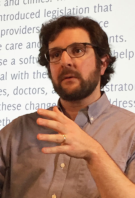
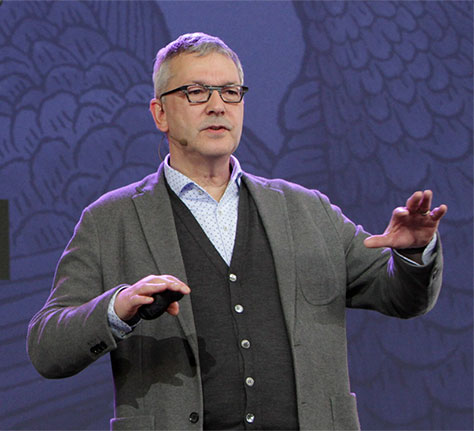
Dan Brown, shown in Figure 2, defined the discovery phase as “a set of activities that yield shared knowledge to structure and inform design decisions about a particular product.” Each of those activities has outputs. In the workshop’s first exercise, we captured discovery activities and outputs on Post-it notes, then grouped them into categories, to which we assigned labels.
Figure 2—Dan Brown
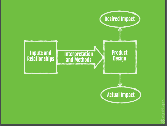
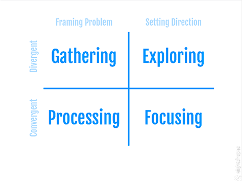
The focus of discovery is on framing the problem you’re going to solve and setting your design direction, as diagrammed in Figure 3. You define the inputs and relationships to set the design direction for a product that will have the desired impact.
Figure 3—Framing Problem + Setting Direction
When framing the problem it is important to consider the following:
business:
added value
cost savings
success metrics
brand
operations
budget and resources
technology:
infrastructure
architecture
policies
expertise
users:
needs
goals
priorities
impact
In the next exercise, we grouped our stickies into two categories: Framing the Problem and Setting Direction. To frame the problem, define the following:
Problem statements—These capture “the aspect of the world we’re trying to change or improve.”
Project objectives—These defines “the project’s desired outcome.”
Contextual statements—These “describe the ecosystem in which the product will live.”
To set the design direction and envision a solution, define the following:
Principles and implications—These include “what the product should do, what makes it unique, [and] what makes it better.” Your findings have certain implications.
Concepts—What’s the big idea?” These derive from the implications.
Models—These define “how the product looks and behaves.”
Detailed design—This derives from the principles and implications.
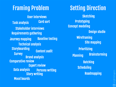
Dan outlined various methods for framing the problem and setting design direction, shown in Figure 4, then mapped them onto the matrix shown in Figure 5. He concluded by mapping out a project plan.
Figure 4—Methods for Framing Problem and Setting Direction Figure 5—Matrix for Framing Problem and Setting Direction
This was a good workshop, though quite basic for the more advanced part of the audience Dan was targeting, when he said it was “geared toward all designers, but particularly design leads and product managers in charge of running projects.” The workshop took place in Fort Mason’s beautiful Chapel. While the room’s high ceiling ensured everyone had a good view of Dan’s slides, its rows of pews did not provide an environment that was conducive to groups’ gathering round to work through workshop exercises together, so it was a good thing that this workshop consisted predominantly of lecture.
While Dan didn’t make his presentation slides available on the O’Reilly site, he conducted a similar workshop on the same topic at IA Summit 2016, for which he did post his slides.
Plenary Sessions: Highlights
The morning keynotes, or plenary sessions that took place in the Festival Pavilion were my favorite part of each day at the conference. A few of these 14 keynote addresses were excellent; most of the rest were very good. The links in the following list go to session descriptions on the O’Reilly Web site, where you’ll find links to the presentations and/or brief video clips for most of these talks.
“Redesign Government,” A conversation between Mike Bracken, Chief Digital Officer of Co-operative Group, and Tim O’Reilly, Founder and CEO of O’Reilly Media
Next, I’ll share a few highlights from my favorite plenary sessions.
Design for the Enterprise: Collaborative Creativity
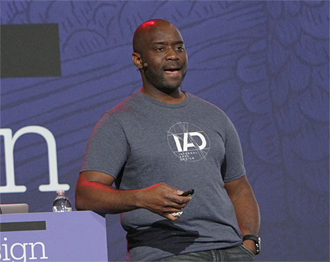
On Day 1 of the conference, Eric Quint, shown in Figure 6, kicked off the plenary sessions. He joined 3M as Chief Design Officer more than three years ago. The company’s CEO had provided “a clear vision: using innovation to improve people’s lives.”
Figure 6—Eric Quint
Photo by O’Reilly
Here are some highlights from Eric’s talk:
“Collaborative creativity is about working across disciplines, building on each others’ ideas, exploring new opportunities, and creating value for people by valuing people.”
“Empathy [is necessary] in the context of collaboration. Designers [should] use their empathy to align with other functions.”
“The role of the Chief Design Officer is the orchestrator—to tie everything together.”
“Be a corporate rebel. If I’m fitting into the system, they should probably fire me.”
“Add design and creativity. This is about transforming the company; changing the way the company works. Observation driven by curiosity. Creating scenarios about what could be.”
“A lot of designers spend a lot of time justifying why they’re there.”
“There are three value propositions for design:
“Design for innovation—as the CEO drives for innovation and growth—[through] front-end collaboration.
“Differentiation [through] customer experience and brand experience
“Optimization of cost savings and productivity.”
“Go from insight-driven design to foresight—about 10 years out.”
“Build a culture where great design in expected.”
“Driving successful transformation, [you must] accept that it’s a marathon, not a sprint. Transformation is a three-year program.”
“Ambassadors are people who are able to roll up their sleeves and drive design.”
“Show, don’t tell the value of design, and measure the progress.”
Elegant Tools: Why B2B and Enterprise Design Is the Next Frontier of Design Impact
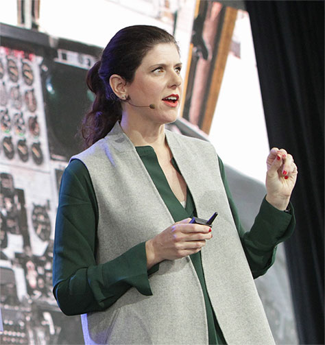
VP of Product Design at Facebook, Margaret Gould Stewart, who is shown in Figure 7, spoke about how people rely heavily on tools to get their work done. “Now, we’re designing tools that are made of software.”
Figure 7—Margaret Stewart
Photo by O’Reilly
She quoted Mary Meeker, who said, “The impact of the Internet has been extraordinary and broad, but, in many ways, it’s just beginning.” Margaret told us, “There are so many industries that are ripe for positive disruption and have the potential to positively change the way that we work and live. … Creating elegant tools for businesses can create a lot of societal value.”
Margaret shared the following four “Facebook Business Design Principles:
Help people learn and grow. Teach people to make the best choices, increasing their confidence and success.
Balance efficiency and effectiveness. Improve how people work so they achieve their objectives with the least amount of effort.
Bring clarity to complexity. Create intuitive ways for people to tackle complicated topics and workflows.
Be accurate and predictable. Provide reliable controls and relevant feedback that build trust in our products.”
She concluded by saying, “Design the future you want to see.”
Design Is a Process, Not an Event
Robert Brunner, shown in Figure 8, is the Founder of the industrial design studio Ammunition. He talked about helping companies to be design driven. “This is kind of a topic du jour in the business community—design, design strategy, design thinking. But I don’t believe there’s enough time spent on really thinking about: How do you become design driven? How do you build this out? How do you make it sustainable…?” asked Robert.
Figure 8—Robert Brunner
Photo by O’Reilly
Robert told us, “Great design—and I’m speaking as a product designer—is an inspired interpretation embodied in a compelling experience. … Something that’s amazing—that has cultural relevance. That people emotionally connect with. … What does it take to consistently do great design? … Is it process? Yes. Talent, of course. Money. Time. Vision. Inspiration. All of these things are very important. To do really great things, it has to be embedded in the culture of an organization—if that is your goal, and there is alignment around that. … We put a lot of emphasis on the front end. Everything it takes to conceive and define something, which, of course, is crucial. But making something great really is a 90% perspiration activity.”
“Even today, … most organizations [think of design as] something in a box. It’s an event. Requirements go in and stuff comes out. … That is a really outdated model of design that truly design-driven companies don’t follow. ”
In design-driven companies, “design is ultimately everyone’s responsibility. They have a compelling vision of an experience they want to create. … Clear, high design expectations across all organizations. A shared understanding of what needs to be done. Priority and commitment.”
Robert concluded with a quotation from Aristotle, “We are what we repeatedly do. Excellence, therefore, is not an act, but a habit.”
Balancing Chaos and Order When Designing for Offline and Online
Head of Experience Design at Airbnb, Katie Dill, shown in Figure 9, began her talk by saying, “The best user experience companies tell a coherent story across every customer-facing touchpoint.” For Airbnb, the user journey progresses from awareness to purchase, use, assistance, and share. They map out this journey using storyboards. “But we don’t always own all of these moments with our customer. In some cases, it’s your community that owns that moment, … that’s actually delivering the service and providing that experience for the end customer.” For “community-based services,” there’s a great deal of diversity in the experience. “But without control over the diversity, … you may lose much of the alignment in the experience.”
Figure 9—Katie Dill
Photo by O’Reilly
When there is so much diversity, “how do you bring order to the chaos?” Katie provided these “tips:
Back up. Zoom out. Know the story.
Anticipate the hiccups. Happiness = Reality - Expectations.
Get out of the way. The community is the hero.
Keep it real.
Open up. Your community is key.
Show them what good is.
Inspire greatness.
Recognize success.
Learn from them.
“So it’s possible to bring some control to that chaos,“ concluded Katie.
Breaking the Habit: The Art of Noticing the World Around Us and Making It Better
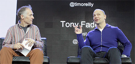
At the end of the morning on Day 1 of the conference, Tim O’Reilly moderated a conversation with Tony Fadell, Founder and CEO of Nest Labs, as shown in Figure 10. Tony told a lot of stories about the history of Apple products.
Figure 10—Tim O’Reilly and Tony Fadell
Photo by O’Reilly
Here are a few highlights that went beyond just stories:
“Know where you’re going, but add things over time, then the community goes with you.”
“Adapt and move on. You have to tune into that [user] frustration. They’re not in the moment of real-life frustration. That’s what design is all about—understanding the frustration and bringing clarity. If you can’t simplify, you need to be clear. Sometimes you have to add some steps to be clear and empowering. Try to clean up the design.”
“How can we make it easy for users to install? We’re not going to design it for installers. Design it for users. Install it yourself. 95% of users installed Nest themselves.”
“Design is not just the product. It’s the service, marketing the touchpoints.”
“We have a whole generation of consumers who have an affinity for great design—for great apps. Young kids understand aesthetics. … Employees are demanding [apps] to be great. The smartphone revolution in companies happened because people brought them in. The consumerization of enterprise. Reinvent the whole thing; the process, not just the interface.”
Getting to Good
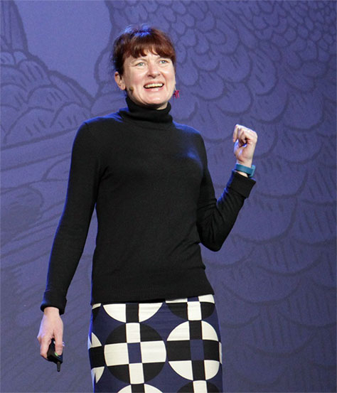
Cofounder and Director of Strategy of Mule Design Studio, Erika Hall, who is shown in Figure 11, asked, “What is good? What is good design? … It’s actually an incredibly important question because … it’s up to us what were optimizing for. … The problem with value judgments and assertions is that they’re subjective. … That gap between what currently exists, what is, and what ought to be, that’s where design happens. … Design requires both considering the world as it is and having a strong point of view on how it ought to be, and then making that plan to get there. … To get to the unknowable future, we start with what we know. We consider how we want to change the world, and we think about the various solutions.”
Figure 11—Erika Hall
Photo by O’Reilly
“The craft [of design] is not sufficient without that conceptual framework,” said Erika. “When we talk about design, so often, what we’re talking about is not the why, but the how, the craft."
“Good design is what best meets the goal."
“What creates (enduring) value? When we look at design that’s changed the world, designs that have added to the world and empowered millions of people … we have to think: What are the characteristics of those designs? What made those designs successful? Most of the time, it’s not the surface, not what we … consider the craft, but the rules and the abstract relationships that underlie the design.”
“We have to move design and designers from a how culture to a why culture,” exhorted Erika. “Our world depends on it. … We can never stop asking, Why?, and that is the most exciting part of design.”
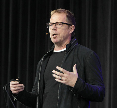
The Best Job in the World
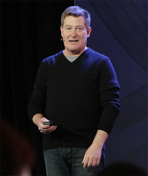
The keynote delivered by Bob Baxley, shown in Figure 12, was the most highly rated of the plenary sessions. He began surveying the audience about their recent problems with software. A lot of hands went up in answer to his questions. “Wow! That’s just depressing,” said Bob. “So the truth is, people really want technology, and we want all this stuff to be working, but there is a rage against the machine.” Or as Alex Pang said, “Rage against badly imagined machines.”
Figure 12—Bob Baxley
Photo by O’Reilly
Here are some highlights from Bob’s talk:
“Too much technology still doesn’t work for the benefit of typical users. This is a failure of Design—not of designers working on the products, but of Design as a function.”
“Design talent is the fundamental constraint on the tech industry’s pace of innovation and quality of output.”
“We run the risk of missing this extraordinary opportunity to help create a more usable, useful, and beautiful world.”
“How many more designers do we need? Let’s look at the labor market for engineering because that’s well tracked….” There are three categories: software developers (1,114,000), programmers (328,600), and Web developers (148,500), totaling 1,591,100 writing code professionally. To achieve and 10:1 ratio of developers to designers, we would need 159,100 designers in the United States today. That’s the bare minimum for organizations that are successful at design. To keep pace with the growth rate for software engineering, we’ll need 20,000 new designers in the US in the next 10 years; 357,500 worldwide. “Where are they all going to come from? I think they’re going to come from the new generation that’s being born right now—that started in 1996. … Generation Z. Millennials are Generation Y.” There are five living generations: the Silent Generation, Baby Boomers, Gen X, Millennials, and Gen Z. “Gen Z is mature, self-directed, and resourceful.”
40% of Gen Z say they “will invent something that changes the world. … They are collaborative team players. … Design is a hypercollaborative endeavor. … [Gen Z] know how to learn online. … They are multi-device natives.” Most have five screens. They create and make rather than share, “communicate with images more than text,” are “future focused,” and are “realists ready to work for success.”
Abilities of a designer—“five critical communication skills:
Math—The ability to understand and precisely describe objective reality.
Art—The ability to process, synthesize, and articulate subjective experience.
Reading and writing—The ability to transfer and receive thoughts and ideas at scale and across time.
Engineering—The ability to plan, build, and perfect systems and machines.
Design—The ability to envision and communicate a range of options; selecting the best one for specific requirements and constraints.
“How are we going to get all of these kids motivated to join our profession? … We’ve got to start talking to people outside design and tech. … Talk about design in the popular press. … Were going to have to start apprentice programs for non-college grads. … Design is fundamentally an apprenticeship skill. … Talk to teenagers at your local high school.
The Importance of Story
Christian Roman, shown in Figure 13, is a Story Artist at Pixar Animation Studios. He told us, “When we look at the world, we see stories. From people and objects to landscapes, everything makes sense to us because we innately know there’s a story behind them.” He spoke about the ways in which “a story can influence and compel an audience.”
Figure 13—Christian Roman
Photo by O’Reilly
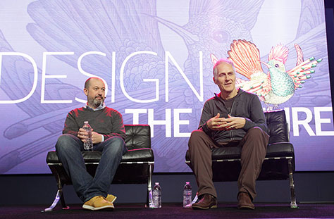
Redesign Government
This conversation between Mike Bracken, Chief Digital Officer of Co-operative Group, and Tim O’Reilly, shown in Figure 14, was one of my favorite sessions. It was a great discussion about putting people at the center of government services, featuring a case study about the very successful enterprise software–design effort at GOV.UK and offering a lot of practical advice about doing design within large enterprises.
Figure 14—Mike Bracken and Tim O’Reilly
Photo by O’Reilly
Giving us some context, Mike said, “We started Government Digital Services and put it right in the middle of government. … We gave it domain power….” Tim interjected, “What he means by that is the ability to turn off and turn on a government Web site. He shut down services that didn’t work.” “We closed down about 2,000 of those. … We thought very early on that design was the organizing principle of our organization. If we were going to be known for one thing, it was going to be design. Because not only did we have to design public services, which is a huge challenge and the rallying call to everybody, we had to design the organization that had never existed before to do that task. And it had to be designed in a way that was inherently scalable.”
After showing a video depicting some common user interactions with GOV.UK, they continued their conversation. Mike said, “Large organizations, governments particularly, follow their own dominant logic, so … create things that look like our own structures. … Users have really only one need of government, which is, at the point of need, to recognize it’s the government, not 338 agency brand names or 28 departmental names. … It’s quite arrogant to presume that you as a user have to understand how government is structured in order to deal with government. So the first user need was: start to redesign services with the assumption that the user would tell you what they want and you’d give it to them.”
Mike presented the following “design principles:
Start with user needs, not government needs.
Do less.
Design with data.
Do the hard work to make it simple.
Iterate. Then iterate again.
This is for everyone.
Understand context.
Build digital services, not Web sites.
Be consistent, not uniform.
Make things open. It makes things better.”
“We started looking with an open eye at what people were actually doing in government, and we found that we had roughly 30 to 40% of our content … that no one was looking at, ever, so we got rid of that. … Everything was driven by user research. … By designing simple answers to often-asked questions, we were meeting the needs of millions of people, first time.”
“We created the profession called content design, which is a combination of a bit of pure design and writing … for the Web … to rewrite [policy] in ways that people understood. … We then started to look at transactions. If you applied the same models of simplicity and design based on user needs to transactions, you find that you can … make those very simple as well.”
“We saved 4.1 billion out of the UK public purse, which is substantial for an organization [that took] three years to get to an annual budget of 50 million.”
“Multidisciplinary teams were important. … We had to surround teams with designers, developers, user research, content designers, people who were good with data, analysts, going with teams of ten, twelve, fifteen, and working that way. The pre-eminent model within that team was to design a new service, but the team wasn’t all designers. We had to teach our designers to code. … I don’t see how you can be a designer of services if you can’t code. If you don’t know JavaScript. If you don’t have some idea of that. … The most blurred line is between design and front-end dev.”
Unfortunately, Evernote dumped my extensive notes from this session—along with my notes for the entire second day of the conference—but I was able to resurrect many of them by viewing the session videos. We had published an article about the GOV.UK redesign on UXmatters a few weeks before the conference, so you can get more information from “How Focusing on User Experience Helped GOV.UK Win Design of the Year.”
Conference Sessions: Highlights
While I attended a few great sessions, I missed several sessions that I would have liked to attend, either because they were full or because of the distance between the venues. The key deficiency in the content was an overreliance on panel discussions—there were nine of them—which have a universal tendency toward invoking boredom.
How to Discuss Design Without Losing Your Mind
Adam Connor, VP of Organizational Design at Mad*Pow, shown in Figure 15, began this session by saying, “Conversations can hurt,” and showing numerous examples of negative feedback in the form of reactions and directions.
Figure 15—Adam Connor
Photo by O’Reilly
Adam’s talk was about critique, which has two facets: “giving and receiving. At their foundation is intent. Giving critique with the wrong intent is self-focused. Giving critique with the right intent is objective focused. When giving critique, use a filter. Gather initial thoughts and reactions. Revisit them in the right context. When giving critique, don’t assume. Find out the reason behind thinking, constraints, or other variables. When giving critique, don’t invite yourself. Get in touch and ask to chat about the design. When giving critique, lead with questions. Show an interest in their process and learn more about their objectives. When giving critique, talk about strengths. Critique isn’t just about the things that aren’t working.
“Receiving critique with the right intent takes humility and restraint. When receiving critique, remember the purpose. Critique is about understanding and improvement, not judgment. When receiving critique, think before responding. Do you understand what the critics are saying? When receiving critique, participate. Analyze your proposed solution alongside everyone else. When receiving critique, set the foundation. Use prior agreements and objectives to get everyone on the same page.”
“Critique occurs in three contexts: “standalone critiques, design reviews, and collaborative activities. … Critique is a skill. You need to practice. Choose who you critique with carefully. Rules of critique:
Avoid problem solving.
Everyone is equal.
Everyone is a critic.
The designer is responsible for next steps.
Adam next talked about setting the right foundation for critiques:
“personas—User archetypes that describe their average behaviors, goals, expectations, knowledge.
goals—Desired, measurable outcomes of the user interacting with the product or service. Can be user oriented, business oriented, or both.
principles—Statements, often worded as rules, that capture the desired qualities or characteristics of the final solution.
scenarios—Short narratives that describe the desired behaviors, thoughts, emotions, of the user as they move through a use case.”
“Standalone critiques go through cycles of observation and evaluation, synthesizing observations, and creating or refining. Critique is about iteration and improvement. So long as you’re looking to improve on whatever it is you’re doing, you’ve got an opportunity for critique.”
“Design reviews also have their challenges. Take control. Pretend you’re dealing with difficult people. Recap objectives. Don’t rely on them for critique.”
“Critique is at the core of collaboration” and leads to convergent thinking.
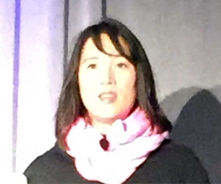
From Design Thinking to Design Driven
Suzanne Pellican, shown in Figure 16, is Vice President of Experience Design at Intuit, a “customer-focused, design-driven technology company [that exists] to improve customers’ financial lives so profoundly, they can’t imagine going back to the old way.”
Figure 16—Suzanne Pellican
Intuit has two core capabilities:
Finding “an important problem that we and those we enable can solve well, with durable advantage”
Design for Delight (D4D)
From 2007 through 2013, Intuit focused intensively on “creating a culture of innovation.” Their goal was to evoke “positive emotion by going beyond customer expectations in ease and benefit throughout their customer journey, so people buy more and tell others about their experience.”
Design for Delight comprises the following elements:
“Deep customer empathy—Know your customers better then they know themselves.
“Go broad to go narrow—To get to one good idea, you must create lots of ideas. Choose what’s most delightful, not what’s easiest or cheapest.
“Rapid experiments with customers—Watch what they do more than listen to what they say.”
Since 2013 and through today, Intuit’s focus has shifted to “executing on innovation.” To do that they had to:
“Focus the business.
“[Have] design at the table.
“[Ensure] design leads brand.
“[Build] full-stack systems.”
They had to “galvanize the entire organization around a bold vision.” With “leadership commitment, design became the new norm.” “Vision and strategy [derived] from a durable set of insights [from research].” Intuit is committed “to design excellence.” Today, user experience is at the center of their business. Suzanne concluded by saying, “With the privilege and recognition of design, comes the responsibility.”
The Art of Storytelling
In his talk, Christian Roman, shown in Figure 13, described “the Pixar culture of story:
Yes, and…
Fail early, fail often.
Trust the process.
Start with the familiar.
Kill your babies.
2+2
There are no rules.
Everyone is encouraged to give notes.
Everyone is working toward making the story great.”
“Questions to ask your story:
What is this story trying to say? What’s the point of the story?
What does the main character want?
What does the main character actually need?
What are the stakes? What will happen if the character doesn’t get what they want or need?
What is slowing the story down from delivering its message? What is unnecessary?
What is the inciting incident that changes the main character’s world?”
Great Products Begin with Great Cultures
Steve Johnson, shown in Figure 17, who is VP, User Experience, at LinkedIn, showed us a photo of his “favorite designer of all time,” Gene Roddenberry, the creator of Star Trek. He told us, “Gene Roddenberry is the designer of the Motorola flip phone. He’s the designer for the iPad. Gene’s the designer for Google Glass. He’s the designer for the taser. He’s the designer for the very first Bluetooth ear piece. … He invented Oculus…. He is also the designer of Skype. … All of these things that were invited back in the 1960s, are all things that, even to this day, we try to emulate.”
Figure 17—Steve Johnson
Photo by O’Reilly
Here are some highlights from his talk:
“Great cultures are created and scaled, by consistent, enthusiastic, and reliable people.”
“Hiring a team diverse in perspective and background leads to a great culture.”
“Incentivize collaboration.”
“Build super strong bridges.”
“Turn failure into fuel for success.”
“Great cultural leaders are effective because they are highly engaged and genuinely approachable.”
“Great cultural leaders are humble. It“s important for cultural leaders to change with the times. Great leaders can adapt effortlessly. They’re inclusive. They“re non-hierarchical.”
“Amazing peo9ple create amazing cultures, which build amazing products.”
“Unique personalities = unique ideas. The perspective they bring is different.”
“Trend setters define the era.”
“Adaptation = flexibility and speed.”
“Great cultures are reflections of shared company values.”
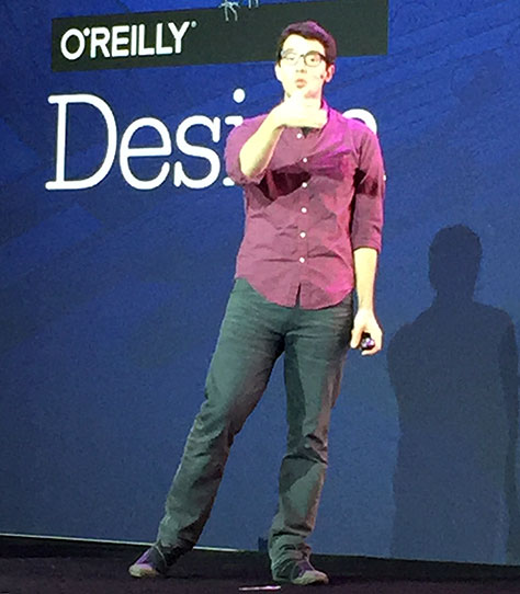
From GV: Design Sprints for Startups
Braden Kowitz, a product designer and prototyper at Google Ventures, shown in Figure 18, told us about their five-day Design Sprints, during which a team maps on Monday, sketches on Tuesday, decides on Wednesday, prototypes on Thursday, and tests on Friday. Sadly, Evernote destroyed my notes for this session.
Figure 18—Braden Kowitz
Proceedings
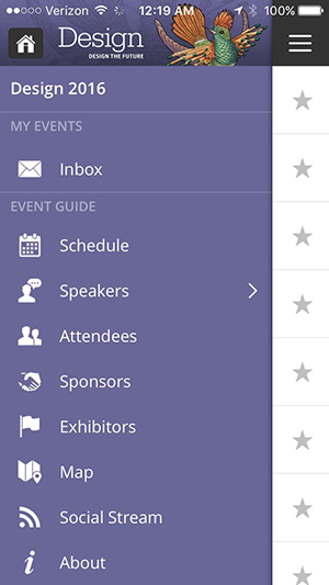
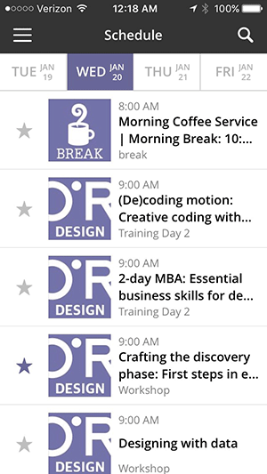
I loved the excellent Web app that O’Reilly provided to Design Conference attendees. As shown in Figures 19 and 20, it provided a convenient way of viewing the schedule, reading about sessions and speakers, connecting with and sending messages to other attendees, and finding my way around Fort Mason. And I didn’t have to carry anything extra around with me!
Figure 19—O’Reilly Events mobile app Figure 20—Conference schedule in mobile app
O’Reilly also provided an excellent, highly informative Web site. So far, the O’Reilly Design Conference team has done a great job of preserving the historical information about the 2016 conference on their site. However, they haven’t made most that information navigable from their current conference site. Nevertheless, if you scroll down toward the bottom of the current home page on the O’Reilly Design Conference site, you’ll find a link to a compilation video, comprising of much of the content from the 2016 conference. To view it, you must have a Safari membership, but there’s a free trial that requires no credit card. There are also links to a collection of video clips from the keynote addresses that you can view without any membership and a collection of photos.
If you go to the actual O’Reilly Design Conference 2016 site, you’ll also find the conference schedule, with links to complete information about individual sessions—including presentations and video clips—plus, information about speakers, events, and more. There are now some broken links to files not found.
Venue
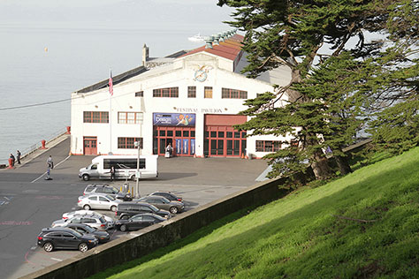
The biggest deficiency of this conference was its venue at the Fort Mason Center for Arts & Culture. This would be a fine venue for a single-track conference with a few workshops, which could be contained within the buildings in Lower Fort Mason. However, the organizers had planned more tracks than could be accommodated in those buildings, necessitating time-consuming treks up and down the steep hill to Upper Fort Mason. Figure 21 shows the Festival Pavilion, where the plenary sessions took place and the lower part of the hill that is the site of the Upper Fort Mason venues. There were shuttle buses that carried attendees back and forth between Lower and Upper Fort Mason, but most of the time when I needed one, there wasn’t one available. This arrangement created quite a bit of inertia in terms of the motivation necessary to move from Lower and Upper Fort Mason and was the cause of my missing several sessions I would have liked to attend. For popular sessions in too-small halls, being late wasn’t an option. In fact, I sometimes couldn’t get into sessions even when I was on time.
Figure 21—Festival Pavilion at Fort Mason
Photo by O’Reilly
The workshops, conference sessions, and events took place in the following venues at Fort Mason:
Lower Fort Mason:
Festival Pavilion—O’Reilly did a great job of making this converted warehouse space comfortable by creating a beautiful lobby, shown in Figure 22; an open area with booths for exhibitors, areas where refreshments were served, and a few very small seating areas and play spaces for attendees. Massive draperies separated this open area from the lecture hall at the far end of the pier. In the lecture hall, there was some seating at tables near the front, which was great; the rest, in rows of folding chairs. The stage was high enough to give everyone a good view and had a gorgeous backdrop, as you can see in some of the photos of the plenary addresses and other conference sessions that were held there.
Herbst Pavilion—This hall is in another converted warehouse space on a pier and was used only as a dining hall at lunch. While being right on the waterfront was pleasant, the cold, bright glare of this concrete space was unwelcoming.
Southside Theater—This old theater was a comfortable venue for conference sessions and the Ignite Design event, which took place there, but was not a good space in which to conduct workshops.
Fire House—This small room was too small to accommodate the people who wanted to attend the sessions that took place in it. Workshops were also held in this space.
Upper Fort Mason:
The Chapel—Both workshops and conference sessions were held in this lovely, old chapel.
General’s Residence Ballroom—This beautiful, old residence was the site of two conference tracks—one in the Ballroom.
General’s Residence Dining—The other track of conference sessions that took place in the residence were in the dining room.
Figure 22—Inside the Festival Pavilion
Fort Mason was a fair distance from the conference hotel, the Sheraton Fisherman’s Wharf, so getting there and back required Uber, Lyft, or a cab.
Events & Hospitality
O’Reilly hosted a variety of events during the conference, as follows:
Wednesday, January 20:
Architecture Walk—Guided by Dan Klyn. More on this a bit later.
Ignite Design—The speakers gave brief, five-minute talks, which were limited to 20 slides that rotated automatically after 15 seconds. After a long day with nothing to eat, I opted to go to dinner at Seed + Salt, a great vegan restaurant, instead of attending this evening event.
Thursday, January 21:
O’Reilly author book signings—At breaks throughout the day, attendees lined up to meet O’Reilly authors—the first 25 getting a free, signed copy of a book. I never managed to get one.
Birds of a Feather sessions—Attendees with shared interests gathered at lunchtime. With the mob scene around the food trucks, I missed noticing these were happening this day.
Design Startup Showcase—Early-stage, design-related companies presented their design solutions to venture capitalists (VCs), judges, and their peers. Missed this.
Exhibit Hall Reception—Drinks, snacks, and networking. Nothing for me to eat here, so after a bit of networking, I was off to Seed + Salt again.
Friday, January 22:
Design Dash—This 5K run took place at 6:45am. For morning people only, not night owls like me.
Design Startup Showcase—Missed this one, too.
Birds of a Feather sessions—These took place during the lunch break. I attended a lively discussion on wearables, led by Greg Nudelman. The round dining tables were conducive to conversation.
Each day began with morning coffee service. There were morning and afternoon breaks, and lunch was provided by a variety of food trucks. I’d realized there would probably be nothing for me to eat at the conference, but had thought I’d be able to get lunch at Green’s, another great vegan restaurant that’s right in Fort Mason. Unfortunately, they were closed for renovations that week!
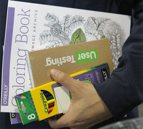
Even for those of us who weren’t lucky enough to get a signed O’Reilly book, there was some choice swag for conference-goers, as shown in Figure 23, including a lovely coloring book and pens, a print copy of O’Reilly’s 2016 Design Salary and Tools Survey, and various booklets published by O’Reilly.
Figure 23—Conference swag
Photo by O’Reilly
I stayed at the conference hotel, the Sheraton at Fisherman’s Wharf. The rooms were reasonably priced and very comfortable, but the extremely small lobby wasn’t at all conducive the sorts of serendipitous social gatherings that usually occur at conference hotels.
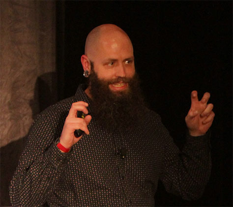
Architecture Walk: Patterns and Structure
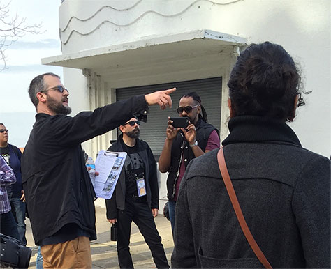
This walk took place in the afternoon on the first day of the conference. I’m an architecture buff, so opted to go on the walk with several friends rather than attend another workshop. It was led by Dan Klyn, shown in Figure 24, who is an Information Architect at The Understanding Group and is a Lecturer at the University of Michigan School of Information. In Figure 24, we were gathered outside the Maritime Museum, in the Aquatic Park Bathhouse Building—a large, ship-shaped building in the streamline moderne style. We then visited Ghirardelli Square and took in a number of residences in different styles on Russian Hill. A highlight of the tour was our visit to the San Francisco Art Institute. I really enjoyed this walk!
Figure 24—Dan Klyn, leading the Architecture Walk
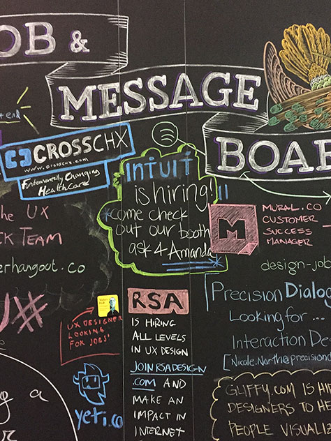
Community
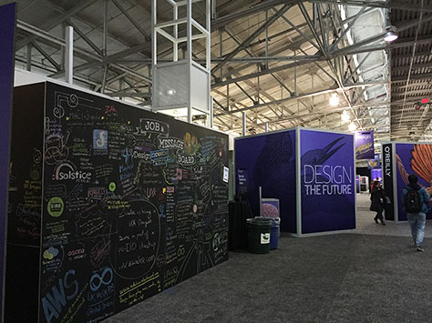
This conference attracted a fairly diverse community of designers. Many of the speakers were thought leaders in UX leadership, design, or strategy. In the lobby, there was a message board to which this creative community contributed, which was a thing of beauty, as shown in Figures 22 and 25.
Figure 25—Message board
Conclusion
The O’Reilly Design Conference 2016 was a very good inaugural conference! There was some truly excellent content. I’m excited about attending the next one, which will take place March 20–22, 2017, again in San Francisco, but at the elegant Westin St. Francis Hotel on Union Square. I hope to see you there!
Founder, Publisher, and Editor in Chief of UXmatters
Silicon Valley, California, USA
With more than 20 years working in User Experience at companies such as Google, Cisco, WebEx, Apple, and many startups, Pabini now provides UX strategy and design consulting services through her Silicon Valley company, Strategic UX. Her past UX leadership roles include Head of UX for Sales & Marketing IT at Intel, Senior Director of UX and Design at Apttus, Principal UX Architect at BMC Software, VP of User Experience at scanR, and Manager of User Experience at WebEx. Pabini has led UX strategy, design, and user research for Web, mobile, and desktop applications for consumers, small businesses, and enterprises, in diverse product domains. Working collaboratively with business executives, multidisciplinary product teams, and UX teams, she has envisioned and realized holistic UX design solutions for innovative, award-winning products that delighted users, achieved success in the marketplace, and delivered business value. As a UX leader, she has facilitated conceptual modeling and ideation sessions; written user stories; prioritized product and usability requirements; established corporate design frameworks, standards, and guidelines; and integrated lean UX activities into agile development processes. Pabini is a strategic thinker, and the diversity of her experience enables her to synthesize innovative solutions for challenging strategy and design problems. She is passionate about creating great user experiences that meet users’ needs and get business results. A thought leader in the UX community, Pabini was a Founding Director of the Interaction Design Association (IxDA). Read More