Top

Web Content That Persuades and Motivates

November 22, 2010

There are several key elements that are missing from a large number of Web sites, and these missing elements often lead to bad user experiences and the total ineffectiveness of those sites.

Leahy’s Law states: if a thing is done wrong often enough, it becomes right. As a result, volume becomes a defense of error. During a recent review of hundreds of Web sites, I found Leahy’s Law to be descriptive of the content on most Web sites. That is terribly unfortunate for the Web site owners who are trying to attract the attention of their prospective and current customers and entice them to take a desired action—often no more than a phone call or an email message requesting more information. The same errors of omission exist on most sites—whether their purpose is sharing information or selling products or services.

In this article, I am going to explore the written Web site content whose purpose is to cause prospective customers to take action—or that results in their not taking action—from the perspective of its achieving a company’s sales and marketing goals. This discussion assumes the company has a service or product to sell. If you’re not interested in the motivational aspects of sales psychology and what their proper use can do to help a company’s sales efforts, then stop right here, because you will not like this article. Yes, I am one of those people—a professional salesman who has over 36 years of experience—who has turned his attention to assisting companies in properly communicating with their current and prospective customers through their Web sites and other media. I’ll describe a few of the main reasons Web sites often don’t fulfill their owners’ expectations for sales or marketing tools or provide support for their branding strategy, then offer some simple and creative solutions to these problems.

Champion Advertisement
Continue Reading…

Purchase Psychology: Providing Motivation

What drives consumers to purchase any product or service? They do so for a reason that is tied to an emotion—their reason, not yours. At first glance, this idea may seem foreign or confusing. However, it is 100% accurate. Human psychological theories abound and have many different focuses. Everything we’ve learned about human motivation—from the radical behaviorism of B. F. Skinner to Abraham Maslow’s Hierarchy of Needs to Richard Lazarus’s cognitive theories, makes one thing apparent: people act when what they see, read, hear, or feel motivates them to do so. So, why do most Web sites ignore these motivating factors? The reasons vary, but it is primarily due to the fact that most people who create written content for Web sites have no training in using persuasive language.

Persuasion, in the form of providing motivation, can be as simple as an ego stroke—appealing to a person’s self-image or desire for success. Here’s an example from a business setting: A department manager purchases new software so her company can remain competitive. With this purchase, the department manager has perhaps helped her company keep up with the times, be more responsive to its customers, and made the lives of her staff easier and more manageable. But most important, because she has answered the division manager’s demands for a higher degree of customer-relationship management, she gets to keep her job.

Among the many emotions that drive decision making—including purchases—are worry, pride, curiosity, envy, frustration, fear, hope, love, gratitude, and disappointment. Some goals that drive buyers’ decisions include averting crisis, becoming more competitive, saving time and money, making jobs simpler and lives easier, and increasing their feeling of comfort with a major purchase. Therefore, one of the most important things to recognize in creating messages for Web sites is the need to consider the potential emotional impact on the target reader—or any reader. Listing factual information does not evoke emotions or provide motivation.

Have You Earned Your Readers’ Time?

Timing is everything. Another, no less important element of Web site content is the amount of time it takes to deliver your message. Tens of thousands of hours of research by numerous companies tell us that readers of advertising messages allow us only a very short time—with the result that we either capture their attention or repel them in confusion. On the Web, you’ve got only three to ten seconds. Of course, you cannot successfully close a sale that quickly, because doing so requires that you guide prospective customers through taking additional steps, but you can certainly end any further chance of your winning them over in that small amount of time. Sellers of products or services should not create any negative thoughts or feelings in the minds of their customers. Confusion and frustration are two such emotions. Neither provides a positive user experience.

Consider your own personal history of doing keyword searches to find a product or service on the Web. We all know there are ways to move sites up in the search engine listings that have nothing to do with the keywords we’re searching for. But ignoring the possibility of prospective customers’ landing on a totally wrong site, let’s look at what happens when they land on a right one with a poor message.

In appalling numbers, Web sites fail to inform prospective customers of how the site can help them—answering the real motivational reason for the search. In sales-speak, we refer to this as answering the WIIFM (What’s In It For Me?) question. Answering that question properly addresses prospective customers’ emotional reasons for being on a site to begin with. Until you answer that fundamental question in the minds of your prospective customers—or even your current customers who are looking for new products or services—you have not earned their time. You must earn the time customers are willing to give you to tell them why they should want do business with you and your company instead of your competitors.

Benefits Versus Features: An Old Lesson Revived

In the late 1970s, as a sales representative for Scott Paper Company, I learned how to create benefit/feature statements for consumer products. On the very first day on the job, we were taught that one does not work without the other. They still don’t. Simply defined, features are what a product or service is or does. For example, our widget comes in 24 colors, comes with a warranty, and is made of the finest quality materials. Benefits, on the other hand, describe what the product does for its user. For example, our widget will help you save time, make your staff more efficient, help you competitively, make your life easier, and prevent you from worrying about your choices. Benefits cause your customers to be more satisfied with your product and service offerings and, therefore, increase their loyalty to your company and your brand.

Today, most Web sites are factually descriptive. By that, I mean that they mainly describe what they do and who they are. Believe it or not, therein lies the basic problem. The vast majority of Web sites—and I have no hesitancy in including the Web sites of extremely prominent companies in this group—are inwardly focused, presenting facts about themselves, lists of the products and services they provide, profiles of their personnel, and corporate histories. Of course, you should not discard this information or take it lightly, because these facts support the decisions your prospects and current customers need to make. But facts and features do not motivate people to take action. They only form the basis for later rationalization.

Consumers want to know what benefits a product or service offers to them—how it will satisfy their emotional needs. The problem is not that the information these sites present is wrong, but that they’re presenting it in a manner that arouses neither the readers’ emotions nor their motivation to act—unless you count driving them to another site.

I cannot think of any more appropriate examples than the messages of two huge companies that are currently facing each other in the consumer products marketplace: Google and Apple. Droid TV commercials from Google are visually stunning, with their jewel-like Web icons on a spinning globe. But their main message seems to be “we do a lot of apps.” The latest Web and print Droid ads are quite cold and merely factual, as you can see in Figure 1.
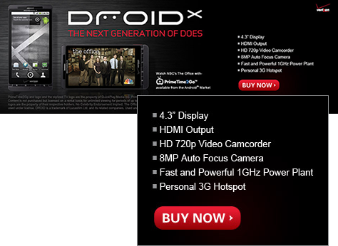
Figure 1—A Droid ad on the Web—just facts about features
A Droid ad on the Web—just facts about features

On the other hand, take a look at the iPhone TV ads from Apple—or any advertising from Apple for that matter. These ads speak about the benefits of ownership and how your life will be better if you own an iPhone. The ads have highly personal appeal, are warm and inviting, and are emotionally charged. Figure 2 shows a recent iPhone ad. I grant that, in focusing on these ads’ emotional appeal, I’m ignoring the fact that Apple’s volume advertising is buying mindshare on a national scale. But look at both companies’ ads and tell me what you feel when you come away from each of them. The feeling is likely to be vastly different, as will your motivation to purchase one or the other of these products. Of course, I understand that I’m ignoring other factors in purchasing decisions like cost, connectivity, and functionality. However, the emotional response that the iPhone ads evoke is powerful enough to overcome almost any set of features a competitor might offer.

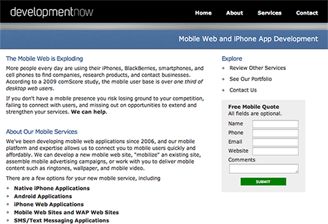
Figure 2—An inviting iPhone ad
An inviting iPhone ad

Timely, Plain, and Simple Language Versus Techno-Speak

The late David Ogilvy, founder of one of the most prominent ad agencies in the United States today, made these insightful statements about ad copy:

  • “I don’t know the rules of grammar…. If you are trying to persuade people to do something, or buy something, it seems to me you should use their language.”
  • “On the average, five times as many people read the headline as read the body copy.”

In these two quotations, he has gone straight to the heart of two glaring problems that prevent Web sites from being effective for the companies that create them: confusing language and bad timing. Beneficial reasons for doing business with a company often get hidden in the onslaught of facts a Web site presents, the industry-specific language it misuses, and techno-speak that actually says nothing at all. Quite often the motivators that matter to buyers never appear in a Web site’s content until the second or third page, where they are likely rendered totally ineffective—too little and too late. Web sites that don’t communicate effectively fail to motivate buyers and provide a poor user experience.

Web Sites That Fail to Motivate

One finds examples of Web sites that fail to motivate their customers everywhere on the Web, on sites for every type of company.

On one recent Web site visit, I spotted this tagline right below the site’s logo: Tomorrow’s Technology Today. Great! However, when there are no facts on the entire home page that indicate what a company does, as on this site, a visitor’s experience of the site begins in a state of confusion. This company could have been in systems integration, modeling and simulation, or cloud computing. Many companies fail to clearly state what they do on their home page—much less how they help people. If prospective customers were searching for products or services on the Web and hit a site like this, it is unlikely they would remain on the site long enough to find out what the company does.

Recently, when I was searching for mobile Web sites, I found a page on DevelopmentNow.com that’s a real winner. As Figure 3 shows, their Mobile Web and iPhone App Development page clearly states the reasons a business should be interested in having a mobile Web site—attracting new customers, reaching new markets, connecting with existing customers, assisting their staff, and boosting sales—then goes on to say they can deliver a mobile Web site quickly and affordably. They’ve done a wonderful job of making their case.

Figure 3—Mobile Web and iPhone App Development page
Mobile Web and iPhone App Development page

But, when I went to the Web site’s home page, shown in Figure 4, the information it provided was merely factual, and its content failed to effectively communicate the benefits the company offers. Plus, half of the information it does provide is hidden behind a Flash introduction. The information on this home page leaves potential customers’ understanding of why they ought to be interested in doing mobile apps to the readers’ imagination. It appears that two different people authored the content on these two pages.

Figure 4—Development Now home page
Development Now home page

Regarding small professional corporations’ Web sites, including those of doctors, lawyers, and other professionals, let me pose a simple question. Do you care where your doctor or lawyer went to college, law school, or medical school? With a few possible exceptions—for example, graduates of competitive universities such as Duke versus UNC or USC versus UCLA—or for some highly specialized skill sets—I’d venture to guess that, upon visiting their offices, you’ve never asked. All you are looking for is help getting well, staying out of jail, or maybe suing your next-door neighbor for property infringement. In any of these cases, you’re looking for help—someone to hold your hand and make you feel better about the world in general. So why is it that the vast majority of their sites offer nothing more than factual information that spurs no action? Please refer again to Leahy’s Law.

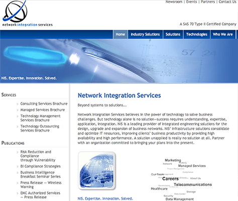
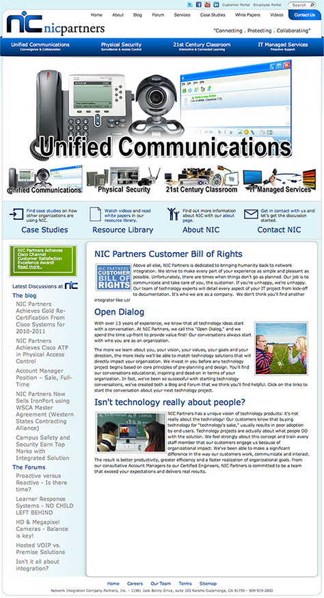
My final example illustrates the huge differences that can exist between the home pages of similar service providers—in this case, providers of network integration services. One such disparity could spell the difference between success and failure for a company. When I searched for network integration companies, I found two companies that offered a great many facts about their services: Network Integration Services, whose home page is shown in Figure 5, and NIC Partners, shown in Figure 6. But they didn’t differentiate their services and offered no message that resonated with me or would motivate me to action.

Figure 5—Network Integration Services home page
Network Integration Services home page
Figure 6—NIC Partners home page
NIC Partners home page

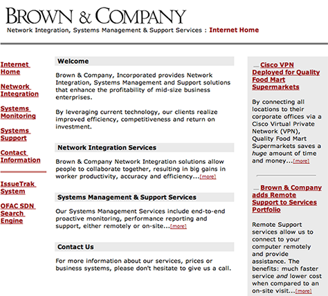
On the other hand, the home page of Brown & Company Network Integration hit me squarely in the heart and mind with their offering. Their home page, shown in Figure 7, presents the following information, in this order: profitability, efficiency, competitiveness, collaboration among employees, productivity, accuracy, proactive solutions, and faster service with lower cost. Then they explain how they accomplish each of these. Visually, the site could use some improvement. But they got my attention, and that is the whole point. The first two sites didn’t hold my attention, but I would have picked up the phone to call Brown & Company, because they told me what they would do for me. They answered the WIIFM question definitively and in a timely manner and made a psychological impact.

Figure 7—Brown & Company home page
Brown & Company home page

Closing Thoughts and Conclusions

I frequently hear business owners and managers complain that their Web sites are failing to

  • bring them any new or repeat customers
  • offer support for their marketing efforts
  • provide ROI (return on investment)

When I read the content on their Web sites, it is not hard to understand why they’re not effective. Even owners of sites that sit atop the search results for particular keywords complain about their low numbers of conversions from site visitors to customers. The reason is frequently quite simple: they have offered only facts or descriptions of features, and neglected to mention any motivating reasons to do business with them.

Regardless of a Web site’s architecture, color choices, rich interactivity, or data-capture capabilities—all of which may play important roles for Web sites that support a brand or sell products or services—if a Web site does not communicate a compelling and emotionally motivating message that gives people reasons to react positively and make contact to get more information or even immediately make a purchase, the Web site might as well not exist. 

President of Accurate Business Communications

Portsmouth, Virginia, USA

Chandler TurnerChandler’s personal passion is deeply understanding how communications drive people to action. He applies this knowledge to marketing communications of many types, including Web site content and marketing collateral. The focus of Chandler’s one-person company, Accurate Business Communications, is supporting other businesses in their sales and marketing efforts by creating communications that enable his clients to meet their business goals. In 1977, when Chandler was starting out as a Sales Representative with Scott Paper Company, their national sales trainers had begun to learn about and adapt Neuro-Linguistic Programming (NLP) to consumer products sales. His journey has taken him from a basic understanding of the Pygmalion Effect to learning about advanced discovery techniques, cognitive psychology, the function of short-term memory, and rationalization of thought and perception. In his work, Chandler calls on 35 years of experience in field sales and training for such organizations as Scott Paper Company, Wells Fargo Home Mortgage, Northwestern Mutual, and several regional consulting firms. He speaks often and presents seminars on the subject of strategic Web site content.  Read More

Other Articles on Content Strategy

New on UXmatters