- Opening Keynote: “Winning a Seat at the Table: What It Takes to Shape the Direction of a High-Profile Product,” by Laura Granka, Head of UX Research for Google Search
- “Shaping Organizations to Deliver Great User Experiences,” by Peter Merholz, VP of User Experience at Groupon and Co-Founder of Adaptive Path
- “Validating UX Strategy Concepts Through Service Design,” by Ashley Halsey Hemingway, Associate Director of User Experience at AppNexus
- “Lessons from UX STRAT 2013: Applied to the Real World,” by Krispian Emert, Usability and IA Specialist at Microsoft
- “How to Avoid Losing Design Strategy to Business Strategists,” by Brian Gillespie, Strategy Consultant and, formerly, Principal at Continuum
- “UX as a Core Company Strategy,” by Martin Granström, Head of UX for Nook Media
- “Putting UX and Strategy at the Heart of the Product Team,” by Todd Wilkens, Design Principal at IBM
- Keynote: “Design Your Strategy,” by Matthew Holloway, VP of User Experience Design at Shutterfly
- “Big Love: The Case for Conscious Coupling in UX Strategy,” by Ronnie Battista, UX Practice Lead at Slalom Consulting
UX STRAT 2014, Part 2: Day 1 of the Conference
In Part 2 of our UX STRAT 2014 review, we’ll cover Day 1 of the main conference, which took place on Monday, September 8, at the Boulder Theater, in Boulder, Colorado. Paul Bryan, producer of UX STRAT 2014, welcomed everyone and opened the conference. The program for Day 1 of the conference was packed with great content.
Day 1 of the Conference
Here are our reviews of the presentations on Day 1 of UX STRAT 2014.
Winning a Seat at the Table: What It Takes to Shape the Direction of a High-Profile Product
Reviewer: Pabini Gabriel-Petit
Presenter: Laura Granka
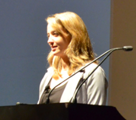
Dr. Laura Granka, shown in Figure 1, is Head of UX Research for Google Search and delivered the opening keynote address. She began her talk by presenting a retrospective of the Google Search user interface. The original Google user interface was simple, “perhaps because the team that developed it initially did not understand how to do HTML,” said Laura. Today’s user interface is even simpler. “They took away the links above the search box. When people search Google, they just want one big search box. People are comfortable typing in more. … If you look at the logo itself, you can see some evolution as well. It has evolved to the current flat design. The challenge was that even evolving the logo was driven by UX.”
“Google’s philosophy is: Focus on the user and all else will follow.” Speed, performance, quality, and efficiency are also important. “User-centered data is fresher data.” “It is also important to have highly performant search results, as well as recent results, not dated results.
“UX helped drive the concept of predictive text, which dynamically displays the most common search [queries].” “Google’s goal was to make the results seem light-speed fast. In 2010, Google Instant came out. It felt like results appeared faster than users could type. This required a huge number of servers. It takes a lot of computing power to be able to do this dynamically, in real time.
“Query formulation a big issue. We wanted to be able to assist people with their queries.” “Google is still data driven, but the way Google is data-driven has changed. This [used to mean] metrics, performance, speed, and quality.”
When Larry Page became the CEO, “UX got a mandate to make it all look good. There were lots of different applications with different looks. We needed to make them more consistent. This evolved into the Kennedy project, and we were able to evolve the Google design and experience across all Google products and improve consistency across all applications.”
The Role of UX Research
“Today, Google’s goal is to be more data informed—not just on core metrics, but also richer data. Material Design is rebranding and is also more than just fixing problems. It is driving a consistent brand and identity across Google products. It’s responsive, consistent, flexible, and cross-platform. There are new input styles, including fingers and voice. We want to be your assistant. We want to be predictive. We want to organize the world’s information and make it accessible and usable to help people accomplish their goals using technology.
“Research helps us to understand the user’s context. For example, if a user is on the phone, and the phone is in the cup holder, so the voice is muffled, and they accidentally call someone they didn’t want to, how do they cancel that call, still hands free? These are the sorts of challenges we identify and solve to inform design.”
“UX Research comes in to reconcile the different opinions. It’s not about opinions. It’s about data. Design is not art; it’s not subjective. It’s not about who likes what better. It’s about finding solutions. We do this in partnership with Engineering and Product Management. Everybody brings their own expertise.
User-Centered Design and the Development Process
“UX is part of the development cycle. The process is iterative, and there’s a lot of collaboration. We ideate, build a product, and launch it. During ideation, we ask: ‘What do we know already—about users and the competition? We search for information and insights about users. We go broad—then, in the next phase, we go narrow—but we want a lot of ideas at this stage. During the build phase, we iterate the solution to ensure that we understand the right solution and to get to the best launchable state. As part of the launch phase, we evaluate and track our success. Our mantra is to launch and iterate.
“Google follows a truly user-centered design process, including research, testing, design, and prototyping. We leverage prototyping resources to convey true proofs-of-concepts to the Engineering team. It’s hard to convey true experiences and get motions and gestures right without implementing a prototype. We do a lot of iteration. We think about user needs, goals, contexts of use, and the end-to-end experience. This changes the data we want to get. There are a lot of qualitative elements that we use as inputs.
“Google UX has established guidelines and frameworks, so we don’t need to play around with unnecessary details. When we do a Material Design spec, we know what patterns to use. People should focus on their core strengths.
You have the spec, and that’s what everybody is working toward.
The HEART Metrics
“We work in the context of the HEART metrics. Whether you’re working with quantitative or qualitative data, it’s important not to focus on just one or two metrics. The HEART metrics include:
- Happiness—Look at moments of delight. What do people love? People love holding an iPhone, for example. From a quantitative perspective, we also measure satisfaction through surveys. We ask, ‘How satisfied are you with these search results?’ We have an overall pulse on how people are feeling about products.
- Engagement—Time spent and what they do. How much are people reading? How are people sharing? How deeply are people engaging with your product?
Adoption—The pace of uptake. How quickly are people signing up for your product? What is the interest in your product or service at any point in time? Why there may not be as much interest in your product. - Retention—Things people use at least twice a day. How frequently are people coming back? It’s just something you have to do.
Task success—Core usability and behavior analysis. Task and behavior tracking.
“We use data to drive a lot of the insights and inspiration. We combine both qualitative and quantitative analysis to provide an understanding of the complete, end-to-end experience. We’re using the whole spectrum of data to inspire us. We’re moving from data driven to data informed to data inspired. Our goal is to understand how to move to the next step ahead. How do products require people to be on the Internet? How can we get more people using the internet—bringing the Internet to remote locations?
The Role of User Experience in the Business
“We can talk about the cool stuff we do, but the reality is that it’s messy. We can have the best intentions, but the process is messy. People disagree. Guidelines and frameworks help you to know when to push back. Timelines can be too tight. Be clear about what it means to skip certain phases. Resolve uncertainties. Things just might not work out the way we expected. It’s never ideal, but we make it as ideal as it can be.
“We engage in dialogue and bring flexibility. Relationships matter. We have to take the time to invest in talking with the people we work with, to build relationships. [You must] have the core trust of the Development team.
They need to trust that you’ll take their concerns into account. We must undestand the technical tradeoffs. Product Management needs to understand the value of working with User Experience. We want others to be able to express their own priorities, based on their own view of the world. We need to know the time it will take to reach our goal. We need to speak the language of our colleagues—Engineers and Product Managers.
“A small group, a small team of designers, can make a big difference. The UX team implemented a new Material Design strategy to drive consistency across all products. We didn’t want to fly too high, where we’d need approval from the CEO for everything. But we needed to go to a higher level—for example, VP, SVP. We met with those leaders, so they were on board before the UX team went to Larry Page to suggest a consistency drive. Because we had buy-in from stakeholders, we were able to get it through without challenge and improve the user experience as a whole.”
At Google, people are “thoughtful about relationships, constraints, and product needs. Google encourages a grassroots approach. It’s all about the people. We’re all there for the same purpose.”
Q&A
Paul Bryan kicked off the Q&A by asking, “How do UX people at Google gain and build influence, so we can be involved in the products we want to be involved with?”
Laura: “The way we worked with stakeholders. Research was much more centered on Engineering.
People ask different questions.
Don’t just consider the result.
It’s not just about the quality of the result.
But we needed to deliver quality results, down even to the spelling. Our results needed to be high quality and make a difference. When they do, we get a seat at the table. But there are a lot of other factors that come into play: mobile, context of use, end to end.”
Q: “Google moved from data driven … to data inspired, but a lot of people who are data inspired want to move toward data driven.”
Laura: “We’re looking at data differently. Where do we want to be?”
Q: “How do you ensure visual consistency? How do you ensure that your governance model, guidelines, and standards evolve?”
Laura: “We do have an approval process, but nobody approves everything.” There are Google guidelines for a Content Strategist or a Contert Writer, for example. While “there is no overall approval process for guidelines and standards, there’s a grass-roots effort to move up to that.”
Q: An audience member asked about the “convergence points [in the relationships between] Product Management, Engineering, and User Experience. How do those convergence points work? Is there an overlap between Product Management and Product Strategists?”
Laura: “UX is working more with Product Managers. We used to work more with Engineers. Now, our biggest partnerships are with PMs. Some PMs know that UX can help make products amazing, so they include UX early. Others, not so much. Product Management works with UX and Engineering to get input on what the solution should be. There’s a lot of back and forth. We work together to define the experience strategy. UX is part of the overall strategy and drives the experience strategy. But it’s closely tied to Product Management.”
Q: Someone asked a question about Google’s reaction to users’ behavior changes.
Laura: “At Google, metrics for measuring success were easier, quick metrics.
Now a lot of things are happening on a page, so we can’t use same success metrics. Before, [we were concerned] if people didn’t click [a call to action] on a page or about abandonment. Now there’s: How much time did people spend on a page? Qualitative evidence about how people read and swipe through a book. There was some change aversion. When we launched Kennedy, with a new visual design, our satisfaction metrics dropped. Going back over time, if you change anything, people are going to struggle. But it gets back to where you were over time.”
Q: “It’s important to speak the language of engineers and PMs, but how do you communicate the benefits of working with UX?”
Laura: “In the past, UX had fewer people and less influence. Today, we have more. People now see the value of UX. One way to become more relevant was to develop prototypes and show those. We do a lot of showing, not just telling. We show evidence of how people are actually using the products.”
Q: “The Material Design principles are amazing. How did you come up with them and get them accepted?”
Laura: “Material is the metaphor—the metaphor is a piece of paper. This metaphor is the unifying theory of a rationalized space and a system of motion. The material is grounded in tactile reality and inspired by the study of paper and ink, yet technologically advanced and open to imagination and magic. We want to be bold, graphic, and intentional. We wanted colors to express a point of view with the design. Motion provides meaning—for example, motion brings attention to key things we want the user to focus on. Motion respects and reinforces the user as the prime mover. Primary user actions are inflection points that initiate motion, transforming the whole design. For example, this can convey what’s on top, layering.”
Q: There was a question about UI versus UX. “How is UX is perceived?”
Laura: “Some people have a good understanding, but their words are wrong. There are times when a stakeholder uses the wrong terminology—such as ‘usability person’ or ‘usability testing’ instead of user research. We made a conscious decision in 2007 about titles—UX, not UI or usability.”
Q: “How do you work with UX with time constraints?”
Laura: “The main challenges are working with process issues; timelines.”
Q: “How was research involved in the logo redesign? How was UX involved in the process.”
Laura: “Designers just started using the flat logo in all of their mockups, so more and more people saw it. There were people who were worried about changing the branding. We worked with Marketing. UX pointed out that this is a logo that can port better. It’s not just how it looks. It’s more responsive and adaptable, which made a difference to stakeholders.”
Q: “I work at Walgreens, and I wonder what the role of UX should be in the integration of digital and other channels—in multichannel programs—across the end-to-end service design and systems design.”
Laura: “Google has done a lot of analysis of the interaction between the virtual and the physical world. We’re spending a good deal of time looking at designing across the total ecosystem of experience. It’s about the context of use. How do you take things in the physical world and translate them to online—the situation and the context? During the ideation stage, define the context of use.”
Q: “Different companies have different titles for what we do. At Google, is there a difference between a UX designer and an interaction designer?”
Laura: “The titles have evolved. We have visual and motion specialists. In the research disciplines, different people are doing qualitative and quantitative research.”
Q: “Is UX involved in strategic decision making? Is UX the objective?”
Laura: “Yes, it is now. UX does have a seat at the strategy table. UX does drive a lot of the decisions.”
Conclusion
UX people always seem to be highly curious about the way Google does business. Laura’s talk gave us a clear picture of the role and accomplishments of User Experience at Google. Plus, Laura very graciously answered the audience’s many questions.
In my overview of the conference, I mentioned that all of the speakers’ presentations are available on SlideShare. Regrettably, I was mistaken in this case. Laura Granka’s presentation is not there.
Shaping Organizations to Deliver Great User Experiences
Reviewer: Jim Nieters
Presenter: Peter Merholz
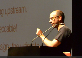
Peter Merholz, Co-Founder of Adaptive Path and VP of User Experience at Groupon, who is shown in Figure 2, delivered one of the more insightful, inspiring, and yet ambiguous presentations of the UX STRAT conference. His high-level points made perfect sense and provided clarity on how to structure UX teams to deliver maximal value in any organization. However, I found it a bit difficult to follow some details of Peter’s presentation. For this reason, I reached out to several people at the conference, but nobody could clarify his points for me. They agreed that Peter is a great speaker and his talk conveyed an important message, but that some specifics remained unclear.
Peter’s Journey
Peter started his presentation by talking about his journey from college to his current position at Groupon and how his perspective has evolved over time. He came out of college with a degree in anthropology and—as many such graduates do—wondered how the heck he might leverage his degree to get a job. Fortunately, Peter recognized the emergence of the Web, which was happening at just that time, and realized that he had a knack for information architecture. But he also realized that just building Web sites wasn’t good enough. If a user can’t find the content or complete the task for which they came to a site, what is its value? “Strategy is informed by user research,” Peter told us. Because he saw the need to create great UX designs that are based on research, ensuring that they meet the needs of users, he helped to found Adaptive Path.
Later, Peter realized that even when he had a great UX strategy based on solid research, the resulting product wasn’t always great. Just having good designers wasn’t enough. He understood that he needed to interact with and influence the culture and the executives of the companies for which he worked. “Culture eats strategy,” declared Peter. As a consultant, he didn’t have access to that level, so he decided to go to Groupon, as VP of UX.
Groupon—from Services to Strategy
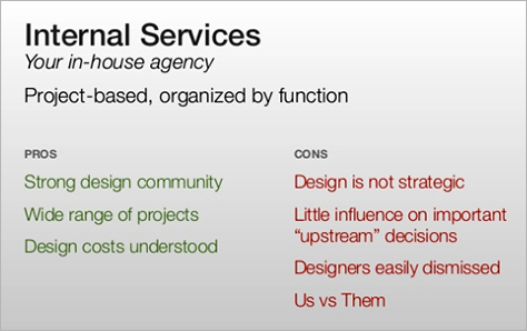
When Peter joined Groupon, he noticed that designers were working tactically, on isolated design projects for which other groups had defined the requirements. Initially, Groupon viewed the UX team as a services organization that produced tactical designs for specific projects, as shown in Figure 3. Part of the team’s challenge was their organizational structure: The UX team was organized by function. To be sure, there were some positive aspects to this structure. For example, Groupon had a strong design community and the costs of the design team were well understood. On the other hand, “Designers were not seen as strategic contributors, so were brought in late,” said Peter. Thus, designers had no impact on upstream decisions that those in other roles were making. As a result, people in other functions found it easy to dismiss their ideas. Of course, another factor was that the designers were all in their 20s and Product Managers were in their 30s, which resulted in a Why-should-I-listen-to-you? attitude.
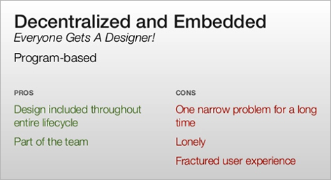
Next, the UX team moved to a decentralized and embedded model, in which the leader coordinates across teams and each product team gets a designer, as shown in Figure 4. “Every product had a completely autonomous team. This is a fairly typical model in Silicon Valley,” acknowledged Peter. Using the decentralized and embedded model solved part, but not all of the problem. On the plus side, design was part of the product team throughout the entire development lifecycle. However, one challenge that this model presented was that members of the UX team focused on just one narrow problem for a very long time. There was a tendency for designers not to interact with other designers, and they felt isolated. Worse, the lack of dialogue among designers was likely to result in a fractured user experience across different aspects of the product.
But with Peter—someone with credibility—running the UX team, they were able to restructure and rethink their engagement model. With the goal of improving the UX team’s impact and the overall Groupon user experience, Peter brought three new models to bear:
- They moved to what Peter calls a centralized partnership model.
- They organized the UX team around the customer journey instead of focusing on isolated, tactical designs.
- They introduced a two-stage process called the double diamond model, in which the first stage is Product Definition; the second stage, Product Execution.
Centralized Partnership Model
Peter recognized that he could take some lessons from Marty Cagan, who wrote the book Inspired: How to Build Products Customers Love. I have been a fan of this model for many years. In fact, a colleague and I invited Marty to come in to talk with our executive team when I was at Yahoo! In the centralized partnership model, shown in Figures 5 and 6, design is a centralized organization, reporting up through a single leader, and design teams are committed in partnerships with specific product or business teams. Each product team is a fully formed team, comprising product managers, engineers, and UX designers.
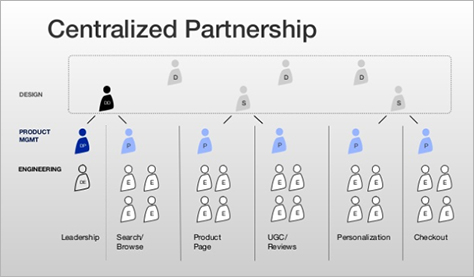
In this model, a UX leader within a business unit pulls in designers from a centralized organization to deliver great designs. However, there is one important difference between the centralized partnership model and the typical centralized model: Instead of having one designer work on multiple projects, as is often the case in companies, you assemble a UX team for each project. “Think in terms of design teams, which are better than unicorns working individually,” advised Peter. “We organized design teams by parts of the product.”
Centralization helps the UX team to maintain consistency across a meaningful set of products, and the partnership aspect helps ensure that the UX team has a strong relationship with Product Management and, therefore, an understanding of product challenges. Thus, this centralized partnership model has enabled Groupon to maintain consistency across their products.
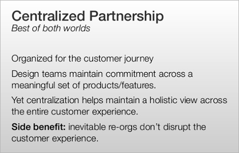
Through experience, Peter has found that each UX team should comprise between four and seven members. Having a single strong design leader for a small UX team enables that leader to manage down, across, and up; get the most out of their team; collaborate with cross-functional partners; and present to executives and other stakeholders. Peter acknowledged that he places a great deal of responsibility on these leaders, but each of them also has significant autonomy.
Organizing the Team Around the Total Customer Journey
The question Peter asked himself: “How can I organize my design team in recognition of this customer journey?” How could he devise solutions for online, offline, and physical journeys? He needed influence the larger executive team to structure product teams by touchpoints on the total customer journey.
Peter decided to form a multidisciplinary design team for each project—similar to the way a design agency structures its project teams. He borrowed this concept from his work at Adaptive Path. So, instead of assigning just one designer to a project, they created a design team for each project. I have to agree with this model. In fact, I wrote an article for UXmatters several years back in which I talked about the importance of creating full UX teams comprising researchers, interaction designers, visual designers, and, possibly, front-end developers for each project. In that article, I pointed out that, while we might not be able to take on every project, each project that we worked on following this model would result in designs that differentiated the product in its marketplace.
Peter found that the best way to organize UX teams is around business problems, not functions. He does not organize teams around Interaction Design or Visual Design. Rather, he creates multidisciplinary teams that work together to solve business challenges. For example, if a business problem were redesigning the acquisition flow, a multidisciplinary team would work on it, not just one designer.
Peter made a strong point in suggesting that a UX teams’ work should comprehend the total customer journey, not just one aspect of the journey. In designing a customer journey, Peter said, “It is senseless to have marketing and product or UX design on different teams. It’s all the same customer journey. Marketing and product being in separate organizations has got to stop.”
Double Diamond Process Model
Finally, Peter turned to process. In determining the process that the product teams would follow at Groupon, his objective was to ensure that teams had the ability to define an optimal product before entering the engineering, or build, phase. So Peter leveraged the double diamond process model that the UK Design Council introduced in 2005. “Double diamond is a remarkably good tool for communicating what we care about,” said Peter. The double diamond model is shown in Figure 7 and comprises two separate phases:
- definition phase—During this phase, product teams study and gain an understanding of the market, develop customer empathy, create a product strategy, ideate, prototype, and define an experience strategy.
- execution phase—During this phase, product teams work through tradeoffs to deliver an optimal product.
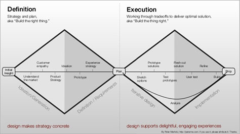
One pitfall with double diamond as originally conceived is that many teams tend to conduct a single definition phase, then iterate many times during the execution phase. Peter flipped that around, so a product team could iterate concepts multiple times during the definition phase, then execute rapidly during the execute phase. “It’s cheaper to iterate on definition than on execution. It takes longer to get to the right thing if you don’t iterate on ideation,” said Peter. Because Groupon defined the product so well up front, they shortened the time it took to build it.
Peter pointed out that some critics might suggest that double diamond doesn’t seem very Lean or agile. But Peter disagrees and believes that it’s very Lean. In reality, he cares less about what process a team uses during the execution phase. If you get the product definition right, you can use almost any process during the execution phase to move rapidly through build.
“Be wary of people espousing methodologies,” advised Peter. “Typically, they are crutches to free people from critical thinking. Also, they’re focused on execution—that is, once you already have a plan. (Designers are remarkably good at limiting their own impact.) And, they don’t address the truly fundamental challenge facing design and UX, which is organizational.
Ensuring Creativity and Operational Success
As many other UX leaders have discovered, Peter found that maintaining a central UX function under a single leader becomes challenging over time, as design teams and companies grow. Partner teams may believe that they need to own all of the resources working on their products. Plus, they may not understand why design costs what it does—especially when they run into funding constraints. Working with partner teams requires a lot of coordination and communication. Moreover, operational concerns may take priority over creative issues.
Peter borrowed a lesson from both technology and journalism. Technology companies have a CTO and a VP of Engineering. In journalism, there is both an Editor in Chief and a Managing Editor. So Peter decided that Groupon needed both a VP of Design, to focus on the business and operations side, and a Creative Director, to focus on the creative side of design.
Final Words
“With a centralized partnership, teams with strong leadership influencing definition, and a relatively small team, you have leverage. And leverage equals power,” Peter told us. “There’s no reason design can’t be the driving force.” As UX strategists, we just need to have confidence, present evidence, and demonstrate commitment to hold this power.
In conclusion, Peter pointed out that, as industries evolve from being technology-driven to being feature-driven, then to being experience-driven, UX leaders must reconsider how they should organize their teams. Most organizations are still stuck in a features world, in terms of the way they structure their UX teams. Thus, as UX strategists, we need to start thinking about how our organization can evolve from a technology or feature focus to an experience focus—and how to structure our UX teams to facilitate our focusing on the experience.
During the Q&A following Peter’s presentation, several people posed interesting questions to him. Here are a few of the questions and Peter’s answers:
Q: “In a world of limited resources for design, you have to identify resource tradeoffs, especially in the context of prioritization. How do you prioritize?”
Peter: “The benefit of having an executive at the table is that he can make decisions. An executive doesn’t have to ask for permission. If you make decisions, you had better be right more than you are wrong. However, you have the ability to decide and communicate.” Consequently, Peter worked with his boss to create clarity, then made decisions and communicated them to the larger organization. The centralized partnership model enabled the UX team to be very effective because they could load-balance across teams, if necessary. This model also meant that they couldn’t easily get more headcount. The bottom line is that organizations need UX executives who understand all organizational factors and can make the right decisions.
Q: “Did you develop an architectural vocabulary or framework to keep the experience together and consistent?”
Peter: “We wanted to develop a UX architecture or framework, but this wasn’t the most broken issue at Groupon. We want and need such an architecture, and we will hopefully get to it. Had this issue presented more significant challenges, we would have addressed it sooner.”
Q: “Would this organizational structure apply to a small startup?”
Peter: “I don’t see why not. It’s probably easier and less formal than in a large company. Just make sure to keep a … design team [of a sufficient size] on each project. But make sure they stay within the four to seven range.
I walked away from Peter’s presentation more excited than by most other presentations during UX STRAT 2014. He talked to us very directly about topics that, for years, I have felt UX leaders should be discussing more, but don’t. Instead of addressing major issues, we often tend to talk about minor points of focus and methods. But I believe that, as an industry, User Experience is at a crossroads, and UX strategists must consider factors such as organizational structure and process. If we don’t, no matter how good our designers are, we will not deliver differentiated experiences. Peter hit this issue on the head. Again, while some of his details were hard to follow, his message was among the most powerful and energizing of the conference.
If you want to delve into Peter’s topic in greater depth, take a look at his presentation, which is shown in its entirety in Figure 8.
UX STRAT 2014: Peter Merholz, “Shaping Organizations to Deliver Great User Experiences” on SlideShare
Validating UX Strategy Concepts Through Service Design
Reviewer: Jim Nieters
Presenter: Ashley Halsey Hemingway
When Ashley Halsey Hemingway, who is shown in Figure 9, attended UX STRAT 2013, she was inspired by speakers such as Aline Baeck, who had said “We should start helping with strategy-level problems without waiting to be asked.” When Ashley returned to work after the conference, she did just that in her role as Associate Director of User Experience at AppNexus, in New York City.

Bring Your Own Seat (BYOS)
Rather than waiting for someone to give her a seat at the mythical strategy table, Ashley brought her own chair and pulled it up. She worked from the assumption that she is a strategist and began creating artifacts that delivered strategic value.
Ashley suggested that the mythical seat at the table may not even exist in many organizations, so if we’re going to engage in strategy, we must create a space for it. “To grow stakeholder confidence, we must understand the challenges that stakeholders and the larger organization are facing and solve them proactively,” Ashley told us. “We then need to find a way to get our solutions to these problems implemented. Find internal allies and let them add to your ideas and create value. … Force investment in User Experience to be a conscious decision.”
After UX STRAT 2013, Ashley decided to leverage the concept of service design as a starting point for creating her seat at the table. She created workflow diagrams that highlighted user flows for different aspects of the trading experience. Her goal was to address the complete workflow, not just one small piece. Once Ashley had created several strategic journey maps and alignment diagrams like that shown in Figure 10, she took another look at them, asking what could she do to make them more impactful for the organization as a whole.
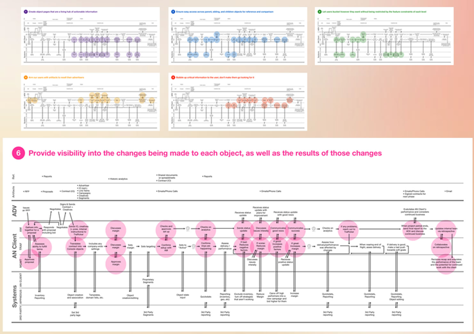
“Use the word strategy,” recommended Ashley. In the beginning, she referred to her deliverables as UX concepts, but then noticed that the terms she used changed the way product team members and other stakeholders responded to them. So she transitioned from calling these artifacts UX concepts to calling them UX strategies—for example, “UX Strategies for Trading,” as shown in Figure 11. The word strategy articulates a stronger position than the word concept, and stakeholders listened to her more when she talked about strategy.
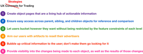
Once Ashley had gathered key information about users and their challenges and opportunities, she shared her knowledge with stakeholders. She found it helpful to share not only the insights her research produced, but also her process. “If I share the steps I take to validate my ideas, my stakeholders will also become confident supporting my ideas,” said Ashley. Thus, Ashley gained visibility and support for her ideas within AppNexus.
Ashley pointed out that, on one hand, UX people spend a lot of time trying to understand our users and get inside their heads, which is essential to create great user experiences. On the other hand, we sometimes treat our internal stakeholders like they’re a black box. “You need to understand stakeholders like you would users,” advised Ashley. Try to understand their deeper challenges, needs, wants, and the opportunities inherent in working with them. In a presentation at CHI, in 2007, I made the same point, saying “I tend to treat my internal stakeholders like users, in the sense that I work to understand their pressures and find ways to help solve their challenges, while making them want to engage more with User Experience.” Ashley suggested that we work to understand our stakeholders’ concerns and challenges and identify opportunities to help. Within a typical company, a lot of the work we do is about finding allies, understanding their pressures, helping to solve their problems, and enrolling stakeholders in our UX efforts.
As an example, when Ashley initially started at AppNexus, team members would mention in an almost off-hand way that the pages of their applications were ugly, lacked clarity, or did not seem to meet user needs. Despite their making such general comments, no one took the initiative to ask her to update the applications’ interaction design, visual design, or information architecture. Because product teams often do not ask for specific help, UX needs to take proactive steps to improve products. Therefore, Ashley decided that she would proactively address the challenges herself to improve the user experience of these products. So she created new designs and shared them with other teams internally.
“Always have a plan for implementation. A recommendation without a plan for implementation is only half of a recommendation.” declared Ashley. Nevertheless, not all of her ideas could be implemented right away. “Make your UX ideas and recommendations publicly available, even if they aren’t being listened to right now.” Initially, there was no room on the product roadmap to implement her redesigns. Ashley socialized her concepts and, ultimately, gained the support of a UI developer who implemented her ideas. Once she had the designs implemented, she was able to share them with other teams and highlight why the new designs were relevant. Because Ashley took the initiative to do a redesign, get it built, and socialize its successful execution, others in the organization recognized her team’s value.
Ashley’s initiative paid off. Later last year, she was promoted to Associate Director of UX. Ashley’s message: In organizations where User Experience doesn’t already have the support of the most senior leaders, we need to show what we can do and prove our value.
The downside of Ashley’s being promoted was that, for some reason, stakeholders in the organization assumed that, if an application got released, Ashley must have signed off on it. Unfortunately, many aspects of the applications and sites were still, in fact, being designed and coded by engineers. In some cases, the code was from several years in the past and had not benefited from user-centered design or design thinking. As a result, Ashley and her team decided to proactively identify a number of issues that needed to be fixed over time. As before, because the UX designs were not core to the product roadmap that the business had already established, there was no easy way to get her changes implemented.
But, rather than sit back and wait, Ashley again sought executive-level support. In this case, she reached out to her Senior Vice President to socialize her concepts. To get her design changes implemented, they decided to put development engineers on her team in rotation, so they could execute on UX priorities. So, even without direct funding, they were able to invest in Ashley’s design improvements because people could clearly see the value of their implementation.
So, again using the perhaps hackneyed metaphor of having a seat at the strategy table, Ashley found that “UX can bring our own seat to the table by starting to make investable recommendations.” Our executives and teams will support us if we give them something valuable and worthy of investment and help them to explain to stakeholders why our ideas are valuable, and thus, why User Experience is valuable as well.
Overall, I found the concepts that Ashley presented to be valuable and relevant—to all forms of UX design, whether service or product design. In this review, I’ve focused on her core message, which is simple, powerful, and validating to UX professionals at any level who practice UX strategy. In Figure 12, you can see Ashley’s slide deck.
UX STRAT 2014: Ashley Halsey Hemingway, “Validating UX Strategy Concepts Through Service Design” on SlideShare
Lessons from UX STRAT 2013: Applied to the Real World
Reviewer: Pabini Gabriel-Petit
Presenter: Krispian Emert
For both me and Jim, one of the highlights of UX STRAT 2014 was becoming friends with Krispian Emert, a Usability and IA Specialist at Microsoft, who is shown in Figure 13. Krispian described the challenges of her work, saying “Getting your company to think more strategically is difficult. If you were hired for tactical work, you’re not thought of as a strategic thinker.” The first part of her presentation was a recap of the valuable lessons that she learned at UX STRAT 2013, including thoughts from Nathan Shedroff, Aarron Walter, Leah Buley, Lis Hubert and Paul McAleer, and Dan Klyn, and deriving much inspiration from Tim Loo, whose workshop, “Redesigning Business Culture and Thinking Around the Customer,” she attended. To learn about the insights they shared during UX STRAT 2013, you can refer to my reviews of Day 1 and Day 2 of the conference.

Krispian also presented a case study, describing how she was able to put her learnings from UX STRAT 2013 into practice in her work: “I shared my learnings. Stakeholders took notice and asked me to join a multichannel project. I got a seat at the table! To help the organization to understand the current state, I did research as a UX team of one. I translated my research into models. To make the results fun, we did customer journey mapping of the painpoints and created storyboards, which went over well. Experience principles kept everybody on track. We created a customer-centered strategy. How do we know we’re on the right track? We measure what’s meaningful for the business and customers, using performance continuums. Task completion is where we’re going to put our efforts. I had some big wins. I got involved early, and my research helped counteract some false assumptions.” Figure 14 shows Krispian’s slide deck.
UX STRAT 2014: Krispian Emert, “Lessons from UX STRAT 2013: Applied to the Real World” on SlideShare
How to Avoid Losing Design Strategy to Business Strategists
Reviewer: Jim Nieters
Presenter: Brian Gillespie
Brian Gillespie, who is shown in Figure 15, spoke about a topic that is important to UX professionals: We, as a design community, expect that design should play a role in business strategy—and not just in “a tactical, ad hoc fashion … later in the process of bringing a product to market … just to add aesthetics and make something look good.” However, with other disciplines’ adopting design thinking and adjacent disciplines such as Customer Experience gaining so much visibility, Brian posed this question: “Will designers lose design strategy to business strategists?”
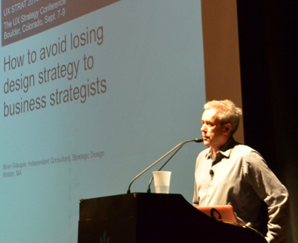
In his presentation, Brian defined strategic design and presented three methods that enable UX leaders and other UX professionals to demonstrate their strategic business value:
- competitor customer experience audit
- strategy visualizations
- service blueprint
Honestly though, Brian’s talk covered so much content and so many details that it was difficult to follow. While I took away the high-level concepts, I found myself a bit lost in overwhelming detail. However, as I now look back at those details with more time to digest them, they provide a great deal of insight into how Brian delivers strategic business value.
What Is Strategic Design?
Brian defined strategic design as follows:
- “the use of design processes to foster innovation and grow business
- “an integrated and holistic approach to the design of how a company does business
- through customer-facing touchpoints
- driven by strategic business intelligence
- supporting diverse strategic goals
Brian then talked a bit about why strategic design matters, quoting Thomas Watson, CEO of IBM, who said, “Good design is good business.”
Strategic Design Methods
Brian presented three methods that show how UX professionals can help drive business strategy, and he demonstrated the value of these methods through case studies.
Case 1: Competitor Customer Experience Audit
In this case study, Brian engaged in a Competitor Customer Experience Audit for BrownCo / JPMorgan Investments to determine how they could differentiate from all of their competitors and especially the main one. “We wanted to find that competitor whitespace,” said Brian. He showed how this method helped them to define strategy, prioritize a corporate roadmap, and drive innovation. From a design strategy perspective, it helped them to focus design and create and communicate design principles, and it resulted in a comprehensive design brief. The approach they took to this audit was to critique the customer experience of leading competitors. Brian’s method included the five steps shown in Figure 16:
- Determine key competitor sites for review.
- Develop an active-trader persona.
- Model a customer experience lifecycle.
- Simulate and rate the experience of active traders.
- Identify strengths, weaknesses, and opportunities.
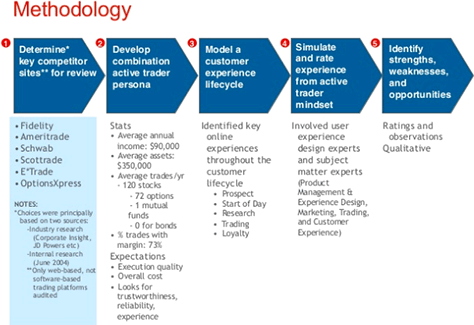
The key competitors that Brian chose included the following:
- Fidelity
- Ameritrade
- Schwab
- Scottrade
- E*Trade
- OptionsXpress
Brian based these choices principally on information from two sources:
- industry research
- internal research
To define the active-trader persona, they identified key statistics such as average annual income, average assets, number of trades per year, and average number of trades on margin. They also evaluated customer expectations such as execution quality, overall cost, trustworthiness, reliability, and experience.
In modeling the customer experience lifecycle, they identified key online experiences throughout the customer lifecycle, which included the following:
- Prospect
- Start of Day
- Research
- Trading
- Loyalty
In rating the experience, they involved both UX experts and subject-matter experts such as Marketing, Trading, and Customer Experience. These teams worked together collaboratively to rate the experience at each point in the customer lifecycle. Finally, they collaboratively identified strengths, weaknesses, and opportunities.
During the audit process, they created three categories of artifacts:
- preparation artifacts such as:
- instructions and guidelines
- a list of key competitors to audit
- definitions of customer segments, each of which they had articulated as a single primary persona or set of personas
- customer experience lifecycle
- key tasks and task flows
- task heuristics, including best practices, best of breed, industry rated
- scripts
- execution artifacts such as:
- scores and scorecards
- evaluations
- screen captures
- raw notes
- analysis artifacts such as:
- strengths, weaknesses, and opportunities analysis
- overall opportunities—competitive white space
- results compilation and presentation
Brian then talked in greater detail about a few of these artifacts and the results he derived from them. Let’s take a look at a few of them.
Preparation Artifacts
As part of their preparation, Brian and his team created a list of tasks they wanted to evaluate, as shown in Figure 17.
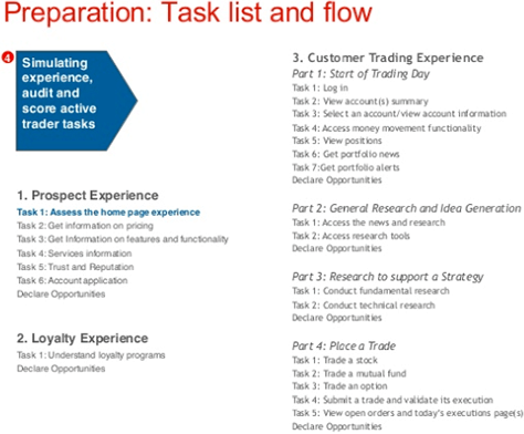
The team also identified a set of heuristics for the home page, against which they could evaluate specific attributes of the home page. Some of these attributes include the following:
- Does the home page speak principally to active traders?
- Is the brand name strongly associated with active trading? For example, through its tagline or leading line of business?
- Is there a clear call to action to learn about your needs?
- Does the navigation support the persona, or user, needs?
- Does the home page give you a clear sense of the overall content of the site?
- Does the content appear to focus on active traders?
- Is brokerage the principal line of business?
- What other lines of business are evident?
They evaluated the home page for each of these characteristics and used a scorecard to rank them in priority, on a 1 to 5 Likert scale, as shown in Figure 18. Then they identified strengths or opportunities and weaknesses for each activity. They also conducted an analysis on pricing, features and functionality, services, trust and reputation, and the account application, and made general observations.
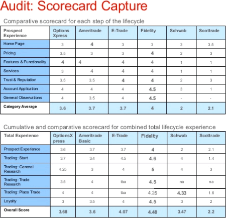
Based on the audit scorecard, the team could see which companies performed better on each step in the lifecycle, as well as delivered a better total lifecycle experience. Based on this scorecard, they also identified the strengths, weaknesses, and opportunities for each company, as shown in Figure 19.
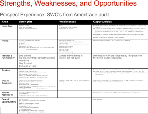
With such a comprehensive audit, the team was able to present clear strengths, weaknesses, and opportunities for improving the user and customer experience across different points in the customer lifecycle. This method helped them to define strategy, prioritize a corporate roadmap, drive innovation, focus design, and create and communicate design principles. Plus, it enabled them to create a comprehensive design brief.
Case 2: Strategy Visualization
Brian pointed out that “a strategy visualization is a visual and verbal story that outlines the relationship between the foundational elements of strategy and how they drive the rationale for design.” Again using BrownCo / JP Morgan Investments as an example, they looked at corporate strategy, customer segmentation and personification, strategic drivers, product definition, and design principles, as shown in Figure 20.
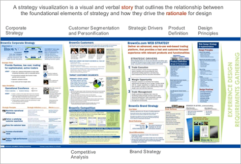
Brian’s approach was one of curation. He collected assets and made sure that he provided the right balance of visual and verbal information. His goal was communication. Through this approach, he helped instill belief in his team’s rationale for design and trust in the process, fostered objective decision making, and socialized their strategy.
Case 3: Service Blueprint
Finally, Brian conveyed that service blueprints are a type of artifact that can bring perspective and rationale to leaders in an organization. Although I must confess that, by this point, I had a hard time taking in any more information.
Conclusion
In essence, I find myself agreeing with Brian that, if we, as UX professionals, just do what leaders ask us to do tactically, which is often to “make user interfaces look pretty,” we will absolutely lose strategy to business people who usurp our message and methods. To become or remain relevant, we need to employ methods and deliver artifacts that speak the language of business and help senior business leaders to understand, in their terms, how to improve the total user experience. When we can show how products stack up against the competition and leverage cross-functional teams of stakeholders to jointly make recommendations, UX gets its seat at the strategy table.
During his talk, Brian showed us many different types of design strategy deliverables. Check out the deliverables in Brian’s presentation, shown in Figure 21. You may find a deliverable that would be useful in your design strategy practice.
UX STRAT 2014: Brian Gillespie, “How to Avoid Losing Design Strategy to Business Strategists” on SlideShare
UX as a Core Company Strategy
Reviewer: Pabini Gabriel-Petit
Presenter: Martin Granström
Martin Granström, Head of UX for Nook Media and shown in Figure 22, spoke about establishing User Experience as a core company strategy. Martin told us that, to accomplish this goal, it is necessary to
- “Establish a UX mindset.
- “Start working with UX planning.
- “Provide UX direction.
- “Identify experience domains.
- “Create experience teams.
- “Create experience plans.
- “Execute on the plan.”
Design Strategy
Martin established a UX framework at Nook. Seven steps make up the “UX lifecycle:
- Awareness—Aware of my needs, product awareness, desire to act
- Consideration—Identify candidates, compare, pick candidates
- Purchase—Shop atmosphere, information at shop, point of purchase
- First hour—Setup, explore, move on
- First week—Usability, everyday usage, defend purchase
- First month—Done learning, natural part of me, first bill—worth it?
- Years go by—Quality, decay effect, customer service”
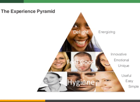
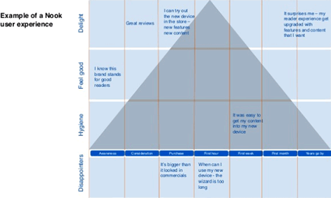
Martin explained his experience pyramid to us, which progresses from hygiene to feels good to delight. “When you design experiences, … an easy, usable, and simple product needs to be in place first.” That’s at the hygiene level in the experience pyramid. Figure 23 shows his model for an experience pyramid; Figure 24, an example of an experience pyramid that Martin’s team created for a Nook user experience.
For Nook, their UX direction considered the following three stages of the user experience:
- discover
- consume
- organize
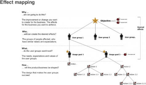
Next, Martin spoke about effect mapping: “It’s about business goals; stuff we measure success on; points of experience, features. You have to prioritize for desired effects and objectives that you’re after.” Figure 25 shows an effect map. In discussing UX intents, Martin showed examples of experience goals and experience domains.
Setting Up the Experience Team at Nook
Martin described how he set up his Experience Team, which comprises the following key roles:
- UX Planner / Product Manager
- Lead Interaction Designer
- Lead Visual Designer
- UX Researcher
- Lead Software Engineer
“There should always be a little bit of overlap between the roles,” advised Martin. Key team members go through weeking experience reviews, during which they cover the following:
- experience plan
- key experiences
- flows and visual design
- software status
- release plan
The purpose of the experience reviews is to get approval for the experience plan and design solutions, and update action items. “Experience reviews can be very formalized, providing all these documents, or on a whiteboard,” said Martin. “You have to have agreement on the design you’re going to produce. Documentation really helps. Everybody has the same expectations.”
Experience Plans
Experience plans describe the vision, problem definition, investment objective—“Why is this worth spending money on?”—addressable market, industry trends, competitors—“What do they do that is good; that delights?”—market feedback, usage feedback, business opportunities for both the product and the company, experience goals that are “tied to business goals” and help keep you focused and on track, and experience evolution plans, which show what you’re working on.
UX Prioritization
“We were working on so many different projects at the same time—so many features. We needed to come up with a way to talk about features—a ranking system.” They came up with a prioritization grid, with Experience and Frequency of Use dimensions. They considered new features by placing them on this grid—for example, “something people ask for a lot and will use.”
Final Words
Should UX STRAT focus on UX strategy or design strategy? In my view, this conference should be all about UX strategy. As a community, UX professionals face such profound challenges, and UX STRAT is where we come to find answers. This was one of the least pithy talks of the conference and focused more on design strategy than UX strategy. You can check out Martin’s slide deck in Figure 26.
UX STRAT 2014: Martin Granström, “UX as a Core Company Strategy” on SlideShare
Putting UX and Strategy at the Heart of the Product Team
Reviewer: Jim Nieters
Presenter: Todd Wilkens
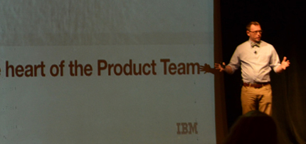
Todd Wilkens’ talk inspired me more than any other presentation at UXSTRAT 2014. Todd, who is shown in Figure 27, talked about how IBM is transforming itself from “stodgy, old Big Blue” to a company that differentiates on the user experience. Since attending UX STRAT, I have heard Pierre-Henri Clouin, Chief UX Strategist for IBM Design, and others from IBM Design speak, and I have been equally impressed.
The main thing that impressed me—and so many others in the audience—is the scale at which IBM is transforming User Experience. IBM’s Senior VP of Design, Phil Gilbert, reports to the CEO, Ginni Rometty, and they intend to hire 1,000 new designers by 2017. At UX STRAT, many presenters talked about how they are working hard to “get a seat at the strategy table”—whether in the executive boardroom or at another table at which important business decisions get made. Hearing about the extent of IBM’s transformation deeply inspired me—and probably everyone else in the audience. Several people expressed interest in working at IBM after Todd’s presentation.
Killing UX Strategy to Save UX and Strategy
Todd started by posing IBM’s challenge: “How do we create a sustainable culture of experience-focused product development that delivers great product and solution outcomes at IBM’s scale?” It’s important to recognize that IBM has over 400,000 employees, and sustaining a design-centric culture at that scale requires giving up some ownership. “Everything we do at IBM Design requires equal parts: Audacity + Humility,” said Todd. Even though they intend to hire 1,000 designers, how can they scale if they have 3,000 product teams? How can they deliver a delightful experience for each of their products? To address this challenge, Todd highlighted four “core beliefs” that drive their approach to UX strategy at IBM:
- “Experience-focused decision making and planning is the key to delivering real value to market.”
- “Creating great experiences requires a strong design competency.”
- “Whole organizations, not just designers, deliver great experiences to market.”
- “Agile/Lean/DevOps is also key because of the need for speed, flexibility, and quality.”
Delivering Market Value Through Experience-Focused Decision Making
In talking about IBM’s core belief that experience-focused decision making and planning is the key to delivering real value to the marketplace, Todd presented two corollaries:
- Corollary 1—“There is no such thing as enterprise software anymore. There is just good software and bad software.”
- Corollary 2—“Focus on good experience and design needs to be in the DNA of your company culture.”
Specific to Corollary 2, IBM actually has a great design history. Back in 1973, then CEO Thomas Watson, Jr., said “Good design is good business.” Just recently, Ginni Rometty said, “I believe, if I could be so bold, that the work done here will change the world. This is a recommitment to a heritage of innovation that has transcended IBM.”
Creating Great Experiences Requires a Strong Design Competency
Consistent with IBM’s core belief in a strong design competency, they’ve recently recruited hundreds of talented designers—over 200 between January 2013 and October 2014. In fact, more than 60 new designers started on just one day, July 8, 2013. As I mentioned earlier, IBM’s goal is to hire 1,000 designers in the next two years. That’s about a 300% increase in UX staffing.
Delivering Great Experiences Takes an Entire Organization
There are two corollaries to IBM’s core belief that whole organizations, not just designers, deliver great experiences to market:
- Corollary 1—“There is no such thing as UX Strategy or Design Strategy. There is only Product Strategy.”
- Corollary 2—“Product Strategy is driven by Product Management, but only works when UX is in the hearts, minds, and hands of everyone on the team.”
The awesome thing about this Todd told us: “IBM Design is now responsible for the product management practice for IBM as a whole.” But Todd pointed out that there’s more to this than simply teaching Product Managers design thinking. They need “Design Thinking++.” “Design thinking is a way of solving problems that is especially helpful for creating product and service experiences. But it isn’t necessarily an approach for delivering products to market.” “ IBM Design Thinking [is] a framework for whole teams to deliver great experiences to market.”
IBM Design Thinking Model
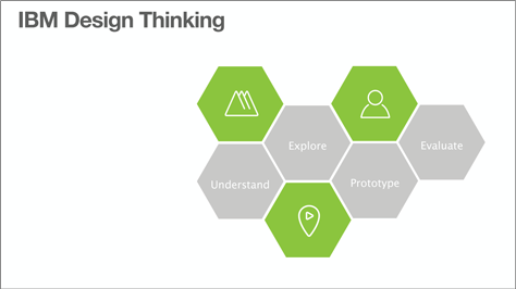
As shown in Figure 1, IBM Design Thinking comprises four steps, plus three practices that help them to execute those steps effectively. The four steps are:
- Understand
- Explore
- Prototype
- Evaluate
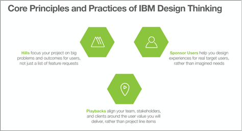
As shown in Figure 2, the IBM Design Thinking model includes three core principles and practices that differentiate their design and development competency from those of other companies in their industry—who should take notice of these practices:
- hills—This practice focuses projects “on big problems and outcomes for users, not just a list of feature requests.” Hills represent a “commander’s intent”—a framework that gives the troops “freedom to act.” Thus, this approach is strategic rather than tactical and frames planning periods for releases around “user-centric market outcomes.” For example, you would not say, “Deliver a custom wiki community template to allow agile teams to collaborate on client projects,” because this would prescribe a specific feature. Rather, you would define intent—a hill that describes what the user needs—in this case, “A GMU-based sales leader can assemble an agile response team from across IBM in 24 hours without management involvement. Deliver by November, 2014.” This intent might result in a wiki, but framing it in this way lets the team decide how to best solve the customer’s problem. “Hills fill the gap between a vision statement and a backlog.”
- sponsor users—This practice helps teams to “design experiences for real target users,” rather than trying to satisfy the imagined needs of abstract personas. Sponsor users are “a set of real users recruited to join the product team for a period and do participatory design.”
- playbacks—This practice aligns teams, stakeholders, and clients around the user value they want to deliver as a team rather than project line items. In a playback, the team plays back “the user experience for a defined scenario” to stakeholders to foster collaboration, encourage feedback, and achieve alignment. “All conversation and alignment is around the user value that the team will deliver.” IBM has “a culture of showing versus telling,” during playbacks. To leverage visual communication, they might create pictures, but more often they prefer to create prototypes. Todd suggested that, while a picture may be worth a thousand words, “a prototype is worth a thousand meetings” to discuss and debate a concept! “The greatest value of a prototype is often how it tells a story of user value.”
Holding Designcamps Helps Organizations to Deliver Great Experiences
Acknowledging the idea that a design team alone could never scale to produce great experiences across a company the size of IBM, IBM Design created and deliver what they call Designcamps to educate and activate teams by teaching them how to deliver great experiences together. The goal for Designcamps: “accelerating projects through experiential, multidisciplinary learning and IBM Design mentoring.”
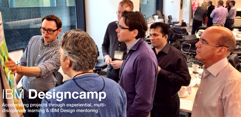
IBM has, at this point, held over 100 Designcamps for product teams, product managers, IBM executives, new-hires, and more.
Agile/Lean/DevOps Promotes Speed, Flexibility, and Quality
“IBM Design Thinking is a framework for collaboration that help us create innovative experiences with real [user outcomes in mind]. DevOps is a framework for collaboration that delivers experiences to market, evolving them quickly and responsively. IBM Design Thinking + DevOps makes a truly modern, iterative approach to creating, delivering, and evolving quality experiences….” IBM’s development model focuses on three shared values:
- market outcomes for users
- continuous learning
- radical collaboration
As shown in Figure 4, “IBM teams take shared ownership of user outcomes.” Everybody on a development team participates and delivers value.
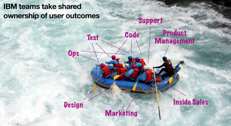
IBM teams then focus on evaluating their concepts and iterating them rapidly. They evaluate their priorities, hills, and hypotheses and consider their implications.
What Is the Outcome?
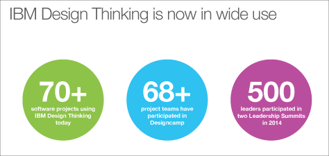
As Figure 5 shows, the practice of IBM Design Thinking is now very prevalent within IBM.
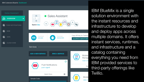
Todd shared some examples of successes that have resulted from IBM Design’s transformation, including IBM Mail Next and IBM BlueMix, which is shown in Figure 6.
I found Todd’s presentation deeply inspiring. It showed that it is possible to transform a long-established company—even the largest company—into a company that differentiates on experience design. I, for one, will continue to keep IBM on my list of companies to watch.
UX STRAT 2014: Todd Wilkens, “Putting UX and Strategy at the Heart of the Product Team” on SlideShare
Design Your Strategy
Reviewer: Pabini Gabriel-Petit
Presenter: Matthew Holloway
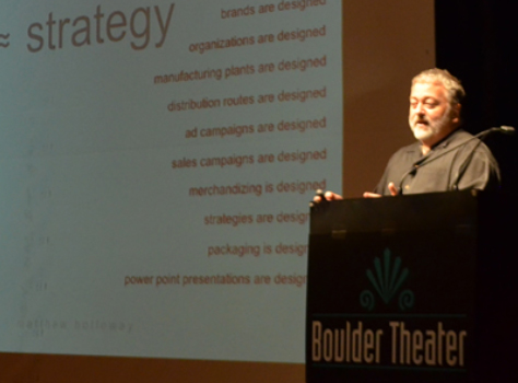
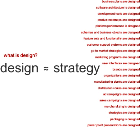
Matthew Holloway, shown in Figure 35, and I were colleagues back in the early ’90s, working on the Human Interface team within Apple Computer’s Enterprise Systems Division, so I had been looking forward to seeing him again. Matthew gave an excellent keynote, which he began by making the point that design is approximately equal to strategy, and we can design strategy—as well as a host of other things that deliver business value, including software architecture, development tools, feature sets and functionality, marketing programs, business plans, product roadmaps, user interfaces, brands, and organizations, as shown in Figure 36.
When Design Is Not Equal to Strategy
“What is design?” As shown in Figure 37, important factors in design include opportunity, synthesis, simplicity, innovation, sustainable advantage, and facilitation. Design makes things happen and has the potential to solve challenges, gain credibility, challenge assumptions, innovate, and create value. Building a design competency requires design leaders, resources with skills in the craft of design, establishing a track record for predictable results, and building a design portfolio. Designers are detail focused, creative—maybe even obsessive.
When design is not equal to strategy: “A lot of people see design as just the aesthetics, deliverables, artifacts, guidelines, specs, and mockups that embody the visual and the presentation.” Others focus on designing for usability.
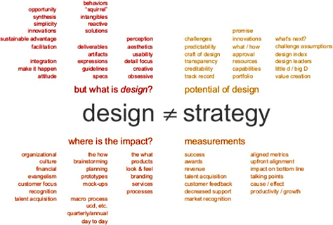
Great design can impact organizational culture, financial outcomes, the evangelism of a customer focus, recognition in the marketplace, and talent acquistion. “We don’t always talk about what’s behind design. Design as a philosophy can have really big impact,” remarked Matthew. Design has impact on products, look and feel, branding, services, and processes—through brainstorming, planning, prototyping, and creating mockups, as well as the user-centered design process.
What are the success metrics for design? “Who cares about design awards? They’re not a metric for how well designed a product is,” stated Matthew. To get “up-front alignment” on what success means, you need to ask, “How is success going to look for what I’m designing.” “You want to have an impact on the key metrics that the CEO and board look at,” advised Matthew, including metrics such as revenue, impact on the bottom line, productivity and growth, customer feedback, decreases in the need for support, market recognition, and talent acquisition.
When Design Is Less Than or Equal to Strategy
There are many challenges, as shown in Figure 38—including frameworks, market forces, business models, the value chain, establishing a design language, customer desires, technical viability, design versus design, product versus procuct, logic or creativity, market and resources, evolution or revolution, actual or potential value, productivity and growth, context, compliance or choice, control or chaos, global or local.
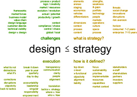
“What is strategy?” asked Matthew. “Taking a step back and looking at corporate strategy, it’s the vehicle—how you’re going to get to the arena. Strategy looks across everything in an organization—which lever gets pulled forward or pushed back; who gets more resources or less.” Thus, strategy considers economics, differentiators, context, process, content; strengths, weakness, and gaps; the product portfolio, technology, people, markets, operation, culture, space, opportunities and threats, social change, innovations, market disruptions, and more. Strategy looks at the business horizon—for consumer products, one to two years; for enterprise products, seven to ten years.
“Strategy is going to be defined from the top down, at the C-level, and cross-functionally,” acknowledged Matthew. User Experience cannot succeed, “if it doesn’t align with business strategy.” Shareholders, partners, investors, and suppliers assess a company’s strategy and priorities. Execution is tactical.
“Strategy is all about alignment—syndicating ideas throughout an organization,” stated Matthew. “Strategy is the closest thing to religion that a corporation has. It’s faith based till it’s over—and it’s never over. Strategy provides a comprehensive view of the organization. Designers need to look at strategy holistically. Do you have the credibility to participate in that discussion? As challenging as it is to see the holistic picture of all these elements as a designer, it’s even harder to speak the language.”
When an organization rolls out its strategy—“even though it’s the dumbest stuff and the designers may not have participated in the decisions, the designers are still going to do it,” said Matthew. One of the challenges is that “the design piece around strategy sometimes comes very late in the process—that is, late in terms of early strategic definition.” Most businesses have the perception that strategy is much bigger than design. The press, on the other hand, recognize that “design a key differentiator.”
“Are designers up to sitting at the table?” asked Matthew. “I love the table metaphor. You can bring your own chair to the table, but there’s still a bouncer who can kick UX folks out of the room or move them over to the little kids’ table.”
With Design Plus Strategy
In describing how organizations can combine design and strategy, as shown in Figure 39, Matthew leveraged his experience when he was a VP at SAP, leading the Design Services Team, where he worked under Hasso Plattner, CEO and Co-Founder of SAP. “The design team worked with business strategy to come up with a strategy,” said Matthew. As for all enterprise companies, “the challenge, historically, is that the person who buys the software doesn’t use the software.”
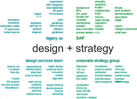
Matthew related this story to us: “Hasso got the design bug. … We had lost our customer focus, and he wanted to bring it back. So Hasso tried to buy IDEO.” When that failed, “he decided to create his own IDEO, the Design Services Team.” With Hasso’s sponsorship, Matthew built up the team from 5 to 35 people in 8 months and created 180 products in 3 years. He also set up the Design Thinking training program and trained hundreds of product managers, engineers, and executives in “the full design thinking process. At first, the executives were skeptical about this. The Corporate Strategy group … focused on KPIs, collecting [and analyzing] data, and … making sure people were accountable for strategy.”
The Design Services Team asked customers to sit on product teams and “help design products that met user needs.” The goal was to cross-pollinate the legacy UX team, which had 300 designers around the world, and take their user experiences to the next level. However, “the relationship between the two teams was not constructive. The leader of the UX team thought the Design Services Team should report to him, not Hasso. The UX team was in charge of guidelines and icons; the Design Services Team was in charge of processes, tools, services—bigger ideas. The UX team’s performance was judged by the number of screens they designed.” Hasso wanted to ensure that the legacy UX team and the Design Services Team would stay separate.
When Design Equals Strategy
Continuing his SAP story to show what happens when design equals strategy, as shown in Figure 40, Matthew told us about the Design Services Team’s role in organizational transformation, redesigning human capital management, and setting the business strategy for on-demand software and Torrent: “The Design Services Team started getting more traction.” Their first project was an organizational transformation. “The culture at SAP would not only eat strategy for dinner, it would eat it as a snack. Many, even most, members of the SAP organization focus on business goals and outcomes, so design has no meaning to them.” “What Hasso … wanted design to do was create culture change. … (Hasso invented enterprise software; he doesn’t think anything is broken.)”
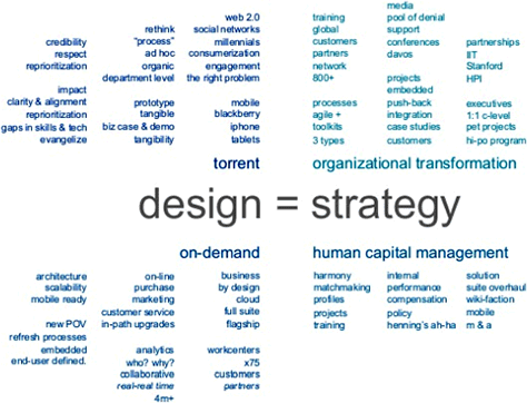
“Our organizational transformation plan [involved] changing performance goals and tools. We got a lot of traction with … human capital management tools for HR. We redesigned our in-house tools for performance management. The tools didn’t matter. It was the policies that mattered. We got leaders talking to one another about compensation, performance, and assessment. We introduced the perspective that the goal of performance management is to help grow employees. We reintroduced the concept of a wiki. Our team of 35 UX people and 800 developers was able to change an entire suite of tools around new business processes. You were supposed to redesign a tool, and you redesigned policy? Yep.
“If you can design a policy, you can design everything. So we started redesigning everything. We rolled out an internal social networking tool, Harmony. We redefined our project management tools, HCM suite. Design could have an impact on the organization, not just the software.” The shift to on-demand software happened, so “we rolled out upgrades in the cloud. We looked at everything from architecture to the backend to analytics. We redesigned work centers [that] were losing $400 million a year just on contractual relationships. We even redesigned the contract. Why are you called a design team? That’s not a big enough term for what you’re doing. This helped build credibility for design being more than just design.
Next came Torrent. “We designed the business strategy for SAP. Web 2.0 was a hot topic. Mobile was taking off. Hasso did not want to miss this revolution, so we did some really interesting workshops: How much is it going to cost us to move to Web 2.0. We used the design thinking framework. We built prototypes of what SAP’s strategies could be for various market-based scenarios. We showed what would happen given different factors such as social and mobile.
We could change a prototype while we were showing it to eStaff and execs. These were new concepts for a lot of these guys. They didn’t know social networking. We presented to the board. [Some] felt we hadn’t gone far enough. Some thought we were crazy.
“We used PowerPoint as the backbone for our prototypes. We videotaped presentations. The company shifted its product focus. And the role of design had a huge impact on the company because we designed the strategy to enable them to do that. The company embraced … design thinking at a more strategic level.”
Design Times Strategy
Nearing the end of his presentation, Matthew told us: “You can initiate these kinds of changes. You can have bottom-up momentum. How can you contribute? Make it better? Design the role you want design to have. Designers know how to design. Design the role you want to have in your organization. Design how you’d achieve that role,” as shown in Figure 41.
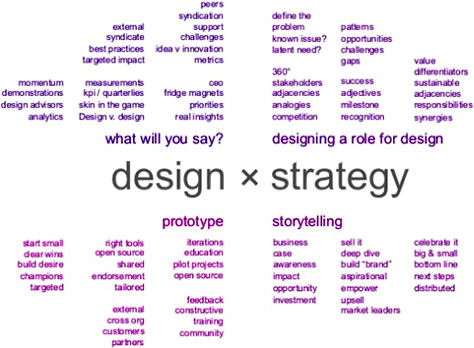
Yes, the CEOs at Procter & Gamble, IBM, and SAP started their design services organizations, but there are opportunities for designers to invite themselves to meetings and sit at the table. Matthew told us his own story: “I became a VP because I got on an airplane with my team. We invited ourselves to a meeting and sat down at the table. We just acted like we belonged there. You have to design the role you want and make that happen. You become the prototype. Be audacious. Use charm and guile. Design yourself.”
Use storytelling to make a business case for and raise awareness of the impact design can have—the opportunity design presents and the investment it will take to realize that opportunity. “Sell it, celebrate it,” advised Matthew. “This is one of the most powerful things that design can offer.”
Q&A
Paul Bryan opened the Q&A by asking Matthew a question about how to have impact.
Matthew: “Build rapport and credibility with executives. Really learn the business. Who’s who? Who’s trending up or down? The new / old school. It’s really about the relationships you have—who trusts you and wants to hear your opinion. It’s critical to build those relationships. Once you have that momentum, hold on, because you may have a lot more on your plate than you thought.”
Q: “What will design look like in the next five to ten years?”
Matthew: “Design is at a crossroads. We spend a lot of time having conversations about design versus design thinking. With all of our internal dialogue, from the outside, it doesn’t look like we know what we’re talking about. We keep wanting to tinker with design and make it better. We have to stop doing that; stop redefining what User Experience is; stop publishing comments suggesting that we don’t know what User Experience is or that it’s at a nascent stage. We just have to move forward. As a community, we have to move it forward. We have to stand up and say, ‘This is what UX is.’
“Design has to take the approach that we are part of a business. In business, I can make a decision in 45 seconds if you give me the data. We work in industries; they’re businesses. We can change culture, but first we have to be on the inside.”
Conclusion
While Matthew’s subject matter was deeply reflective, he injected humor throughout his talk. It’s part of who he is and took me back to earlier times when I’d enjoyed a collegial relationship with him. His presentation represented the height of minimalism and simplicity. However, Matthew defied the current trend in presentations of minimizing the amount of text on slides and instead created slides that resembled tag clouds, comprising nothing but text—though they were aesthetically pleasing groupings of text. You can see his slide deck in Figure 42.
UX STRAT 2014: Matthew Holloway, “Design Your Strategy” on SlideShare
Big Love: The Case for Conscious Coupling in UX Strategy
Reviewers: Jim Nieters and Pabini Gabriel-Petit
Presenter: Ronnie Battista
Ronnie Battista, who is shown in Figure 43, gave his talk just before the Happy Hour that closed Day 1 of UX STRAT 2014. This turned out to be the ideal slot for Ronnie’s talk because his presentation put the entire audience in a jovial and playful mood as we moved into our social time. This talk came with a disclaimer: “This is the only presentation I’ve given that comes with a warning. Some people don’t get my style,” cautioned Ronnie. While Ronnie had deliberately decided to deliver a humorous and satirical presentation, many of his points also hit home from a strategic UX perspective.
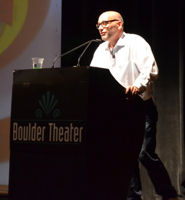
Perhaps some of Ronnie’s humor may have been shocking to certain people. However, while a few attendees with whom Jim spoke suggested that Ronnie’s talk was too focused on fun, so had presented less substantive UX strategy content, we disagree. Ronnie delivered some of the most salient points we heard at the conference, and after the passive of many months, we still remember Ronnie’s key messages. We cannot say the same about some of the other presentations. Figure 44 shows an example of a slide that was just for fun.
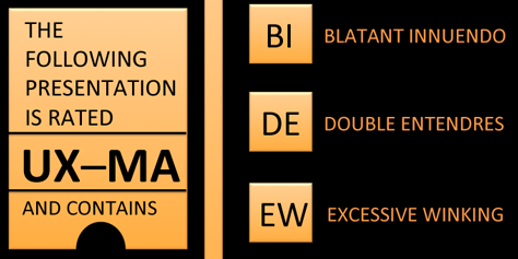
Ronnie borrowed the title for his talk from a news article that had been published just a few weeks before UX STRAT, which was about how Gwynneth Paltrow had decided that she and her husband, Chris Martin, would not divorce one another, but would instead rather “consciously couple.”
Getting Rid of Our Excess Baggage
One example of Ronnie’s making a serious point disguised with humor was his sharing an image, shown in Figure 45, that while perhaps a bit over the top, still conveyed his message clearly. Ronnie talked about how UX professionals carry a lot of emotional baggage, hold a good deal of prejudice, and have passionate opinions about the way the world around us should be—including how other disciplines should, but do not always, react to us. This excess baggage really does not help us.

Communicating Our Value More Clearly and Consistently
“We know what we do, but a lot of people still don’t,” remarked Ronnie. We understand the value of what we do, but many of the people with whom we work have an imperfect understanding of what User Experience even does, let alone what our value is. As a professional community, we need to take responsibility for the fact that we communicate our value inadequately and inconsistently—emphasizing different points of value and presenting our worth through different filters. It is our job to communicate the value that we can deliver clearly and consistently.
Back in around 2000, the Chief Marketing Officer role arose, because Marketing organizations quantified and clarified exactly what they do—and exactly what their value is. Yes, we are seeing more Chief Design Officers and Chief Experience Officers, but not nearly enough—and that is largely because we do not use a consistent vocabulary in describing our contributions and value.
As the slide in Figure 46 shows, we lack even a perfect definition of user experience. Ronnie stated the issue well when he said, “For us to achieve our potential, we need to reframe our a profession.” And we have to do so consistently. What are we? Are we user-centered design? Are we UX? CX? XSD? XS? If we don’t have a clear and consistent definition for what we do, nobody’s going to listen to us. As Ronnie pointed out, “We have a marketing problem.”
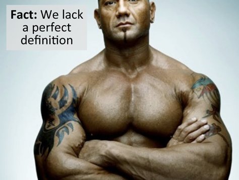
Stopping the Debate About Who Owns What
Delivering a more serious warning, Ronnie said, “We debate about who owns what—often,” as Figure 47 shows. “As an industry, we’re fragmented and siloed. We’re compromised.” This is another example of how we often get in our own way. When we debate who owns what with other functional teams, without first offering a clear definition of what we do and our value, why should they give us the responsibility and authority that we seem to think we should have?
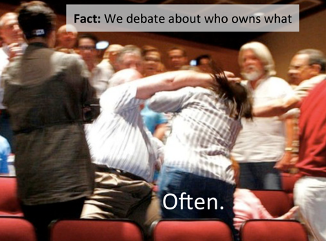
Getting a Seat at the Table
“To sit at the business table, it helps to be invited. There’s a price when you’re not invited; you’re not doing that work,” Ronnie told us.
“Names are important. … CX versus UX is the big [debate].” We must use the right words—our words matter. When we talk about ourselves as designers, leaders ask us to do UI design. When we use the term strategy, they invite us to the strategy table. Ronnie said, “If you don’t call it strategy, you’re not going to be at that table.”
Ensuring Our Survival
“Does this have to be a fight?” asked Ronnie. “Will we win? Or will we see the death of User Experience as we know it?” as Figure 48 shows. “Will UX have to give up who we think we are in order to become consistently relevant?”
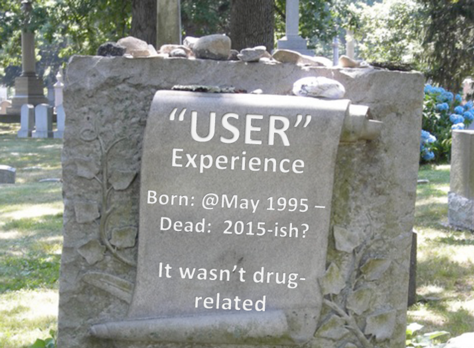
“We need business sponsors to survive,” acknowledged Ronnie.
“I’m a lover not a fighter. I think there’s a way we can come together.” To win, we need to “share the sandbox,” as Samantha Starmer says. Ronnie reassured us that “It’s not about capitulating. UX is strategy, not design.”
Converging on Experience Strategy
“UX needs to think and act big. We need to define what we’re doing. We have to deliver ourselves. We have to build the sandbox. For us to achieve our potential, we need to reframe [User Experience] as a profession. For a seat at the table, we need to be invited.”
“We’re going to have both the strategic work and the design work,” said Ronnie. If we look at the intersection of who the people are to whom we deliver value, what value we provide, and where and when we deliver value that Figure 49 shows, “the one thing that unites them is experience strategy,” said Ronnie. As Ronnie postulated, perhaps our true value exists in our ability to deliver a total experience strategy. For those of us who want to work at a strategic level, maybe we need to present ourselves, not just as UX professionals, but as Experience Strategists.
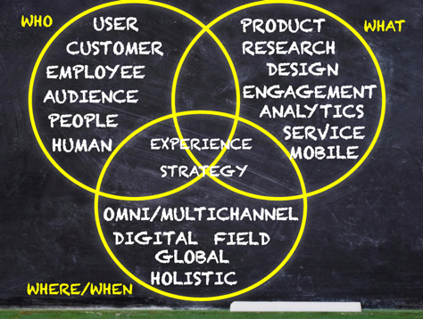
Wrapping Up
In conclusion, Ronnie said, “Business trumps all. You sit at the table if you start with business. Always bring business to the table. Marketing is your invitation. You sit at the table if business understands your value. Marketing is important. It’s not just nice to have. Let’s play nice and build our sandbox. … If anybody can do it, it’s the folks in this room. We are the best at this, and it’s time that the world knows that. We need big love. We can’t do it alone.”
Defining What We Do
The issues that Ronnie raised in his talk reminded us of Marty Cagan’s concern that we, as UX professionals, do not clearly and consistently convey our value, which he communicated in his 2007 book, Inspired, when he said:
“Many product people complain to me that their company doesn’t staff or even understand user experience design, and they know their product suffers for it. … Others tell me that their company values good user experience design, but they don’t really understand the roles or how a good design comes about. This is a very serious problem that not enough companies are aware of.
“It seems to me that the design community hasn’t been doing enough to address this lack of recognition for their importance to a product. While they do a good job of communicating among themselves…, in general, I think these guys spend a lot of time preaching to the choir. The message about the value they deliver is most needed by the teams without designers.”—Marty Cagan
Jim remembers the story of a child asking US Senator Diane Feinstein, “Do you belong to an organized political party?” to which she replied, “No, I’m a Democrat.” Open dialogue can be messy. Historically, UX professionals have continually debated matters of terminology and introduced new, progressive concepts—of course, the latter of these has had considerable upside. User Experience has been a rapidly evolving professional practice. Now, it’s time to move on from the continual debate and start creating a clear UX platform that—even though it may perhaps be simplistic—everyone can understand and align behind.
So we side with Ronnie: Until we can converge on a common vocabulary and value proposition for User Experience, we cannot expect business leaders to take us seriously and consistently employ us for the roles that we want and across the set of industries where User Experience could make the most impact. Can we please get it together?
To establish what we do in the minds of business leaders and our peers in other disciplines, we need to stop debating endlessly among ourselves; once and for all, define the terminology that we use—and this should not be about our individual branding or allowing other selfish, personal interests to intrude; and clearly communicate our value to the world.
Kudos to Ronnie
Taking Ronnie’s message seriously and answering the questions that he’s posed are key to the future of the field of User Experience. Today, many organizations are focusing not on user experience, but on customer experience. Too many people, when they think of user experience, think only of a tactical UI design team, so do not include UX professionals in strategic dialogues. That needs to change.
Ronnie’s talk engaged us immediately and powerfully, and he maintained a high level of energy throughout his presentation. At the end of his talk, with some audience members in tears of laughter, Ronnie said, “Seriously, though, I feel at home here. You guys are my tribe. I love you guys.” In saying this, Ronnie captured the sentiment of so many people at UX STRAT 2014. It’s a conference of like-minded people who are trying to solve the same big challenges in their work, meeting in a context where we can frankly discuss the challenges that we face.
Think about it: How often do we go to conferences where presenters talk endlessly about tactical issues that will never transform their organizations into being experience focused? Far too often. In contrast, at UX STRAT, we heard presentation after presentation full of stories about both the challenges and the successes that the speakers have experienced. This is exactly what User Experience, as an industry, needs.
Ronnie’s talk delivered big fun, so was the perfect lead-in to the Happy Hour, where it triggered some very interesting conversations. Figure 50 shows an abbreviated version of Ronnie’s presentation. ![]()
UX STRAT 2014: Ronnie Battista, “Big Love: The Case for Conscious Coupling in UX Strategy” on SlideShare

