Top

Conference Review: STC Technical Communication Summit, Usability Track

June 4, 2007
Organization 1 star
Content 3 stars
Presenters 3 stars
Proceedings 1 star
Venue 4 stars
Hospitality 4 stars
Community 4 stars

As a technical writer, I’ve been aware of the Society of Technical Communicators (STC) since I was in college. However, I’ve never joined the organization. This year, the STC Technical Communication Summit was held just a short drive away from me in Minneapolis, on May 12–16, 2007, and my employer paid for me to go.

The best part of my experience at the STC Summit was meeting people who, like me, are craving information on the trends of which we are such a large part—such as Web 2.0, user-centered design, and new software tools. For the most part, I got the information I craved. As a technical writer who is professionally heading deep into usability and user interface (UI) design, I actually went to the conference for the usability certificate program.

Each certificate program—there were also programs for e-learning, master writing, content management, tech comm 101, and team management—comprised a two-day weekend seminar before the conference, plus four required sessions during the conference itself.

Champion Advertisement
Continue Reading…

Conference Registration

Registering for the STC conference proved to be a very difficult experience. After my boss told me I could go to the Summit, he first tried to purchase my registration for me, using his corporate credit card. I stood behind him, and neither of us could quickly figure out the path to completing the registration. We gave up for the time being, and my boss gave me his credit card information so I could take my time registering. Unfortunately, this was just the beginning of my troubles with the STC Technical Communication Summit Web site and printed materials.

I decided to create a Google calendar for my conference schedule. At that time—around mid-March—I believe the organization and layout of the schedule for the education sessions were okay. There was nothing extremely bad or good about the conference site. However, when I returned to the conference site in April, it had been redesigned, making it almost completely unusable. Specific information about the usability track was very limited and left me with too many questions. There was no grid or calendar of any kind that concisely displayed conference events. Links did not take me where I expected them to lead me. The search feature was a farce. It was truly a frustrating experience.

The STC Web site has never been nice to look at, but the conference site added a new, lower level to the organization’s poor Web design. A poorly designed site by a respected professional organization is an embarrassment they should fix—if only to help the image problem they’ve had for years. I brought up the issue of their poor site design during my weekend seminar, and everyone who heard what I had to say about it jumped in and agreed.

To make matters worse, when I received the huge conference schedule booklet, I found it was organized so it was impossible to tell the time of any given session or activity by simply looking at its description. I had to check for time and day headings that might be two pages away and easily lost amidst the rest of the text. Again, I expected much better from a technical communications organization.

Usability Seminar

Lyle Kantrovich and Chad Curtis from Human Factors International (HFI) led the usability seminar. I had never heard of HFI before, but others in the class had. The students were a nice mix of people who were completely new to usability theory and practice, while others were more up to speed, making the seminar mostly a review for them. The seminar was an abbreviated version of one of HFI’s three-day seminars that can count toward their usability certification.

All seminars were held at the downtown Minneapolis Hilton. Classes were from 9:00 am to 4:30 pm, and STC provided a decent lunch. The HFI usability seminar—though mostly a review for me—was interesting and helpful as I transition my career path toward becoming a usability specialist. Lyle and Chad from HFI were definitely knowledgeable and well rehearsed in their presentation. Their handouts—which arrived just as class began on Saturday morning—were excellent. Each attendee received a huge binder containing every slide, plus a booklet on Web controls, and nice reference sheets for topics they covered—including screen types, accessibility, and so on—on glossy card stock. There were exercises at the end of each segment of the seminar that proved to be a good test of our knowledge and opinions.

The weird bit about the HFI presentation was the video clips they played, which seemed not originally to have been created for the seminar. Perhaps the clips were part of their new employee training, because they felt cultish. For example, the CEO of HFI, Dr. Eric Schaffer spoke slowly and calmly with a slight smirk—as if he were perhaps secretly trying to brainwash us. HFI uses a very particular methodology and lingo that today seem a couple of steps behind more progressive thinkers like Robert Hoekman and Luke Wroblewski. I could be totally wrong, but that’s how it felt to me.
Required Sessions

The four sessions that were required to complete the usability certificate were not obvious choices on the part of the organizers. Of the dozen or so sessions that included the word usability in their titles, only one was a required session for the certificate. The four required courses were

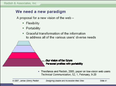
  • “Don't Leave Me Out! Designing Usable and Accessible Web Sites,” by Ginny Redish—During her talk, Ginny spoke about an ideal approach to accessibility, as shown in Figure 1.
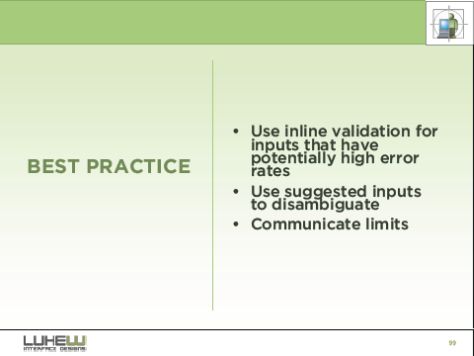
  • “Web Form Design Best Practices,” by Luke Wroblewski—He gave us many useful best practices for designing Web forms like those shown in Figure 2.
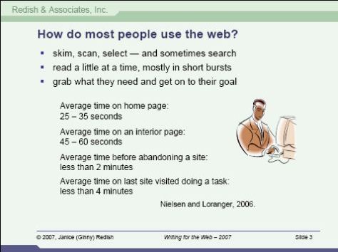
  • “Writing for the Web,” by Ginny Redish—One would think it was 1996 with a topic like “Writing for the Web.” Considering the vast majority of people in the audience were professional writers, Ginny reviewed best practices that all of us should have known in the first place. However, one slide I found interesting gave statistics on how people use the Web, as Figure 3 shows.
  • “From Graph Paper to the Internet: New Techniques for Visualizing Data,” by Charles Kostelnick—The inclusion of the session on visualizing data was a complete mystery to me—usability of technology was not what this session was about. It was about one new way of graphing data—mosaic—that was so confusing no one at the session even pretended to get it. It was purely academic and not one bit useful to people who were there to earn the usability certificate.
Figure 1—An ideal approach to accessibility from Ginny Redish
Ideal approach to accessibility
Figure 2—Luke Wroblewski’s best practices for error messages in forms
Error messages in forms
Figure 3—Ginny Redish’s statistics on how people use the Web
Statistics on how people use the Web

Of these four courses, only two were remotely useful to me—forms and accessibility—but even those were redundant to the seminar I had attended over the weekend.

The Rest of the Conference

I went to four other sessions, the first of which was Carolyn Snyder interviewing Jared Spool. As expected, this was an interesting romp through UX ideas and stories—such as “The best thing about users is that someday they will die.” Jared also briefly discussed the future of technical communication, but apparently he held his tongue, because a post to his blog later in the week revealed that he thinks the profession is dying. Looking at the comments—one is mine—this is not a popular viewpoint, for obvious reasons. The problem seems to be: If we, as UI designers, do usability testing and use bulletproof design techniques, this will keep documentation at a minimum. And this is as it should be. But technical writing has focused on the needs of users since before usability even had a professional title. Technical writers will always be needed. But I’ll forgive Jared this time, because he bought me a glass of wine at the happy hour he and Carolyn hosted on Monday evening.

The other sessions I went to mostly concerned usability testing and case studies. My favorite one of these was “Pattern Language as Knowledge Management Tool,” by Professor Michael Hughes—a UXmatters columnist. He discussed how he built an Access database with a Web interface to keep track of his usability test findings. The goal of this application was sharing corporate knowledge and making it more available and better organized. He was a terrific speaker and shared some very apt wisdom on moving corporate knowledge from the individual level to the organizational level.

Conclusion

The conference was three weeks ago and I’m still waiting for the conference proceedings CD-ROM I ordered, as well as my actual certificate. We were supposed to receive the CD-ROMs at the conference, but they weren’t ready yet. (I had to ask three different information desk people before I got that answer.) Despite this being STC’s 54th annual conference, it seemed like maybe the second or third time they’ve put this together. There was a severe lack of overall organization, and the planning of the tracks was amateurish at best. What STC has to remember is that not everyone is interested in STC as an organization, and many conference-goers are not even members. Certainly they should not cater to non-members, but the Technical Communications Summit concentrates a bit too much on the business of STC. Still, I truly enjoyed my experience at the Summit in Minneapolis, and I did come away with new vigor and knowledge about user experience as a profession. 

User Experience Designer at Digital River Inc.

Minneapolis-St. Paul, Minnesota, USA

Stacia MarlettStacia worked as a technical writer for six years in the Minneapolis-St. Paul area, in all sorts of industries, including the medical device, pharmaceutical, travel, and hospitality industries, and most recently, e-commerce. She has written everything from sales training materials to manufacturing user guides to system text. Although Stacia studied writing, technology has been her true passion for ten years. She is currently achieving her dream of leaving a mark in new technology by growing into a user interface design position at Digital River. Stacia has already successfully contributed to the redesign of a Web application and will continue working on that redesign project. She is also beginning a large project to overhaul an internal Web application, merging several individual tools into one.  Read More

Other Articles on Conference Reviews

New on UXmatters