Top

Conference Review: IA Summit 2007: Part I

April 26, 2007
Organization
Content
Presenters
Proceedings
Venue
Hospitality
Community

In 2006, I attended my first Information Architecture (IA) Summit. It was the best of the many conferences I attended that year, making this year’s conference a must-attend event. The 8th annual ASIS&T IA Summit was at the Flamingo in Las Vegas, Nevada, USA, March 22–26, 2007. The theme of the conference was Enriching Information Architecture—“examining three trends: rich information…, rich interaction…, and rich relationships…”—but the sessions I attended were more about process, methods, and strategy.

Opening Keynote: The Lost Art of Productively Losing Control
Presenter: Joshua Prince-Ramus

The Web That Wasn’t
Presenter: Alex Wright

The Brave New World: Usability Challenges of Web 2.0
Presenter: Jared Spool

WebPatterns: Design Patterns in Web Site Architecture and User Interaction
Presenter: John Allsopp

Communicating Design: An Astonishingly Close Look at IA Documentation
Presenter: Dan Brown

Where Does IA Fit in the Design Process?
Moderator: Peter Boersma
Panelists: Larisa Warnke, Peter Merholz, Livia Labate, Leisa Reichelt, and Josh Seiden

Maximum Value Information Architecture: Big IA Is the Way You Do, Not What You Do
Presenter: Austin Govella

Champion Advertisement
Continue Reading…

Since the conference organizers didn’t allow members of the press to register for pre-conference workshops in advance, I attended only the main conference. The pre-conference comprised 18 workshops, with some well-known presenters speaking on interesting topics, including:

  • Victor Lombardi’s workshop on “Introduction to Internet Business Strategy”
  • Dan Brown’s “Communicating Design: Making IA Documentation Clear and Actionable”—Dan’s workshop presentation is available on SlideShare.
  • David Malouf’s “Designing RIAs: A Workshop on Interaction Design Theory & Practice”—See Dave’s presentation SlideShare.
  • Peter Morville’s “Information Architecture 3.0”
  • a redux of last year’s workshop “Creating Conceptual Comics: Storytelling and Techniques” by Kevin Cheng, Jane Jao, and Mark Wehner—Their presentation is on SlideShare.
  • Indi Young’s “Navigation Magic: Mixing Root Tasks into a Recipe for Top-Level Application Structure”
  • Jared Spool’s “Web Design Foundations”

The remainder of this review covers the main conference.

Organization

Other than during the opening keynote and closing plenary, three scheduled sessions ran in parallel. However, there weren’t themed tracks, which made it harder to decide which sessions to attend and more likely that sessions of interest would occur at the same time. Also, without programmed tracks, it was necessary to switch rooms often, which with the spread out conference facilities at the Flamingo meant you might not get into popular sessions. On several occasions, I was unable to attend sessions I had planned to attend, because the too-small rooms were full by the time I got there. In some cases, there were two or three concurrent sessions I would have liked to attend; at other times, no sessions that were of interest to me.

There was also a parallel flex track that the organizers intended to use for “re-runs of popular presentations, birds-of-a-feather sessions, impromptu get-togethers, and other activities.” In practice, the flex track didn’t work very well. Early in the conference, the flex track sessions weren’t posted on schedules at convenient locations. The only schedule I saw was near the registration desk in the area where morning and afternoon teas were served, facing away from the area where most people gathered. However, as the conference progressed, the organizers added schedules in several other more convenient locations. Few popular presentations were repeated, and I missed the one repeated session that I would have liked to attend the first day, because I didn’t see the schedule until after it had occurred. While it was a good idea to reserve a room for BOF sessions and get-togethers, good scheduling and large enough rooms for popular sessions would have, for the most part, obviated the need for reruns.

The conference sessions started at a ridiculously early hour—8:30 am—considering that the conference was in Las Vegas, which is known first and foremost for its nightlife.

Posters were shown only during a reception held in the evening on Saturday, March 24th. Unfortunately, the reception wasn’t on the PDF schedule I’d downloaded from the IA Summit Web site and used to plan my conference in advance of the event, and the time conflicted with the UXnet dinner I’d organized. So, while I was at the reception briefly, I missed seeing the posters.

Content & Presenters: Highlights

All of the sessions I attended were worthwhile, with speakers ranging from good to great. In addition to the many speakers from the United States and Canada, speakers hailed from far-flung places around the world, including the United Kingdom, Norway, the Netherlands, Italy, South Africa, India, Australia, and Brazil. Only about a third of the speakers were women.

Day 1: Opening Keynote: The Lost Art of Productively Losing Control

Presenter: Joshua Prince-Ramus

Joshua Prince-Ramus (shown in Figure 1) is a Principal Architect at Ramus Ella Architects (REX). At the beginning of his keynote address, he quipped, “By statute, you can’t call yourself an architect without accreditation. So you’re all committing a felony.”
Figure 1—Joshua Prince-Ramus delivering the keynote address
Prince-Ramus

Prince-Ramus showed some buildings his company has recently designed and described how his team developed specific architectural solutions. An effective speaker, Prince-Ramus spoke about the “artificial schism between creation and execution,” equating creation with copulation and the nine months of gestation that follow with execution. Here are a few other highlights from his talk:

  • “Microsoft and Amazon are intent on killing the book, …but the book is technology.”
  • “‘Willful artistic vision’ is a pejorative definition of design or architecture. … Design is a specific solution to a specific set of criteria, not a willful artistic expression.”
  • “We always include the [building] owner in the design team.”
  • “With open conference rooms, amazing things came out of who fortuitously walked by the conference rooms.”

While I enjoyed Prince-Ramus’s talk, I didn’t find most of what he had to say particularly relevant to the audience.

Day 1: The Web That Wasn’t

Presenter: Alex Wright

During his interesting talk, Alex Wright canvassed the work of various forebears of the Web such as Paul Otlet, Vannevar Bush (shown in Figure 2), Douglas Engelbart, Ted Nelson, Andries van Dam, the Xerox PARC team, and the Intermedia team at Brown University. Eugene Garfield’s system of citation ranking, or link-node analysis, greatly influenced Google page ranking.
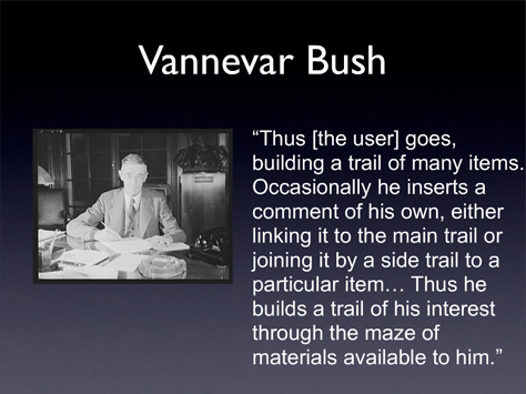
Figure 2—Vannevar Bush and the Memex
Vannevar Bush

According to Alex, “Today’s Web is hamstrung with fundamental flaws: statelessness, the lack of two-way linking, versioning, and the inherent limitations of the two-dimensional page metaphor.” Some key concepts from “the Web that wasn’t”:

  • Paul Otlet:
    • a marriage of top-down classifications and bottom-up categorizations from a social space
    • an information classification scheme that learns from users
    • different types and gradations of links that communicate something about the quality of the information at their destinations
  • Vannevar Bush:
    • “selection by association rather than indexing”—associative trails
    • two-way links
    • visible pathways
  • Douglas Engelbart:
    • integrated authoring tools for small group collaboration
    • integrated audio/video conferencing

Nothing new to me here, but a nice summary of what went before. For those not involved with hypertext in its early days, I’m sure his talk was enlightening. Alex’s presentation is available on SlideShare.

Day 1: The Brave New World: Usability Challenges of Web 2.0

Presenter: Jared Spool

This is the third variation on this evolving theme I’ve heard from Jared Spool—originally at The Web and Beyond, in Amsterdam, then at the UIE Web App Summit, in Monterey. Figure 3 shows Jared giving his excellent talk on Web 2.0 to a packed room at the IA Summit. Hes an engaging speaker, and his talks are always popular.
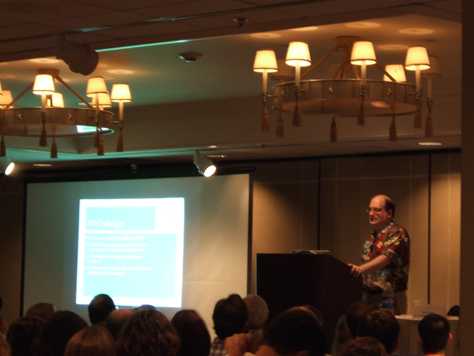
Figure 3—Jared Spool
Jared Spool

Jared spoke about how technology products evolve from their initial emphasis on technology to features to user experience. “Eventually, you get too many features. Web 2.0 is focusing on experience.” According to Jared, the core features of the Web 2.0 experience include

  • APIs (Application Programming Interfaces)—“APIs are critical.”
  • RSS feeds
  • folksonomies, or tagging
  • social networks

However, Ajax and user-generated content are emphatically not part of Web 2.0. “They’ve always been part of the Web.”

“The poster child of Web 2.0 is Flickr,” said Jared. “Once you sign up for Flickr, you go to your own home page. Personalization is a key piece of Web 2.0.”

Jared told us, “Our research has shown us the big usability issues of Web 2.0”—for example, long-tail information architecture challenges and social networking challenges. “As soon as you start to rank people, people start to game the systems.”

Day 1: Great Sessions I Missed

Day 1 was frustrating. Because of overcrowding, I was unable to get into the following sessions on Saturday:

  • Using Search Analytics to Diagnose What’s Ailing Your IA,” Lou Rosenfeld and Rich Wiggins—And I missed the rerun, because I didn’t learn until too late that there was one. Lou Rosenfeld and Rich Wiggins previewed some of the content from their forthcoming book, Search Analytics for Your Site: Conversations with Your Customers. Their handout showed examples of search data and included an extensive bibliography. The presentation is available on SlideShare.
  • The Living Design Document and ION: Documenting RIAs,” Kevin Silver and Chris Rivard—They spoke about their documentation system, which attempts to capture the operative image of a Rich Internet Application (RIA) throughout its entire lifecycle, and their Interface Object Notation (ION), which is a pseudo code language for consistently describing the functionality of page objects within RIAs. Their presentation is available on the IA Summit Blog.
  • Best Practices for Form Design,” Luke Wroblewski—I heard several people say Luke’s presentation was their favorite at the Summit. This was basically the same presentation Luke gave at the UIE Web App Summit, so I’d already heard and written a review of a longer version of it. Luke’s presentation is available on Functioning Form.

There was very positive buzz in the hallways on all of these sessions. I also heard good things about Stephen Anderson’s “The Conversation Gets Interesting: Creating the Adaptive Interface,” which I regrettably missed. That title just didn’t grab me, but later I learned he spoke about designing applications that adapt to the needs of individual users. His presentation is available on SlideShare.

I had much better luck on Day 2. There were many good choices among the sessions that day.
Day 2: WebPatterns: Design Patterns in Web Site Architecture and User Interaction

Presenter: John Allsopp

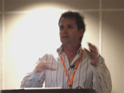
John Allsopp (shown in Figure 4) gave an impassioned talk about his WebPatterns project. Starting with current practice, he told us, “Designers are using ID and CLASS to add semantics” to common elements on Web sites, but we have no shared language. For example, common IDs include unique page elements like footer, header, logo, banner, content, main, container, and search; common classes, things like title, help, section, menu, text, copyright, and links.

Figure 4—John Allsopp
John Allsopp

John advocated for the development of a common vocabulary: “It’s important for a vocabulary to emerge out of practice. … It doesn’t work for someone to dictate vocabulary. … There are all these tremendous advantages to getting a common vocabulary. A common vocabulary will facilitate maintaining or building sites as a team.”

Descriptive terms for page elements are usually either presentational, relating to their position on a page, or role based, relating to their purpose—for example, body text versus content. “Some people name by the nature of the thing and some by the place on a page,” said John. “If you’re putting presentational terms right in your code, it may cause problems when you move something. … Developers are using the semantic elements of HTML. … If you go beyond the lore of developers who are using best practices, the commonality drops off. We’ve got this group of people who work together to get a common outcome, but we don’t have a common language.” He quoted Brad Appleton:

“Fundamental to any science or engineering discipline is a common vocabulary for expressing its concepts and a language for relating them together.”

John posed these rhetorical questions: “Who’s going to do this? Where’s it going to come from? XHTML? HTML5? The W3C? One of the great beauties of the Web is the light touch the W3C has had, by and large. Languages emerge from the bottom up; design patterns, from data, rough consensus, and working code rather than committees. I was skeptical about whether an anarchic process could result in a common vocabulary. There’s a very strong sense in the design community that we need something. There’s no Chapter I: Genesis where God’s going to name things.

“What are people actually doing? Taking this pattern language approach. … But often people are developing libraries, not patterns or languages. A language has a certain dynamic. It’s generative—small patterns build up to create larger patterns. How do we classify types of patterns? A Web page is built up of smaller parts. It’s this generative thing. Web pages are built up of smaller elements. The Web itself is hierarchical. The lower down in the tree, the simpler the constructs are.

“Page layout patterns. Page navigation patterns. Within a particular class of patterns, … a class doesn’t necessarily define what something is well. … You can classify patterns by the role they play—container, navigation, branding, user interaction. … The distinction between what something is and what something does is really important. A class describes what something is; a role, what something does.” For user agents and assistive devices such as screen readers, it’s preferable to communicate what something does. “Browsers are just printers for the screen.”

A classic three-column page layout pattern—with a container, a navigation bar, and a sidebar—separates the content from the navigation. John said, “Let’s start calling things by what they do and are. … A lot of times, people are doing the right thing. The next iteration of sites will start homing in on a common vocabulary. How can we start using the same terminology for the same things? Let’s identify things by what they are. Simply giving things names doesn’t help, because we haven’t agreed on what to call them. If we had names, it would solve so many of our problems. Patterns are about aggregating. We’ve got a small number of patterns working together to create an extremely common construct on sites. It’s time for us to become a discipline by having a common vocabulary. Information architects influence practice more than most designers. It’s not about one person saying, ‘You must do this.’ … Let’s start getting consensus. I love this idea of the wisdom of the crowd. I’ve started a wiki and blog. I would love to see a collaborative process occur. … This is about having richer semantics.”

Day 2: Communicating Design: An Astonishingly Close Look at IA Documentation

Presenter: Dan Brown

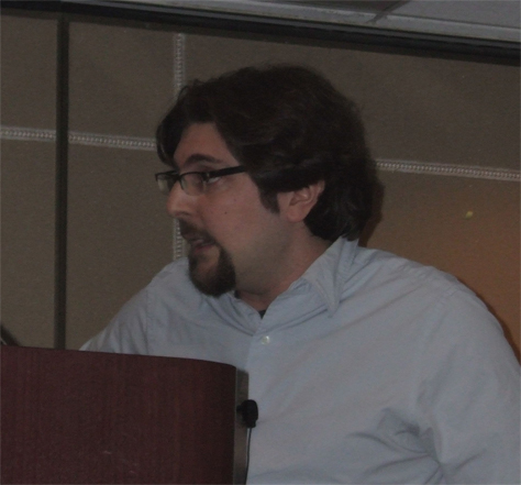
Dan Brown (shown in Figure 5) spoke about the role of information architecture documentation on a Web design project. “A document captures an idea.”

Figure 5—Dan Brown
Dan Brown

IA documents provide

  • consistency of vision—Documents help facilitate communication. This first one is most important. Some people arent involved in a project all along the way. By creating documentation artifacts, you can capture decisions.
  • accountability—Documents represent project history. Documents give a historical view of an entire project.
  • traceability—Documents show progress. Do decisions rely on private discussions? By having a set of artifacts, you document decisions.”

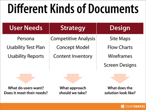
There are dozens of different kinds of documents, but “the big ten” documents fulfill various roles, as shown in Figure 6.

Figure 6—Different kinds of documents
Documents

Dan described a usability report as “a screen shot and a list of all the problems on that screen.”

Taking a closer look at flow charts, Dan showed several examples and involved the audience in a discussion of their uses. Example flow charts included references to wireframes, swimlanes, and annotations that indicated where problems had occurred during usability tests. Flow charts start in the upper-left corner and include anchors at the beginning and end of a flow. They typically include steps, paths, and decision points, but can also include step distinctions—for example, notifications, options, or confirmations—step variations—a single step that varies according to state—step groupings, step details, error paths, triggers—which start events—and scenarios under which a flow would occur. He said, “Triggers and scenarios are nice-to-haves.”

Next, Dan spoke about the anatomy of a document. Documents include the following kinds of elements:

  • defining elements—which make a document what it is
  • elaborating elements—which provide useful details, according to context
  • enhancing elements—which add details to support a broader agenda

The essential elements of wireframes include the following:

  • a representation of what a user sees
  • the blocks of content on a page and how they’re important relative to one another
  • a caveat that this is not design

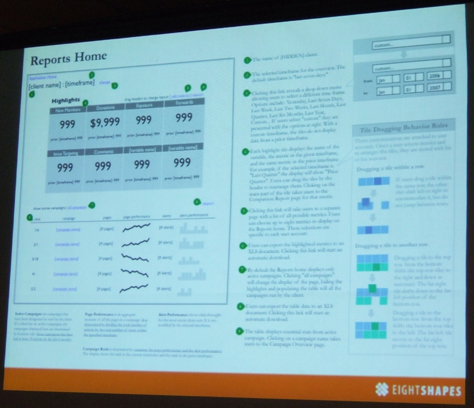
Figure 7 shows a beautiful example of a wireframe.

Figure 7—A wireframe
Wireframe

From the audience, Andrea Wiggins contributed some other possible elements of wireframes:

  • goals and objectives of a page
  • the context for a page—For example, to show how a user got to a page, you might include a miniature version of a flow, with the preceding and following pages.
  • annotations that define business rules and behaviors

Dan told us, “Think critically about your own documentation. Don’t become married to your documentation. Sometimes you need to throw it away and start again, because sometimes it doesn’t work.” He showed us a case where he’d done just that. When creating deliverables:

  • establish the purpose for a document—“What do you want to get out of it?”
  • identify your audience—“Whos this thing for? They may demand different kinds of information.”
  • inventory their contents
  • prioritize their contents—“layers of information; dimensions of data”
  • create a visual language

Finally, Dan discussed how to “employ deliverables in one’s process:

  • communicate purpose
  • relinquish control
  • note opportunities for improvement
  • estimate the value of maintenance”

Dan said, “We can extend pattern library work into our documentation systems and describe how to use patterns.” He suggested that we “leave annotations out of wireframes if using them for paper prototypes.”

While Dan thinks “Visio is one of the best diagramming tools out there,” he now uses OmniGraffle. “I switched to Mac® for my mental health.” His partner, Nathan Curtis, creates wireframes using Illustrator® and InDesign® from the Adobe® Creative® Suite.

Dan is a very dynamic speaker, and this was one of my favorite sessions at the IA Summit. Dan’s presentation is available on SlideShare.

Day 2: Where Does IA Fit in the Design Process?

Moderator: Peter Boersma

Panelists: Larisa Warnke, Peter Merholz, Livia Labate, Leisa Reichelt, and Josh Seiden

Peter Boersma (shown in Figure 8) led a lively panel discussion on how IA fits into the design process. The key questions the panel discussed:

  • What is a design process?
  • Who needs a design process?
  • When should IAs be part of the design process?
  • Where do you keep your design process?
  • How do you communicate a design process?
  • Why should others create a design process?
Figure 8—Peter Boersma introducing his panel
Peter Boersma

Livia Labate spoke about the importance of defining process to manage demand for IA services, to ensure operations are efficient and quality is sustainable, and to preserve people’s sanity. A defined process also enables “innovation within boundaries.” She emphasized the need for a toolbox rather than a rigid process:

  • During discovery, frame the problem.—“Understand user needs and business goals, by exploring their dimension and points of convergence,” through user research, domain research, industry benchmarks, and business goals assessment.
  • During modeling, explore the solutions.—“Architect the solution by modeling the user interaction with the product touch-points.” Do task and content analysis; create personas and scenarios; explore organization, classification, and navigation systems; model interactions; and establish naming conventions, patterns, and guidelines.
  • During validation, assess the level of success.—“Improve and adjust solutions through continued user feedback and observation,” by doing usability testing, prototype validation, heuristic evaluations, and user behavior analysis.

She said, “Balance user needs and business goals to conceive solutions [that] enable positive experiences.” Livia’s presentation is on SlideShare.

I found Leisa Reichelt’s presentation on agile user-centered design (UCD) particularly interesting. Her presentation is on SlideShare. Here are a few highlights:

  • “Design should last throughout a project.”
  • “Waterfall is bad. Washing machine is good.”—Washing machine referred to iterative cycles of design that occur throughout a project.
  • “There are a lot of variants of waterfall—all of which have a lot to do with fiction, I think. Waterfall assumes you know what youre going to do.” In reality, “design decisions will continue to happen throughout implementation.”
  • “Agile and UCD have a lot of things in common with one another. Its a myth that agile and UCD dont play well together. … Agile and UCD are both about progressive improvement.”
  • She advocated for “pair design.”
  • “Take things to customers early and often. Design only as much as you have to. You want to get to lo-fi prototyping as quickly as possible. … Paper and pencil.”
  • “First, test the proposition/concept/overall idea/strategy.” …
  • “One thing thats great about multidisciplinary teams: They have a sense of ownership.”

Peter Merholz, Director of Practice Development at Adaptive Path, spoke about their approach. “Adaptive Path doesn’t have a process—a set way of doing things. We adapt to the client. We have a methodology, a toolbox. We begin with discovery, talking with stakeholders, user research, strategy—how we’re going to solve a problem. Design is the planning of the solution. Finally, we build an implementation of the solution. There aren’t always all of these steps. Practices that take place during a project might include experience strategy, user research, interaction design, information architecture. Every practice is involved in discovery. It’s best to have as many practices involved as possible throughout the process.

“As we’re doing more strategy, we don’t know what the outcome is going to be. Can you tolerate ambiguity? You have to engage in communication with a lot of people to figure out where you are. Rigid process requirements are less common. …

“As part of our sales process, we show our deliverables and educate clients about our process.”

Livia Labate said, “Process helps innovation. If you have flexibility and modularity in your process toolbox, it doesn’t constrain your ability to innovate within design or development. … The IAs help to frame what we’re trying to accomplish. We go through the entire process again if there are changes.”

According to Josh Seiden, “Process is never the goal. It makes our work visible and is driven by project parameters and goals.” About Cooper’s goal-directed design, he said, “So much of a design methodology can be cultural.”

Peter Merholz stated emphatically, “An agency that has one designer working on more than one interactive design project at a time is going to do a disservice to their clients. We’re not always able to practice the ideal, because you don’t know what will come up in the flow.”

Day 2: Maximum Value Information Architecture: Big IA Is the Way You Do, Not What You Do

Presenter: Austin Govella

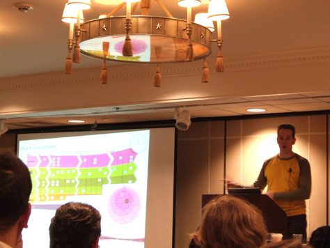
Austin Govella (shown in figure 9) gave an enjoyable talk about strategic IA. The creative imagery on his slides was evocative and introduced a touch of whimsy. “Big IA is about strategy and contributions to your organizations overall goals,” said Austin. “Everybody should be headed in the same direction. During discovery, you often find theres a gap between what they say theyre doing and what theyre actually doing.”

Figure 9—Austin Govella
Austin Govella

When discussing the role of IAs in setting business goals, business models, and strategy, Austin said, “This is one of my pet peeves: Somebody says, ‘That’s not what IAs are supposed to be doing.’ I just think of things a little further down the road. Always know where you’re going.” That lets you “contribute to the organization in a greater way.”

“Seven strategies for creating a larger impact on the business:

  1. Rich interaction widgets—Tools, not rules. Give people something useful they can use in other situations. Separate behavior from content.
  2. Controlled vocabulary—Make mountains from molehills. Change perspective to make things bigger.
  3. A/B testingNo is only part of Now. No only starts the conversation. See where the conversation takes you.
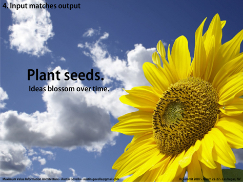
  4. Input matches output—Plant seeds. Ideas blossom over time. (See Figure 10.)
  5. Find great minds—Think like them. Talk like them. Or, figure out why you dont.
  6. GIS application—Play new games. Change the rules. Change the outcomes. When you have some insurmountable barrier, if you change the way you play the game, you can go around it.
  7. Campaign sitemap—Ice the cake. Always add one more layer.”
Figure 10—Plant seeds
Plant seeds

Austin’s presentation is available on SlideShare. 

Photographs by Pabini Gabriel-Petit.

Read Part II

Principal Consultant at Strategic UX

Founder, Publisher, and Editor in Chief of UXmatters

Silicon Valley, California, USA

Pabini Gabriel-PetitWith more than 20 years working in User Experience at companies such as Google, Cisco, WebEx, Apple, and many startups, Pabini now provides UX strategy and design consulting services through her Silicon Valley company, Strategic UX. Her past UX leadership roles include Head of UX for Sales & Marketing IT at Intel, Senior Director of UX and Design at Apttus, Principal UX Architect at BMC Software, VP of User Experience at scanR, and Manager of User Experience at WebEx. Pabini has led UX strategy, design, and user research for Web, mobile, and desktop applications for consumers, small businesses, and enterprises, in diverse product domains. Working collaboratively with business executives, multidisciplinary product teams, and UX teams, she has envisioned and realized holistic UX design solutions for innovative, award-winning products that delighted users, achieved success in the marketplace, and delivered business value. As a UX leader, she has facilitated conceptual modeling and ideation sessions; written user stories; prioritized product and usability requirements; established corporate design frameworks, standards, and guidelines; and integrated lean UX activities into agile development processes. Pabini is a strategic thinker, and the diversity of her experience enables her to synthesize innovative solutions for challenging strategy and design problems. She is passionate about creating great user experiences that meet users’ needs and get business results. A thought leader in the UX community, Pabini was a Founding Director of the Interaction Design Association (IxDA).  Read More

Other Columns by Pabini Gabriel-Petit

Other Articles on Conference Reviews

New on UXmatters